Creating a Custom Analytics Dashboard from Scratch the "Blue Peter" way
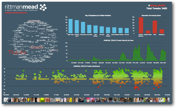
This year, Rittman Mead were the Analytics Sponsor for the UKOUG Tech13 conference in Manchester, and for those that visited the UKOUG stand during their time there will have noticed the Rittman Mead-sponsored Analytics Dashboard on display. In this blog post I will cover how it was put together, the "Blue Peter Way" !
(remember to ask your parents permission before downloading any of the following items)
You will need :
- A Linux server.
- A Web server
- The Redis key/value store
- A DataSift account
- The Webdis HTTP server
- The tagcanvas.js jQuery plugin
- The vTicker jQuery plugin
- The flot plotting library
- Some Sticky-backed-Plastic (jQuery)
- Lots of coffee
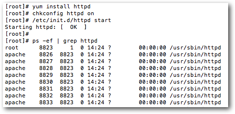
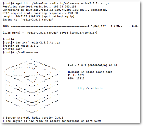
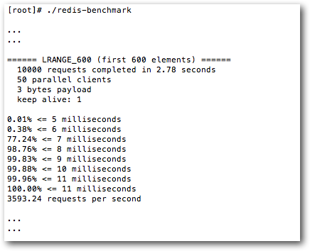
Next up is the Redis key/value datastore. I'll be using Redis to store all incoming tweets from our datasource ( more on that in a bit )

Ok so that's our datastore sorted, but what about our datasource ? Clearly we will be using Twitter as our primary data source but mere mortals like myself don't have access to Twitter's entire data stream, for that we need to turn to specialist companies that do. DataSift, amongst other companies like Gnip and Topsy ( which interestingly was bought by Apple earlier this week ) can offer this service and will add extra features into the mix such as sentiment analysis and stream subscription services that push data to you. I'll be using DataSift, as here at Rittman Mead we already have an account with them. The service itself charges you by DPU ( Data Processing Units ) the cost of which depends upon the computational complexity of the stream your running, suffice to say that running the stream to feed the analytics dashboard for a few days was pretty cheap.
To setup a stream you simply express what you want included from the Twitter firehose using their own Curated Stream Definition Language, CSDL. The stream used for the dashboard was very simple and the CSDL looked like this :-
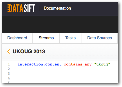
This is simply searching for tweets containing the string "ukoug" from the Twitter stream. DataSift supports all kinds of other social data, for a full list head over to their website.
Now that we have our data stream setup, how do we actually populate our Redis data store with it ? Simple - get DataSift to push it to us. Using their own PUSH API you can setup a subscription in which you can specify the following output parameters: "output_type", "host", "port", "delivery_frequency" and "list" amongst many others. The output type was set to "Redis", the host, well, our hostname and the port set to the port upon which Redis is listening, by default 6379. The delivery_frequency was set to 60 seconds and the list is the name of the Redis list key you want the data pushed to. With all that setup and the subscription active, tweets will automagically start arriving in our Redis datastore in the JSON format - happy days !
The next step is to get the data from Redis to the browser. I could install PHP and configure it to work with apache and then install one of the several Redis-PHP libraries and write some backend code to serve data up to the browser, but time is limited and I don't want to faff around with all that. Besides this is Blue Peter not a BBC4 Documentary. Here's where we use the next cool piece of open source software, Webdis. Webdis acts as a HTTP interface to Redis which means I can make HTTP calls directly from the browser like this :-
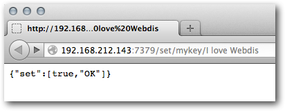
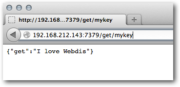
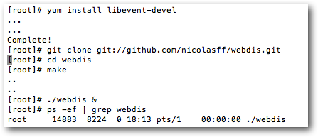
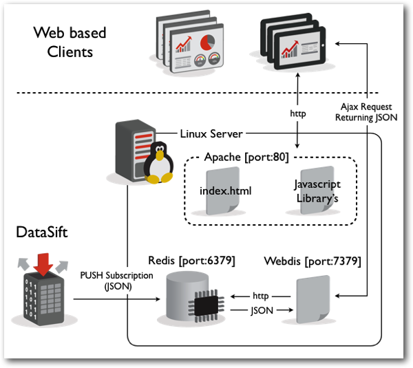
One advantage to using this architecture on a small data set is that you avoid having to write any backend code at all, the data is pulled directly to the browser where you can then use Javascript to manipulate it. This meant I could avoid having to test server performance which was good as I had no idea how many hits the dashboard would get - it got a lot ! The server simply acted as the middleman and I could instead focus on the performance of the client-side, this is something I could test with the various devices I have at home.
Would I do this in a production environment with larger data set, probably not, it wouldn't scale, I'd instead write server-side code to handle the data processing, test performance and push only the required data to the client. The right tools for the right job.
Next we'll move onto the dashboard itself where we'll be using jQuery, Ajax, a couple of jQuery plugins, a plotting library and some Javascript to pull the whole thing together. Before we can do anything else we need to retrieve the data from Redis via Webdis and parse the JSON so we can manipulate it as a Javascript object. The following code snippet demonstrates how this can be done.
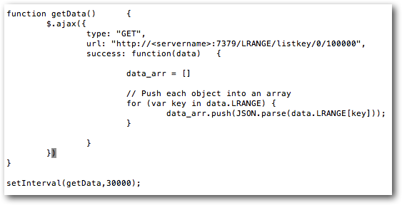
The function getData() is called within the setInterval() function, the second parameter to the setInterval() sets the frequency of the call, in this case every 5 mins (30000 milliseconds). The getData function performs an Ajax get request on the url that points to our Webdis server listening on port 7379 which then performs an LRANGE command on the Redis data store, it's simply asking Redis to return all list items between 0 and 100000, each item being a single tweet. Once the Ajax request has successfully completed the "success" callback is called and within this callback I am pushing each tweet into an array so we end up with an array of tweet objects. We now have all the data in a format we can manipulate to our hearts content.
Now onto the Graphs and Visualisations.
The Globe
The Tweet Ticker
Tweet Velocity

The flot plotting library was used to create this graph. You simply pass flot some data in the form of an array and set all the display options in a json string. The data for this was created by truncating the tweet timestamp to the nearest hour and then aggregating up to get the totals using javascript array manipulation.
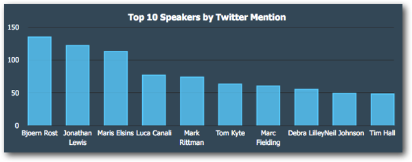
Top 10 Speakers by Twitter Mention
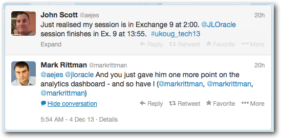
tut, tut Mark.
Twitter Avatars
![]()
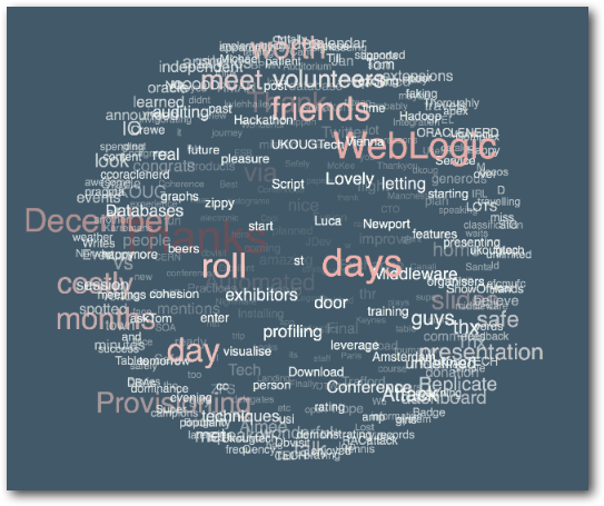
The twitter Avatars used the tagcavas.js library but instead of populating it with words from the Twitter content the Tweet avatars were used. A few changes to the plugin options were made to display the results as a horizontally scrolling cylinder instead of a globe.
Twitter Sentiment

Perhaps the data you're analyzing needs to be taken into context as a whole. You'd expect a 1000 Techies running around a tech conference to be happy, the sentiment analysis seemed to do a better job at ranking how positive tweets were than how negative they were. Perhaps from a visualisation point of view, a logarithmic scale along with a multiplier to raise the lowest score would have worked better in this case to reflect how positive overall the event was. One thing is clear though and that is that further statistical analysis would be needed over a much larger data set to really gain insight into how positive or negative your data set is.
The remaining graphs were also created using flot. The data was sourced from a spreadsheet provided by the conference organizers, it was aggregated and then hardcoded into the web page as Javascript arrays and passed to the various flot instances.
So that's it kids, I hope you've enjoyed this episode of Blue Peter, until next time….
Edit - 6-Dec-2013 19.07:
Mark has asked me the following question over twitter:
"any chance you could let us know why these particular tools / components were chosen?".
I thought I'd give my answer here.
One of the overriding factors in choosing these tools was time. With only 3 days to piece the thing together I decided early on that I'd write all the code on the client side in Javascript. This meant I could write all my code in one location and in one language with less to test and less that could go wrong. Webdis Allowed me to do this because I didn't need to write any back end code to get the data into the browser.
All the tools were also open source, easy to install/configure and are well documented, I had also used them all previously - again, a time saver. Redis was chosen for 2 reasons, it was supported as a subscription destination by DataSift ( along with many others ) and I'm currently using it in another development project I'm working on so I was up to speed with it. Although in this solution I'm not really taking advantage of Redis's access speed it worked well as somewhere to persist the data.
I've used flot several times over the years and although there are other Javascript charting library's out there I didn't have time to test and learn a new one, flot was a no-brainer. As was jQuery, the de-facto Javascript library for Ajax, DOM manipulation and for adding suger to your webpages. I'd not used tagcanvas or vticker before but if you can install and get a jQuery plugin working in less than 10 minutes hassle free then it's probably a good one, both these met this criteria.
If I was coding a more permanent solution with more development time then I'd add a relational database into the mix and use it to perform all of the data aggregation and analysis, this would make the solution more scalable. I'd then either feed the browser via ajax calls directly to the database via backend code or populate a cache layer from the database and make ajax called directly on the cache, similar to what I did in this solution. It would have been nice to use D3 to develop a more elaborate visualisation instead of the canned flot charts but again this would have taken more time to develop.
