Simple Ways to Simplify: Quick Fixes to Enhance OBIEE Visuals
Over the past couple of months I worked with a few clients in order to conduct an assessment on dashboard and analysis design. In most cases I was noticing that the dashboards were overflowing with content to the point that there was really no discernible “story” or “flow” to the information. Most of the dashboards were an overwhelming hub of large tables, excess dashboard prompts, and complicated charts and graphs. Many times the client complaints were that the dashboards were not being fully adopted by the user base. The users knew that something was in fact wrong with what they were looking at, but just couldn't put their finger on why the analysis process was so frustrating. While this may seem unavoidable during a time when you are trying to provide your users with what they want and “need," there are a few simple ways to aid this issue. During the development process, simplicity is often overlooked and undervalued, and that is why a few key design principles can drastically improve the user experience.
In many cases that I’ve seen, all dashboards start with the good intention of quickly relaying information to the user. However, as the requirements process grows in length, more and more compromise is made in keeping clean, consistent, functional design. Many of the dashboards in my assessments often hand the user everything they ask for without ever questioning the value. Developers often settle on poor design just to have something accepted by their users and released into production.
While each client is unique and has their own set of issues to resolve, there are a few consistent principles of dashboard design that can be applied for everyone.
Top-Down Analysis—The practice of allowing users to drill from summary to detail, gives your user community the ability to make their dashboards as dynamic as they need to be. This method will never give the user too much, or too little information. With detail being a choice, not the default, the user that can log in and be prompted to have to drill into further detail, rather than being presented everything all at once. While this is a widely accepted best practice when it comes to dashboard design, this principle is ignored more than you would think. Odds are that your VP does not need to see 50 rows of detail level information in a table every time they view their dashboard. The primary purpose of presenting this detail level is to answer a very important question that should be posed by analyzing your data at the summary level. The user can examine something simple like a trend analysis, and then decide whether further examination is needed. The benefit of this common principle is that your user is never overwhelmed and irritated with an overload of information. The dashboard should be treated with the same care and consideration you would . Your organization’s dashboard (product) should be a joy to use, not an experience coupled with frustration.

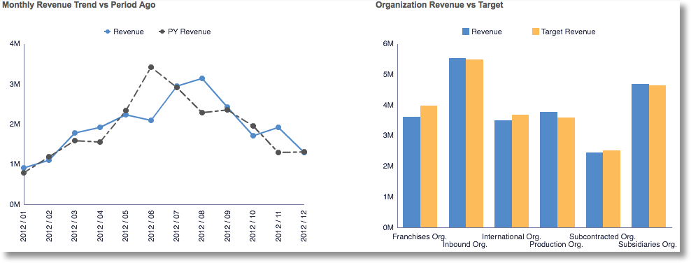
Simplicity and Trimming the Fat-This is another very simple, yet often ignored design principle. From my observation, many developers will create a chart or graph and will leave all the default settings, no modifications needed right? While there is nothing inherently wrong with this, the default will leave a lot of extra pixels on the graph such as unneeded axis titles, shadowing, canvas size, etc. With just a little effort here, you can remove all of these unnecessary data pixels (pictured below) and provide a more professional, clean design. The point that I’m trying to make here is, let’s not get lazy with our visualizations. Instead, we should try to give a lot of thought what is useful in the visualization, and what can be discarded without hindering the message. The less cluttered we make our visualizations, the more pleasant the user experience will be. And as we all know, the happier our user community is, the easier your life as a developer’s will be.

Options for Option’s Sake-The types of visualizations used for a dashboard are one of the most important criteria for user adoption. By choosing visualizations that do not adequately display the type of analysis needed, or tell the correct story about the data, can be a frustrating waste of time for the user. Just because there are a lot of available graphing options in your analytical tool, does not mean they need to be used. This mistake is often made in an attempt to visually enhance the dashboard, or add “variety” . Try to consider things like what type of scale is in my graph (nominal, or interval pictured below), or do I want to provide summary or detail? Be sure to choose your graph based on these factors, rather than picking a graph that you think will add to variety and then figuring out how you can make it useful.
Visually appealing dashboards are important, however this is only relevant when the graphs are enhancing the users analytical experience. These mistakes are very costly because the overall goal of a dashboard is not to provide variety for varieties sake, but to quickly and accurately relay a message. By focusing only on visualization variety, we run a terrible risk of rendering a dashboard useless.
There are a lot of great resources out there that can provide more detail that can surely take your dashboards to the next level so I certainly suggest reading up information design methodology. I think the principles I’ve listed above are a great way to get started and provide some quick fixes on the road to enhancing the user experience within your organization.