Analyse Your Data on the Go with Oracle Synopsis App

How many times did you receive an email on your phone with an Excel or CSV attachment you wanted to analyse immediately in an app on your mobile, without having to wait until you reach the laptop? Not only viewing raw numbers but also creating graphs and summaries with the possibility to share the end result with your colleagues?
Your prayers have been answered with the recent release from Oracle of Oracle Synopsis. This is a new mobile app available for Android devices (an iOS version coming soon) that enables building data analyses on the go by interacting with data directly on the smartphone/tablet. It is a free application that doesn't require any OBIEE backend or additional licensing.
Happy to announce that we have launched Synopsis on Android. Now go analyze your data. https://t.co/tAxCrz4RAY pic.twitter.com/JT6dHMKgVu
— BI Mobile Labs (@bimobilelabs) December 21, 2016
Oracle's mobile ecosystem so far has been represented by Oracle BI Mobile HD: an app available since several years, requiring an additional license, which focused on the visualization of OBIEE's pre-built content like dashboard, analysis or alerts. The main limitation of BI Mobile HD is that all content must be created upfront in a computer browser in order to be accessed by the application, no "analysis" option was available other than predefined drilling or navigation capabilities.
Synopsis extends Oracle's mobile ecosystem by adding an app capable of analysing data on the go, interacting directly with files on the phone/tablet in a visual and intuitive way.
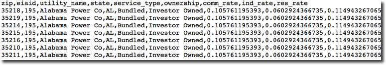
Let’s have a look at how Synopsis works. For my test I'll use the Federal U.S. Electric Utility Companies and Rates data coming from en.openei.org.
I first downloaded the CSV file in my phone, then opened the Oracle Synopsis App and selected the file from the "Downloads" folder.
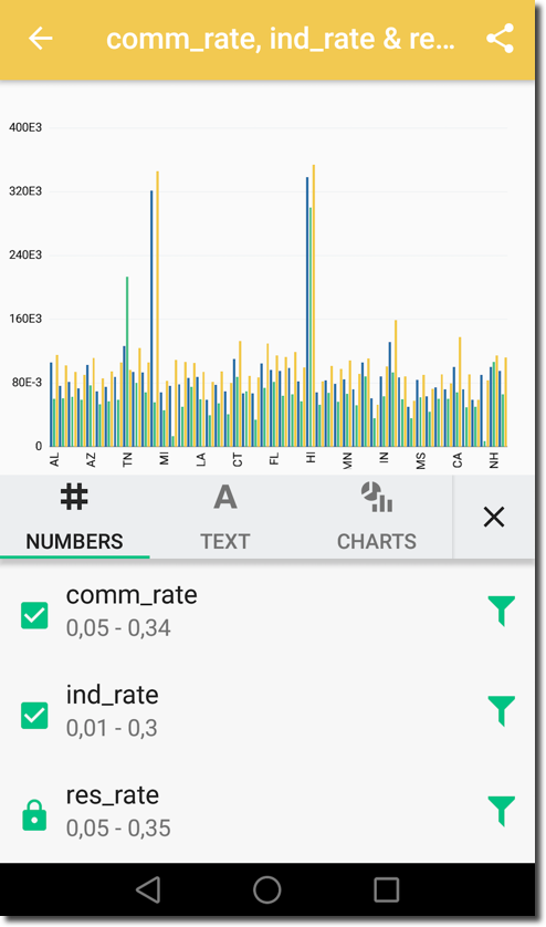
By default, just by opening the file with Synopsis app, I get a project named as the source file (iouzipcodes2011) showing a bar chart of ZIP by UTILITY_NAME. I'm able to switch the coordinates of the graph by either changing the dimension of the X-axis or the measure on the Y-axis by selecting another option from the sections on top and bottom of the graph respectively.
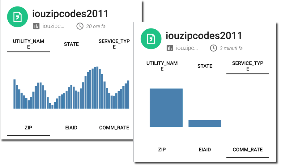
The default graphs are provided just by opening the file, without having to define any measure or dimension.
The question now is: What am I looking at? How do I change the default behaviour?
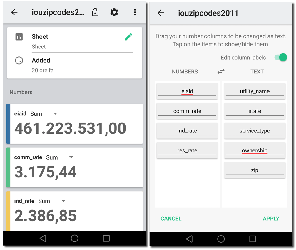
I can get an idea about what Synopsis is doing by clicking on the project title itself. By default the application associates all text columns to dimensions and all numeric columns to measures, aggregating them with SUM. I can however change the default behaviour by:
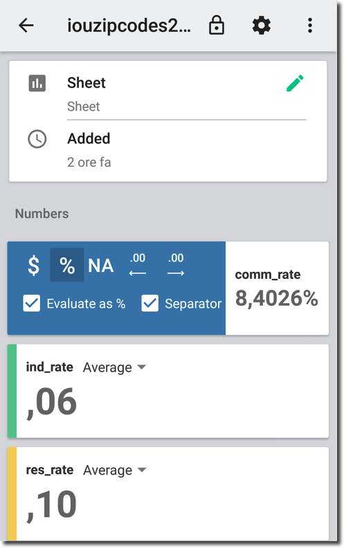
- Changing the aggregation method for the measures, possible alternatives are Average and Count
- Changing the text and numbers (dimension and metrics) assignments by clicking on the cog icon and accessing the related screen
- Hide a column by just tapping on the column name (in the grey box shown in the image below), a
linewill be shown on top the hidden column name.
Measures format can be changed just by sliding the related number tile and setting decimals, currency, percentage format among others.
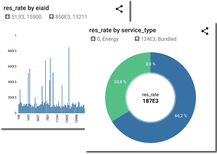
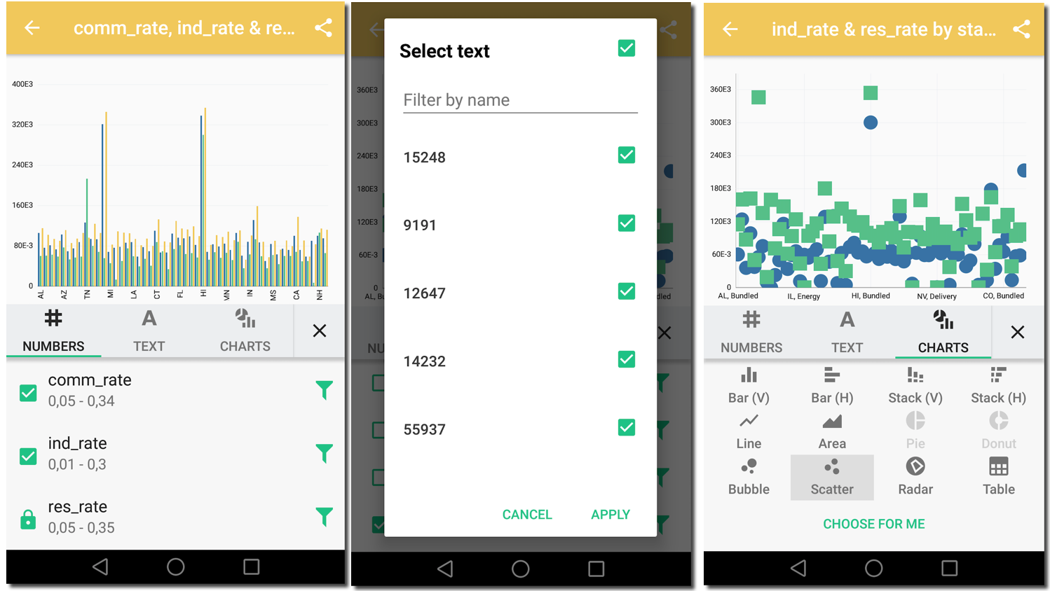
When clicking on a measure (e.g. ind_rate), a list of graphs, one per dimension, is presented. The type of graphs depends by the attribute type (bar for a text, line trend for a date) and cardinality (a donut is presented when the number of distinct value for an attribute is shown).
I can however change the graph type by clicking on it. There are multiple options:
- One or more metrics can be added and filters can be applied
- Attributes can be added and filters can be applied
- The graph type can be changed
An image of the resulting graph can then be easily sent via mail by clicking on 
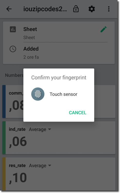
When clicking on padlock icon projects are secured with the fingertip sensor. This option is enabled only in mobile devices supporting the fingertip recognition.
Projects can be exported: a .syn file will be created containing both data and metadata. The project file can then be shared and reopened with the Synopsis app in other mobiles. In this first release is not possible to share projects between Synopsis and other tools like Visual Analyzer or Data Visualization Desktop but it’s an obvious enhancement that one could imagine Oracle considering for the future.
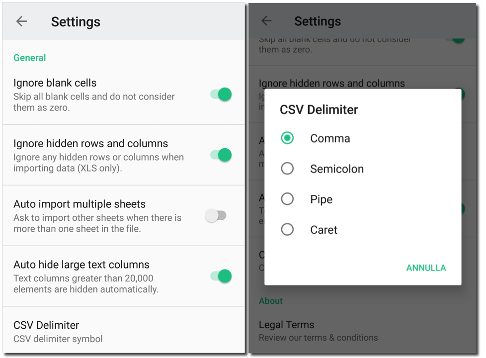
A list of global settings is also available in order to change import settings like blank cells management and CSV delimiter.
Be aware that Synopsis requires the Excel (or CSV) file to be in a pure tabular form; extra heading rows or collapsed cells will prevent Synopsis from parsing it. On top of this, in order for it to work at least one numeric and one text column are needed.
Conclusion
Oracle Synopsis is a great addition to Oracle's mobile offering. It provides an app capable of analysing data on the go in a very visual and intuitive way. So far only CSV and Excel files are supported but my guess is that it will soon be possible to interface to a lot of other applications especially in the Cloud. And - it’s free!