Analysing Elections Data with Oracle Data Visualisation Desktop

Disclaimer #1 This post is not about politics. Its dataset is about politics, but that's a coincidence. It could be about immunisation or transport or anything else. If you are strictly against any politics, here is a link to watch cute kittens.
Introduction
Let's pretend that I'm an analyst and got a supposedly interesting data set. Now I want to understand if the data is actually interesting or it's a total rubbish. Having been in IT for some time I can use tools and technologies which typical end-user can’t access. But this time I pretend I’m a usual analyst which has data and desktop tools. And my task is to do a research and tell if there are anomalies in the data or everything looks like it supposed to look like.
The main tool for this work is obviously Oracle Data Visualisation Desktop (DVD). And, as a supplementary tool, I use Excel. This post is not a guide for any particular DVD feature. It won’t give a step by step instruction or anything like that. The main idea is to show how we can use Oracle Data Visualisation for an analysis of a real dataset. Not simply show that we can build bar charts, and pie charts and other fancy whatever charts, but show how we can get insights from the data.
The Data
I should say a few words about the data. It is an official result of the Russian State Duma (parliament) elections in 2016. Half of the Duma was elected by party lists and for this post I took that data. I should confess that I cheated a little and decided not spend my time downloading and parsing the data piece by piece from the official site, and took a prepared set.
From a bird's-eye view I have the following data:
- Voting results by election commissions: number of votes for every political party and a lot of technical measures like number of registered voters, number of good and damaged voting ballots and so on.
- Turnout figures at given times throughout the day.
From a more technical point of view, the data was stored in two big files with multiple JSON in each. As the data preparation part is big enough, it was extracted to another post. This one concentrates purely on visualisation and the second one is about data flows and comparison to Excel.
Analysing the Data
I did some cleaning, refining and enriching of the data and it's time to use it. I started with a standard Stacked bar chart. It shows percentages of parties by regions and in addition width of bars shows Total votes. The chart is sorted by ascending Total votes.
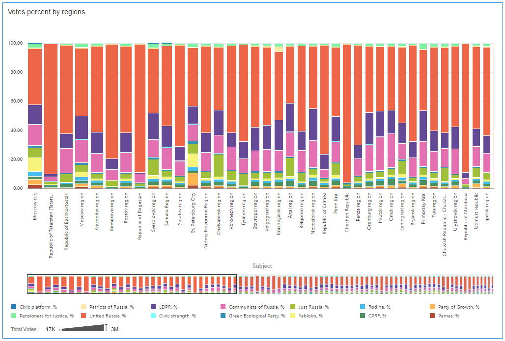
What can we say here?
Before I start talking I need a lawyer and a disclaimer #2:
Disclaimer #2 Some of the results may be interpreted in different ways. Some of them may be not so pleasant for some people. But I'm not a court and this post is only a data visualisation exercise. Therefore I'm not accusing anyone of committing any crimes. I will make some conclusions because of rules of the genre, but they should be treated as hypotheses only.
That’s not a proven charge (see disclaimer #2) but for me these regions look a bit suspicious. Their results are very uncommon. United Russia ruling party (orange bars) got an extremely high result in these few regions. This may be a sign of some kind of interfere with an election process there. But of course, other explanations (including a measure incorrectly selected for sorting) exist.
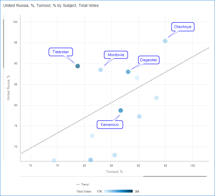
Just for reference so we don’t forget the names: Tatarstan, Kemerovo, Dagestan, Chechnya and Mordovia. There are a few more regions with similar results but their number of voters is lower so I don’t show them here.
At this point I'm starting to suspect something. But I need more visuals to support my position, and my next hypothesis is that in these regions ballots were somehow added to voting boxes (or protocols were changed which is basically the same). From a data visualisation point of view that will mean that these regions will have higher turnout (because of added ballots) along with higher United Russia result.
To check this I need one more measure - Turnout, %. It shows how many of registered voters actually voted. I can create this field without leaving visualisation mode. Cool.
Note. This formula may be not absolutely correct but it works well for demonstration purposes.
In order to visualise this hypothesis, I built a Scatter chart. Its horizontal axis is Turnout,% and vertical one United Russia, %. And I added a trend line to make things more obvious. Colour density shows Total votes.
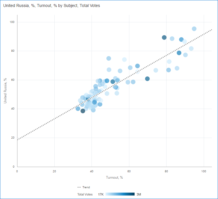
I think my hypothesis just got a strong support. As usual it is not an absolutely impossible situation. But it's hard to explain why the more people come to voting stations the higher one party result is. I'd expect either high result not depending on the turnout (more or less like Uniform distribution) or at least a few exceptions with high turnout and low result.
I consider this result strange because in real life I'd expect that higher turnout should mean more opposition voters (a passive group indeed) coming to voting stations. But that's only my opinion. And highly arguable I should agree. What I really want to show here is that these charts highlight an oddity that should be investigated and may or may not have a rational explanation.
And who are our heroes? Let’s zoom in on the chart …and we see the same regions.
But maybe other parties can show the same result? We can build the same Scatter charts for every party or we can visualise all at once with a usual Line chart. Here I’ve plotted the percent of vote won by each party (Y-axis) against the overall turnout % (X-axis).
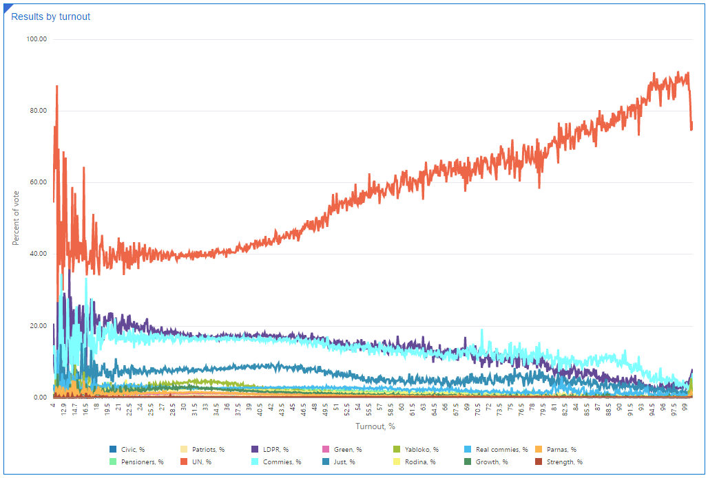
United Russia is the only party that increases with turnout.
So far all my charts were about relative measures, it's time to check some absolute values. Here is a Bar chart which shows a number of precinct commissions by results. I'd expect to see something close to normal distribution - a bell-shaped chart with the maximum around 54% (average turnout). Now, look at the real chart (bin size=1.0%). Its maximum is at 36-37%.
In probability theory, the normal (or Gaussian) distribution is a very common continuous probability distribution. Normal distributions are important in statistics and are often used in the natural and social sciences to represent real-valued random variables whose distributions are not known.
Strictly speaking all numbers I'm showing here are discrete and I should say Binomial distribution rather than Normal but right now for my purposes the diffence is not that big.
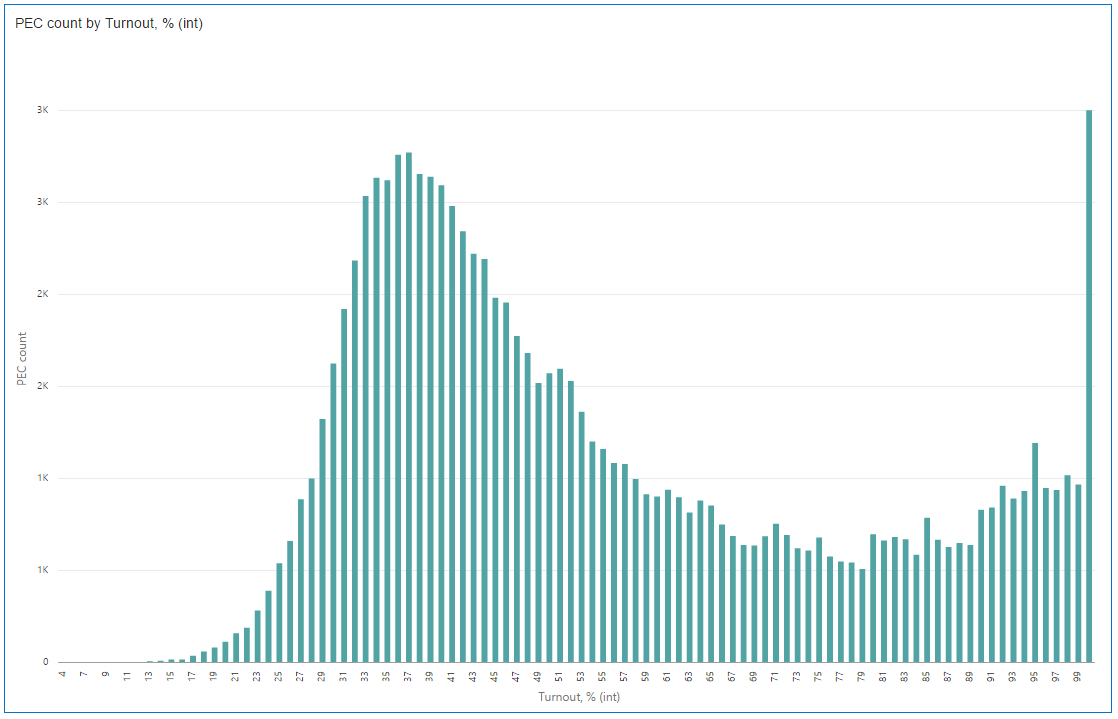
I'm definitely not Carl Gauss (and even not one of his best students) and you may ignore my opinion, but I expected something more like this:
And I don't have the slightest idea how it is possible that the most "popular" turnout is 100%.
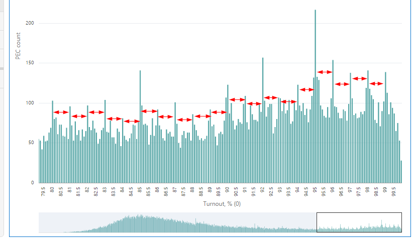
What if we look at the same chart with more details? The previous one was grouped by 1% bins, and this one has 0.1% bins. And I had to add turnout not equal to 100% filter. Even with smaller bin size, the last one is almost the same ~3K commissions. This bar is much bigger than the others and the chart doesn't show anything in that case.
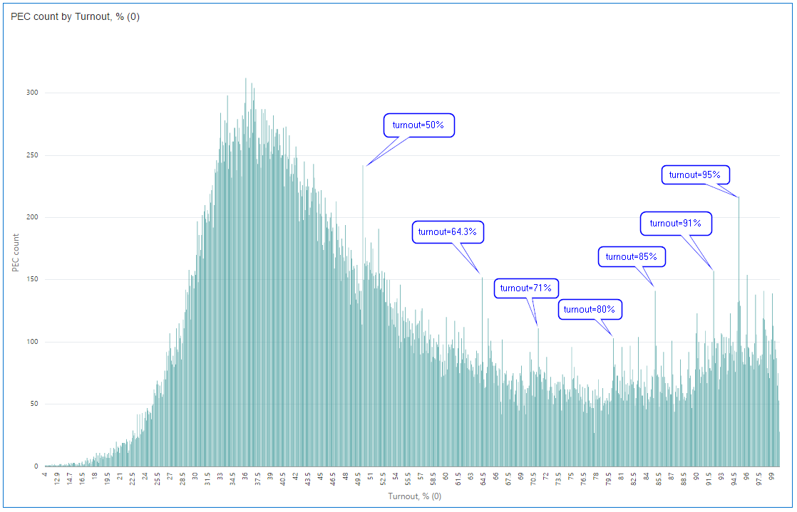
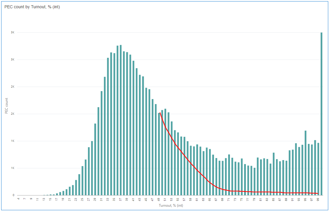
What can we see here? Well, people aren’t really good in generating random numbers. It's perfectly OK to have some runout on the chart. But hey, it's not normal to have them mostly at round values. That looks like someone was trying to fit the result to some plan.
Here is my favourite part of the chart. I marked 1% intervals, and you can see that round turnout value is always more probable than its closest non-round neighbours. No exceptions. A possible explanation is that the number of commissions with results that high is relatively low and even the slightest manipulation is clearly visible.
But wait. What about that 64.3 percent? It’s not round, but it is a big runaway. Let’s take a closer look at this value and check if there is anything interesting or that is a normal situation. Here is a few interesting visualisation for it.
The first one is Tree Diagram. It shows all existing combinations of district and precinct commissions by regions for the filtered data (turnout=64.3). And in order to demonstrate how it works for this case I made an animation. Most of the regions have a few commissions with 64.3% turnout. But Saratov region beats them all.
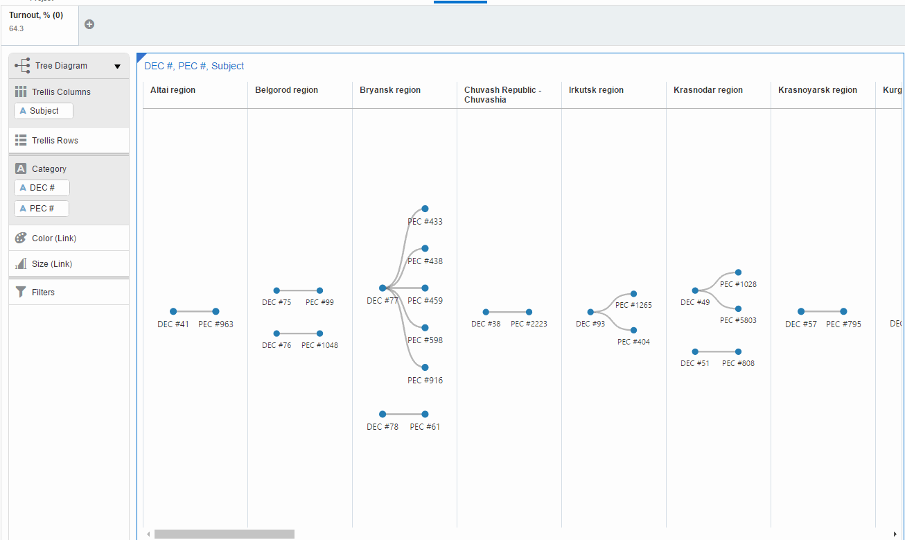
This visualisation has a serious flaw. End-user has to scroll it (I mean for this set of data) and can miss the point. Another visualisation can improve the situation. Network diagram doesn't need scrolling.
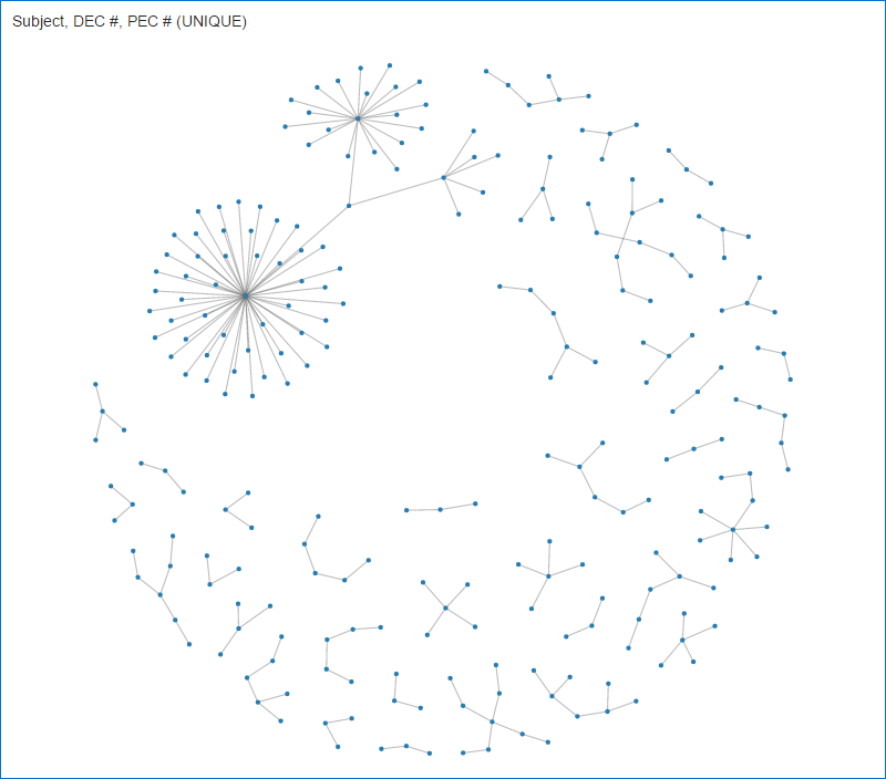
Looks good and shows exactly the same. But for this chart we must ensure that every data point is unique what is not true in my case. Different precinct commissions have the same numbers and I had to create a unique field first (DEC #||PEC #). It's easy to forget and get unpredictable or even misleading results.
Or if you prefer more traditional charts, here is Sunburst for you. Its sectors size shows Total votes and the colour is PEC count. It gives a good representation of how uncommon Saratov's result is.
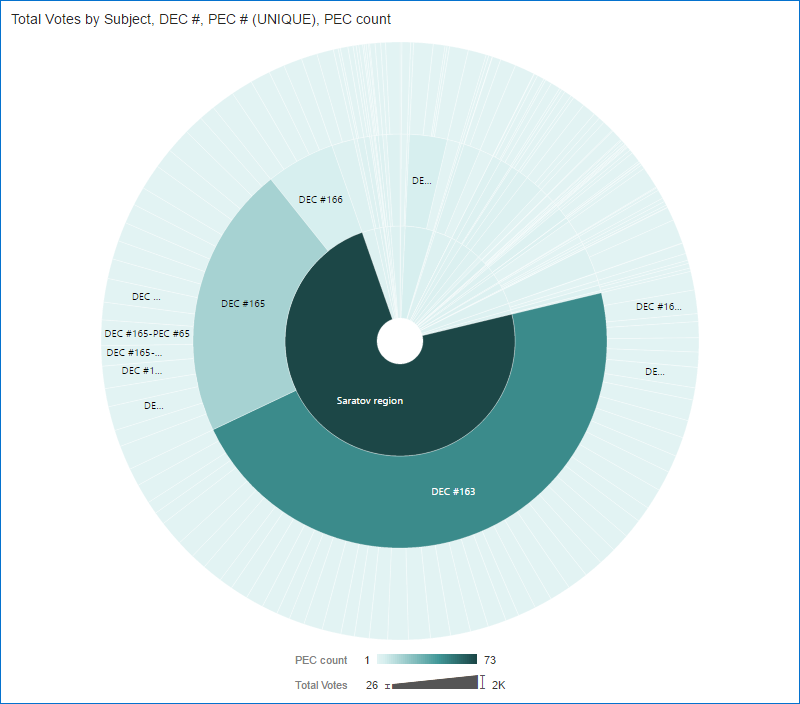
And the last picture for the same topic boring never-old classic Bar chart.
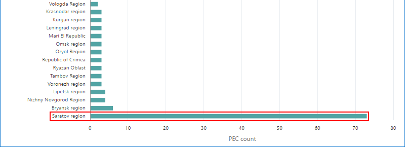
Considering all these charts I'd say that almost exclusive concentration of commissions with 63.4% turnout in Saratov doesn't look normal for me. It's pretty weird that sibling commissions show exactly the same figures.
A few more diagrams which could work well are Sankey and Parallel coordinates, unfortunately, they are less informative because of the high number of precinct commissions. But if the number was lower I'd consider them too.
All previous charts are based on voting data. But I have one more dataset - official turnout. Let's check if we can find anything interesting there. And unfortunately significant part of commissions doesn't have official data, and sometimes I may use formulas that are not exactly the same as official ones, so numbers may differ slightly from what I got from the protocols data.
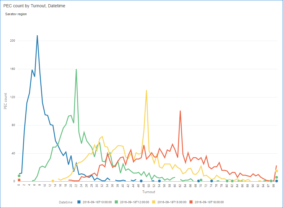
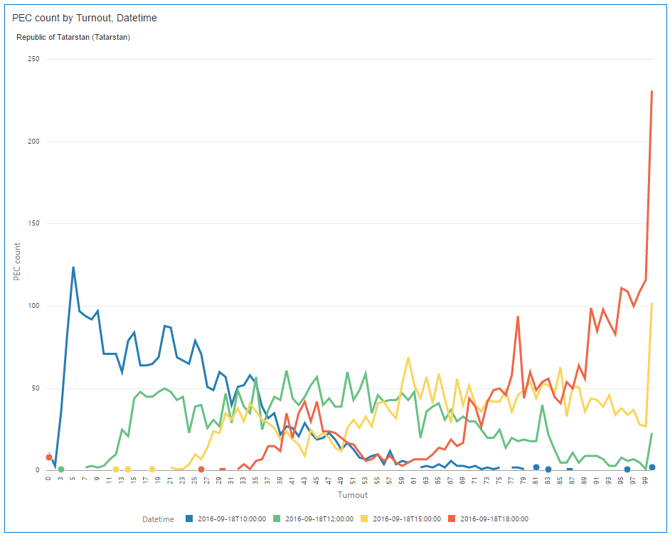
The first chart shows the number of commissions (vertical axis) by the official turnout (horizontal axis). Colour shows the moment of time. Strictly saying I shouldn't have used continuous linear charts for discrete values, but coloured overlapped bars don't give that clear picture.
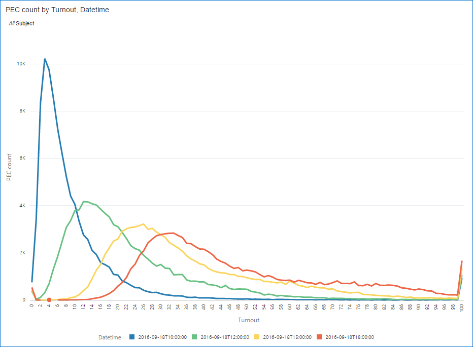
Except for the 100% tail, everything is more or less natural. Graph shape looks more like Gamma distribution rather than Normal but I didn't test it.
What picture do I have for various regions?
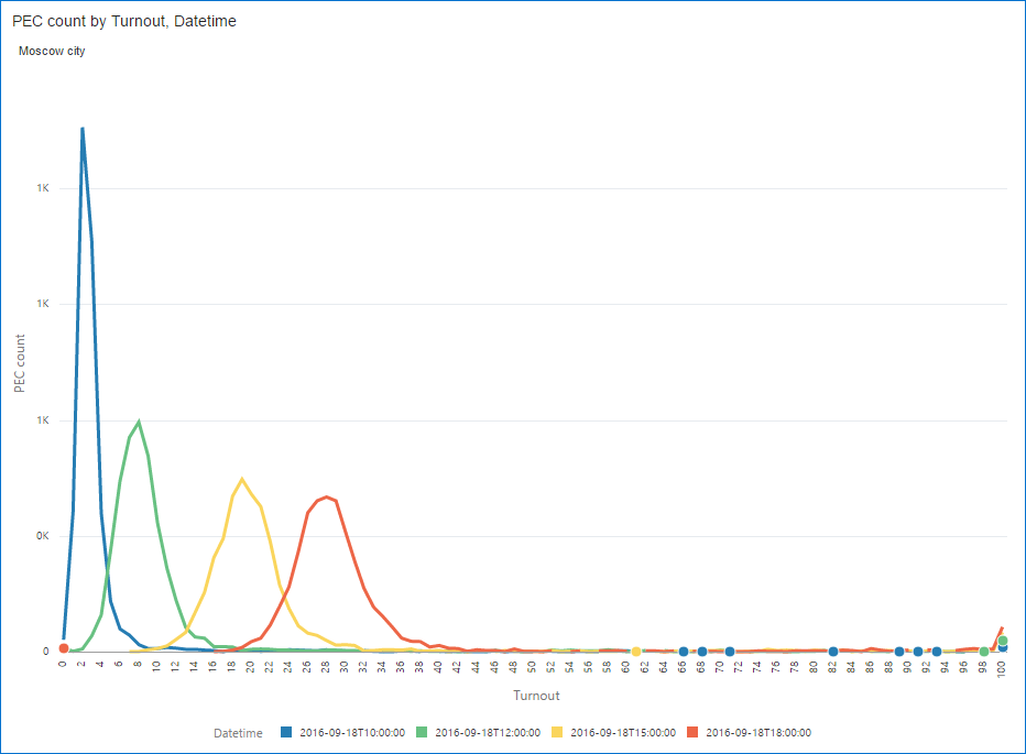
Moscow city is known for a relatively high number of poll watchers and we may expect more clean data there. Ignoring the long tail, these look normal (or binomial if you want to be precise).
Saratov region. The one with 64.3% turnout. Look at these peaks. Do they look natural to you?
Do you remember Tatarstan (was the hero in the beginning of this story)? Here it is. I don't know how can anyone explain how it is possible (without manual results adjusting I mean).
Summary
This post shows how we can use Oracle DVD for visualisation of a real data set. And I hope I was able to convince you that this tool can be useful and can give you really interesting insights. Of course, visualisation alone doesn't answer all questions. And this time actually it was less about answers but more about questions. It helps to ask right questions.
More reading on the topic: 1, 2 (Russian language). If you can read Russian, here you will find more visualisations, discussions and interesting information. And this article is about elections in 2011. Its undisputable advantage is that it is in English.