The Week After: Game of Thrones S07 E06 Tweets and Press Reviews Analysis


Another week is gone, another "Game of Thrones" episode watched, only one left until the end of the 7th series.
The "incident" in Spain, with the episode released for few hours on Wednesday screwed all my plans to do a time-wise comparison between episodes across several countries.
I was then forced to think about a new action plan in order avoid disappointing all the fans who enjoyed my previous blog post about the episode 5. What you'll read in today's analysis is based on the same technology as before: Kafka Connect source from Twitter and Sink to BigQuery with Tableau analysis on top.

What I changed in the meantime is the data structure setup: in the previous part there was a BigQuery table rm_got containing #GoT tweets, an Excel table containing Keywords for each character together with the Name and the Family (or House). Finally there was a view on top of BigQuery rm_got table extracting all the words of each tweet in order to analyse their sentiment.
For this week analysis I tried to optimise the dataflow, mainly pushing data into BigQuery, and I added a new part to it: online press reviews analysis!
Optimization
As mentioned during my previous post, the setup described before was miming an analyst workflow, without writing access to datasource. However it was far from optimal performance wise, since there was a cartesian join between two data-sources, meaning that for every query all the dataset was extracted from BigQuery and then joined in memory in Tableau even if filters for a specific character were included.
The first change was pushing the characters Excel data in BigQuery, so at least we could use the same datasource joins instead of relying on Tableau's data-blend. This has the immediate benefit of running joins and filters in the datasource rather than retrieving all data and filtering locally in memory.
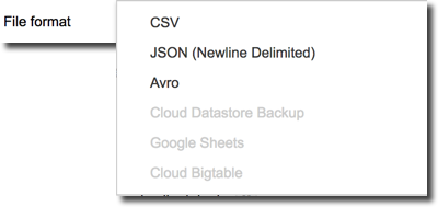
Pushing Excel data into BigQuery is really easy and can be done directly in the web GUI, we just need to transform the data in CSV which is one of allowed input data formats.
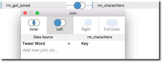
Still this modification alone doesn't resolve the problem of the cartesian join between characters (stored in rm_characters) and the main rm_got table since also BigQuery native joining conditions don't allow the usage of the CONTAIN function we need to verify that the character Key is contained in the Tweet's Text.
Luckily I already had the rm_words view, used in the previous post, splitting the words contained in the Tweet Text into multiple rows. The view contained the Tweet's Id and could be joined with the characters data with a = condition.
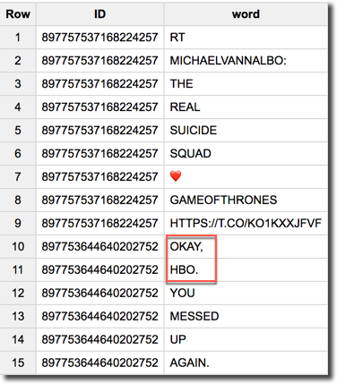
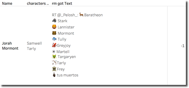
However my over simplistic first implementation of the view was removing only # and @ characters from the Tweet text, leaving all the others punctuation signs in the words as you can see in the image below.
I replaced the old rm_words view code with the following
SELECT id, TEXT, SPLIT(REGEXP_REPLACE(REPLACE(UPPER(TEXT), 'NIGHT KING', 'NIGHTKING'),'[^a-zA-Z]',' '),' ') f0__group.word FROM [big-query-ftisiot:BigQueryFtisiotDataset.rm_got]
Which has two benefits:
REPLACE(UPPER(TEXT), 'NIGHT KING', 'NIGHTKING'): Since I'm splitting words, I don't want to miss references to the Night King which is composed by two words that even if written separated point the same character.REGEXP_REPLACE(..,'[^a-zA-Z]',' '): Replaces using regular expression, removing any character apart from the letters A-Z in lower and upper case from the TweetText.
The new view definition provides a clean set of words that can finally be joined with the list of characters keys. The last step I did to prepare the data was to create an unique view containing all the fields I was interested for my analysis with the following code:
SELECT
  rm_got.Id,
  rm_got.Text,
  rm_got.CreatedAt,
  [...]
  characters.Key,
  characters.Name,
  characters.Family
FROM
  [DataSet.rm_got] AS rm_got JOIN
  [DataSet.rm_words] AS rm_words ON rm_got.id=rm_words.id JOIN
  (SELECT * FROM FLATTEN([DataSet.rm_words],f0__group.word)) AS rm_words_char ON rm_got.id=rm_words_char.id JOIN
  [DataSet.rm_charachters] AS characters ON rm_words_char.f0__group.word = characters.Key
Two things to notice:
- The view
rm_wordsis used two times: one, as mentioned before, to join the Tweet with the character data and one to show all the words contained in a tweet. - The
(SELECT * FROM FLATTEN([DataSet.rm_words],f0__group.word))subselect is required sincewordcolumn, contained inrm_words, was a repeated field, that can't be used in joining condition if not flatten.
Please note that the SQL above will still duplicate the Tweet rows, in reality we'll have a row for each word and different character Key contained in the Text itself. Still this is a big improvement from the cartesian join we used in our first attempt.
One last mention to optimizations: currently the sentence and word sentiment is calculated on the fly in Tableau using the SCRIPT_INT function. This means that data is extracted from BigQuery into Tableau, then passed to R (running locally in my pc) which computes the score and then returns it to Tableau. In order to optimize Tableau performance I could pre-compute the scores in R and push them in a BigQuery Table but this would mean a pre-processing step that I wanted to avoid since a real-time analysis was one of my purposes.

Tweet Analysis
With my tidy dataset in place, I can now start the analysis and, as the previous week I can track various KPIs like the mentions by character Family and Name. To filter only current week data I created two parameters Start Date of Analysis and End Date of Analysis
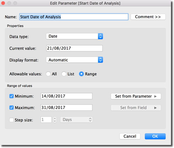
Using those parameters I can filter which days I want to include in my analysis. To apply the filter in the Workbook/Dashboard I created also a column Is Date of Analysis with the following formula
IIF(DATE([CreatedAt]) >= [Start Date of Analysis]
AND DATE([CreatedAt]) <= [End Date of Analysis]
,'Yes','No')
I can now use the Is Date of Analysis column in my Workbooks and filter the Yes value to retain only the selected dates.
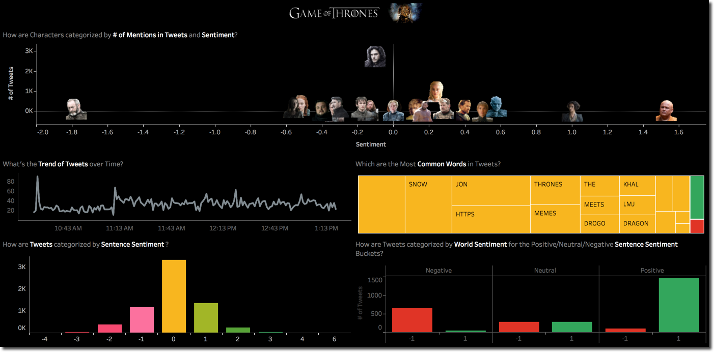
I built a dashboard containing few of the analysis mentioned in my previous blog post, in which I can see the overall scatterplot of characters by # of Tweets and Sentence Sentiment and click on one of them to check its details regarding the most common words used and sentence sentiment.
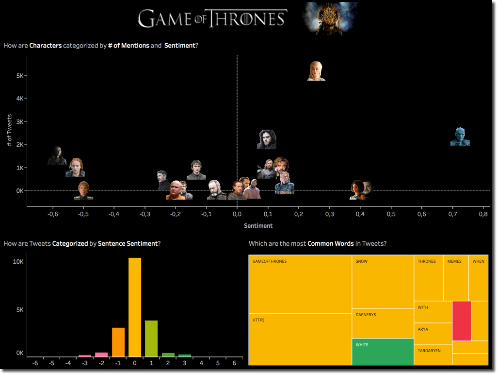
From the scatterplot on top we can see a change of leadership in the # of Tweets with Daenerys overtaking Jon by a good margin, saving him and in the meantime loosing one of the three dragons was a touching moment in the episode. When clicking on Daenerys we can see that the world WHITE is driving also the positive sentiment.
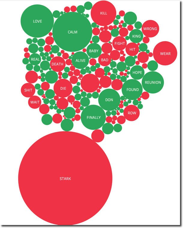
The Night King keep its leadership on the Sentiment positive side. Also in this case the WHITE word being the most used with positive sentiment. On the other side Arya overtook Sansa as character with most negative mentions. When going in detail on The positive/negative words, we can clearly see that STARK (mentioned in previous episode), KILL, WRONG and DEATH are driving the negative sentiment. Interesting is also the word WEAR with negative sentiment (from Google dictionary "damage, erode, or destroy by friction or use.").
A cut down version of the workbook with a limited dataset, visible in the image below, is available in Tableau Public.
Game of Couples

This comparison is all what I promised towards the end of my first post, so I could easily stop here. However as curious person and #GoT fan myself I wanted to know more about the dataset and in particular analyse how character interaction affect sentiment. To do so I had somehow to join characters together if they were mentioned in the same tweet, luckily enough my dataset contained the character mentioned and the list of words of each Tweet. I can reuse the list of words on a left join with the list of characters keys. In this way I have a record for each couple of characters mentioned in a Tweet.
I can then start analysing the Tweets mentioning any couple of characters, with the # of Tweets driving the gradient. As you can see I removed the values where the column and row is equal (e.g. Arya and Arya). The result, as expected, is a symmetric matrix since the # of Tweets mentioning Arya and Sansa is the same as the ones mentioning Sansa and Arya.
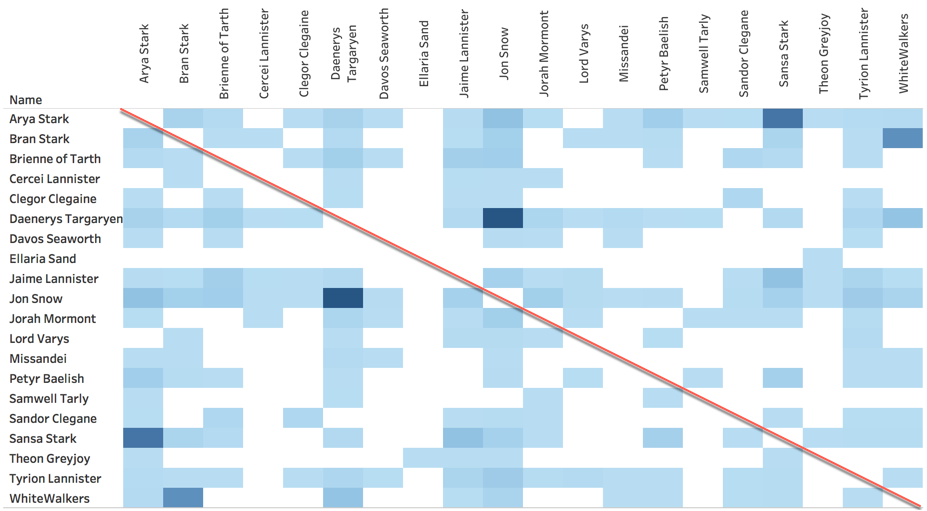
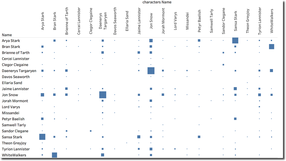
We can clearly see that Jon and Daenerys are the most mentioned couple with Sansa and Arya following and in third place Whitewalkers and Bran. This view and the insights we took from it could be problematic to get in cases when the reader is colour blind or has troubles when defining intensity. For those cases a view like the below provides the same information (by only switching the # of Tweets column from Color to Size), however it has the drawback that small squares are hard to see.
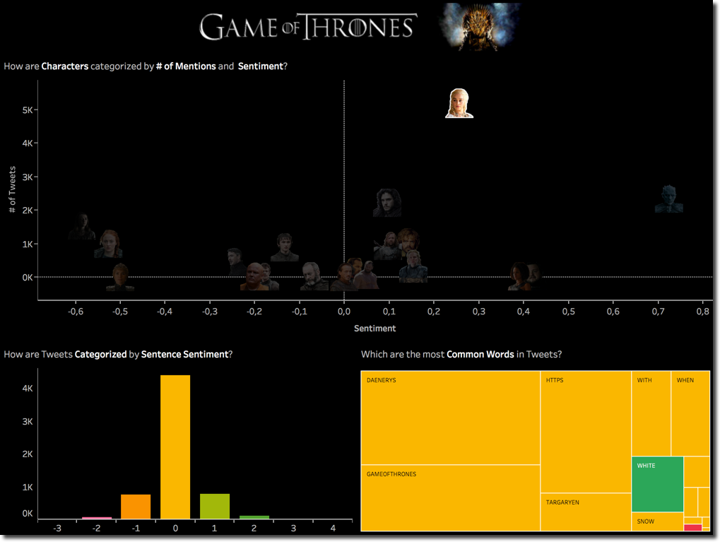
The next step in my "couple analysis" is understand sentiment, and how a second character mentioned in the same tweet affects the positive/negative score of a character. The first step I did is showing the same scatterplot as before, but filtered for a single character, in this case Arya.
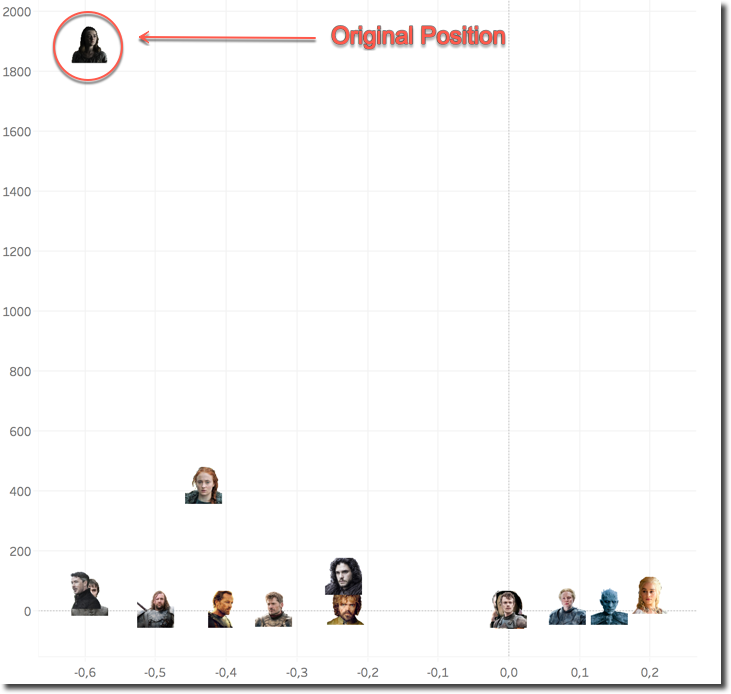
The graph shows Arya's original position, and how the Sentiment and the # of Tweets change the position when another character is included in the Tweet. We can see that, when mentioned with Daenerys the sentiment is much more positive, while when mentioned with Bran or Littlefinger the sentiment remains almost the same.
This graph it's very easy to read, however it has the limitation of being able to display only one character behaviour at time (in this case Arya). What I wanted is to show the same pattern across all characters in a similar way as when analysing the # of Tweets per couple. To do so I went back to a matrix stile of visualization, setting the colour based on positive (green) or negative (red) sentiment.
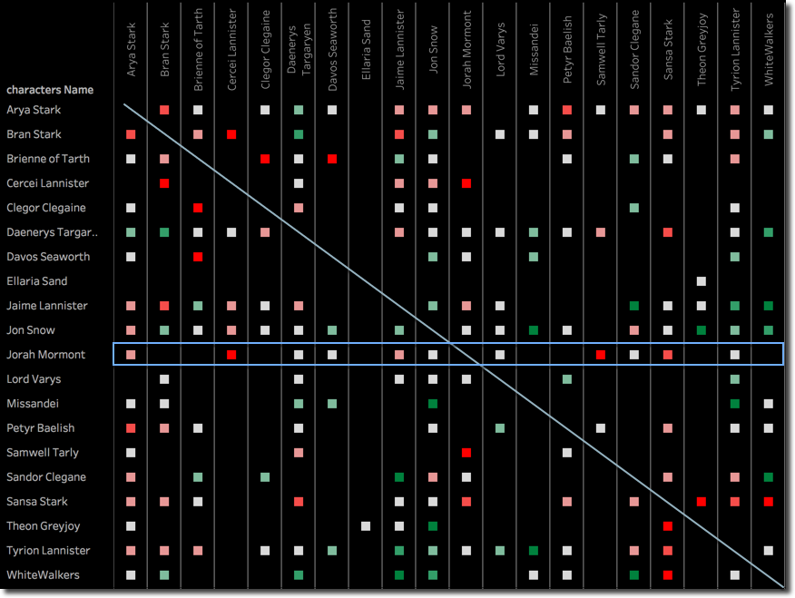
As before the matrix is symmetric, and provides us a new set of insights. For example, when analysing Jorah Mormont, we can see that a mention together with Cercei is negative which we can somehow expect due to the nature of the queen. What's strange is that also when Jorah is mentioned with Samwell Tarly there is a negative feeling. Looking deeply in the data we can see that it's due to a unique tweet containing both names with a negative sentiment score.
What's missing in the above visualization is an indication on how "strong" is the relationship between two character based on the # of Tweets where they are mentioned together. We can add this by including the # of Tweets as position of the sentiment square. The more the square is moved towards the right the higher is the # of Tweets mentioning the two characters together.
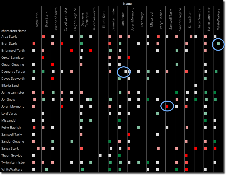
We can see as before that Jorah and Sam have a negative feeling when mentioned together, but it's not statistically significant because the # of Tweets is very limited (square position completely on the left). Another example is Daenerys and Jon which have a lot of mentions together with a neutral sentiment. As we saw before also the couple Arya and Bran when mentioned together have a negative feeling, with a limited number Tweets mentioning them together. However Bran mentioned with WhiteWalkers has a strong positive sentiment.
It's worth mentioning that the positioning of the dot is based on a uniform scale across the whole matrix. This means that if, like in our case, there is a dominant couple (Daenerys and Jon) mentioned by a different order of magnitude of # of Tweets compared to all other couples, the difference in positioning of all the others dots will be minimal. This could however be solved using a logarithmic scale.
Web Scraping
Warning: all the analysis done in the article including this chapter are performed with automated tools. Due to the nature of the subject (a TV series plenty of deaths, battles and thrilling scenes) the words used to describe a sentence could be automatically classified as positive/negative. This doesn't automatically mean that the opinion of the writer is either positive or negative about the scene/episode/series.
The last part of the analysis I had in mind was about comparing the Tweets sentiment, with the same coming from the episode reviews that I could find online. This latter part relies a lot on the usage of R to scrape the relevant bits from the web-pages, the whole process was:
- Search on Google for
Beyond the Wall Reviews - Take the top N results
- Scrape the review from the webpage
- Tokenize the review in sentences
- Assign the sentence score using the same method as in Tableau
- Tokenize the sentence in words
- Upload the data into BigQuery for further analysis
Few bits on the solution I've used to accomplish this since the reviews are coming from different websites with different tags, classes and Ids, I wasn't able to write a general scraper for all websites. However each review webpage I found had the main text divided in multiple <p> tags under a main <div> tag which had an unique Id or class. The R code simply listed the <div> elements, found the one mentioning the correct Id or class and took all the data contained inside the <p> elements. A unique function is called with three parameters: website, Id or class to look for, and SourceName (e.g. Telegraph). The call to the function is like
sentence_df <- scrapedata("http://www.ign.com/articles/2017/08/21/game-of-thrones-beyond-the-wall-review",'Ign',"article-content")
It will return a dataframe containing one row per <p> tag, together with a mention of the source (Ign in this case).
The rest of the R code tokenizes the strings and the words using the tokenizers package and assigns the related sentiment score with the syuzhet package used in my previous blog post. Finally it creates a JSON file (New Line Delimited) which is one of the input formats accepted by BigQuery.
When the data is in BigQuery, the analysis follows the same approach as before with Tableau connecting directly to BigQuery and using again R for word sentiment scoring.
The overall result in Tableau includes a global Episode sentiment score by Source, the usual scatterplot by character and the same by Source. Each of the visualizations can act as filter for the others.
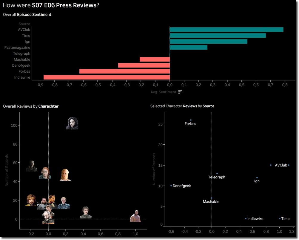
We can clearly see that AVClub and Indiewire had opposite feelings about the episode. Jon Snow is the most mentioned character with Arya and Sansa overtaking Daenerys.
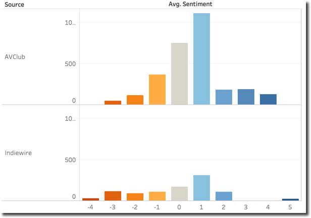
The AVClub vs Indiewire scoring can be explained by the sencence sentiment categorization. Indiewire had most negative sentences (negative evaluations) while the distribution of AVClub has its peak on the 1 (positive) value.
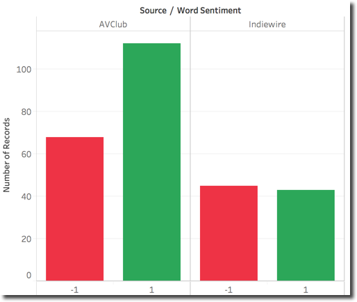
Checking the words used in the two Sources we can notice as expected a majority of positive for AVClub while Indiewire has the overall counts almost equal.
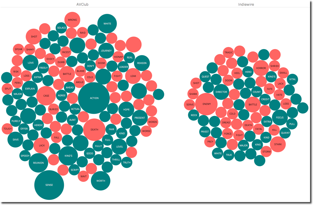
Going in detail on the words, we can see the positive sentiment of AVClub being driven by ACTION, SENSE, REUNION while Indiewire negative one due to ENEMY, BATTLE, HORROR.
This is the automated overall sentiment analysis, if we read the two articles from Indiewire and AVClub in detail we can see that the overall opinion is not far from the automated score:
From AVClub
On the level of spectacle, “Beyond The Wall” is another series high point, with stellar work ....
From IdieWire
Add to the list “Beyond the Wall,” an episode that didn’t have quite the notable body count that some of those other installments did
To be fair we also need to say that IdieWire article is focused on the war happening and the thrilling scene with the Whitewalkers where words like ENEMY, COLD, BATTLE, DEATH which have a negative sentiment are actually only used to describe the scene and not the feelings related to it.
Character and Review Source Analysis
The last piece of analysis is related to single characters. As mentioned before part of the dashboard built in Tableau included the Character scatterplot and the Source scatterplot. By clicking on a single Character I can easily filter the Source scatterplot, like in this case for Daenerys.
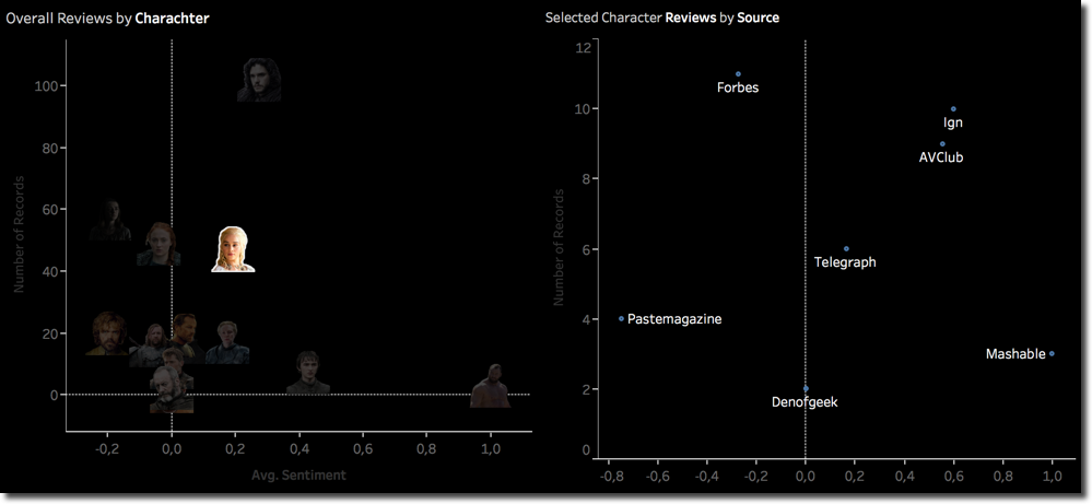
We can see how different Sources have different average sentiment score for the same character, in this case with Mashable being positive while Pastemagazine negative.
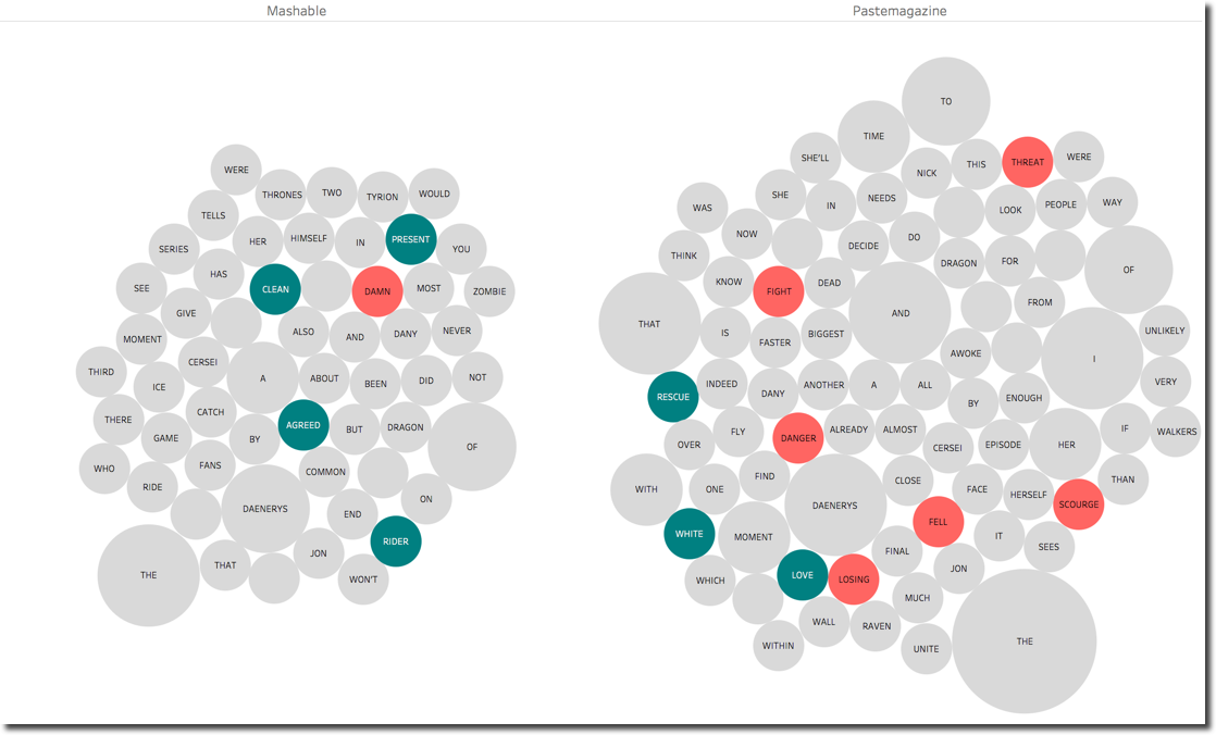
Checking the words mentioned we can clearly see a positive sentiment related to PRESENT, AGREED and RIDER for Mashable while the negative sentiment of Pastemagazine is driven by FIGHT, DANGER, LOOSING. As said before just few words of difference describing the same scene can make the difference.
Finally, one last sentence for the very positive sentiment score for Clegor Clegaine: it is partially due to the reference to his nickname, the Mountain, which is used as Key to find references. The mountain is contained in a series of sentences as reference to the place where the group of people guided by Jon Snow are heading in order to find the Whitewalkers. We could easily remove MOUNTAIN from the Keywords to eliminate the mismatch.

We are at the end of the second post about Game of Thrones analysis with Tableau, BigQuery and Kafka. Hope you didn't get bored...see you next week for the final episode of the series! And please avoid waking up with blue eyes!