Game of Thrones S07 Last Episode: The Summary

Watch the Episode First! It's a friendly suggestion...
The final #GoT episode was transmitted last Sunday, now two years waiting for the next season... How can HBO be so cruel??? And how can I find interesting content for my future blog posts???
At least now European football (not soccer) leagues are back, so TV-side I'm covered!
Going back to serious discussions, Game of Thrones last episode: Yay or Nay? The average sentiment for the episode (taking into account only tweets since Monday) was -0.012: it is negative but represents an improvement when compared to the two previous ones (with episode 6 having the most negative sentiment score).
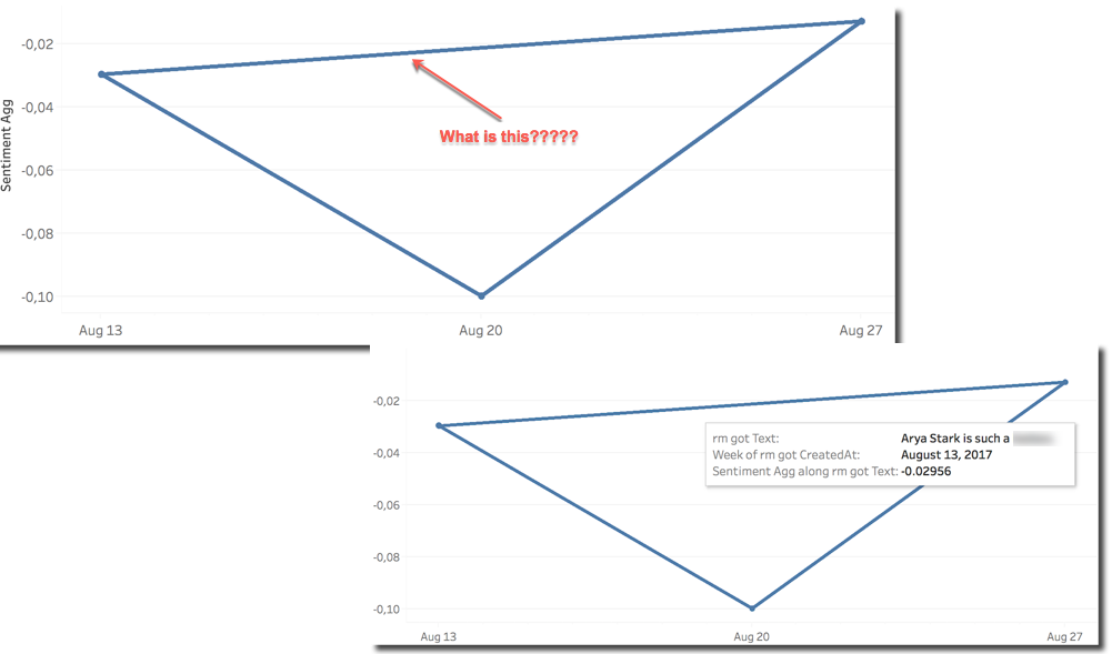
But... Hey! What is the line on top going in time? The line it's due to the external R call and the fact that is forcing us to include the Tweet Text column in the analysis in order to be evaluated. The evaluation of the sentiment is applied on ATTR(Tweet Text) which means kind of SELECT DISTINCT Tweet_Text in Oracle terms. The line on top is drawn because the same Tweet Text was tweeted across several weeks.
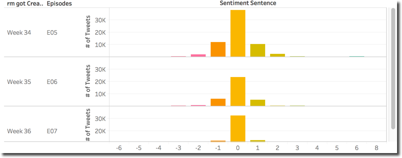
Please notice that the three overall sentiments are close (between 0.01 and 0.10) so, when looking in detail at the distribution of sentiment scores across the episodes we can see that, as expected, are similar.
Zooming to single characters we can see the scatterplot of the last episode, with Jon Snow (or should I say Targaryen?) leading the number of mentions with surprisingly Littlefinger on the second spot and Arya on the third: probably the Baelish dying scene at Winterfell was something highly appreciated by the fans.
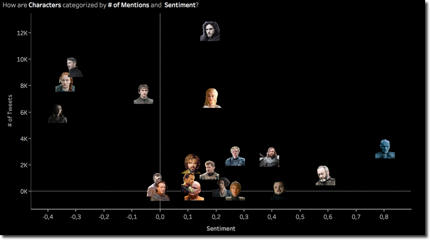
On the positive negative feeling almost nothing changed with Arya and the Night King being the negative and positive poles. I've been telling you about change of leadership on the various axes of the scatterplot by visually comparing today's scatterplot with the previous two. However the transition of the character position in the graph can be visualized again on multiple scatterplots.
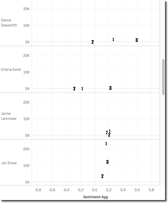
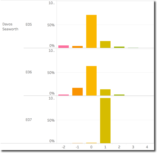
By creating a scatterplot for each character and assigning to the episodes a different number (E05-1, E06-2, E07-3) I can clearly see how Davos Seaworth for example had a big sentiment variation going very positive in the last episode while Jaime Lanninster was more stable. Zooming into Davos position we can see how the sentiment distribution changed across episodes with the E06 representing the most negative while the E07 has almost all positive tweets.
Looking at the words composing Davos tweets we can immediately spot few thigs:
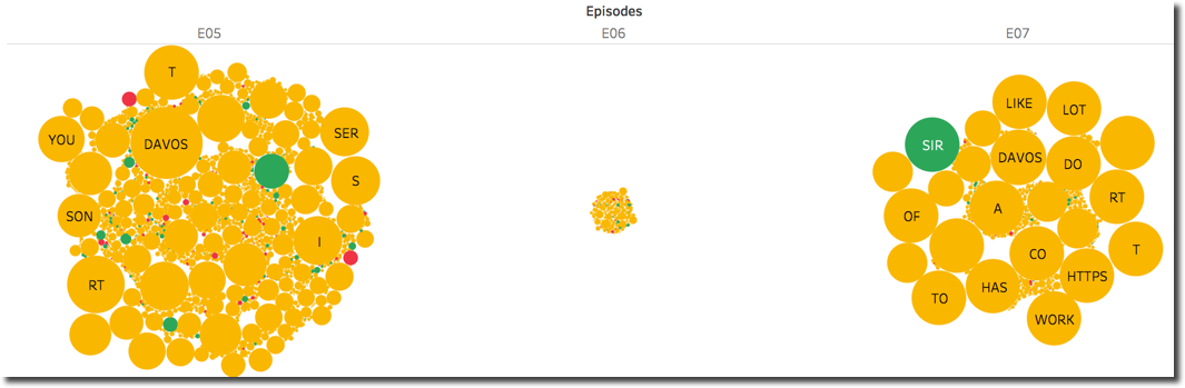
SIRhas a positive sentiment (Sir Davosis how several characters call him) which is driving the overall score in the final episode- The number of tweets mentioning Davos was very small in
E06compared to the other two (we can see the same from the related scatterplot above) - In
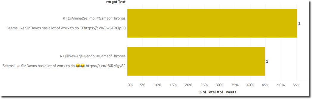
E07we see a good number of circles having the same (big) size, possibly is the same text which has been tweeted several times.
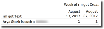
To verify the last point we can simply show the Tweet Text along the # of Tweets and discover that almost the same positive Text count for over the 99% of the whole reference to the character.
Emotions
One of the cool functions of the Syuzhet package is named get_nrc_sentiment and allows the extrapolation of emotions from a text based on the NRC emotion lexicon. The function takes a text as input and returns a data frame containing a row for each sentence and a column for emotion or sentiment.
The sentiment can either be positive or negative which we already discussed a lot previously. The emotion is split in eight categories: anger, fear, anticipation, trust, surprise, sadness, joy, and disgust.
We can extract the eight different emotions into eight calculations with the following code
SCRIPT_INT("library(syuzhet);
r<-(get_nrc_sentiment(.arg1))$anger",
ATTR([Text]))
To calculate the Anger Emotion Score we are passing ATTR(Text), the list of Tweet's texts, and taking the output of the anger column of the dataframe. We can do the same for all the other emotions and create separate graphs to show their average across characters for the last episode. In this case I took Disgust, Anger, Fear, Joy and Trust.
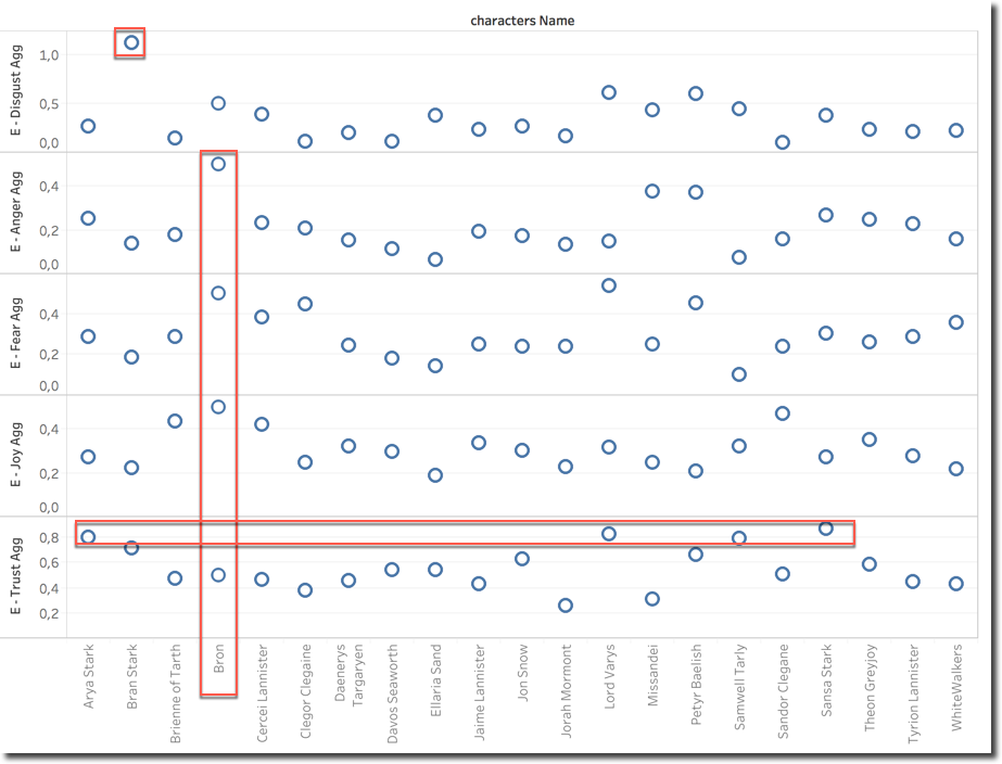
We can then clearly see that Bran Stark is the character that has most Disgust associated to. Bron has a special mix of emotions, he's in the top for Anger, Fear and Joy, such a mix can justify the average sentiment which is close to neutral (see scatterplot above). On the Trust side we can clearly see that the North wins with Arya and Sansa on the top, interesting here is to see also Lord Varys.
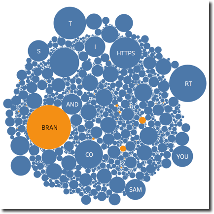
Looking into Bran Disgust detail we can see that is driven by the categorization of the BRAN word as disgusting, probably the dictionary doesn't like cereals.
Scene Emotions
In my previous post I've been talking about the "Game of Couples" and how a single character sentiment score could be impacted by a reference to a second character. For the last episode of the series I wanted to look at different scenes: the main characters I want to analyse are Jon Snow, Littlefinger and Sansa. Specifically I want to understand how people on Twitter reacted to the scenes where the two characters had a big impact: the death of Littlefinger declared by Sansa and the revelation of Jon Targaryen.
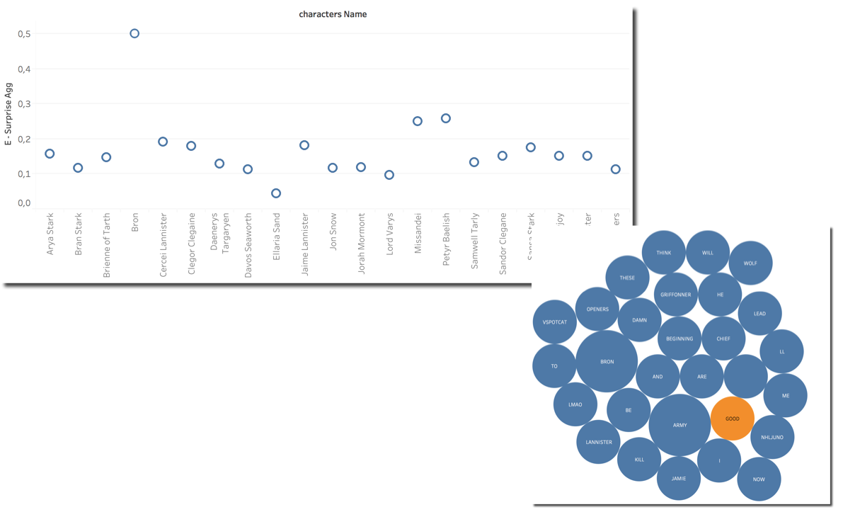
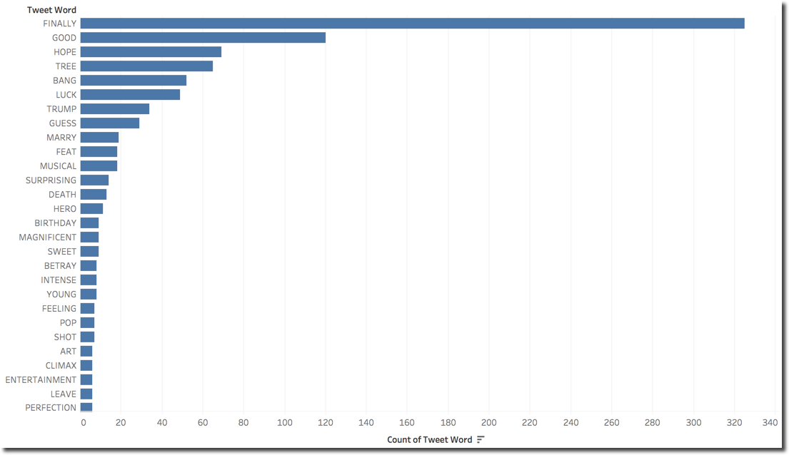
The first thing I wanted to check is the Surprise: How are characters categorized by this emotion? We can see Bron on top being driven by the word GOOD in the related tweets.
We can also notice that Petyr score is quite high (0.2590 and 2nd position) while Jon score is pretty low, probably averaged by the huge number of tweets. We can also see that Sansa score is not very high, even if she is the character providing quite a big shock when accusing Littlefinger.
The overall character average surprise doesn't seem to be very relevant, we need to find a way to filter tweets related to those particular scenes: we can do that by including only few keywords in the Tweet Text. Please note we are going to filter words that will create an OR condition. If a tweet contain ANY of the words mentioned, it will be included.
First I wanted to check which are the words in Jon's tweets driving the Surprise sentiment alongside the # of Tweets
However this is only giving us details on which words are classified as Surprise for Jon, nothing really related to the scenes. I can however filter only the tweets with an overall Surprise sentiment for Jon and check which words are mostly associated with them. I also added a filter for Tweets containing the words TARGARYEN OR SON since I assumed those two could be more frequently used describing the scene.
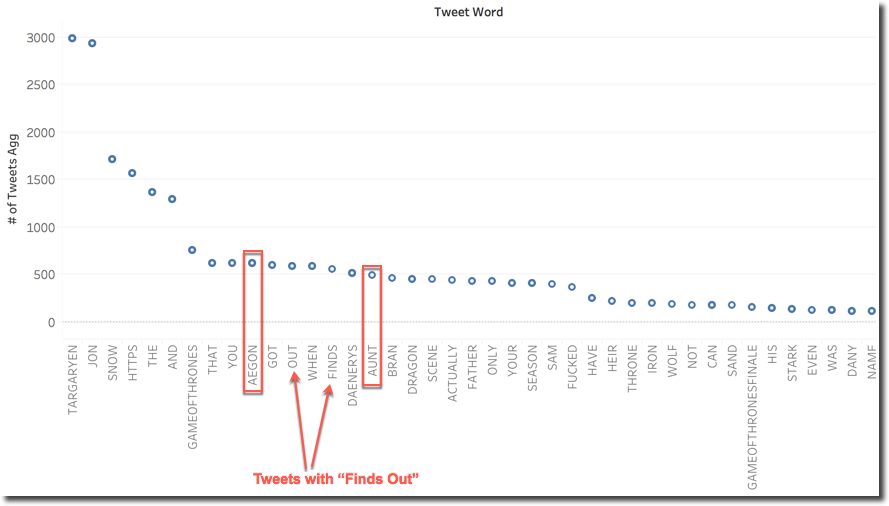
We can clearly see some patterns that are well recognized correctly by the Surprise metric: both Aegon (a reference to Jon's real name) and Aunt (reference to Lyanna or Deanerys?) are in the top 20 and a little bit further right in the graph we can also spot Father. There probably is also some surprise in tweets related to what's going to happen when Jon finds out he's a Targaryen since all keywords are present in the top 20.
When doing a similar analysis on Sansa I wanted to add another metric to the picture: the Average Sentence Emotion Score for all sentences including a word. With this metric we can see how a word (for example AMAZING) changes the average emotion of the sentences where is included. Analysing this metric alone however wouldn't be useful: obviously the words having more impact on emotion are the ones categorized as such in the related dictionary.
I found interesting the following view for Sansa: we see across all the tweets categorized as Surprizing, which are the words most mentioned (Y-axes) and what's the average Surprise emotion value for the sentences were those words were included.
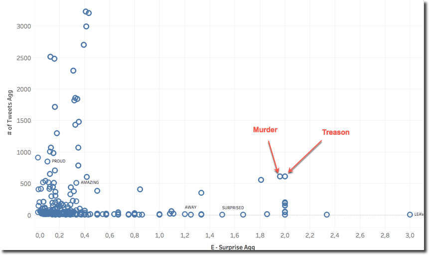
We can spot that MURDER and TREASON were included with a big number of tweets (>500) having an average Surprise score around 2. This seems to indicate that the scene of Sansa convicting Lord Baelish wasn't expected from the fans.
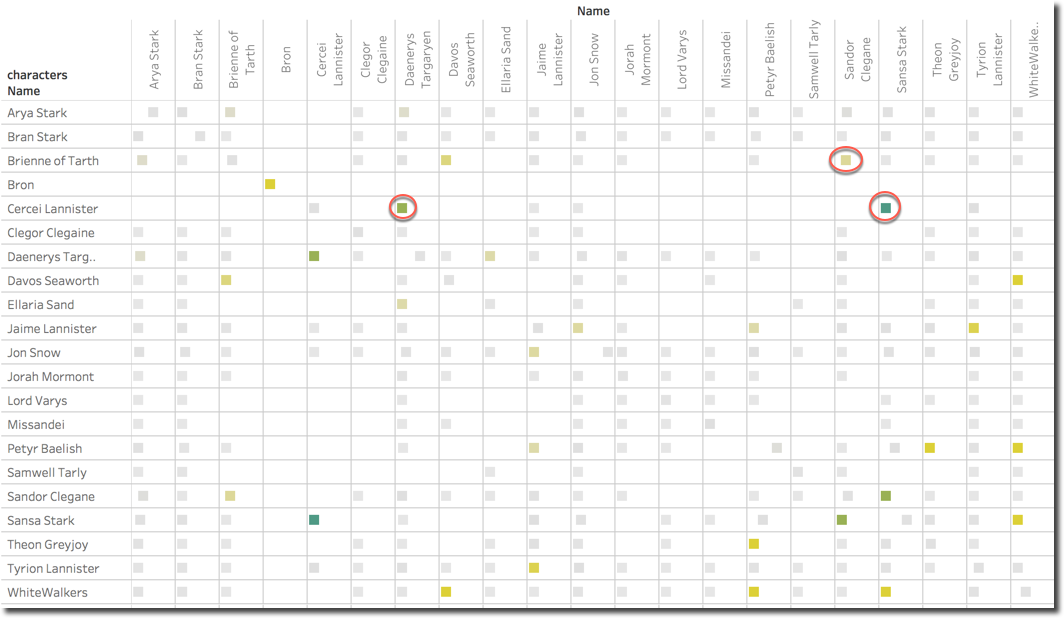
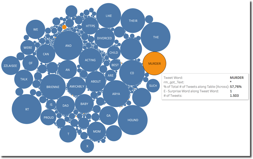
One last graph shows how the character couples (remember the game of couples in my previous post?) have been perceived: the square color defines the average Surprise score while the position in the X-axis confidence (by the # of Tweets).

We can spot that the couple Cercei and Sansa is the one having most Surprise emotion, followed by Cercei and Daenerys. Those two couples may be expected since the single characters had major parts in the last episode. Something unexpected is the couple Sandor Clegane and Brienne, looking in detail, the surprise is driven by a mention to the word MURDER which is included in 57.76% of the Tweets mentioning both.
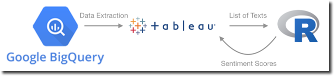
A last technical note: during the last few weeks I've collected about 700 thousands tweets, the time to analyse them highly depends on the complexity of the query. For simple counts or sums based only on BigQuery data I could obtain replies in few seconds. For other analysis, especially when sentiment or emotion was included, a big portion of the raw dataset was retrieved from BigQuery into Tableau, passed to R with the function results moved back to Tableau to be displayed. Those queries could take minutes to be evaluated.
As written in my previous blog post, the whole process could be speed up only by pre-processing the data and storing the sentiment/emotion in BigQuery alongside with the data.
my series of blog post about Game of Thrones tweet and press analysis with Kafka, BigQuery and Tableau! See you in two years for the analysis of the next season with probably a whole new set of technology!