One of the new things that shipped with the OBIEE 10.1.3.4 release was a new set of sample data, and a set of reports and dashboards that show off the more advanced features of OBIEE. If you download and install OBIEE now, this is the sample set of data and reports that you get instead of the "Paint Dashboard", and the idea is that you can use it to explore, and understand, how to make use of some of the more advanced features of the tool. In this blog posting I'll take a look at the new dashboards and reports, and the data that underlies it. If you've not got 10.1.3.4 downloaded, you can access the sample data and reports from this zip file available on OTN.
The new Samples Sales dashboard has four dashboards, containing into total around 20 pages (i.e. tabs) that show off different report features and calculation types. The first dashboard provides an overview of the different pages and reports that are available on the other three dashboards.
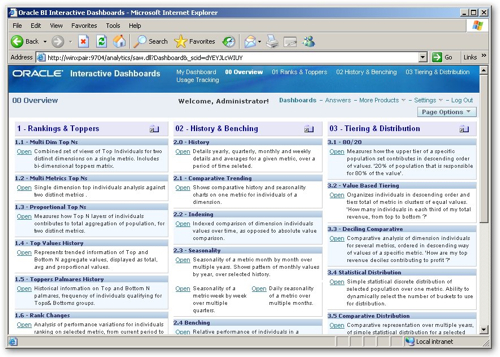
The report descriptions have links next to them that open the individual dashboard pages, with the description being held within a text box and entered as HTML markup.
Clicking on the first of the dashboards, "Rankers and Toppers", brings up a selection of dashboard pages that illustrate the use of ranking and TopN calculation. Taking a look at the first of the pages "Multi Dim Top N", this page provides insight into top performers from two dimensions (time and customer) for a single measure. The filters at the top, looking from the left to the right, set a presentation server variable that sets the TopN cut-off, set the year and quarter for the time dimension, and set the brand, region, customer and team filters for the customer dimension.
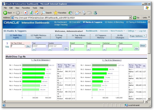
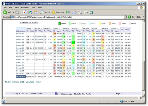
Under the first set of graphs is a cross-tab showing "hot spots", allowing you to spot which combination of values for these two dimension have particularly high values.
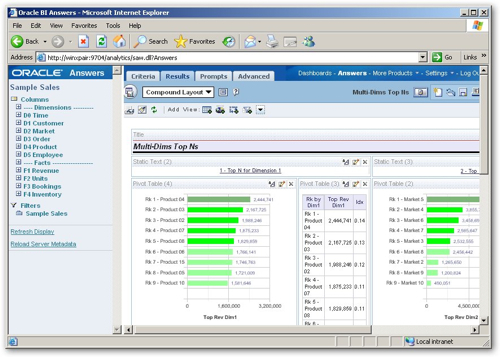
Taking a look at the dashboard page layout, it consists of a number of sections at the top to add the various dashboard prompt filters, then all of the reports are actually contained in the same request. If you take a look at the request, it contains multiple views of the same data, organized as the two sets of graphs and crosstabs (arranged as tables) at the top, and the main crosstab at the bottom. An interesting way to lay out a dashboard page.
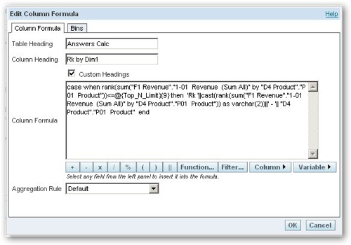
The dashboard page contains a filter at the top, that sets a presentation variable called Top_N_Limit. This presentation variable is then accessed in the various report calculations, to only return results up to the threshold specified by the user.
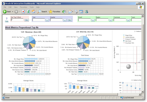
The Multi-Metrics Proportional Top N's dashboard certainly crams a lot of graphs onto the page. I guess the only criticism I have of these new demos is that they're shrunk the font size to fit in so much data, which makes dashboards quite hard to read now (the same font size is then used for your regular dashboards); also, as the Paint Dashboard is only available now if you specifically switch to it, we've lost a pretty "easy on the eye" demo dashboard that was always useful for showing to non-technical, non-statistical users, the demos that now ship with 10.1.3.4 are pretty complex and not something you'd just show casually to business users. But anyway, I digress, here's the dashboard I was talking about.
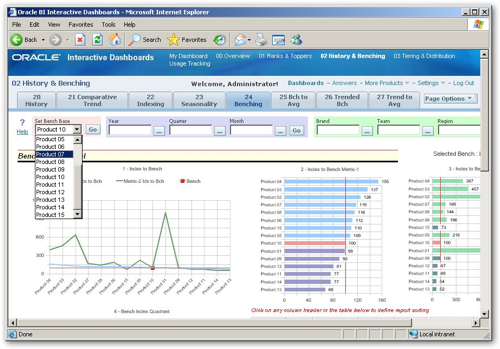
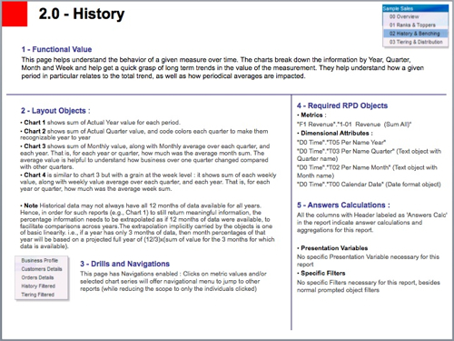
Moving on to the History and Benching dashboard, this shows a number of reports that benchmark one value against another, say taking one product and benchmarking others against it. There's some nice examples of graphs here, the ones below are designed to help you understand the behavior of a given measure over time, breaking information down by year, quarter, month and week.
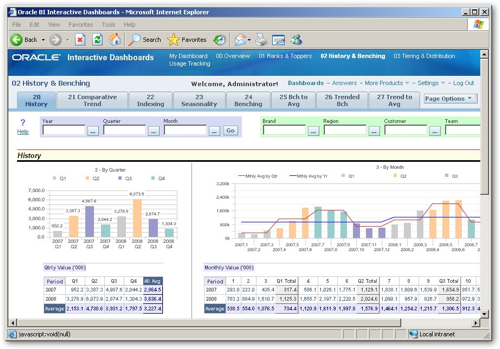
The benchmark report lets you take a particular product and benchmark the others against it, highlighting the benchmarked product in the displayed graphs.
The rest of the dashboards go on in a similar way, and there's actually a set of PowerPoint slides you can download from OTN that goes into the details of each dashboard, each page, each report and the way that the calculations and displays are set up. If you're interested in doing some more advanced reporting, or seeing some "best practice" examples of how reports can be set up, it's worth downloading the slides (part one, part two) and taking a look.
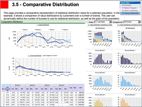
Here's a page describing how the some of the graphs have been devised.
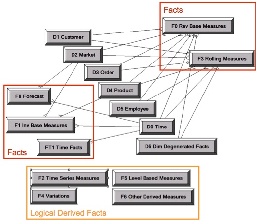
Apart from the reports and the ranking/topping/bottoming etc calculations, there's also value in taking a look at the business model and mapping, and presentation models that the new demo data provides. The business model itself has a lot more detail than the old Paint dataset.
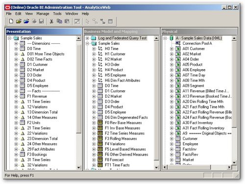
From taking an initial look at the physical model, it shows the use of aliases for all physical tables (Oracle best practice), and how you can use aliases and joins to create tables that contain offset and time-series calculations. Looking at the business model and mapping layer, you can see the various dimension tables, the dimension drill paths, and a number of fact tables that have been set up to hold different classes of calculations. The presentation model layer takes this one further, adding divider "dummy" tables in to separate facts and dimensions (shades of Discoverer here), different icons for different types of tables and so on. If you've seen the Oracle BI Applications repository layer, this is where you'll see a lot of these ideas used in real-life.
The repository also shows off a number of data modeling concepts. The bulk of the model itself is sourced from two separate sources, containing actual and forecast data respectively like this:
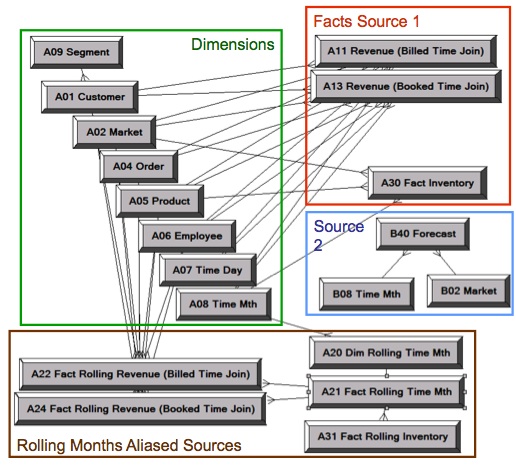
The data then being combined through the use of logical table sources in the business model and mapping layer, so that the federated query feature in the BI Server brings the two data sets together at query run time.
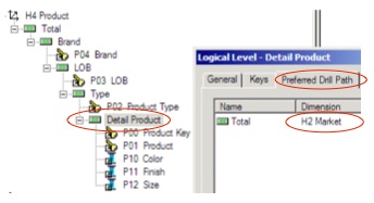
There's an example of drill chaining, where drilling down a hierarchy drills across to a different hierarchy level, rather than the one in your own hierarchy that you're just above.
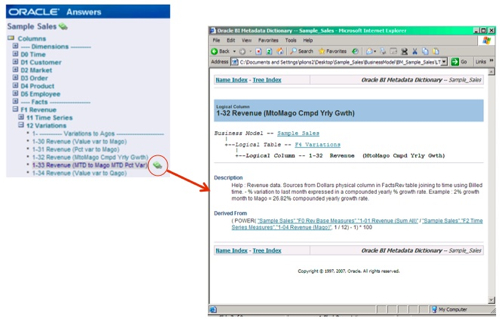
There's also instructions in the PPT file on how to generate a metadata dictionary from the repository file, and then link it to the various report elements so that users can view detailed descriptions on the data in their reports.
Anyway, as I said, all this ships with the 10.1.3.4 release of OBIEE, with the Sample Sales guidelines and explanations available as a PPT file downloadable from OTN. If you're interested in working your way through a few more complex reports and metadata setups, it might be worth you taking a look.