OBIEE How-To: A View Selector for your Dashboard
A common problem report developers face is user groups having different needs and preferences, and as a consequence these user groups want to see their data presented in different ways. Some users prefer to see a graph when others want a table is a classic example. So, how do we do this? It’s a no brainer… we use a view selector. View selectors give us a great amount of flexibility by allowing us to swap out one analysis view for another. You might even take it a step further and use a view selector to swap out an entire compound layout for another one, giving the user an entirely different set of views to look at. Truly powerful stuff, right?
But view selectors do have one limitation… they’re only available at the analysis level. What if you wanted this selector functionality at the dashboard level so that you could swap out an analysis from one subject area for one from different subject area? Or what if you wanted to be able to switch one dashboard prompt for another one? You’re out of luck, it’s just not possible…
Just kidding… of course it’s possible. As it turns out, it’s fairly straightforward to build your own dashboard level view selector using other objects already provided by OBIEE out-of-the-box.
Create a dashboard variable prompt to drive the content. We need a way for the users to select the view they want to see. View selectors have a built in dropdown prompt to accomplish this at the analysis level. To do this at the dashboard level we’re going to use a dashboard prompt.
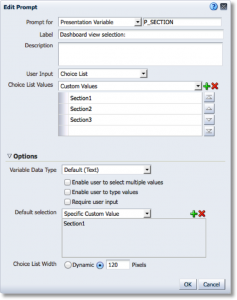
So, the first step is to create a new dashboard prompt object and add a variable prompt. You can name the variable whatever you wish, for this example we’re just going to call it P_SECTION. You can set the User Input to whatever you want, but it’s important that only one option is selected at a time… multiple values should not be allowed. Let’s set the user input to “Choice List” and add some custom values.
What you name these custom values isn’t important but the labels should be descriptive enough so that the users understand the different options. Just keep in mind, the values you use here will need to exactly match the analysis we create in the next step. For this example, let’s use 'Section1', 'Section2', and 'Section3' to keep things simple.
Create an analysis to drive the conditional logic. We need to create an analysis that will return a set number of rows for each of the options in the prompt we just created. The number of rows returned then drives which section we see on the dashboard.
Ultimately, the logic of this analysis doesn’t matter, and there are a dozen ways to accomplish this. To keep things simple, we’re just going to use CASE statements. While not an elegant solution, it’ll work just fine for our basic example.
Add three columns to the criteria, we’ll use a Time dimension and modify the column formula with the following CASE statements. Make sure that the text strings match the Custom Values used in the prompt.
CASE WHEN "Time"."T05 Per Name Year" IN ('2006') THEN 'Section1' END
CASE WHEN "Time"."T05 Per Name Year" IN ('2006', '2007') THEN 'Section2' END
CASE WHEN "Time"."T05 Per Name Year" IN ('2006', '2007', '2008') THEN 'Section3' END
Now we need to update the filter so that the appropriate rows are shown based upon what the user selects. Basically, we need the request to return 1, 2, or 3 rows based upon our P_SECTION presentation variable.
For our example we’re going to create a filter for each of the options and set them equal to the presentation variable we created earlier in our dashboard prompt. Only one filter will be true at a time so the operator between these filters has been set to OR. Also you’ll notice that the default value for the presentation variable has been set to 'Section1', across the board. If, for whatever reason, the P_SECTION variable isn’t set we want the dashboard to default to the first section.
CASE WHEN "Time"."T05 Per Name Year" IN ('2006') THEN 'Section1' END is equal to / is in @{P_SECTION}{Section1}
OR CASE WHEN "Time"."T05 Per Name Year" IN ('2006', '2007') THEN 'Section2' END is equal to / is in @{P_SECTION}{Section1}
OR CASE WHEN "Time"."T05 Per Name Year" IN ('2006', '2007', '2008') THEN 'Section3' END is equal to / is in @{P_SECTION}{Section1}
So, let’s quickly walk through how this works. The end user selects ’Section1’ from the dashboard prompt. That selection is stored in our P_SECTION presentation variable, which is then passed to and used by our filter. With ‘Section1’ selected only the 1st line of the filter will hold true which will result in a single row returned. When ‘Section2’ is chosen, the second row of the filter is true which returns two rows, and so on.
We’re almost done, in the next step we’ll create some conditions on the individual dashboard sections and put it all together.
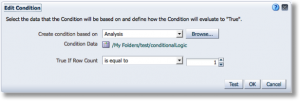
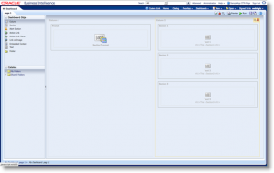
Create sections and set some conditions. We just need to create our sections and set some conditions so that they are shown/hidden appropriately. Create a new dashboard page. Edit the dashboard page and drag three empty sections on to the page. Create a condition on the first section using the Analysis created in the last step. The first condition we need to create should be True If Row Count is equal to 1.
Are you beginning to see how this is going to work? The only time we’ll get a single row back is when the presentation variable is set to 'Section1’. When P_SECTION is set to ‘Section2’ we’ll get two rows back from our analysis. Go ahead and create a second condition that is True If Row Count is equal to 2 for section 2. For section 3 create a condition that’s True If Row Count is equal to 3.
Since we aren’t adding content to these sections, you'll want to make sure to enable the option to “Show Section Title” or add a couple text fields so that you can easily identify which section is rendered on the page. Lastly, drag the dashboard prompt onto the page. Save the dashboard page and let’s take a look.
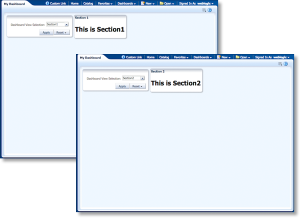
When the page first renders, you should see something similar to the following screenshot. The prompt is set to ‘Section1’ and sure enough, Section 1 appears below it. If you change the selection to ‘Section2’ or ‘Section3’ and hit apply, Section 1 will be hidden and the corresponding content will appear. All that’s left now would be to go back and add content to the sections.
So, using only out-of-the-box features, we were able to create an extremely versatile and dynamic bit of functionality… and all it took was a dashboard prompt, an analysis to hold our conditional logic, and some sections and conditions.
This approach is just another tool that you can use to help deliver the dynamic content your users are looking for. It provides flexibility within the context of a single dashboard page and also limits the need to navigate (and maintain) multiple pages. Admittedly, the example was just walked through isn’t all that exciting, but hopefully you can see the potential.
Some of your users want a minimalist view allowing them to filter on just the basics, while others want to slice and dice by everything under the sun? Create two prompts, a basic and an advanced, and allow the users to switch between the two.
Want to pack a large amount of charts into a page while still minimizing scrolling for those poor souls working with 1024x768? No problem, have a low-res option of the dashboard.
The finance department wants a to see a dashboard full of bar charts, but the payroll department is being totally unreasonable and only wants to see line graphs? Well, you get the idea…
