An Introduction to Analysing ODI Runtime Data Through Elasticsearch and Kibana 4
An important part of working with ODI is analysing the performance when it runs, and identifying steps that might be inefficient as well as variations in runtime against a baseline trend. The Operator tool in ODI itself is great for digging down into individual sessions and load plan executions, but for broader analysis we need a different approach. We also need to make sure we keep the data available for trend analysis, as it's often the case that tables behind Operator are frequently purged for performance reasons.
In this article I’m going to show how we can make use of a generic method of pulling information out of an RDBMS such as Oracle and storing it in Elasticsearch, from where it can be explored and analysed through Kibana. It’s standalone, it’s easy to do, it’s free open source – and it looks and works great! Here I'm going to use it for supporting the analysis of ODI runtime information, but it is equally applicable to any time-based data you've got in an RDBMS (e.g. OBIEE Usage Tracking data).
Kibana is an open-source data visualisation and analysis tool, working with data stored in Elasticsearch. These tools work really well for very rapid analysis of any kind of data that you want to chuck at them quickly and work with. By skipping the process of schema definition and data modelling the time taken to the first results is drastically reduced. It enables to you quickly start “chucking about” data and getting meaning out of it before you commit full-scale to how you want to analyse it, which is what the traditional modelling route can sometimes force you to do prematurely.
ODI writes runtime information to the database, about sessions run, steps executed, time taken and rows processed. This data is important for analysing things like performance issues, and batch run times. Whilst with the equivalent runtime data (Usage Tracking) from OBIEE there is the superb RPD/Dashboard content that Oracle ship in SampleApp v406, for ODI the options aren’t as vast, ultimately being based on home-brew SQL against the repository tables using the repository schema documentation from Oracle. Building an OBIEE metadata model against the ODI schema is one option, but then requires an OBIEE server on which to run it - or merging into an existing OBIEE deployment - which means that it can become more hassle than it’s worth. It also means a bunch of up-front modelling before you get any kind of visualisations and data out. By copying the data across into Elasticsearch it's easy to quickly build analyses against it, and has the additional benefit of retaining the data as long as you'd like meaning that it's still available for long-term trend analysis once the data's been purged from the ODI repository itself.
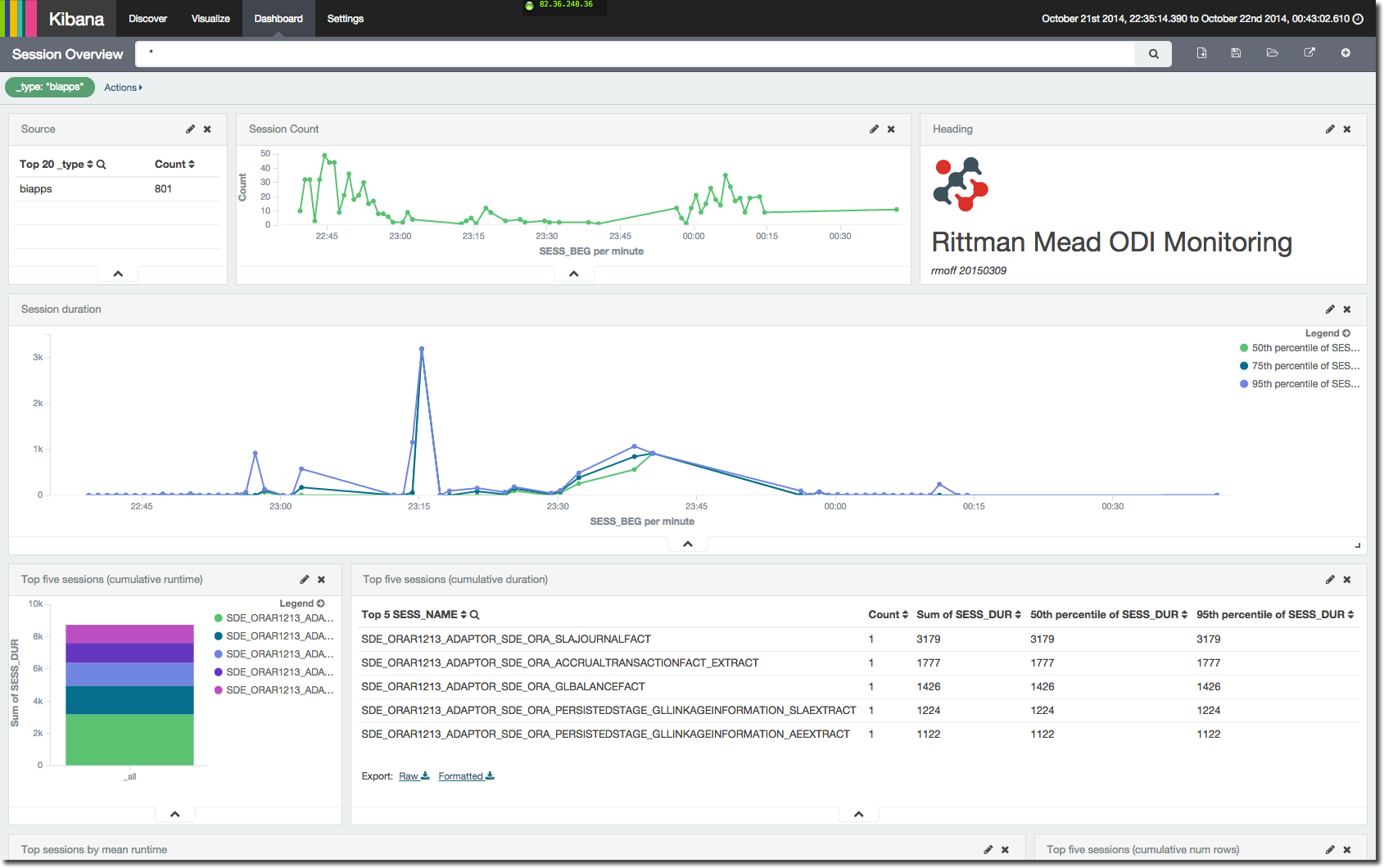
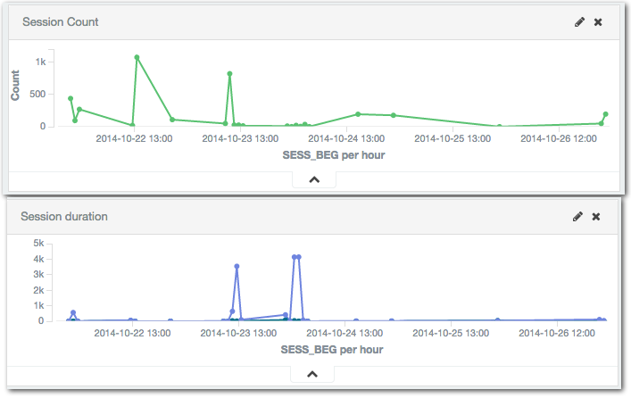
Let’s take a bit of a walk through the ODI dashboard that I’ve put together. First up is a view on the number of sessions that have run over time, along with their duration. For duration I’ve shown 50th (median), 75th and 95th percentiles to get an idea of the spread of session runtimes. At the moment we’re looking at all sessions, so it's not surprising that there is a wide range since there’ll always be small sessions and longer ones:
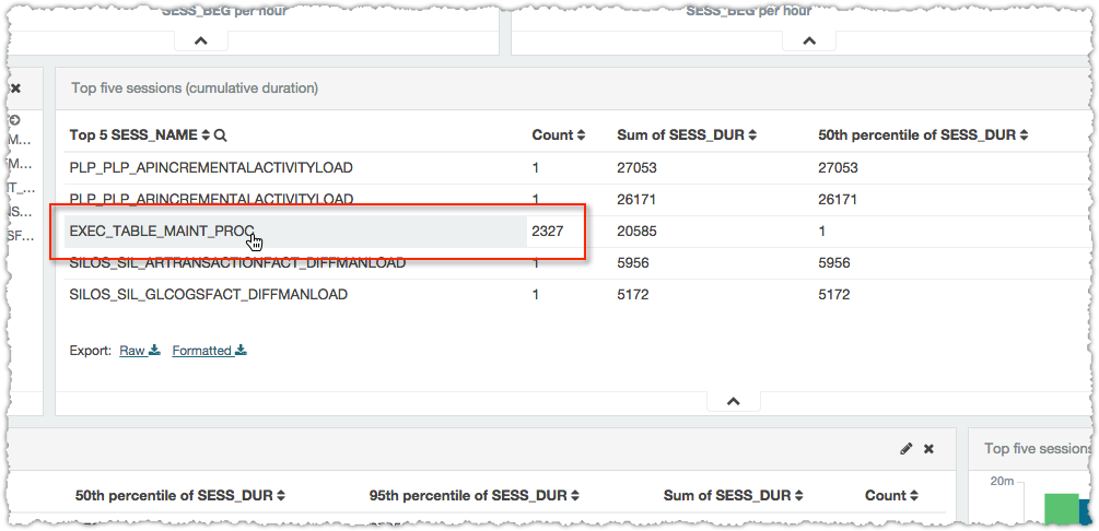
Next up on the dashboard comes a summary of top sessions by runtime, both cumulative and per-session. The longest running sessions are an obvious point of interest, but cumulative runtime is also important; something may only take a short while to run when compared to some singular long-running sessions, but if it runs hundreds of times then it all adds up and can give a big performance boost if time is shaved off it.
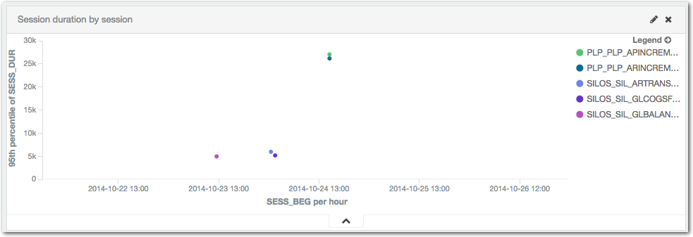
Plotting out session execution times is useful to be able to see both when the longest running sessions ran:
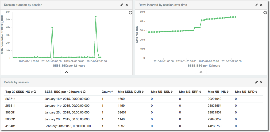
The final element on this first dashboard is one giving the detail for each of the top x long-running session executions, including the session number so that it can be examined in further detail through the Operator tool.
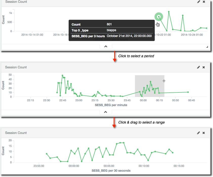
Kibana dashboards are interactive, so you can click on a point in a graph to zoom in on that time period, as well as click & drag to select an arbitrary range. The latter technique is sometimes known as “Brushing”, and if I’m not describing it very well have a look at this example here and you’ll see in an instant what I mean.
As you focus on a time period in one graph the whole dashboard’s time filter changes, so where you have a table of detail data it then just shows it for the range you’ve selected. Notice also that the granularity of the aggregation changes as well, from a summary of every three hours in the first of the screenshots through to 30 seconds in the last. This is a nice way of presenting a summary of data, but isn’t always desirable (it can mask extremes and abnormalities) so can be configured to be fixed as well.
Time isn’t the only interaction on the dashboard - anything that’s not a metric can be clicked on to apply a filter. So in the above example where the top session by cumulative time are listed out we might want to find out more about the one with several thousand executions
Simply clicking on it then filters the dashboard and now the session details table and graph show information just for that session, including duration, and rows processed:
Session performance analysis
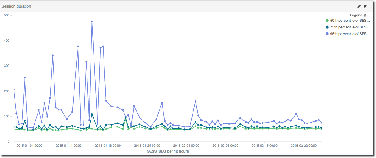
As an example of the benefit of using a spread of percentiles we can see here is a particular session that had an erratic runtime with great variation, that then stabilised. The purple line is the 95th percentile response time; the green and blue are 50th and 75th respectively. It’s clear that whilst up to 75% of the sessions completed in about the same kind of time each time they ran, the remaining quarter took anything up to five times as long.
One of the most important things in performance is ensuring consistent performance, and that is what happens here from about half way along the horizontal axis at c.February:
But what was causing the variation? By digging a notch deeper and looking at the runtime of the individual steps within the given session it can be seen that the inconsistent runtime was caused by a single step (the green line in this graph) within the execution. When this step’s runtime stabilises, so does the overall performance of the session:
This is performing a port-mortem on a resolved performance problem to illustrate how useful the data is – obviously if there were still a performance problem we’d have a clear path of investigation to pursue thanks to this data.
How?
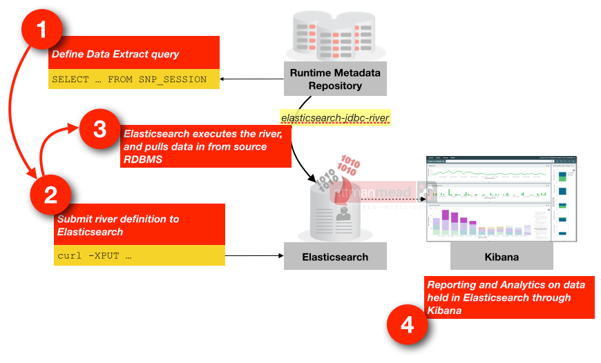
Data's pulled from the ODI repository tables using Elasticsearch JDBC river, from where it's stored and indexed in Elasticsearch, and presented through Kibana 4 dashboards.
The data load from the repository tables into Elasticsearch is incremental, meaning that the solution works for both historical analysis and more immediate monitoring too. Because the data's actually stored in Elasticsearch for analysis it means the ODI repository tables can be purged if required and you can still work with a full history of runtime data in Kibana.
If you’re interested in finding out more about this solution and how Rittman Mead can help you with your ODI and OBIEE implementation and monitoring needs, please do get in touch.

