Using Tableau to Show Variance and Uncertainty
Recently, I watched an amazing keynote presentation from Amanda Cox at OpenVis. Toward the beginning of the presentation, Amanda explained that people tend to feel and interpret things differently. She went on to say that, “There’s this gap between what you say or what you think you’re saying, and what people hear.”
While I found her entire presentation extremely interesting, that statement in particular really made me think. When I view a visualization or report, am I truly understanding what the results are telling me? Personally, when I’m presented a chart or graph I tend to take what I’m seeing as absolute fact, but often there’s a bit of nuance there. When we have a fair amount of variance or uncertainty in our data, what are some effective ways to communicate that to our intended audience?
In this blog I'll demonstrate some examples of how to show uncertainty and variance in Tableau. All of the following visualizations are made using Tableau Public so while I won’t go into all the nitty-gritty detail here, follow this link to download the workbook and reverse engineer the visualizations yourself if you'd like.
First things first, I need some data to explore. If you've ever taken our training you might recall the Gourmet Coffee & Bakery Company (GCBC) data that we use for our courses. Since I’m more interested in demonstrating what we can do with the visualizations and less interested in the actual data itself, this sample dataset will be more than suitable for my needs. I'll begin by pulling the relevant data into Tableau using Unify.
If you haven't already heard about Unify, it allows Tableau to seamlessly connect to OBIEE so that you can take advantage of the subject areas created there. Now that I have some data, let’s look at our average order history by month. To keep things simple, I’ve filtered so that we’re only viewing data for Times Square.
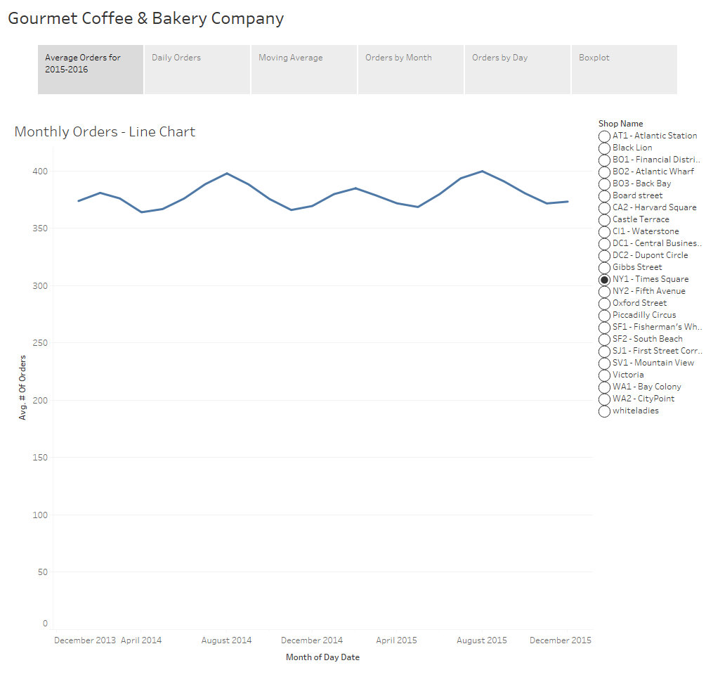
On this simple visualization we can already draw some insights. We can see that the data is cyclical with a peak early in the year around February and another in August. We can also visually see the minimum number of orders in a month appears to be about 360 orders while the maximum is just under 400 orders.
When someone asks to see “average orders by month”, this is generally what people expect to see and depending upon the intended audience a chart like this might be completely acceptable. However, when we display aggregated data we no longer have any visibility into the variance of the underlying data.
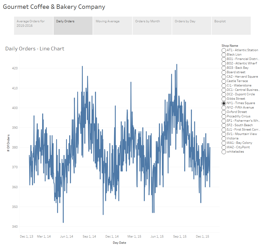
If we display the orders at the day level instead of month we can still see the cyclical nature of the data but we also can see additional detail and you’ll notice there’s quite a bit more “noise” to the data. We had a particularly poor day in mid-May of 2014 with under 350 orders. We’ve also had a considerable number of good days during the summer months when we cleared 415 orders.
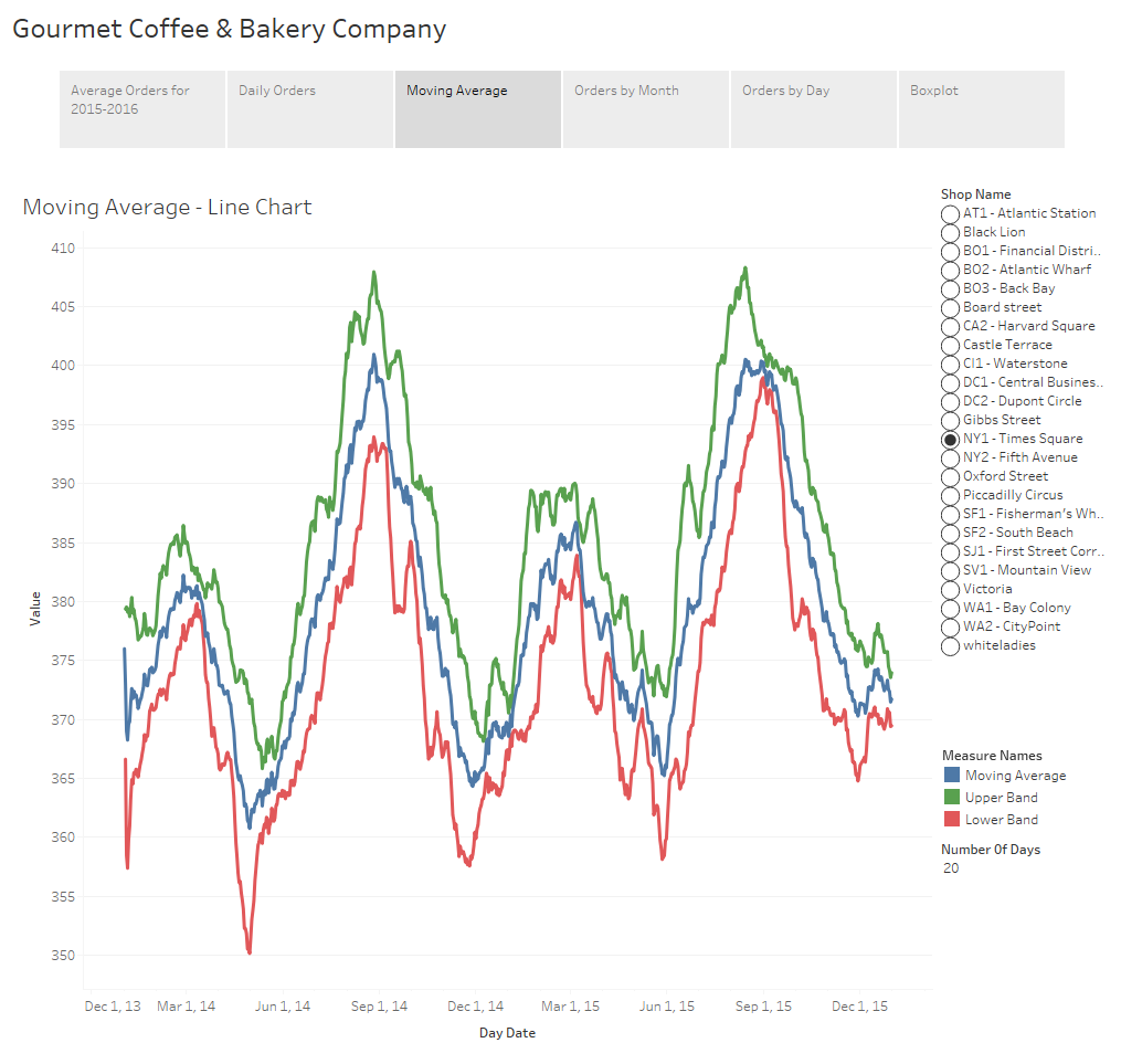
Depending upon your audience and the dataset, some of these charts might include too much information and be too busy. If the viewer can’t make sense of what you’re putting in front of them there’s no way they’ll be able to discern any meaningful insights from the underlying dataset. Visualizations must be easy to read. One way to provide information about the volatility of the data but with less detail would be to use confidence bands, similar to how one might view stock data. In this example I’ve calculated and displayed a moving average, as well as upper and lower confidence bands using the 3rd standard deviation. Confidence bands show how much uncertainty there is in your data. When the bands are close you can be more confident in your results and expectations.
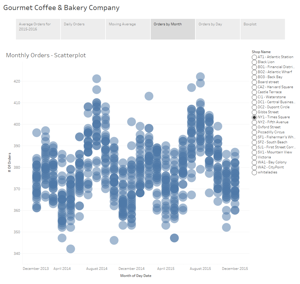
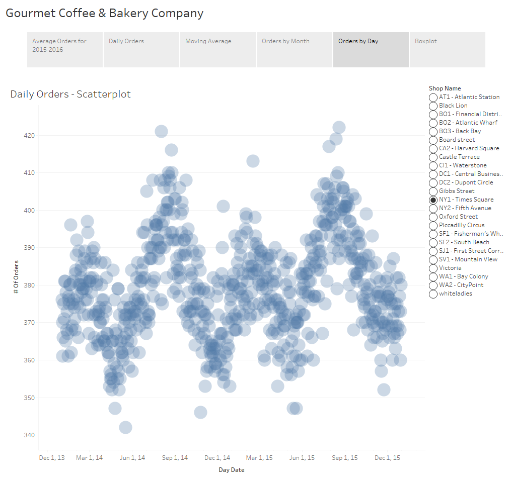
An additional option is the use of a scatterplot. The awesome thing about a scatterplots is that not only does it allow you to see the variance of your data, but if you play with the size of your shapes and tweak the transparency just right, you also get a sense of density of your dataset because you can visualize where those points lie in relation to each other.
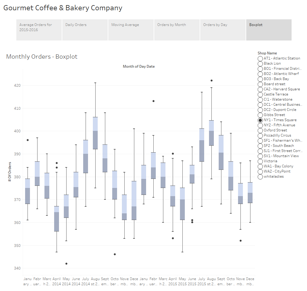
The final example I have for you is to show the distribution of your data using a boxplot. If you’re not familiar with boxplots, the line in the middle of the box is the median. The bottom and top of the box, known as the bottom and top hinge, give you the 25th and 75th percentiles respectively and the whiskers outside out the box show the minimum and maximum values excluding any outliers. Outliers are shown as dots.
I want to take a brief moment to touch on a fairly controversial subject of whether or not to include a zero value in your axes. When you have a non-zero baseline it distorts your data and differences are exaggerated. This can be misleading and might lead your audience into drawing inaccurate conclusions.

For example, a quick Google search revealed this image on Accuweather showing the count of tornados in the U.S. for 2013-2016. At first glance it appears as though there were almost 3 times more tornados in 2015 than in 2013 and 2014, but that would be incorrect.
On the flipside, there are cases where slight fluctuations in the data are extremely important but are too small to be noticed when the axis extends to zero. Philip Bump did an excellent job demonstrating this in his "Why this National Review global temperature graph is so misleading" article in the The Washington Post.
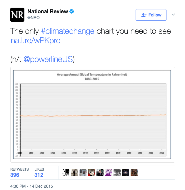
Philip begins his article with this chart tweeted by the National Review which appears to prove that global temperatures haven’t changed in the last 100 years. As he goes on to explain, this chart is misleading because of the scale used. The y-axis stretches from -10 to 110 degrees making it impossible to see a 2 degree increase over the last 50 years or so.
The general rule of thumb is that you should always start from zero. In fact, when you create a visualization in Tableau, it includes a zero by default. Usually, I agree with this rule and the vast majority of the time I do include a zero, but I don’t believe there can be a hard and fast rule as there will always be an exception. Bar charts are used to communicate absolute values so the size of that bar needs to be proportional to the overall value. I agree that bar charts should extend to zero because if it doesn’t we distort what the data is telling us. With line charts and scatterplots we tend to look at the positioning of the data points relative to each other. Since we’re not as interested in the value of the data, I don’t feel the decision to include a zero or not is as cut and dry.
The issue boils down to what it is you’re trying to communicate with your chart. In this particular case, I’m trying to highlight the uncertainty so the chart needs to draw attention to the range of that uncertainty. For this reason, I have not extended the axes in the above examples to zero. You are free to disagree with me on this, but as long as you’re not intentionally misleading your audience I feel that in instances such as these this rule can be relaxed.
These are only a few examples of the many ways to show uncertainty and variance within your data. Displaying the volatility of the data and giving viewers a level of confidence in the results is immensely powerful. Remember that while we can come up with the most amazing visualizations, if the results are misleading or misinterpreted and users draw inaccurate conclusions, what’s the point?