Tableau | Dashboard Design ::Revoke A50 Petition Data::
Dashboards are most powerful through visual simplicity. They’re designed to automatically keep track of a specific set of metrics and keep human beings updated. Visual overload is like a binary demon in analytics that many developers seem possessed by; but less is more.
For example, many qualified drivers know very little about their dashboard besides speed, revs, temperature and fuel gauge. When an additional dash warning light comes on, even if it is just the tyre pressure icon let alone engine diagnostics light, most people will just take their car to the garage. The most obvious metrics in a car are in regard to its operation; if you didn't know your speed while driving you'd feel pretty blind. The additional and not so obvious metrics (i.e. dash warning lights) are more likely to be picked up by the second type of person who will spend the most time with that car: its mechanic. It would be pointless to overload a regular driver with all the data the car can possibly output in one go; that would just intimidate them. That's not what you want a car to do to the driver and that's certainly not what any organisation would want their operatives to feel like while their “car” is moving.
In light of recent political events, the exact same can metaphorically be applied to the big red Brexit bus. Making sense of it all might be a stretch too far for this article. Still, with appropriate use of Tableau dashboard design it is possible to answer seemingly critical questions on the topic with publicly available data.
There's An Ongoing Question That Needs Answering?
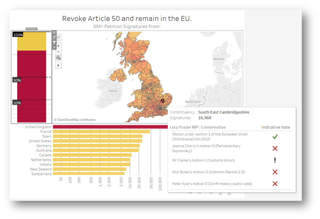
Where did 6 million+ signatures really come from?
Back in the UK, the Brexit fiasco is definitely still ongoing. Just before the recent A50 extensions took place, a petition to revoke article 50 and remain in the EU attracted more than 6 million signatures, becoming the biggest and fastest growing ever in history and sparking right wing criticism over the origin of thousands of signatures, claiming that most came from overseas and discrediting its legitimacy. Government responded by rejecting the petition.
Thankfully the data is publicly available (https://petition.parliament.uk/petitions/241584.json) for us to use as an example of how a dashboard can be designed to settle such a question (potentially in real time too as more signatures come in).
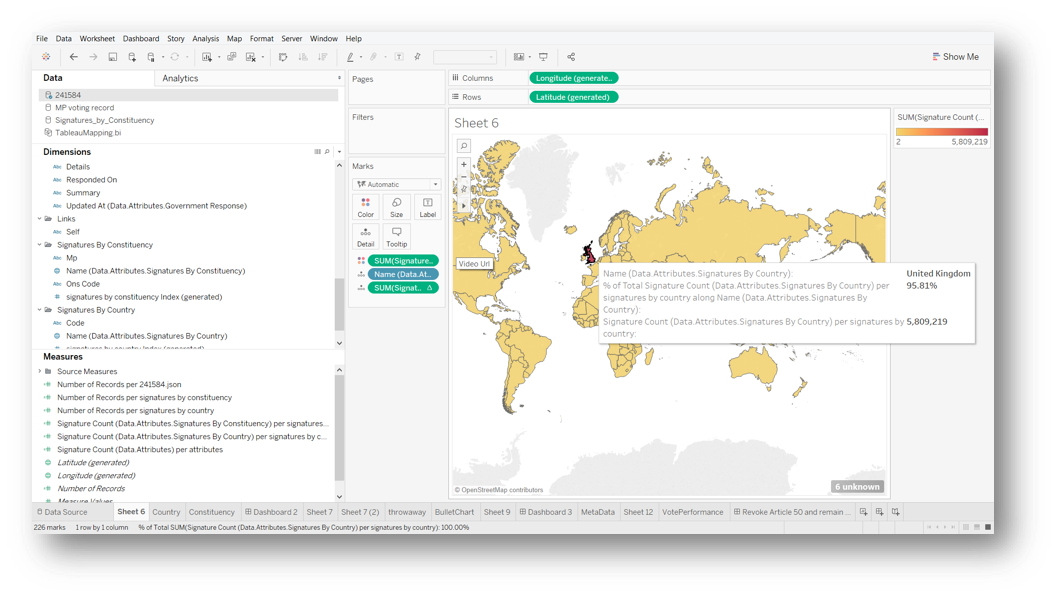
Tableau can handle JSON data quite well and, to nobody’s surprise, we quickly discover that over 95% of signatures are coming from the UK.
Now that we know what we're dealing with, lets focus the map on Britain and provide additional countries data in a format that is easier to digest visually. As cool as it is to hover over the world map, there's simpler ways to take this in.
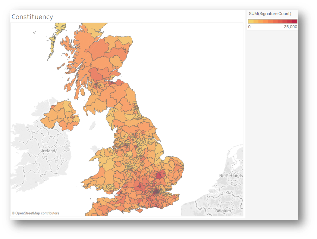
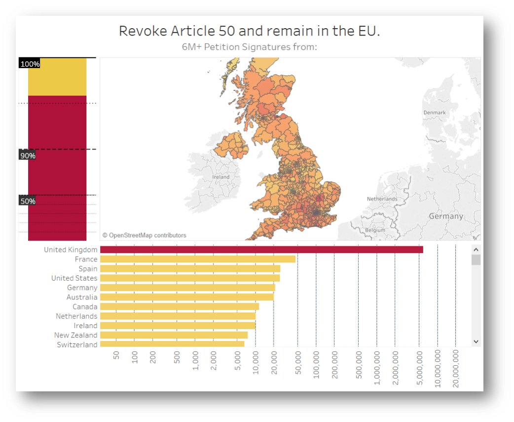
Because in this case we know more than 95% of signatures originate from the UK, the heatmap above is far more useful, showing us the signature count for each constituency at a glance. The hotter the shading, the higher the count.
Scales Might Need Calibration
Bar Chart All The Way
Humans of all levels compute a bar chart well and it's perfect for what we need to know on how many signatures are coming from abroad altogether and from what countries in descending order.
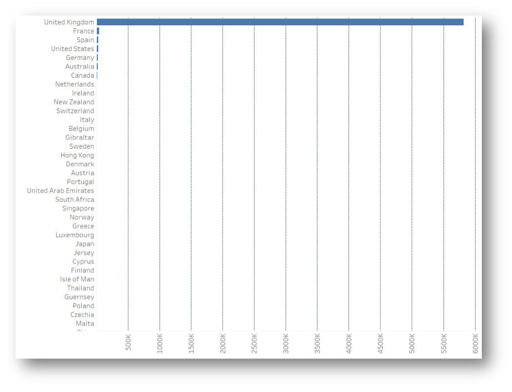
With a margin so tiny, it's trickier to get a visual that makes sense. A pie chart, for example, would hardly display the smaller slice containing all of the non-UK origin signatures. Even with a bar chart we are struggling to see anything outside of the UK in a linear scale; but it is perfect if using logarithmic scales, which are definitely a must in this scenario.
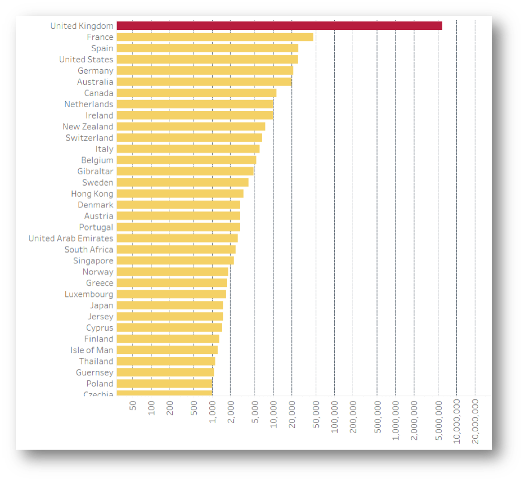
And voila! The logarithmic scale allows the remaining counts to appear alongside the UK, even though France, the next country after the UK with most signatures, has a count below 50k. This means we can keep an eye on the outliers in more detail quite effortlessly. Not much looks out of place right now considering the number of expats Britain produces to the countries on the list. Now we know, as long as none of the other countries turn red, we have nothing to worry about!
Innovate When Needed
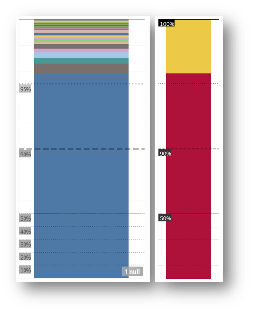
The logarithmic scale in Tableau isn't as useful for these %, so hacking the visualised values in order to amplify the data sections of interest is a perfectly valid way of thinking outside the box. In this example, half the graph is dedicated to 90-100% and the other half 0-90%. The blue chunk is the percentage of signatures coming from the UK, while every other country colour chunk is still so small. Since the totals from other countries are about the same as each mainland constituency, it's more useful to see it as one chunk. Lastly, adding the heat colour coding keeps the visual integrity.
Interactivity
Now that we have the count, percentage and location breakdown into 3 simple graphs we feel much wiser. So it's time to make them interact with each other.
The constituency heatmap doesn't need to interact with the bar charts. The correlation between the hottest bars and the heatmap is obvious from the get go, but if we were to filter the bars using the map, the percentages would be so tiny you wouldn't see much on the % graph. The same occurs for the Country bar chart, meaning that only the percentage chart can be usefully used as a filter. Selecting the yellow chunk will show the count of signatures for every country within it only.
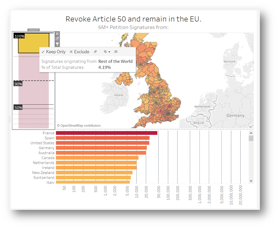
Another way in which interactivity can be introduced is through adding further visualisations to the tooltip. The petition data contains the MP responsible for each constituency, so we can effectively put a count of signatures to each name. It's nice to be able to see what their parliamentary voting record has been throughout this Brexit deadlock, which was obtained publicly from the House of Commons portal https://commonsvotes.digiminster.com and blended in; as more votes come in, the list will automatically increase.
Keep It Simple
As you can see, 3 is a magic number here. The trio of visuals working together makes a dashing delivery of intel to the brain. With very little effort, we can see how many signatures come from the UK compared to rest of the world, how many thousands are coming from each country, how many from each constituency, who the MP you should be writing to is and how they voted in the indicative votes. Furthermore, this dashboard can keep track of all of that in real time, flagging any incoming surge of signatures from abroad, continuously counting the additional signatures until August 2019 and providing a transparent record of parliamentary votes in a format that is very easy to visually digest.