Text mining in R
As data becomes increasingly available in the world today the need to organise and understand it also increases. Since 80% of data out there is in unstructured format, text mining becomes an extremely valuable practice for organisations to generate helpful insights and improve decision-making. So, I decided to experiment with some data in the programming language R with its text mining package “tm” – one of the most popular choices for text analysis in R, to see how helpful the insights drawn from the social media platform Twitter were in understanding people’s sentiment towards the US elections in 2020.
What is Text Mining?
Unstructured data needs to be interpreted by machines in order to understand human languages and extract meaning from this data, also known as natural language processing (NLP) – a genre of machine learning. Text mining uses NLP techniques to transform unstructured data into a structured format for identifying meaningful patterns and new insights.
A fitting example would be social media data analysis; since social media is becoming an increasingly valuable source of market and customer intelligence, it provides us raw data to analyse and predict customer needs. Text mining can also help us extract sentiment behind tweets and understand people’s emotions towards what is being sold.
Setting the scene
Which brings us to my analysis here on a dataset of tweets made regarding the US elections that took place in 2020. There were over a million tweets made about Donald Trump and Joe Biden which I put through R’s text mining tools to draw some interesting analytics and see how they measure up against the actual outcome – Joe Biden’s victory. My main aim was to perform sentiment analysis on these tweets to gain a consensus on what US citizens were feeling in the run up to the elections, and whether there was any correlation between these sentiments and the election outcome.
I found the Twitter data on Kaggle, containing two datasets: one of tweets made on Donald Trump and the other, Joe Biden. These tweets were collected using the Twitter API where the tweets were split according to the hashtags ‘#Biden’ and ‘#Trump’ and updated right until four days after the election – when the winner was announced after delays in vote counting. There was a total of 1.72 million tweets, meaning plenty of words to extract emotions from.
The process
I will outline the process of transforming the unstructured tweets into a more intelligible collection of words, from which sentiments could be extracted. But before I begin, there are some things I had to think about for processing this type of data in R:
1. Memory space – Your laptop may not provide you the memory space you need for mining a large dataset in RStudio Desktop. I used RStudio Server on my Mac to access a larger CPU for the size of data at hand.
2. Parallel processing – I first used the ‘parallel’ package as a quick fix for memory problems encountered creating the corpus. But I continued to use it for improved efficiency even after moving to RStudio Server, as it still proved to be useful.
3. Every dataset is different – I followed a clear guide on sentiment analysis posted by Sanil Mhatre. But I soon realised that although I understood the fundamentals, I would need to follow a different set of steps tailored to the dataset I was dealing with.
First, all the necessary libraries were downloaded to run the various transformation functions. tm, wordcloud, syuzhet are for text mining processes. stringr, for stripping symbols from tweets. parallel, for parallel processing of memory consuming functions. ggplot2, for plotting visualisations.
I worked on the Biden dataset first and planned to implement the same steps on the Trump dataset given everything went well the first time round. The first dataset was loaded in and stripped of all columns except that of tweets as I aim to use just tweet content for sentiment analysis.
The next steps require parallelising computations. First, clusters were set up based on (the number of processor cores – 1) available in the server; in my case, 8-1 = 7 clusters. Then, the appropriate libraries were loaded into each cluster with ‘clusterEvalQ’ before using a parallelised version of ‘lapply’ to apply the corresponding function to each tweet across the clusters. This is computationally efficient regardless of the memory space available.
So, the tweets were first cleaned by filtering out the retweet, mention, hashtag and URL symbols that cloud the underlying information. I created a larger function with all relevant subset functions, each replacing different symbols with a space character. This function was parallelised as some of the ‘gsub’ functions are inherently time-consuming.
A corpus of the tweets was then created, again with parallelisation. A corpus is a collection of text documents (in this case, tweets) that are organised in a structured format. ‘VectorSource’ interprets each element of the character vector of tweets as a document before ‘Corpus’ organises these documents, preparing them to be cleaned further using some functions provided by tm. Steps to further reduce complexity of the corpus text being analysed included: converting all text to lowercase, removing any residual punctuation, stripping the whitespace (especially that introduced in the customised cleaning step earlier), and removing English stopwords that do not add value to the text.
The corpus list had to be split into a matrix, known as Term Document Matrix, describing the frequency of terms occurring in each document. The rows represent terms, and columns documents. This matrix was yet too large to process further without removing any sparse terms, so a sparsity level of 0.99 was set and the resulting matrix only contained terms appearing in at least 1% of the tweets. It then made sense to cumulate sums of each term across the tweets and create a data frame of the terms against their calculated cumulative frequencies. I went on to only experiment with wordclouds initially to get a sense of the output words. Upon observation, I realised common election terminology and US state names were also clouding the tweets, so I filtered out a character vector of them i.e. ‘trump’, ‘biden’, ‘vote’, ‘Pennsylvania’ etc. alongside more common Spanish stopwords without adding an extra translation step. My criterion was to remove words that would not logically fit under any NRC sentiment category (see below). This removal method can be confirmed to work better than the one tm provides, which essentially rendered useless and filtered none of the specified words. It was useful to watch the wordcloud distribution change as I removed corresponding words; I started to understand whether the outputted words made sense regarding the elections and the process they were put through.
The entire process was executed several times, involving adjusting parameters (in this case: the sparsity value and the vector of forbidden words), and plotting graphical results to ensure its reliability before proceeding to do the same on the Trump dataset. The process worked smoothly and the results were ready for comparison.
The results
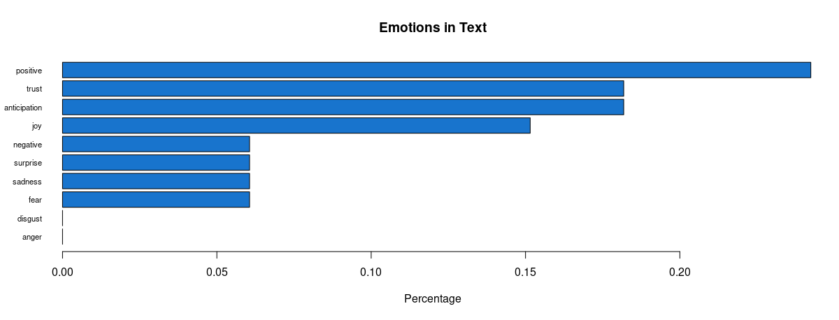
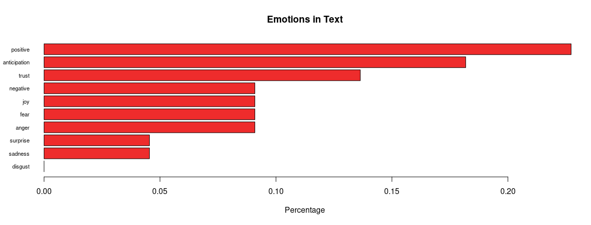
First on the visualisation list was wordclouds – a compact display of the 100 most common words across the tweets, as shown below.
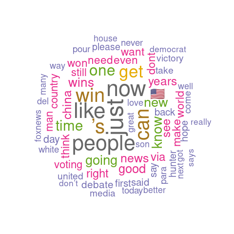
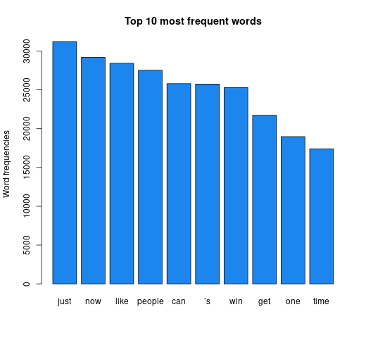
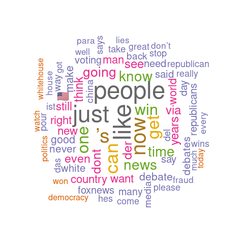
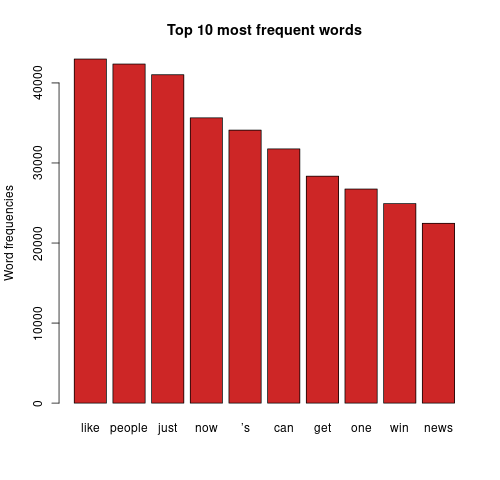
The bigger the word, the greater its frequency in tweets. Briefly, it appears the word distribution for both parties are moderately similar, with the biggest words being common across both clouds. This can be seen on the bar charts on the right, with the only differing words being ‘time’ and ‘news’. There remain a few European stopwords tm left in both corpora, the English ones being more popular. However, some of the English ones can be useful sentiment indicators e.g., ‘can’ could indicate trust. Some smaller words are less valuable as they cause ambiguity in categorisation without a clear context e.g., ‘just’, ‘now’, and ‘new’ may be coming from ‘new york’ or pointing to anticipation for the ‘new president’. Nonetheless, there are some reasonable connections between the words and each candidate; some words in Biden’s cloud do not appear in Trump’s, such as ‘victory’, ‘love’, ‘hope’. ‘Win’ is bigger in Biden’s cloud, whilst ‘white’ is bigger in Trump’s cloud as well as occurrences of ‘fraud’. Although many of the terms lack context for us to base full judgement upon, we already get a consensus of the kind of words being used in connotation to each candidate.
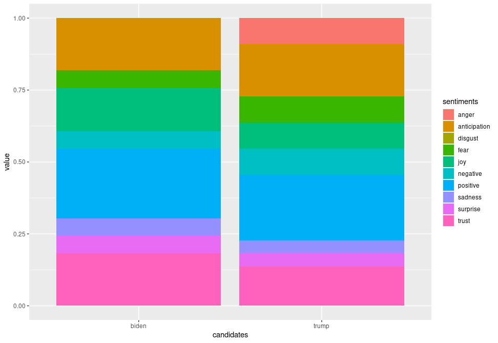
Analysing further, emotion classification was performed to identify the distribution of emotions present in the run up to the elections. The syuzhet library adopts the NRC Emotion Lexicon – a large, crowd-sourced dictionary of words tallied against eight basic emotions and two sentiments: anger, anticipation, disgust, fear, joy, sadness, surprise, trust, negative, positive respectively. The terms from the matrix were tallied against the lexicon and the cumulative frequency was calculated for each sentiment. Using ggplot2, a comprehensive bar chart was plotted for both datasets, as shown below.
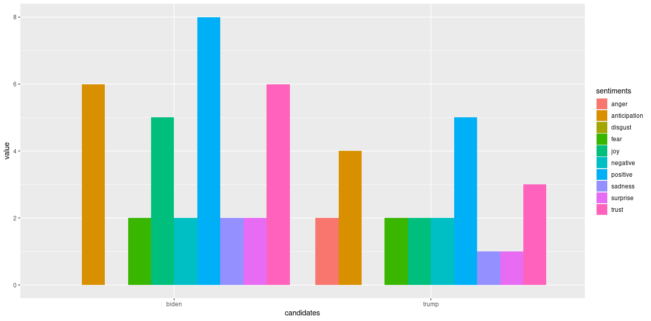
Some revealing insights can be drawn here. Straight away, there is an absence of anger and disgust in Biden’s plot whilst anger is very much present in that of Trump’s. There is 1.6 times more positivity and 2.5 times more joy pertaining Biden, as well as twice the amount of trust and 1.5 times more anticipation about his potential. This is strong data supporting him. Feelings of fear and negativity, however, are equal in both; perhaps the audience were fearing the other party would win, or even what America’s future holds regarding either outcome. There was also twice the sadness and surprise pertaining Biden, which also makes me wonder if citizens are expressing potential emotions they would feel if Trump won (since the datasets were only split based on hashtags), alongside being genuinely sad or surprised that Biden is one of their options.
In the proportional bar charts, there is a wider gap between positivity and negativity regarding Biden than of Trump, meaning a lower proportion of people felt negatively about Biden. On the other hand, there is still around 13% trust in Trump, and a higher proportion of anticipation about him. Only around 4% of the words express sadness and surprise for him which is around 2% lower than for Biden – intriguing. We also must remember to factor in the period after the polls opened when the results were being updated and broadcasted, which may have also affected people’s feelings – surprise and sadness may have risen for both Biden and Trump supporters whenever Biden took the lead. Also, there was a higher proportion fearing Trump’s position, and the anger may have also creeped in as Trump’s support coloured the bigger states.
Conclusions
Being on the other side of the outcome, it is more captivating to observe the distribution of sentiments across Twitter data collected through the election period. Most patterns we observed from the data allude to predicting Joe Biden as the next POTUS, with a few exceptions when a couple of negative emotions were also felt regarding the current president; naturally, not everyone will be fully confident in every aspect of his pitch. Overall, however, we saw clear anger only towards Trump along with less joy, trust and anticipation. These visualisations, plotted using R’s tm package in a few lines of code, helped us draw compelling insights that supported the actual election outcome. It is indeed impressive how text mining can be performed at ease in R (once the you have the technical aspects figured out) to create inferential results instantly.
Nevertheless, there were some limitations. We must consider that since the tweets were split according to the hashtags ‘#Biden’ and ‘#Trump’, there is a possibility these tweets appear in both datasets. This may mean an overspill of emotions towards Trump in the Biden dataset and vice versa. Also, the analysis would’ve been clearer if we contextualised the terms’ usage; maybe considering phrases instead would build a better picture of what people were feeling. Whilst plotting the wordclouds, as I filtered out a few foreign stopwords more crept into the cloud each time, which calls for a more solid translation step before removing stopwords, meaning all terms would then be in English. I also noted that despite trying to remove the “ ’s” character, which was in the top 10, it still filtered through to the end, serving as an anomaly in this experiment as every other word in my custom vector was removed.
This experiment can be considered a success for an initial dip into the world of text mining in R, seeing that there is relatively strong correlation between the prediction and the outcome. There are several ways to improve this data analysis which can be aided with further study into various areas of text mining, and then exploring if and how R’s capabilities can expand to help us achieve more in-depth analysis.
My code for this experiment can be found here.
Contact us to find out what Rittman Mead can do to help you text mine in R.