Oracle Analytics Cloud November 2022 Update: the New Features, Ranked
The November 2022 Update for Oracle Analytics Cloud came out few days ago and in this blog post I'm going to have a look at all the new features it includes.

The November 2022 Update for Oracle Analytics Cloud came out few days ago and in this blog post I'm going to have a look at all the new features it includes. If you are also interested in a comprehensive list of the defects fixed by the update, please refer to Doc ID 2832903.1.
10. Non-SSL, Kerberos Connections to Hive
Non-SSL connections to a Hive database using Kerberos network authentication protocol are now supported.
9. Enhanced Data Profiling
The random sampling depth and methodology that drives augmented features such as quality insights and semantic recommendations has been improved.
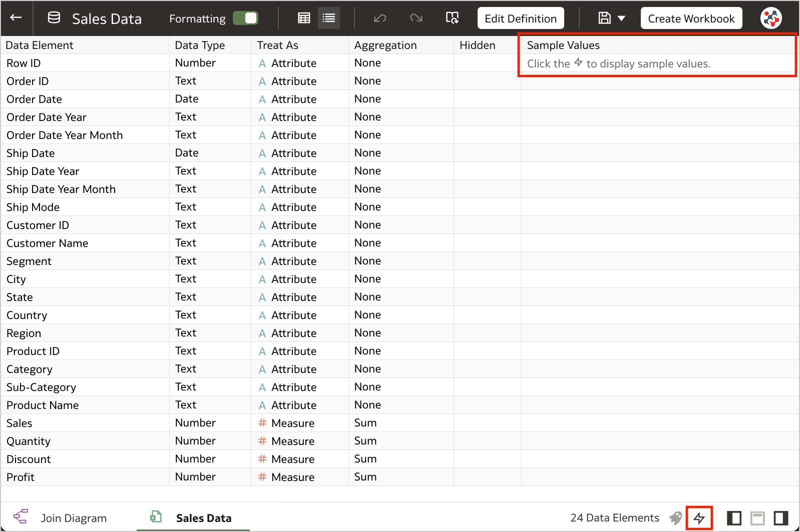
8. Toggle Sample Data Previews in Metadata View
This feature allows users to switch off sample data previews in Metadata view to stop generating the sample values displayed in the Sample Values column and improve their user experience when previews are not required. The toggle switch is displayed at the bottom right of the Metadata view (Figure 1).
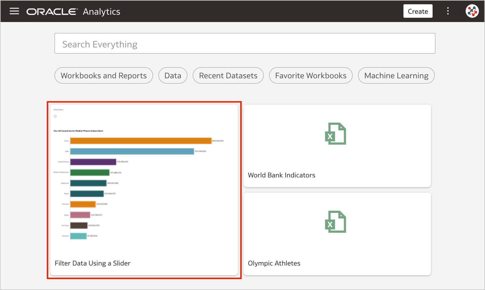
7. Blurred Thumbnails
Workbook thumbnails displayed on the home page are now blurred to protected sensitive data from being exposed to users that don't have the same access as data authors (Figure 2).
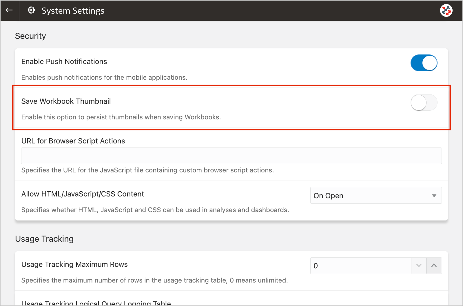
Unfortunately, the blur effect is not sufficient to make performance tile content completely indistinguishable. For additional security, administrators can disable workbook thumbnails altogether by switching off the Save Workbook Thumbnail option in the System Settings section of Data Visualization Console (Figure 3).
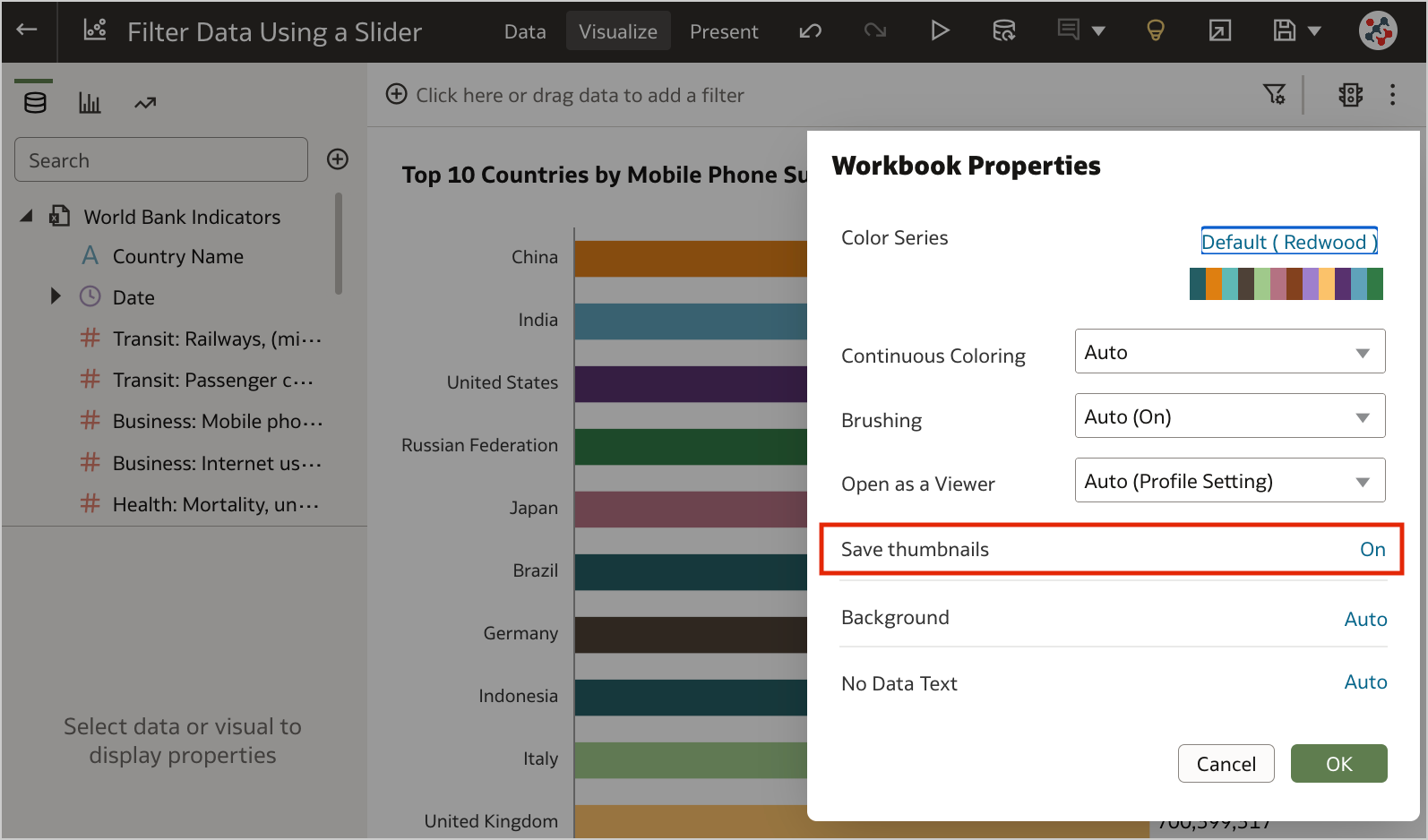
When thumbnails are globally allowed, content authors can show or hide the thumbnail for an individual workbook as required. Click Menu on the workbook toolbar, select Workbook Properties and set Save thumbnails to On or Off (Figure 4).
6. Transform Data to Dates More Easily
Unrecognized dates can be transformed more easily using single-click Convert to Date recommendations.
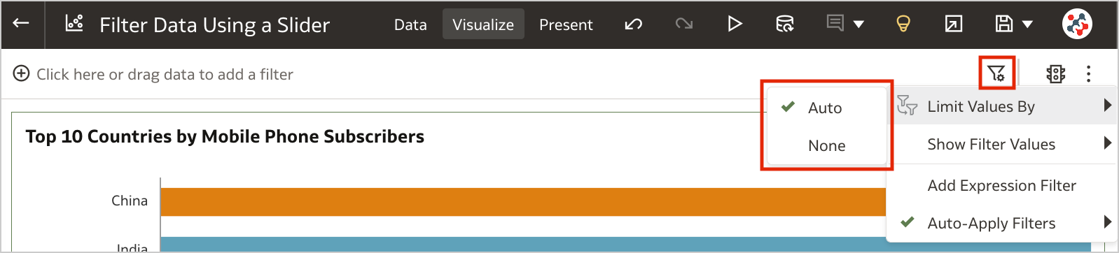
5. Control Filter Interactions from the Filters Bar
When your workbook contains many filters, the Limit Values By icon in the filters bar can be used to toggle between limited filter selection values and unlimited filter selection values (Figure 5).
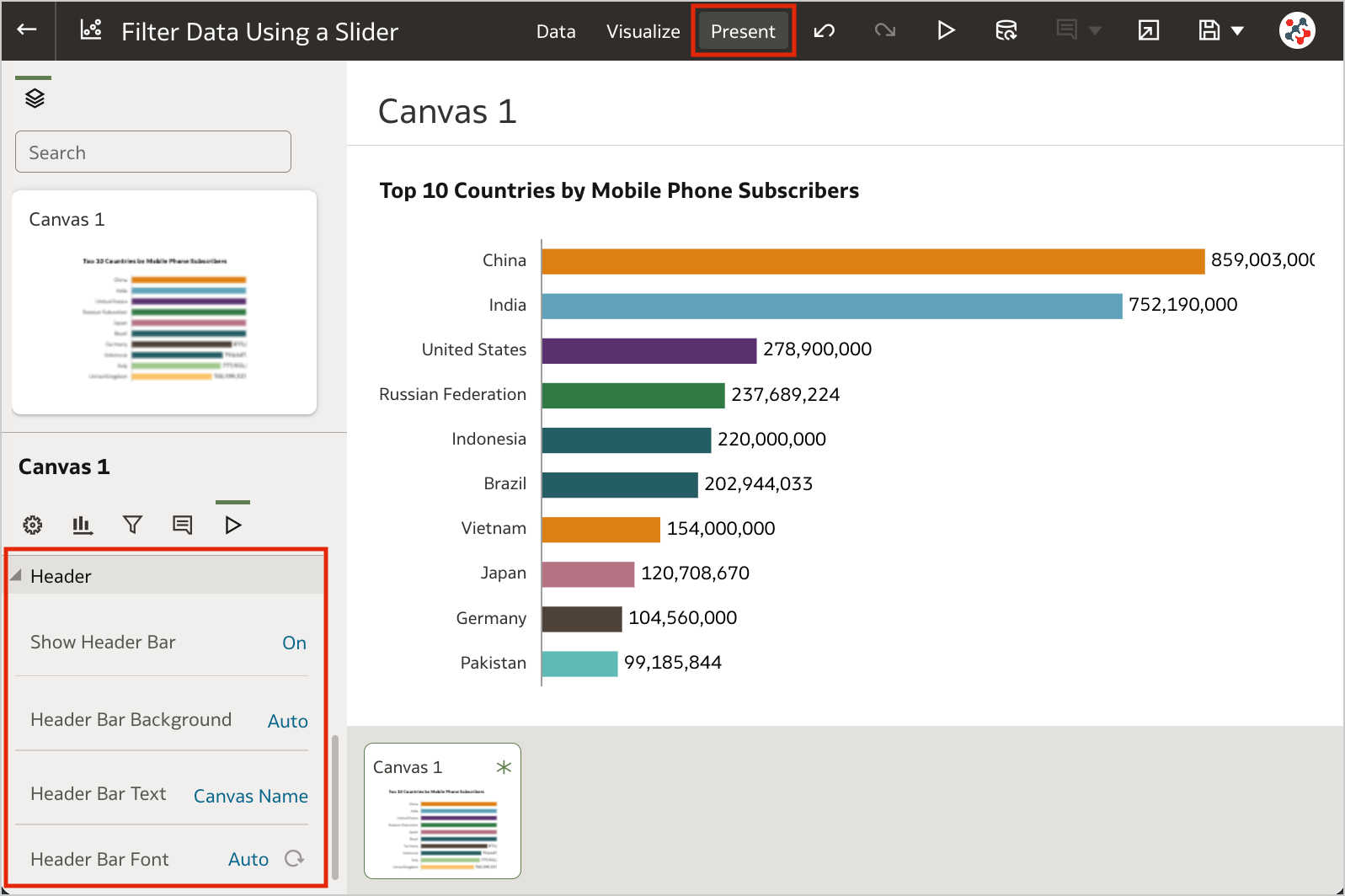
4. Customize the Workbook Header Bar
Authors can show or hide the header bar, and customize it. To customize the header bar color, text, font, and image, go to the Properties panel in the Present page of the workbook and select the Presentation tab (Figure 6). End users can then view the header bar as configured by the author.
3. Filter Data Using a Slider
Slider dashboard filter can be added to a canvas to animate visualizations and show dynamically how your data changes over a given dimension such as time (Clip 1).
Clip 1. Filtering data using a slider dashboard filter.
The feature is similar to a section displayed as slider in Analytics, but more powerful: it generates more efficient queries, with a single object you can interact with multiple visualizations at the same time, and it supports tables and pivot tables as well. To make the most of it, I recommend to set up a custom End for Values Axis of your visualizations.
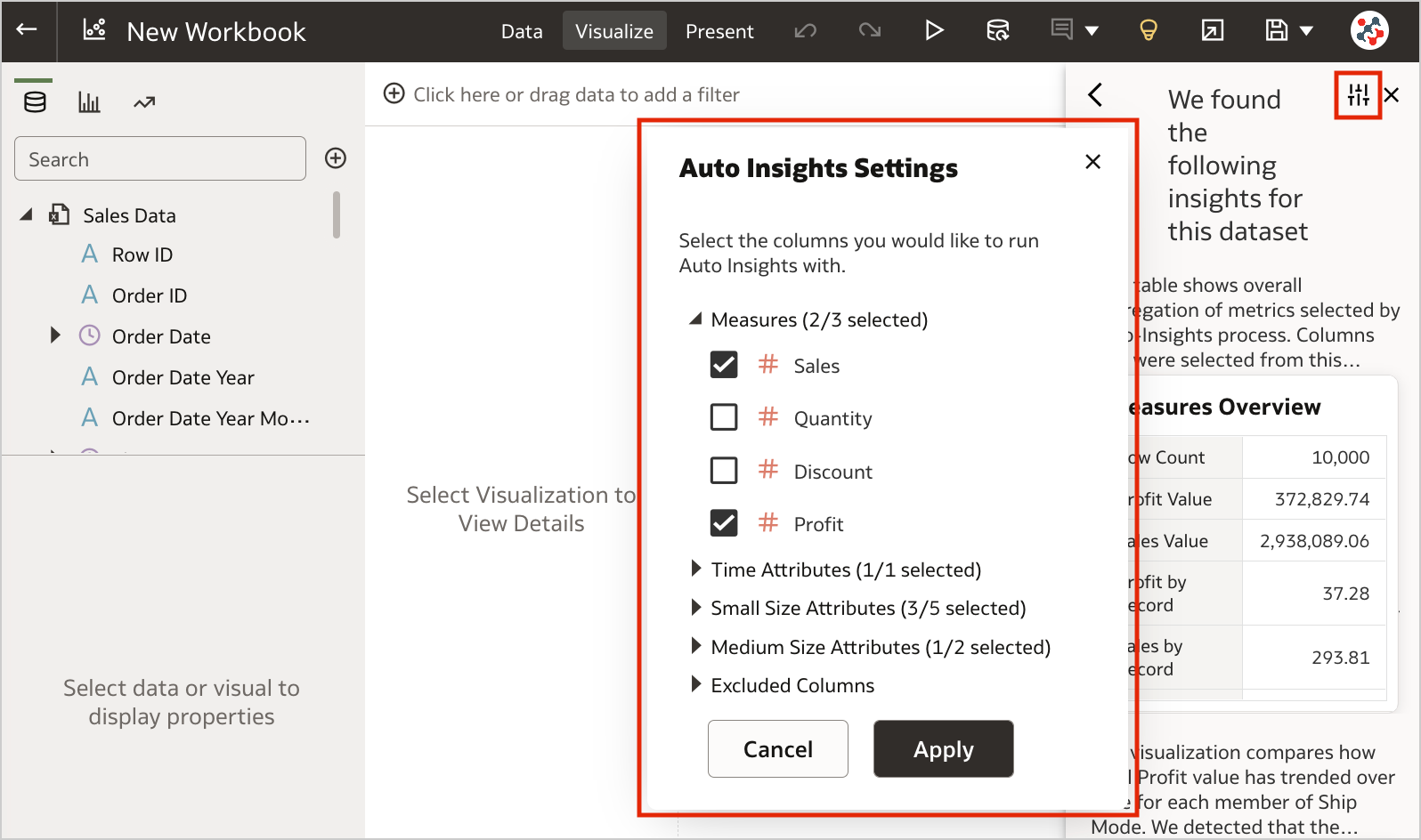
2. Select Columns for Auto Insights
By default, Oracle Analytics profiles all columns in a dataset when it generates insights. Data columns to use for Auto Insights can now be selected by content authors to fine-tune the insights that Oracle Analytics generates for you and focus only on the most useful ones (Figure 7).
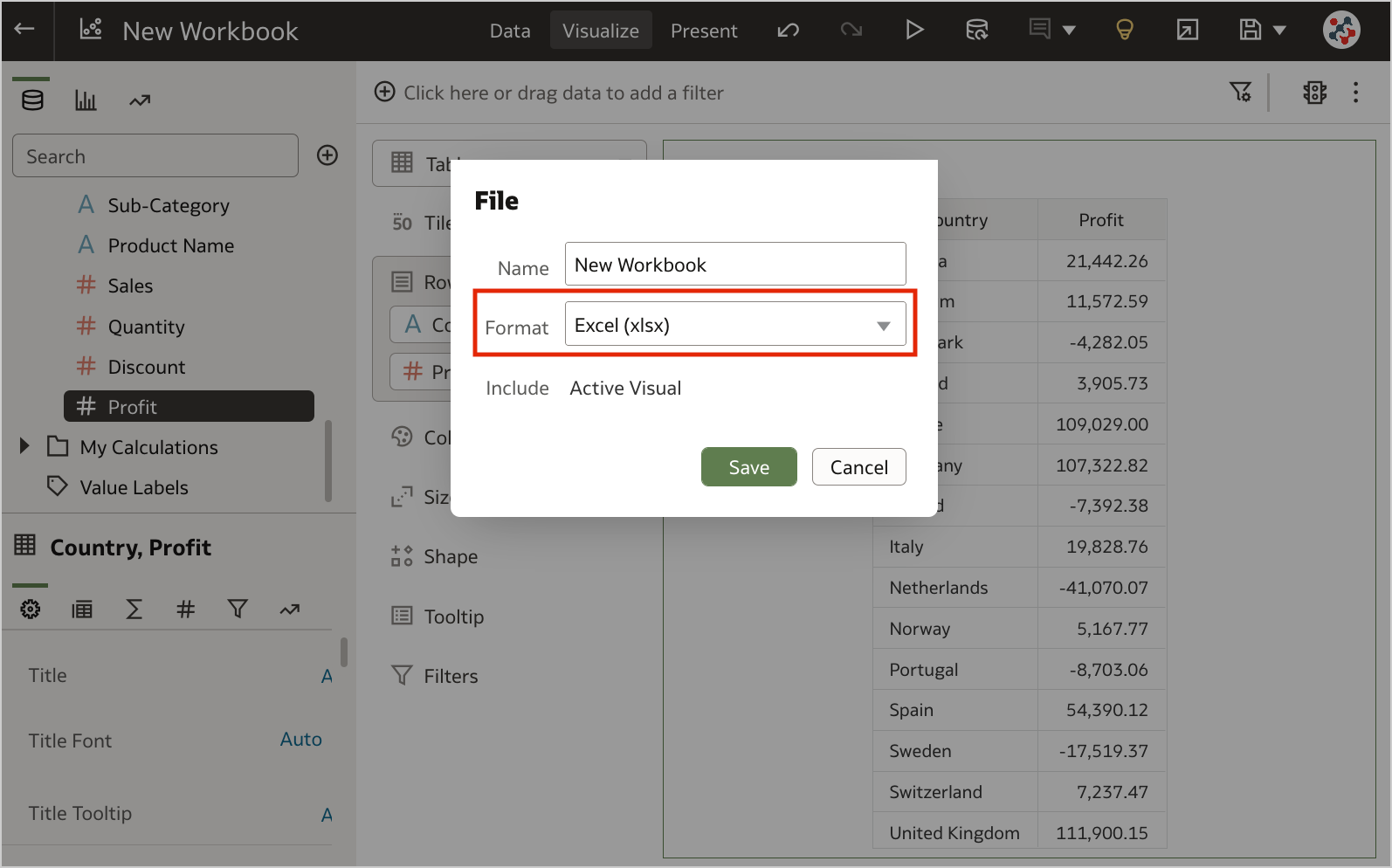
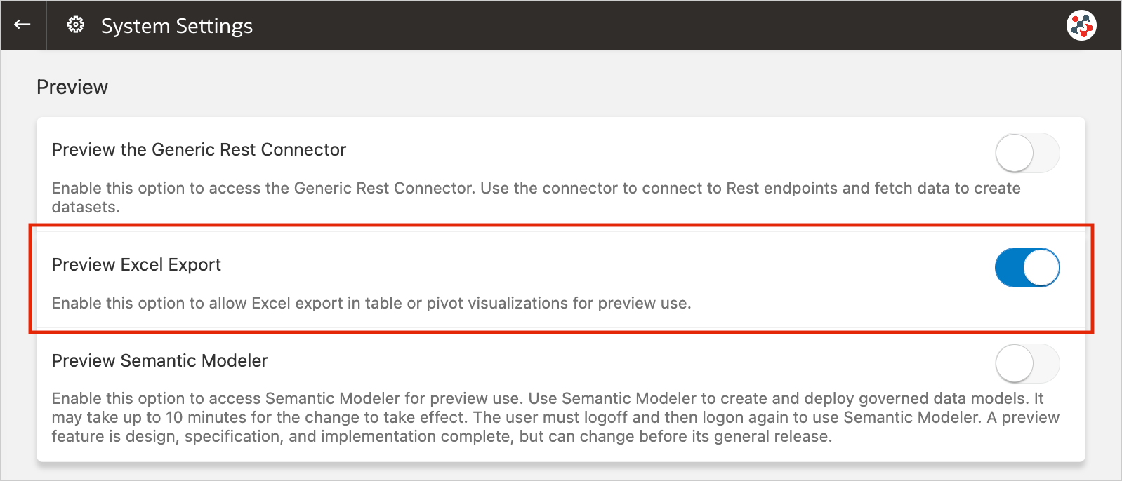
1. Export Table Visualizations to Microsoft Excel
Formatted data from table and pivot table visualizations (up to 25,000 rows) can now be exported to the Microsoft Excel (XLSX) format (Figure 8).
This feature is currently available for preview. Administrators can enable it by switching on the Preview Excel Export option in the System Settings section of Data Visualization Console (Figure 9).
Conclusion
The November 2022 Update includes several new features (and fixes) for Oracle Analytics Cloud that significantly improve Data Visualization and make it more user friendly.
If you are looking into Oracle Analytics Cloud and want to find out more, please do get in touch or DM us on Twitter @rittmanmead. Rittman Mead can help you with a product demo, training and assist within the migration process.