Oracle Analytics Cloud January 2023 Update: What's New?
The January 2023 Update for Oracle Analytics Cloud came out few days ago and in this blog post I'm going to have a look at the most important new features it includes.

The January 2023 Update for Oracle Analytics Cloud came out few days ago and in this blog post I'm going to have a look at the most important new features it includes. If you are also interested in a comprehensive list of the defects fixed by the update, please refer to Doc ID 2919336.1.
Improved Home Page
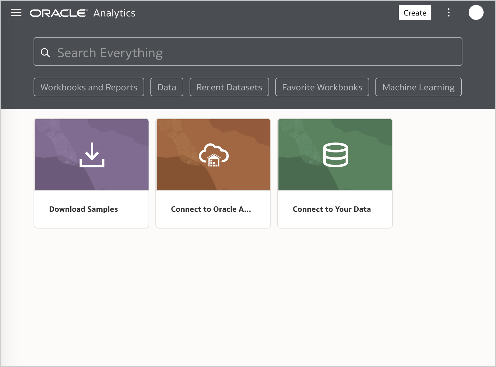
The Home page of Oracle Analytics Cloud has been redesigned with a new style and customization options (Figure 1).
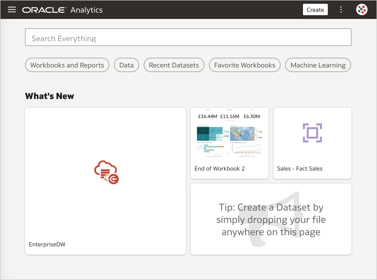
Whether you like the new style or not (I don't), this choice is questionable and represents a backward step compared to the previous release (Figure 2): the background color of the header is no more consistent across all the tools in the suite, and the default text (light grey) is difficult to read on buttons and search bar (dark grey).
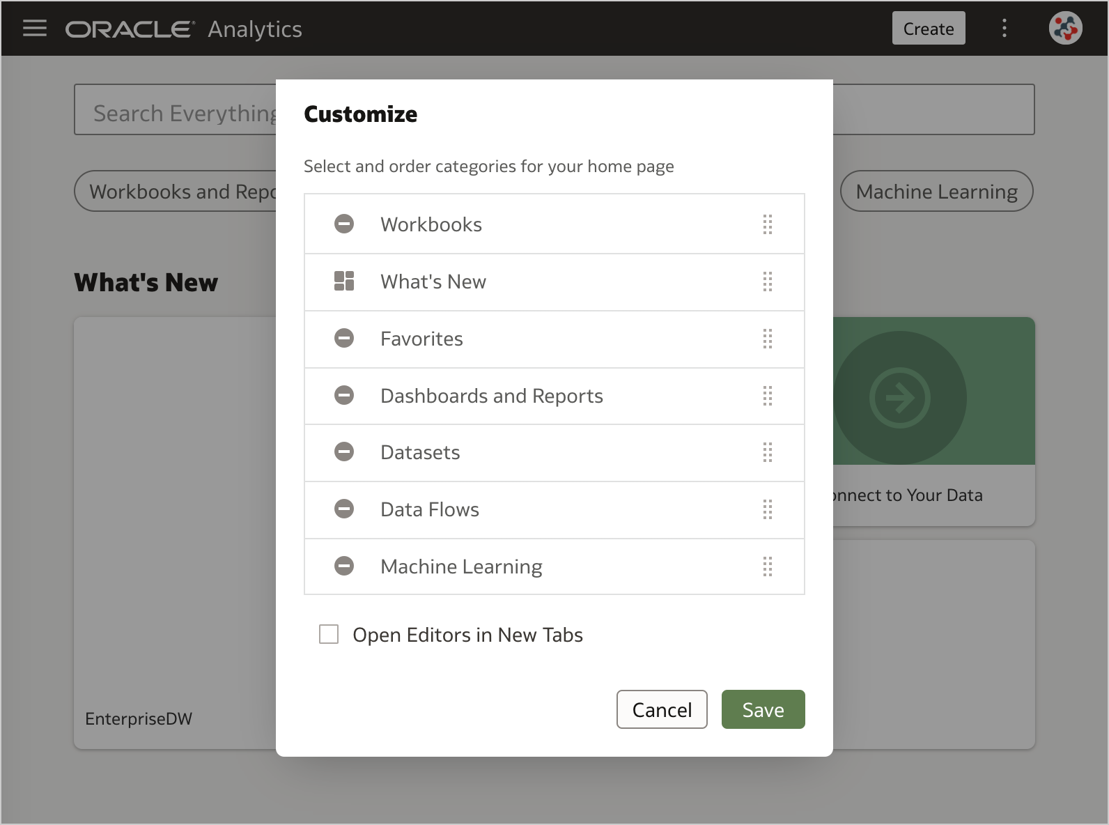
Luckily, for the new customization options it's a different story and I really enjoy the update. The Mosaic display option has been removed and will not be missed (it took up too much space in the Home page when applied). To change how you display content you can now choose between Hidden, Small, Medium and Large display options, and specify the number of rows to display for each category (Figure 3).
Automatically Calculate Time Durations
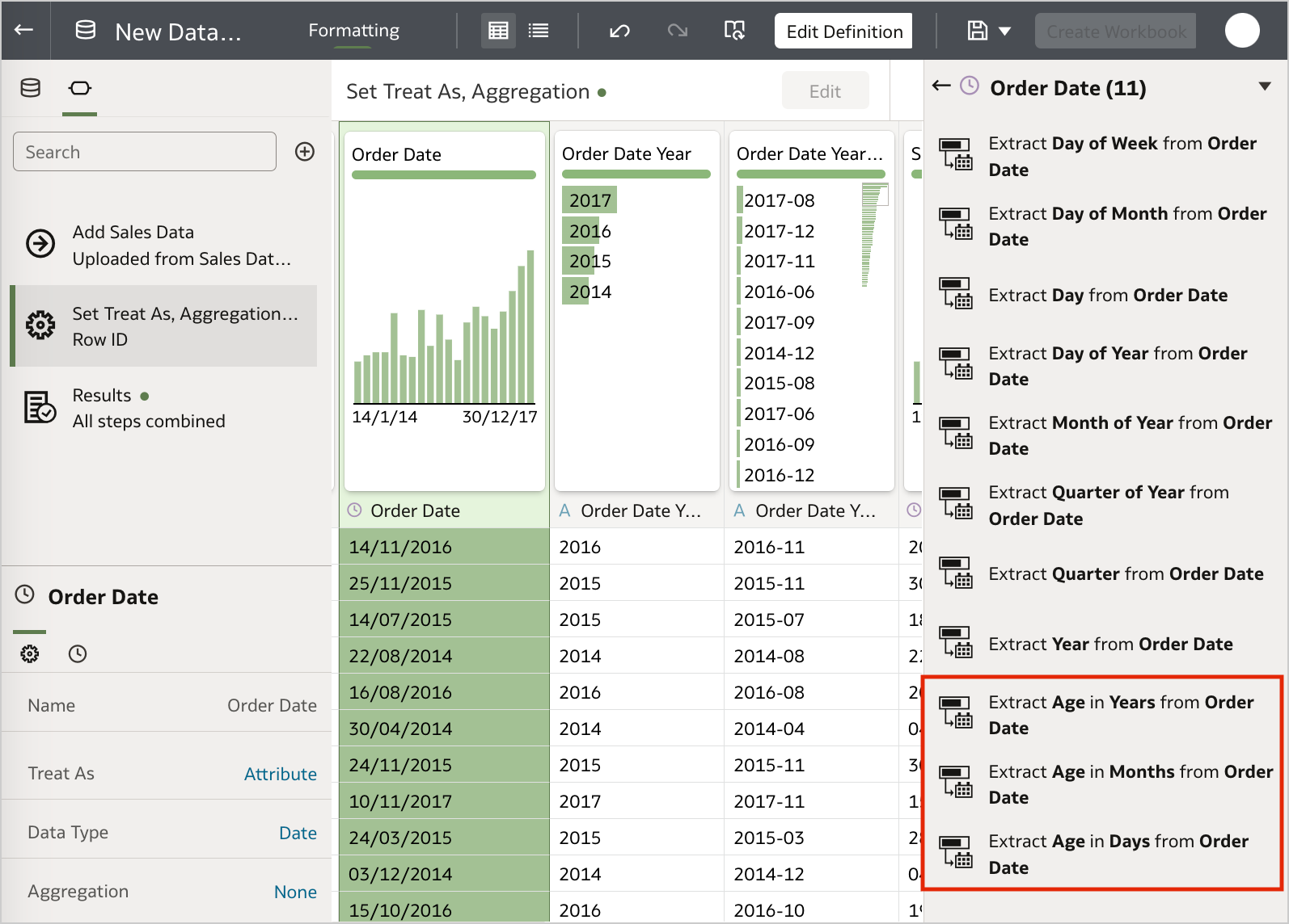
Oracle Analytics Cloud is now able to provide recommendations to enrich your datasets with time durations (Figure 4) by comparing date columns with the system date. This feature literally allows any user to calculate things like the number of days since the order date and assign new data into bins with a couple of links. Moreover, the duration values get updated automatically!
Improved Experience for the Grammar and Properties Panels
The Properties panel has been removed from the Data panel and is now adjacent to the Grammar panel on all workbooks (Figure 5). This is definitely a smart move since it allows content authors to display most options in a single screen without scrolling. The only downside is that you can't have the Grammar and Properties panels available at the same time: in order to display the Properties panel you have to click on the Properties icon and this will hide the Grammar panel.
Improved Explain Experience and Segmentation Algorithm
The user experience with the Segmentation tab when you use the Explain feature has been improved through an enhanced algorithm, new configuration settings and the ability to export identified segments to use them directly on canvases (Figure 6).
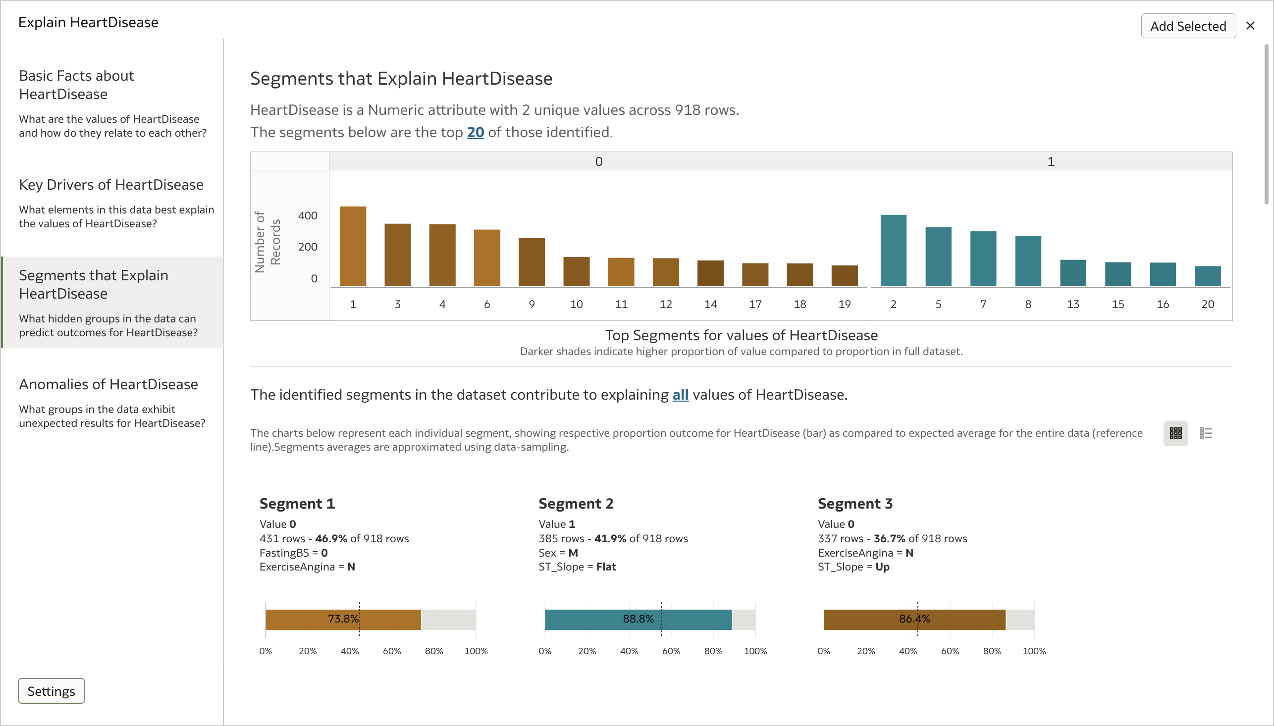
In particular, the user interface allows users to choose how many segments to display and filter them based on target values, specify the number of columns to define segments, the minimum segment size and which columns to use in Explain algorithms.
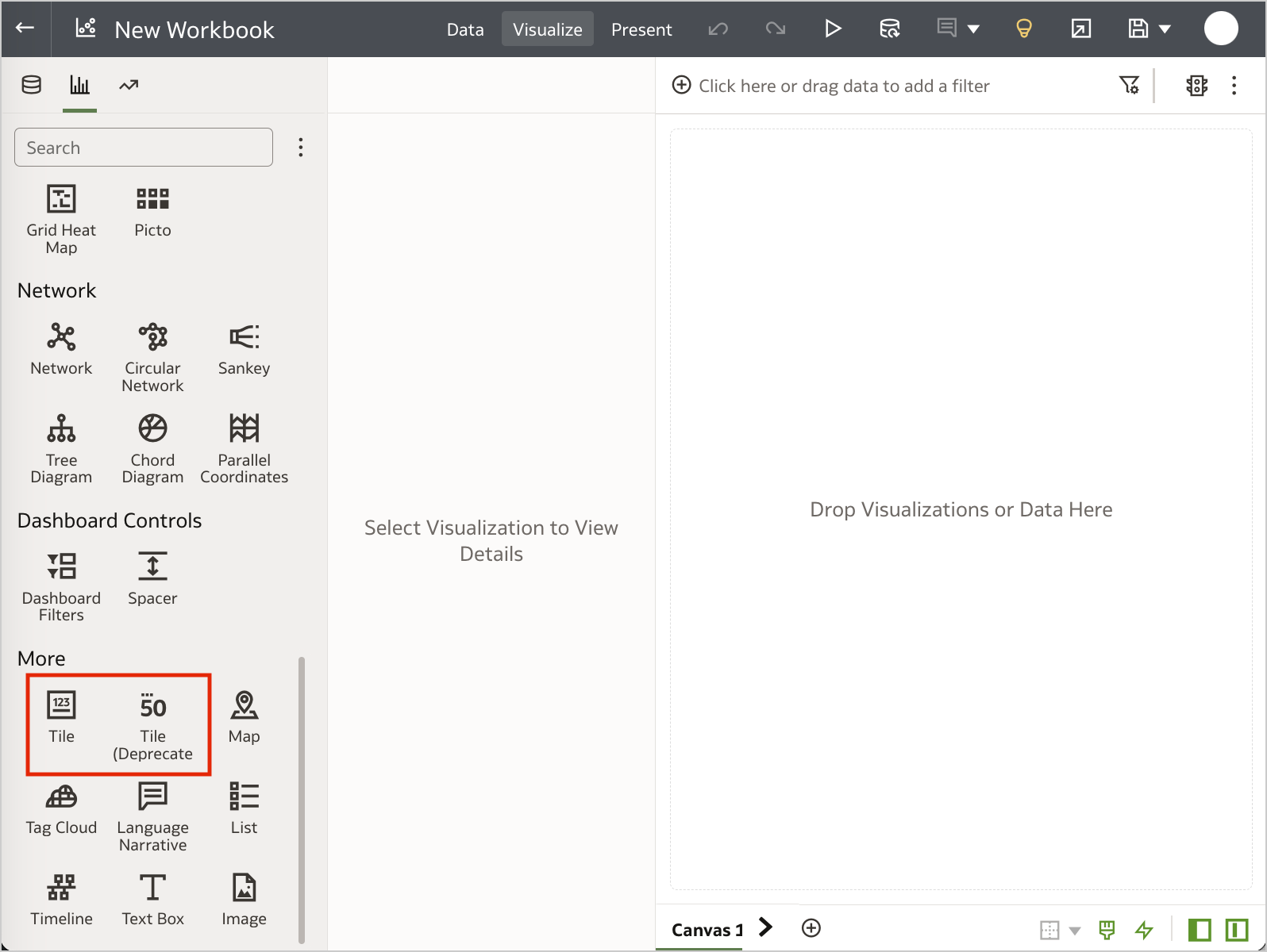
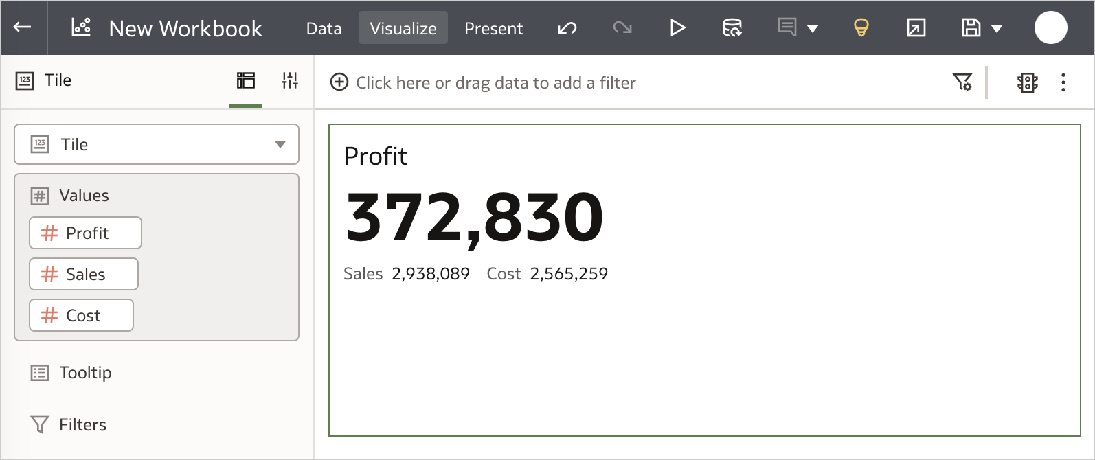
Improved Tile Visualization
A new Tile visualization has been added to the available ones in Data Visualization. The previous version of the Tile visualization is still available, but it has been marked as deprecated and will probably removed in a future release (Figure 7).
The new Tile visualization allows users to include multiple measures (one primary measure and optionally several secondary ones) in order to build and format composite card style visualizations (Figure 8).
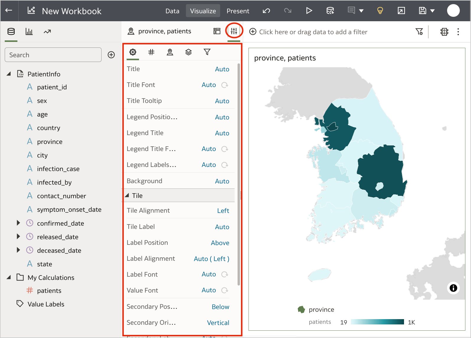
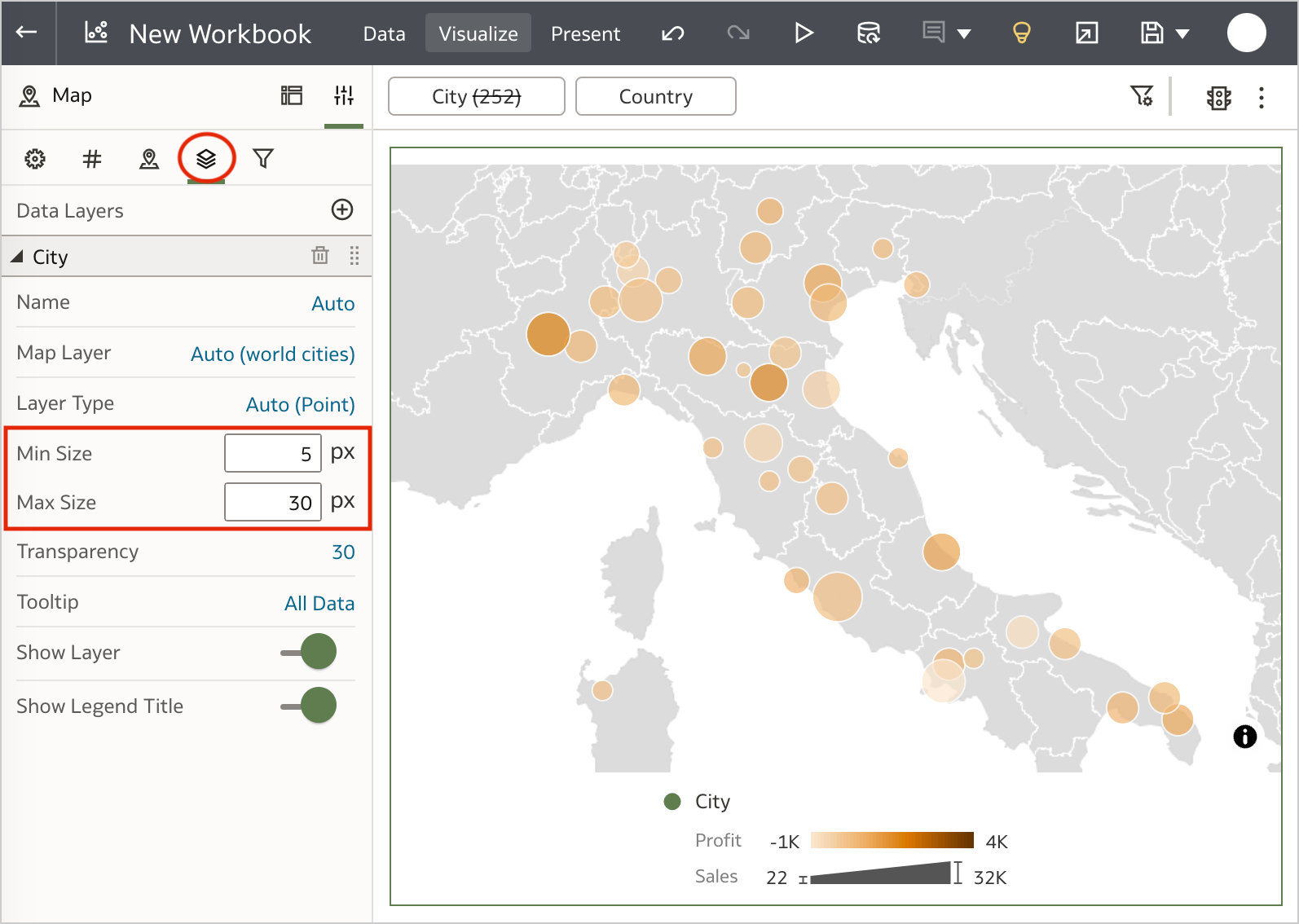
Control Bubble Sizes on Maps
Bubbles are great to display features about individual locations on a map, however, their default size may not be always suitable to properly understand your data. In particular, when the application doesn't allow you to change it as it used to happen in Oracle Analytics Cloud until the January 2023 Update. But now, you can finally set a minimum and maximum size in pixels for these bubbles, to control how cluttered the map looks depending on its zoom level and the density of the locations (Figure 9).
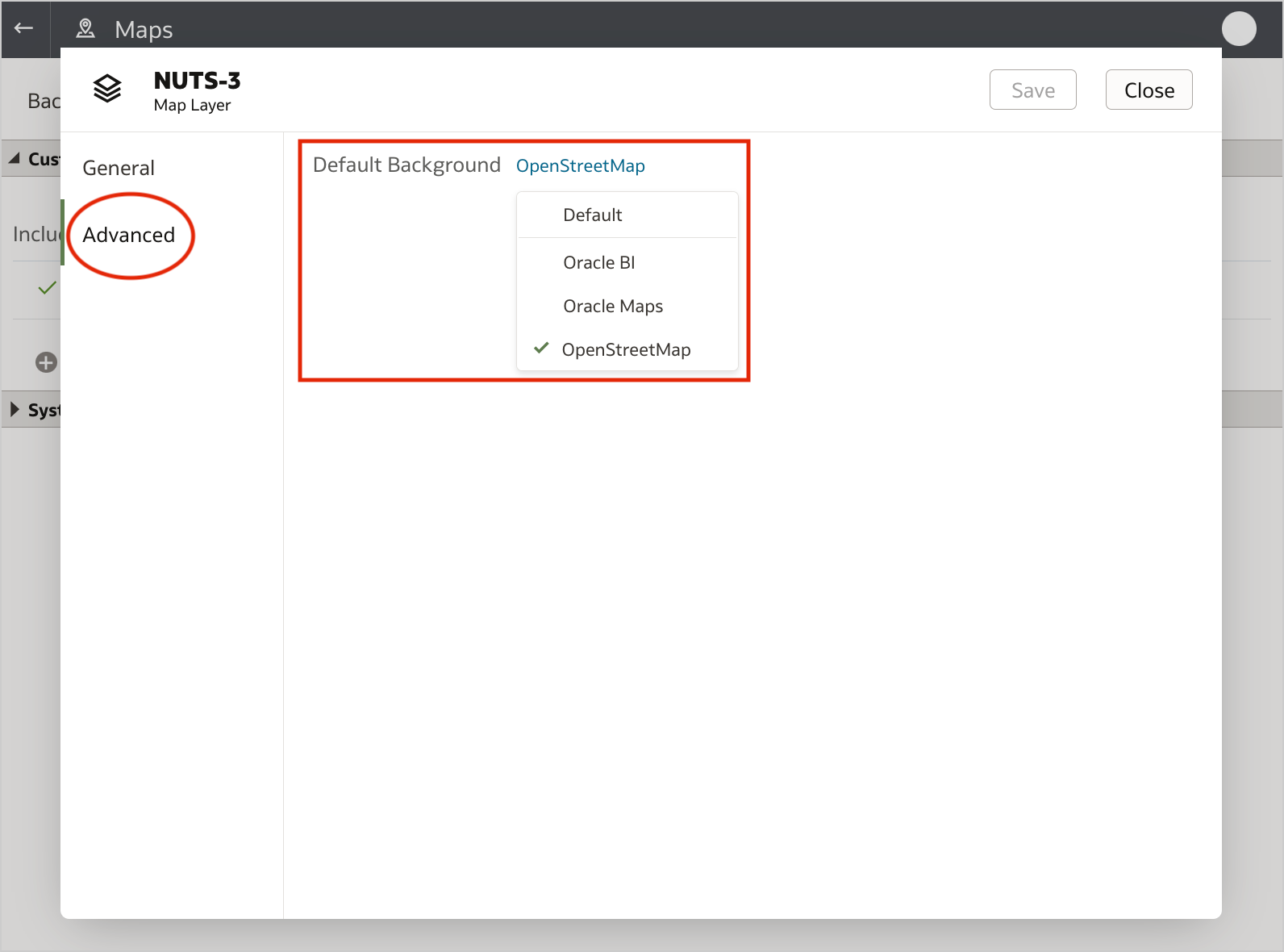
Assign a Map Background to Map Layers
Administrators are now able to assign a default map background to map layers and make it easier for workbook designers to build map visualizations. Whether you are importing a new custom layer or inspecting an existing one, it's sufficient to display the Advanced tab to find the Default Background setting and update it (Figure 10).
Configure the Grid Spacing Between Visualizations on the Canvas
When the canvas layout is in Freeform mode, content authors can click on the Toggle Grid Guidelines icon at the bottom of the page to display a grid on the canvas and configure the spacing of visualizations (Figure 11).
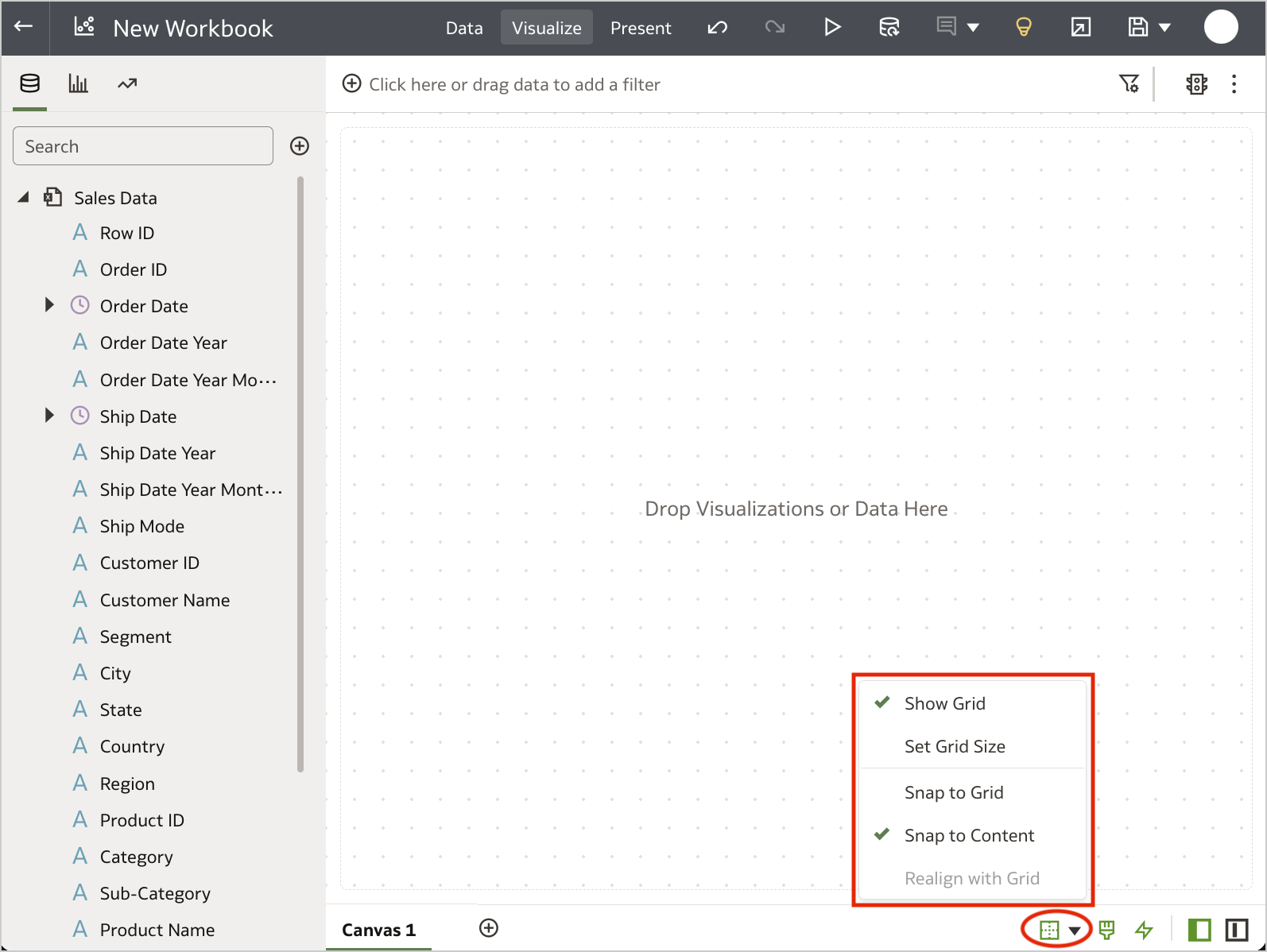
Users can set the grid size (i.e. the distance in pixels between each snap point in the grid) and choose whether to snap visualizations to the grid or not (Snap to Content, the default). This feature results particularly useful when developing a workbook that must fit specific dimensions in order to be embedded into an external portal.
Post-Logout Redirect
The System Settings page contains a new Post Logout Redirect URL security options which allows administrators to specify the URL users are redirected to when they sign out of Oracle Analytics Cloud (Figure 12).
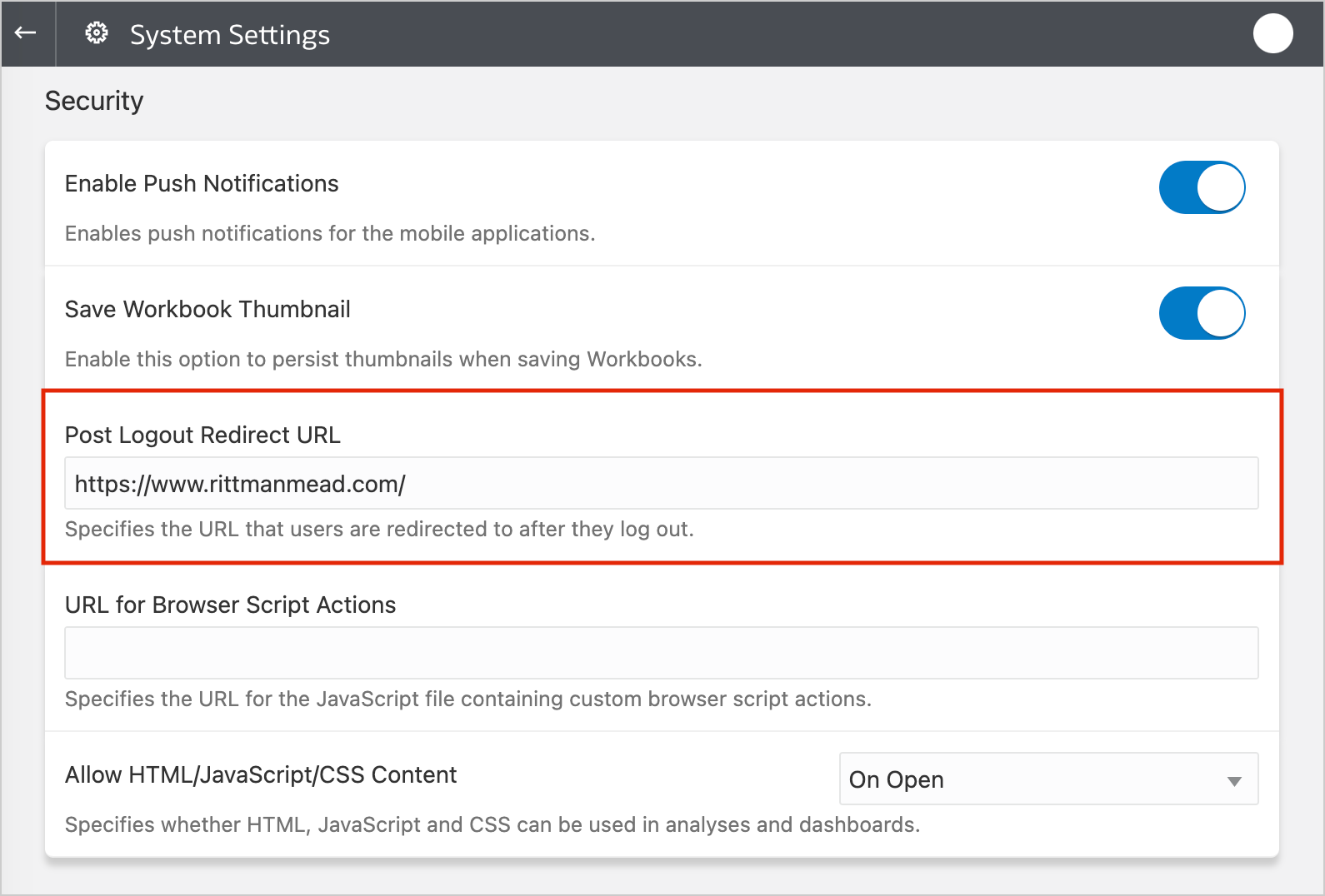
Changing this setting does not require to restart your Oracle Analytics Cloud instance, however, if you created your instance before January 23rd 2023 you have to raise a service request with Oracle Support to make it works.. (-‸ლ)
Other Features
The January 2023 Update also allows users to:
- Connect to Oracle Analytics Cloud from Microsoft Power BI Desktop to analyze data from subject areas
- Add machine learning capabilities to visualizations by consuming OCI Data Science models in data flows
- Add artificial intelligence capabilities to visualizations by consuming OCI Language models in data flows
These features will be further investigated on dedicated blog posts in the next days: stay tuned!
Conclusion
The January 2023 Update includes several new features, enhancements and fixes for Oracle Analytics Cloud that significantly improve the suite.
If you are looking into Oracle Analytics Cloud and want to find out more, please do get in touch or DM us on Twitter @rittmanmead. Rittman Mead can help you with a product demo, training and assist within the migration process.