Extending OAC with Map Backgrounds

One of the really powerful things in Oracle Analytics Cloud (OAC) is the simplicity with which you can create geographical insights using the Map visualisation. I say this as someone who has implemented maps in OBIEE several times and so know the challenges of MapBuilder and MapViewer all too well. It really is a case of chalk and cheese when you compare this to how easy things are in OAC! Well, things just got even better in OAC 5.9. With the introduction of Web Map Service (WMS) and Tiled Web Maps, we can now integrate custom backgrounds to overlay our layers onto. In this post, I will walk through the process of configuring WMS backgrounds and show how this may prove useful to OAC users with a use case based on openly available data sources.
Maps Background
Before we look into these new Map Backgrounds...it's worth taking a moment to offer some background on Maps in OAC. For those of you know how things work, please skip ahead. For those who are new to mapping or who have used Map visualisations in OAC, but never stopped to consider how the data magically appears in your canvas, then here comes a brief guide:
For your data to be rendered on a map, you need three things:
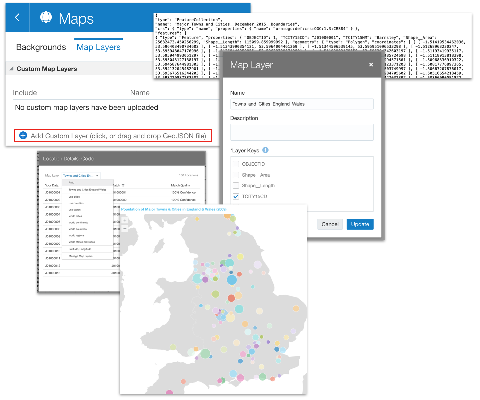
- A Map Layer which defines the geometry of your data. The map layer must be presented in geoJSON format, which defines a series of points or polygon boundaries. The map layer must also include a key, which needs to match the key range in your data set...this is how OAC is able to interpret your data as relating to a specific point or space on the map layer.
- A Background Map, which is basically an image that sits behind the map layer and provides context to it. This would typically be an outline map of the world or it could have greater definition if that is helpful.
- A Data Set that includes a key attribute which relates to its geography. This may be as simple as a country code (or name) or it could be some form of surrogate or business key. When you use this data set to create a Map visualisation, you can allow OAC to determine which map layer to use (based on a comparison of the key in the data set with the configured keys in the available map layers) or you can specify the default layer to be used by setting the Location Details when preparing the data set.
Both Background Maps and Map Layers are configured within the OAC Console. Out of the box, you get a set of useful backgrounds and layers provided, but you are also able to configure your own custom layers and backgrounds. Once set up, they become available for users to select when they create a Map in their DV Canvas.
There's quite a lot to unpack here, including how you can source your geoJSON map layers (either from open sources or via SQL if the geometry data resides in your database), how to add custom layers, how to assign default layers and how to manage the join quality to ensure your visualisation is presenting the right data. Too much to get into here, but I may return to the subject in future - let me know if this would be useful to any of you!
Back to the Map Backgrounds...
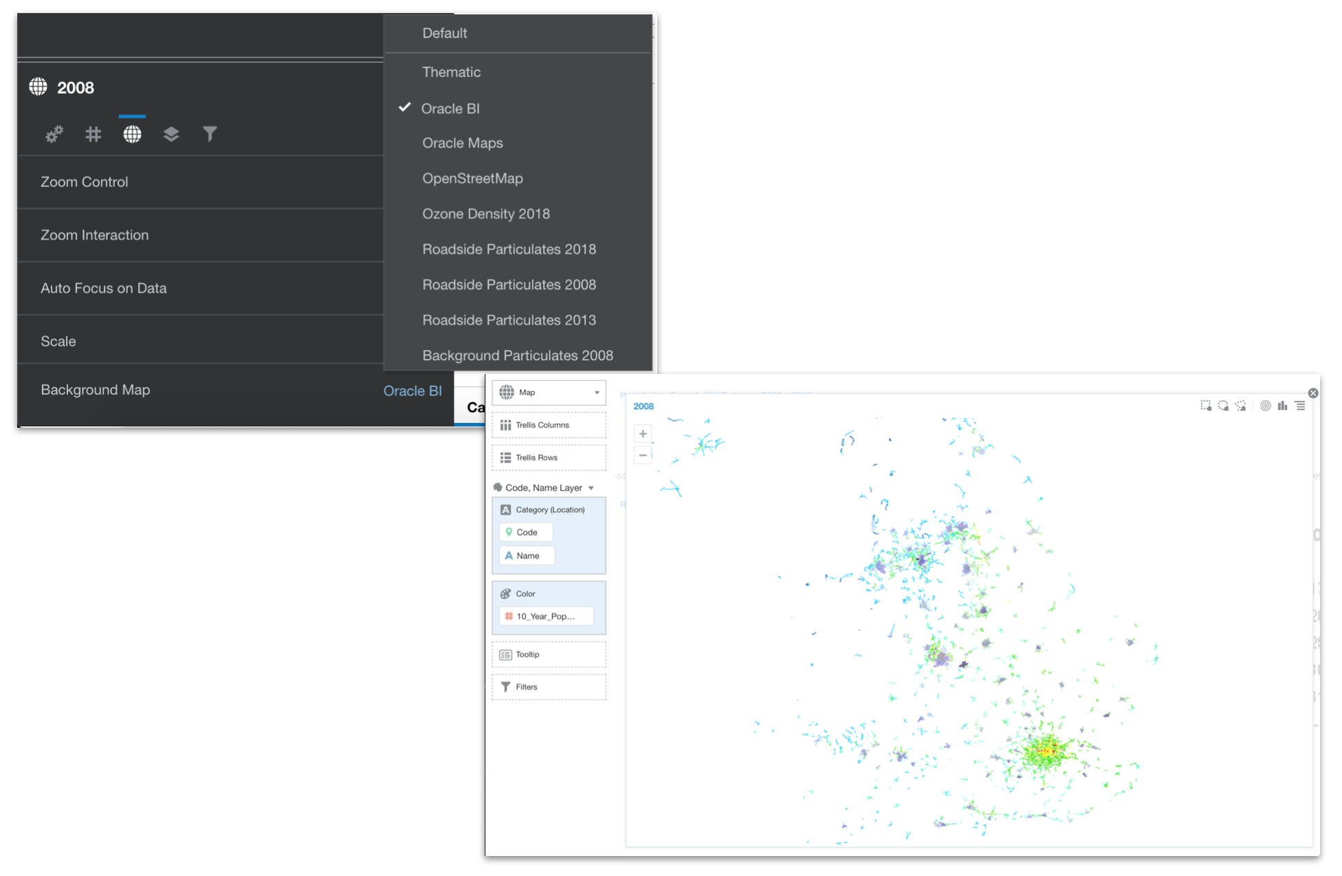
So, OAC provides you with three generic Background Maps out of the box:
- Oracle BI - a clean, silhouetted but coarse grained background map which provides differentiation of country boundaries
- Oracle Maps - a more detailed map which includes road networks, watercourses, national parks, place names etc.
- OpenStreetMaps - an open source background with similar detail to the Oracle Maps background, but a slightly more neutral style
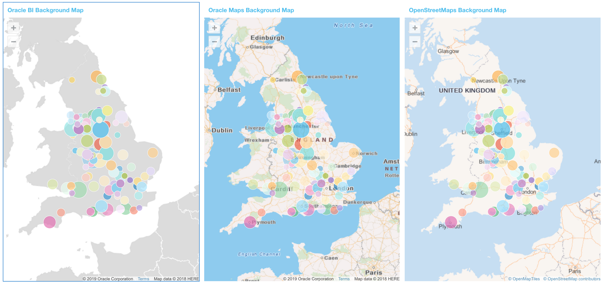
The key thing for me, here, is that the options range from coarse grained to extreme detail, with not much in between. Plus, plotting data against a map that only shows physical infrastructure elements may not be relevant for every use case as it can easily complicate the picture and detract from the user experience.
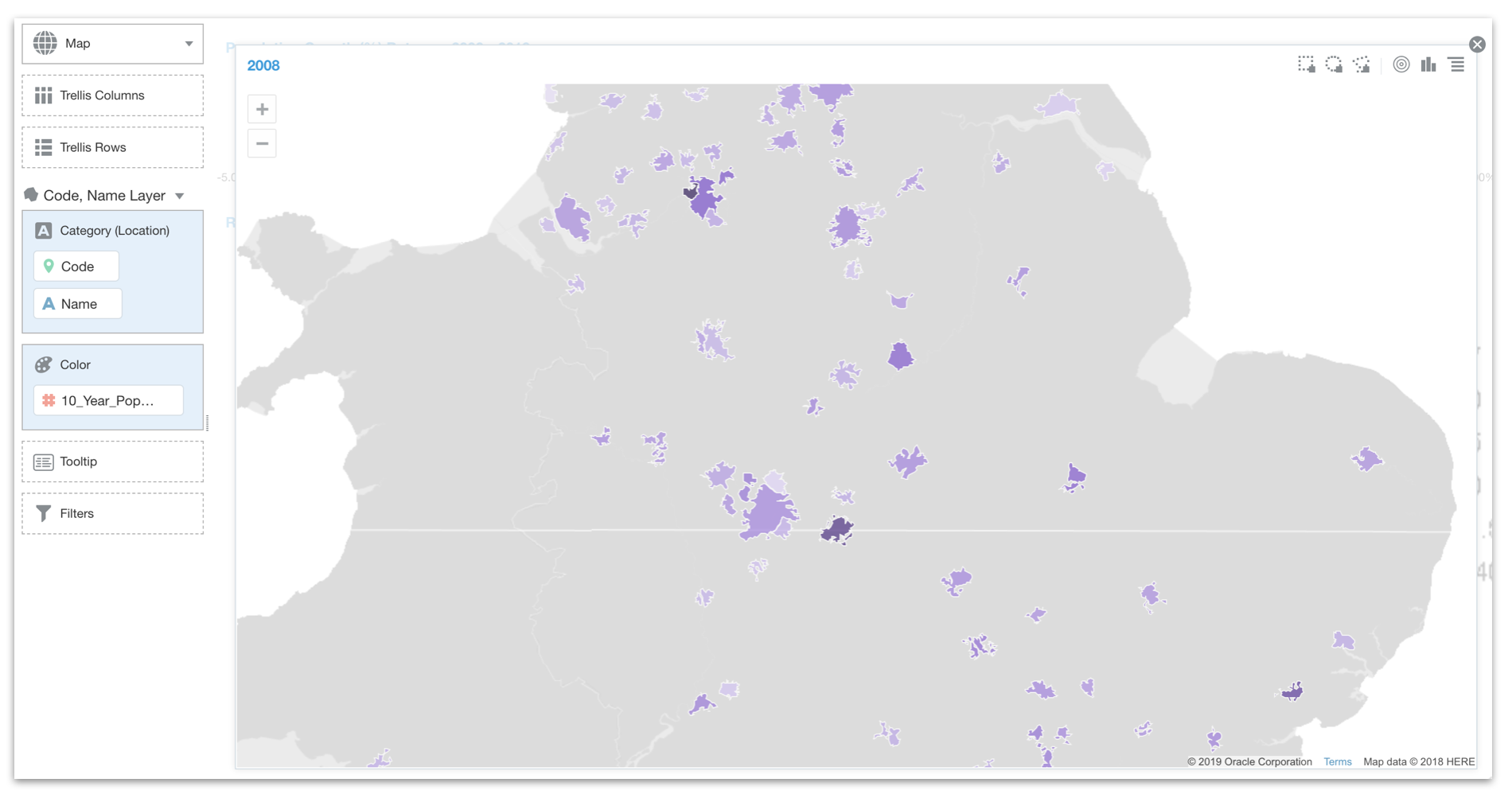
What if I have a data set as per the one shown above (which gives me population and population growth for major towns and cities in England and Wales) and I want to present it in on a map, but in a way that will help me understand more than simply the geographical location? Well, the good news is that there are a growing number of open data map service resources that offer us a rich source for background maps. The better news is that from 5.9 onwards, we are now able to integrate these into our OAC instance and make them available as background maps. Specifically, we are able to integrate Web Map Services (WMS) and Tiled Web Maps.
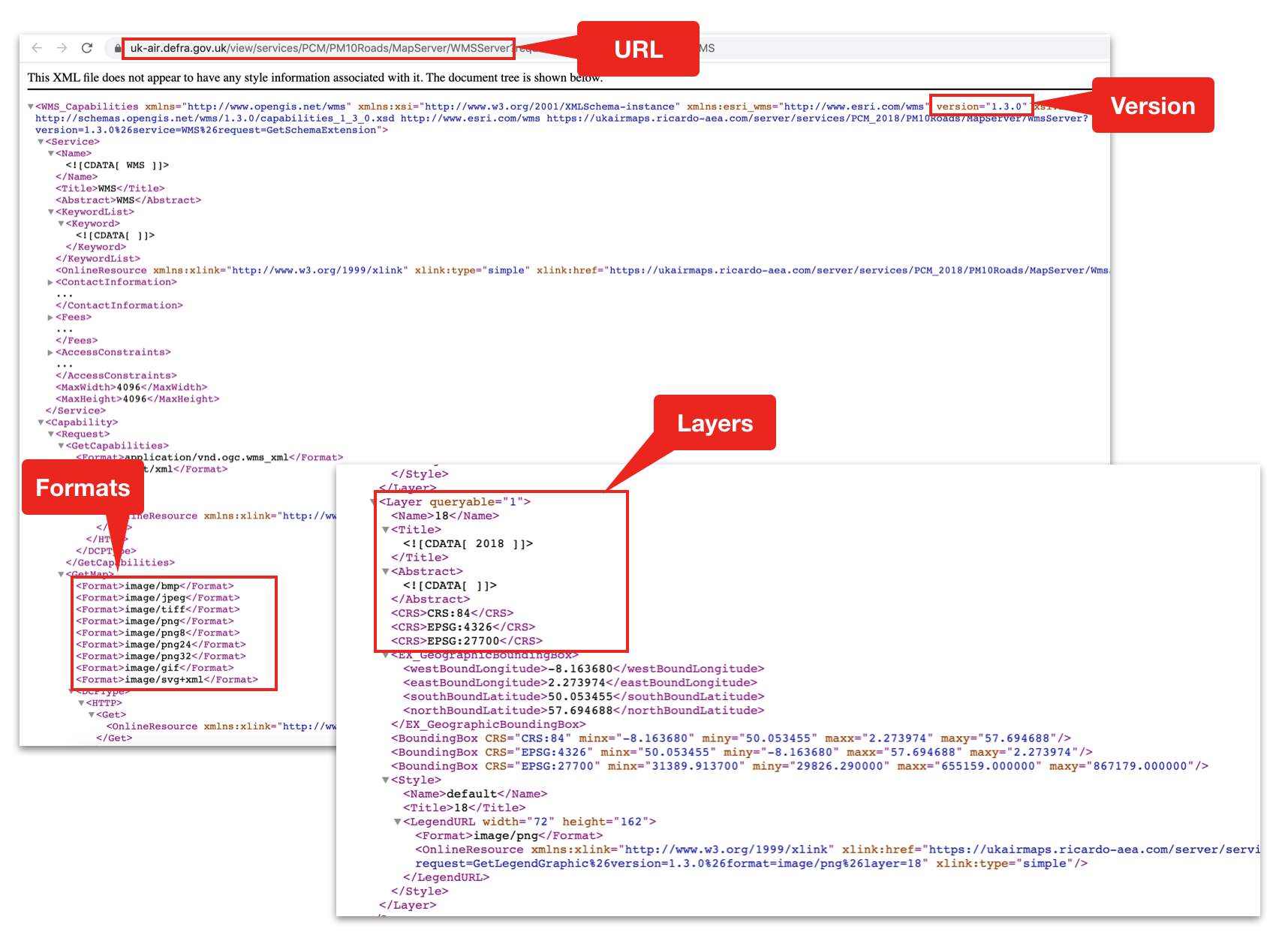
WMS is a universal protocol introduced by the Open Geospatial Consortium and serves as a standard through which providers can make map details available and end user applications can request and consume the maps. The service consists of a number of different request types, among which the GetCapabilities request provides important details needed when integrating into OAC.
Taking my scenario as an example, and using the openly available UK Air Information Resource, we will look at how we can use this new feature to help us better understand the effects of population growth on air quality.
Understanding the GetCapabilities Request
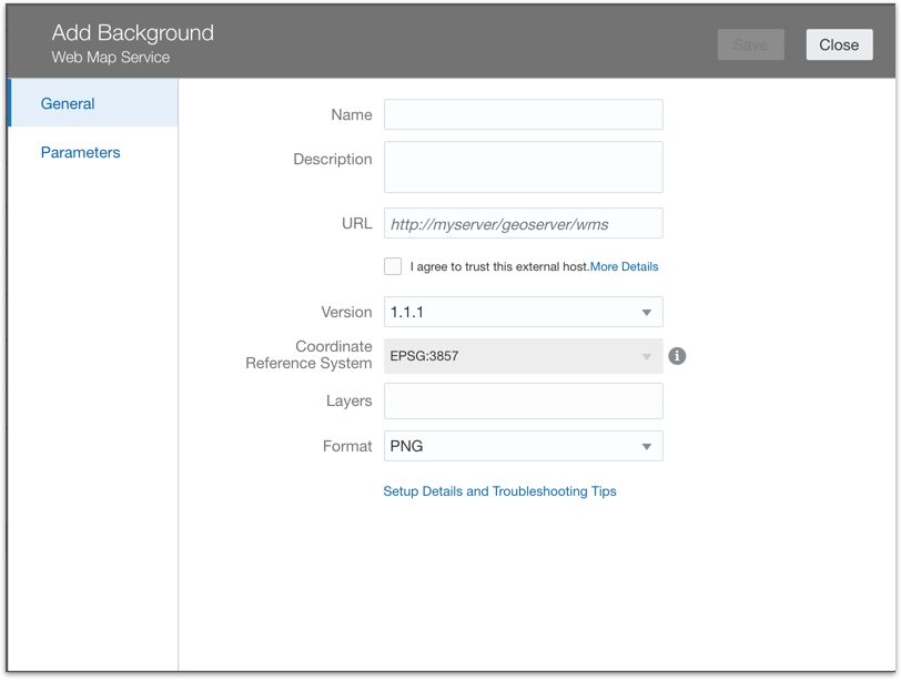
As mentioned before, the Background Maps are configured in the OAC Console, under the Maps option. Navigate to the Backgrounds tab and select the Add Background option. As you can see, we have two new options available to us (Web Map Service and Tiled Web Map).
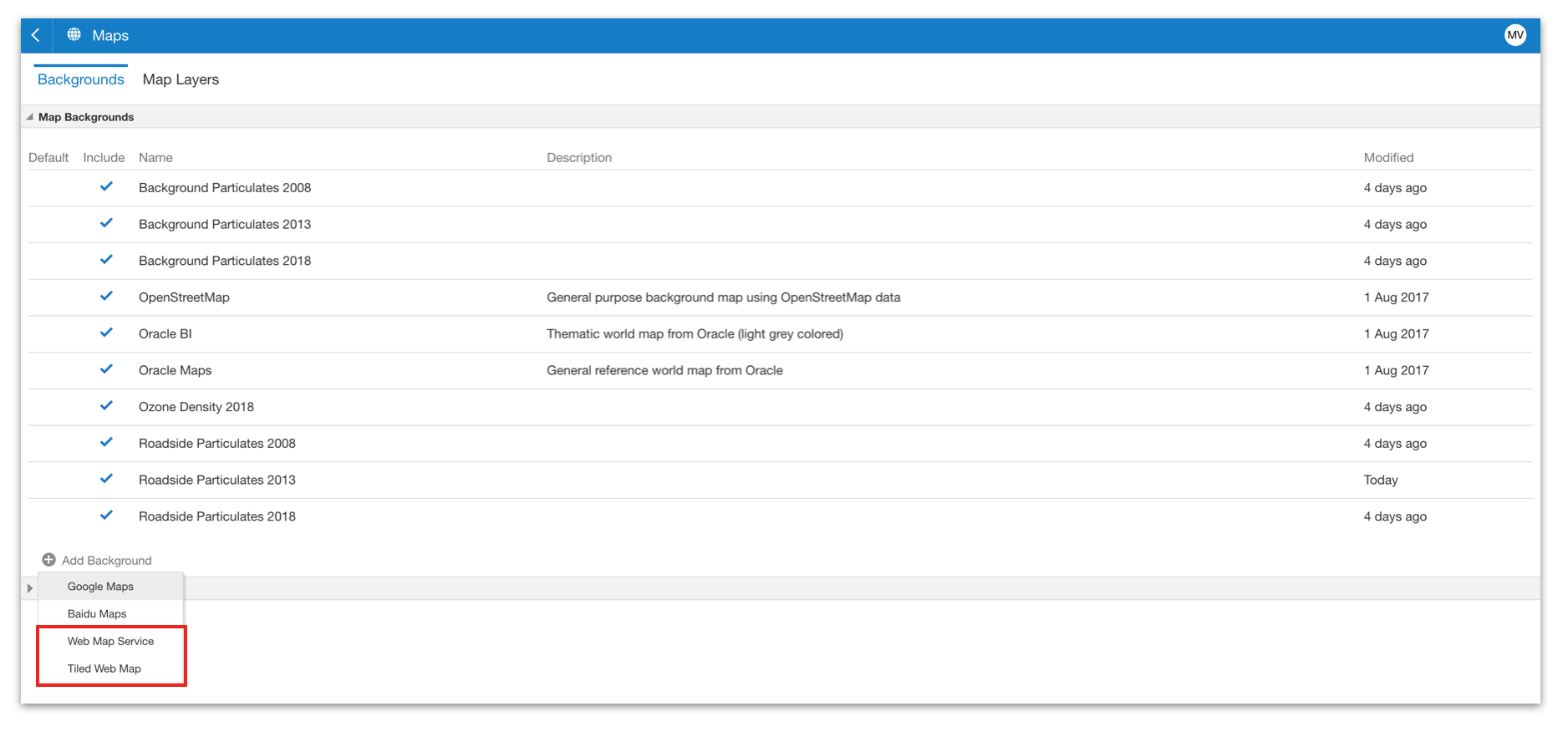
Selecting the Web Map Service option presents us with the Add Background dialog box, where we can configure the map integration. You can see below that we need to provide a name for the background (this is the name that end users will identify the background by in DV) and an optional description. We also have some options that we need to derive from the map service, namely:
- URL - this is the URL for the server hosting the may service
- Version - this specifies the WMS version in use
- Coordinate Reference System - this is a standard value and cannot be modified
- Layers - the WMS service may support multiple layers, and here we can specify the layer(s) that we want to use, based on the layer name.
- Format - the type of image that will be rendered when using the background
All of this information can be derived using the map services GetCapabilities request, which is an XML document that describes the definition of the service. Hopefully, your WMS provider will make the GetCapabilities easily available, but if not (and you know the URL for the host server) then you can pass the request=GetCapabilities parameter for the same result.
Once you have provided the required values, you must finally accept the trust statement (which will automatically add the host site to the Safe Domains list). After saving and a quick refresh, you should be able to inspect the new background and get a Preview. I've found it useful to do this up front, just to validate that the integration is working correctly.
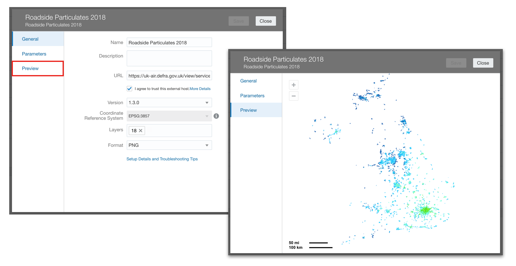
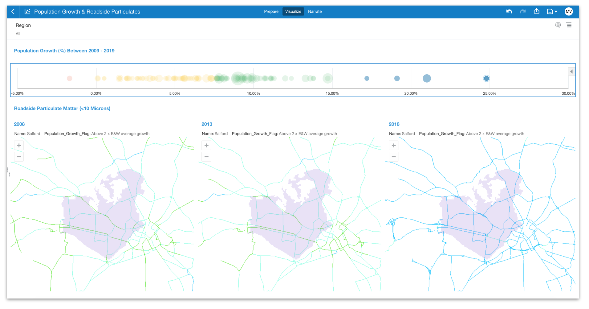
In my scenario, the WMS provides discrete layers for every year from 2001 to 2018. As my data set shows population growth between 2009 and 2019 and I want to see if there is any relationship between population growth and the changes in air quality over time, I have created three separate background maps showing snapshots at 2008, 2013 and 2018.
Now...once we've completed this set up (and assuming we have already created any custom Map Layers and have our Data Set to hand), we have everything we need to begin building some insights.
Using the Map Backgrounds in DV
My hypothesis is that population increase will result in greater use of the surrounding road networks and there should, therefore, be an increase in recorded roadside particulate levels. Obviously, there are other offsetting variables, such as the change in vehicles (cleaner technology, electric cars etc.) and societal changes towards a greener environment. I'm interested to learn something about the balance of these factors.
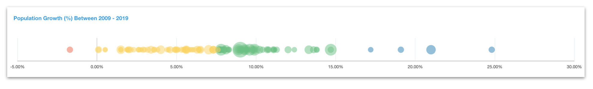
To start with, I will use the data set to identify the range of population growth of each town/city by way of a simple scatter graph. I have assigned colour based on a growth classification and, as well as plotting the growth %, I am using size to represent the base population. To save space, I am plotting data on the X Axis rather than the Y Axis. The end result looks like this:
Next, I create a map using the key element (Code), the Name of the town/city and the population growth measure. The appropriate map layer is selected (as I have already specified the default Location Details for this data set) and it is displayed on the Oracle BI background.
Now, instead of using the Oracle BI background, I am going to switch this to use the WMS based background I have just created...a simple case of navigating to the Map properties tab and selecting the appropriate background from the list.
This doesn't look great when viewing the entire data set, but I am more interested in looking at individual locations. I also want to see how the situation has changed over time. I therefore create two duplicates of the map and change the background to reference the 2013 and 2018 snapshot maps respectively (which, remember, simply pick up different layers within the hosted WMS). I increase the transparency of the Map Layer to 80% (so that I can better focus on the background map) and I switch the Use as Filter setting on my Scatter graph (so that I can use that to focus in on specific locations of interest). The resulting canvas looks something like this:
But...What Does It All Mean?
I can definitely see a change in the roadside emissions, most markedly between 2013 and 2018, but I am missing something important. I have no idea what this change means. Without a legend, I am unable to say whether the analysis supports or contradicts my hypothesis...pretty but also pretty useless!
Luckily, the solution, once again, lies in the WMS service. Returning to the GetCapabilities definition, I can see that each layer includes a <LegendURL> tag which gives me the destination for the legend to the data. A quick check to make sure all layers are using the same legend (thankfully, they are) and an extra visualisation later (this time, an image that references the URL specified in the <LegendURL> tag), I get closer to understanding my data:
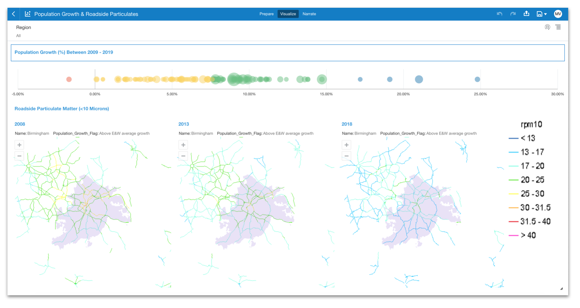
Quite pleasingly, it appears that, regardless of the rate of population growth or the location, there is a consistent reduction in recorded roadside particulate levels.
In Summary
At this stage, it is probably worth saying that technically, it would have been possible to perform this same type of analysis in previous versions of OAC, as it has always been possible to create and overlay multiple layers within your Map visualisation. However, in practice, this particular use case would be impossible to achieve. It would involve carrying the data and the geometries for every single point of every single road appearing in the background map. That would be a lot of data, and even assuming we had it all available to us, it would be difficult to manage and definitely much, much slower to process than calling out to the WMS service and rendering the response images. Not to mention that the geoJSON file for the map layer would likely breach the size restrictions! Using the WMS integration saves us all this pain and opens up many more opportunities.
In fact, I can see some really powerful use cases for this new feature, as it takes the map background away from being a passive component of the Map visualisation and creates opportunities for it to become an active part of the insight process, enriching and adding relevant context to your existing data sets. Hopefully the use case I've presented here sparks your imagination and opens up some new ways of viewing data spatially within OAC.
Footnote: The examples shown above contain public sector information licensed under the Open Government Licence v2.0