OOW2011 : More on the Exalytics New User Interface
One of the key messages Oracle keep putting out about Exalytics, is that they had to provide a new user interface to make best use of the "speed of thought" analytics provided by the product. In particular, a few key new areas were highlighted that were made possible by the in-memory processing provided by Exalytics:
- Auto-suggest for prompts
- Auto-complete for prompts
- "Go-less" prompts
- High-density visualizations incl. microcharts
- Recommendation engine for visualizations
So what in practice does this mean? Oracle PR recently put a number of screenshots of the new user interface up on Flickr, so I'll use these as examples.
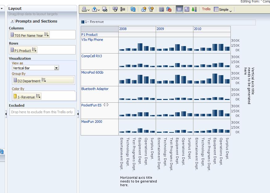
This first screenshot is a good example of the "grid of charts" visualization that Exalytics provides, with each cell in the grid showing its own chart.

Now where I think Oracle are coming from here is the Edward Tufte-inspired sparkline idea, where a single visualization contains small, succinct micro-charts of information, to show stock movements over a time period, for example. I'm not sure what Exalytics is doing, in taking a regular chart and just miniaturising it, then placing it in a trellis of other charts, is quite what sparklines are all about, but it's a good start and could be useful for certain types of analysis.
Note also the fact that the graph controls have now moved over to the left-hand side of the page, rather than under the chart as is currently the case for 11.1.1.5. I've never been a fan of having controls under the chart as you're often short of screen space here, so putting them on the left by default is an improvement.
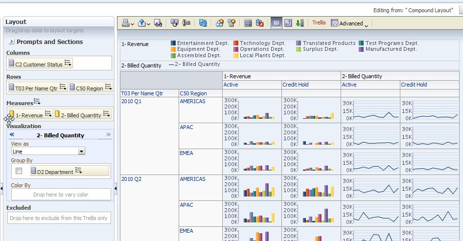
The second screenshot is I think better, and is much more "sparkline-like".

I guess my only concern is whether this type of analysis would always be appropriate; Oracle are also making a big deal this week at Openworld about "big data", and so you can see why analyses like these, displaying large sets of data using lots of small visualizations, would make sense. But my feeling is that the benefit of Exalytics will just be in making regular analyses run faster, and elminate any lag around drilling, analysis, calculations and so on.
For example, if you take this demo by Qlikview, surely the competitor that Oracle were most targeting with this release, their dashboards are far less cluttered and more like the type of dashboard we use now. My design approach with dashboards is to try and reduce complexity, by showing exceptions rather than the full data set, and providing data at a high-level and then the user drill-into more detail, so I'm not sure providing the whole data set, across the whole screen, and then letting the user pick out what's important, is always the best approach.
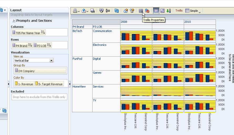
But certainly, there are some types of analysis (typically, the "big data" analysis that Oracle are targeting it at) that would benefit from this, and I also guess that Exalytics, like the iPad, is probably something that makes more sense once you've had hands-on demo and tried it yourself. Here's one more in a similar vein.

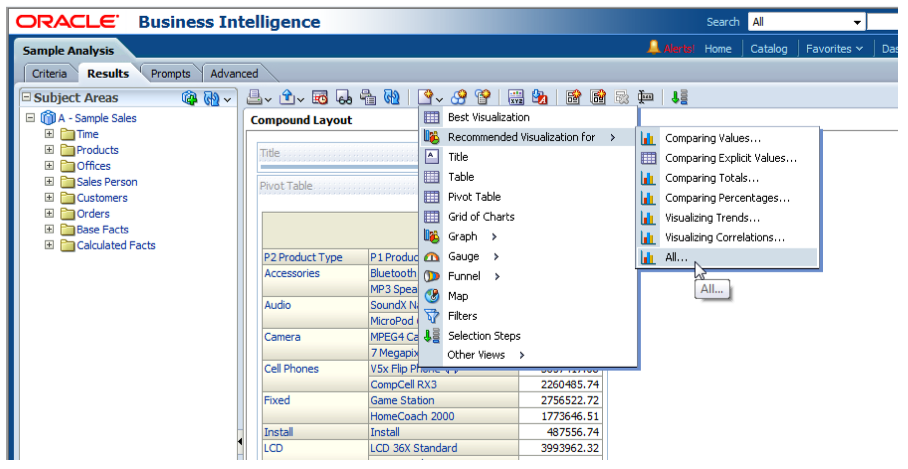
Not in the screenshots but demonstrated at Openworld were the auto-complete and auto-suggest features for prompts. The way this works is that prompts, that have a drop-down menu and free-form text box that let's you search inline for matches, now auto-suggest matches as you type, a bit like the auto-suggest feature on Google. Similarly, when you create an analysis using the Exalytics release, you can ask Answers to suggest the most appropriate visualization based on some heuristics performed by the application, the data you're reporting on and so on.

You can fine-tune this further by selecting a particular type of analysis you are looking to create (compare two numbers, for example), or just let Answers look at your data, the cardinality and so on, and suggest the best visualization for that. Sounds interested, but of course we'll need to see how well it works in practice (i.e., is it Watson, or Clippy?)
It sounds like (though licensing and packaging weren't discussed), that some or all of these visualizations will be Exalytics-only, partly because they will be so I/O intensive that you need an in-memory engine to provide the data, and partly I guess to drive sales of Exalytics. I think we'll hear more about what's in, and what's out, of 11.1.1.6 depending on whether you use Exalytics or not, and I think this may also apply to the TimesTen and in-memory Essbase server that's also been talked about for this release.
Something we've not got screenshots of but that also looked interesting, was the new UI for the Mobile product. The 11.1.1.5 release of OBIEE 11g introduced a new iPad client, which though good was a bit limiting and also suffered from a few usability issues where it hadn't properly adopted the native UI elements for IOS. This new release takes a fresh look at this, includes a coverflow-style dashboard picker, and implements prompts properly by using native IOS controls. I didn't get any hands-on time myself, but this looks like a good upgrade on the initial, 11.1.1.5 release.