Insights - An Open-Source Visualisation Platform for OBIEE

On and off over the last year, I have spent some time developing a customisable framework for building visualisations and dashboards, using OBIEE as the back-end. The result is Insights, a JavaScript web application that offers a modern alternative to OBIEE Answers. As of today, we have officially open sourced the project, so you are free to download, install, hack and contribute as you please.
The primary motive for building this application was to meet some very bespoke reporting requirements for a client, which I mention in my previous blog describing the prototype. During this piece of work I wrote an object orientated interface for the OBIEE web services. The icing on the cake was tying it into Tom Underhill's Visual Plugin Pack.
You can see more information about Insights in a presentation that I did at the recent UKOUG conference here: Bridging the Gap: Enhancing OBIEE with a Custom Visualisation Platform
Since then a lot of the work has been put in to make it developer friendly, visually appealing and hopefully easier to use. I'll be the first to admit that it's far from perfect, but it should be a decent starting point.
Getting Started
In order to use Insights you will need OBIEE 11.1.1.9 or above. Additionally, the application has only been tested using IE11 or Chrome browsers and so compatibility with other browsers cannot be guaranteed.
First, download the application or fork the Git repository.
There is an installation guide in the project at docs/installation.html. Follow this guide to deploy the application on your OBIEE server.
Demo
This is a quick step-by-step demonstration creating a basic dashboard, showing off some of the features in the application (apologies if the GIFs take a while to load).
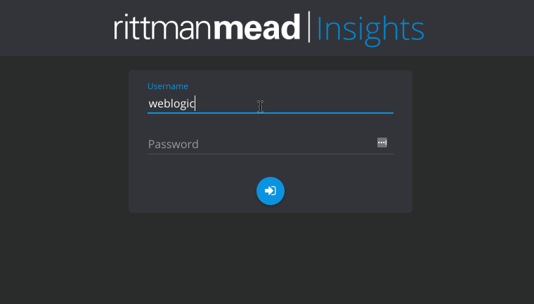
First you log in, using your usual OBIEE credentials. The homepage shows some pre-configured dashboards here, but we're going to click the pencil to create a new one.
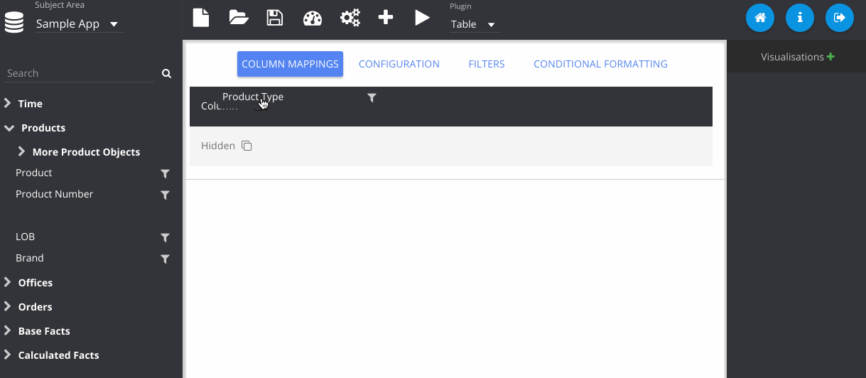
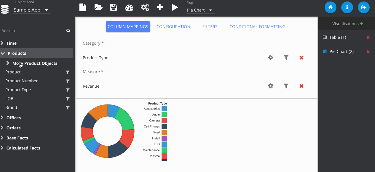
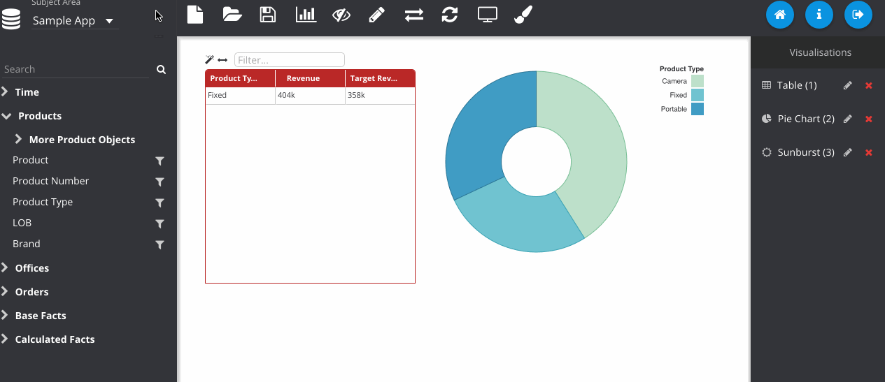
Next I've dragged in some columns from my subject area, Sample App and run the query, displaying the default table plugin.
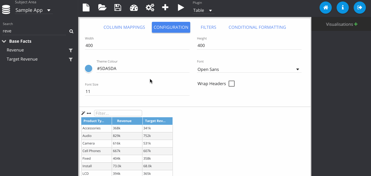
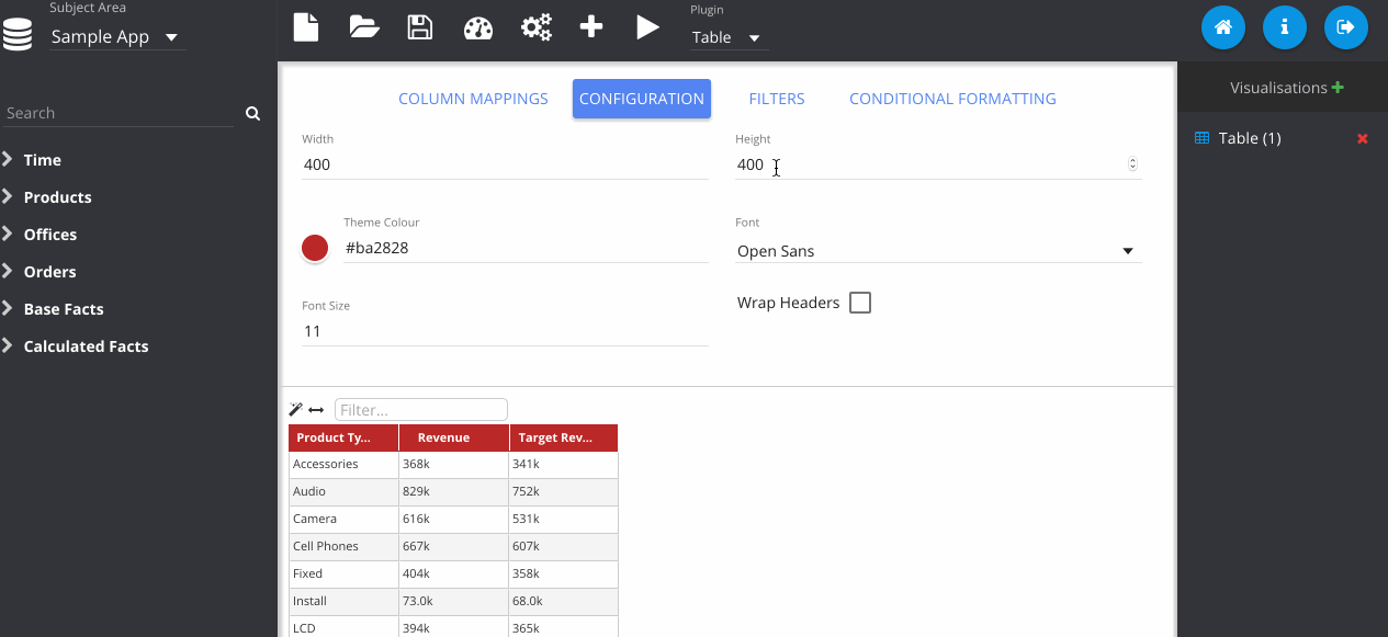
In this step, I've gone to the configuration tab, and changed the colour of my table.
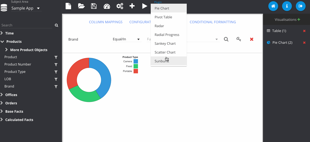
Now I change the plugin type using the drop down menu at the top. Notice that my previous table visualisation gets stored on the right. By clicking the Store button manually, it also adds my new pie chart. Then we can flick between them easily.
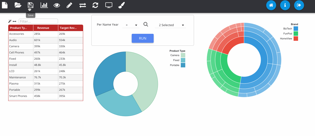
Filters can be added by clicking the icon next to the column on the subject area panel.
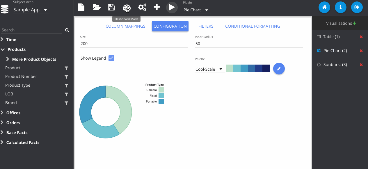
Adding in a sunburst chart, and playing with some of the colours here.
Now we have our visualisations, we can begin constructing our dashboard. You can freely move around and resize the visualisations as you choose. I recommend hiding the panels for this, as the full screen is much closer to what users will see when viewing the dashboard.
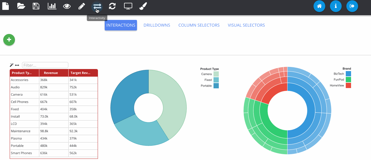
The next GIF shows the interaction framework, which can be used to implement UI features where the user interacts with one visualisation and another visualisation on the page reacts to it. In its most basic form, each plugin type can be filtered - where OBIEE runs the query again. Although more complex reactions that are specific to a certain chart type can also be configured, as seen below with the sunburst chart.
Dashboard prompts can be added by clicking the filter icon next to one of the RPD columns. Any visualisations using this subject area will respond to the prompt. The prompt box can be freely placed on the canvas like any other object.
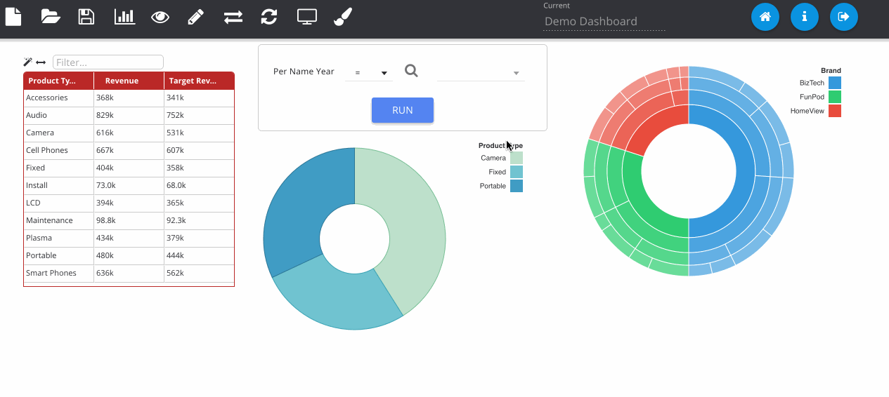
Finally, we can save the object to the web catalogue. This saves as a hidden analysis object in the OBIEE web catalogue and contains all of the information to recreate the dashboard when loading. All OBIEE security features are preserved, so users will only be able to access folders and reports they have permissions for.
Finished dashboards can be viewed in the application once they have been saved. The dashboard viewer will show all dashboard objects in that folder as different pages, available from the left pane. Images can be exported to PNG and PDF as well as data from the visualisations exporting to Excel and CSV.
So How Do I Learn More?
The slides that I did at UKOUG describing Insights give a comprehensive overview of the design behind the tool. You can find them here.
Summary
In a nutshell, those are the main features of the application. Feel free to try it out and have a read through the documentation (available through the application itself or offline as HTML files in the docs directory).
As an open source application there is no official support, however if you experience any bugs or have any requests for enhancements, please post them on the issue tracker.
We hope you enjoy using the app and if you would like to enlist our expertise to help you deploy and develop using this platform, feel free to contact us to discuss it further.