OAC 5.9 - A Tour of the UX Enhancements

Now that we are nicely settled into 2021 (Happy New Year, by the way!), it's time to roll our sleeves up and take a look at the latest release from the Oracle Analytics team: Oracle Analytics Cloud 5.9. Whenever a new release arrives, there is often a clamour for the new functionality that it brings and whilst 5.9 introduces some interesting features that open up new opportunities for analytics users, this is not what caught my immediate attention.
I will take a look at the new features in due course, but in unpacking 5.9, I was first struck by the enhancements in user experience. UX - a tricky to pinpoint combination of efficiency, convenience, intuitiveness, comfort, productivity and emotion - is often the biggest driver of how well a system is adopted. So, it is essential that these things don't get overlooked and it's good to see that they have not been in 5.9. Even though they might seem trivial when considered in isolation, sometimes...
...it's the small things that make a big difference
If, like me, you've spent some time working with DV, you've probably spent a portion of this time watching the blue progress bar jump to 90% and then waiting for the processing to complete and the visualisation to render. You've also probably been caught out once or twice not noticing the blue bar and thinking that the visualisation in focus is displaying the refreshed results. This can be frustrating and so I was pleased to see that this has been updated in 5.9. The blue bar has been assigned to the dustbin and replaced by a spinning wheel which appears when you roll your mouse over a particular visualisation. More importantly, during refresh, the stale visualisation is no longer shown and the visualisation is only displayed when the refresh has completed. To me, this is a more elegant approach for a couple of reasons: firstly, it removes the trap described above - you can be confident that when you see a visualisation displayed, you are looking at the latest, freshest output. Secondly, if you have multiple visualisations on your canvas, your attention is actively drawn to visualisations on completion, allowing users to focus in on what is immediately available, rather than waiting until all visualisation are refreshed. Confusion reduced, efficiency increased.

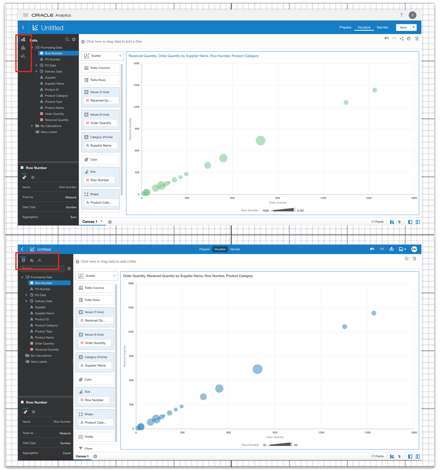
It's always important that the interface is as clean and simple as possible and, when space is at a premium, maximising the area for building and working with your visualisations (aka the canvas) is essential. This has been addressed in 5.9 by a really simple change: in the left-hand panel, the Data, Visualizations & Analytics tabs have been switched from a vertical layout to a horizontal layout, now appearing at the top, above the search bar. Add this to the simplified header (without the Oracle Analytics header and the Project header minimised) and the result is quite noticeable. Again, nothing mind-blowing, but the impact is significant, creating a much cleaner interface with much more of the real estate dedicated to the important stuff.
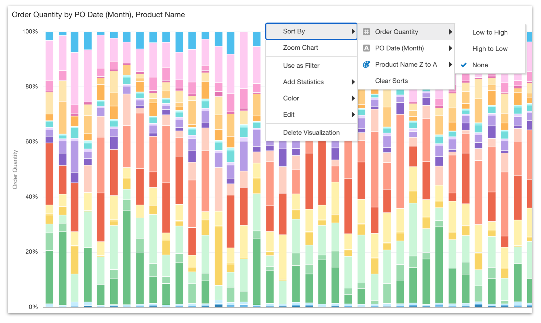
Elsewhere, there are two interesting enhancements as to how we can interact with the Canvas. The first involves sorting data within a visualisation. There is a minor cosmetic change to the way the sort options are presented, with the measures and attributes now being displayed in a nested menu structure rather than a single list. We are still able to perform nested attribute sort ordering or sorting on measure values, but the new menu structure is cleaner and more intuitive, as it also depicts the grammar assignment (colour, size, shape etc.) for each data element. More importantly, as you can see in the screenshot below, we are also now able to explicitly remove sort ordering by selecting None. This removes any default sorting applied to the data when it is added to the canvas.
The second revolves around filtering. You will be familiar with the way that canvas level filters are assigned at the top of the Canvas (via the filter bar), whilst it is also possible to apply filters discretely within any given visualisation (within the Filters assignment). These visualisation level filters get applied in addition to any canvas level filters. However, up until now, the filters needed to be created independently of each other and if you wanted to switch from a canvas level filter to a visualisation level filter (or vice versa), frustratingly, you had to remove and recreate the filters. This has been addressed in 5.9, with filters now being interchangeable, simply be dragging and dropping a created filter from one area to the other. Another nice efficiency saving!
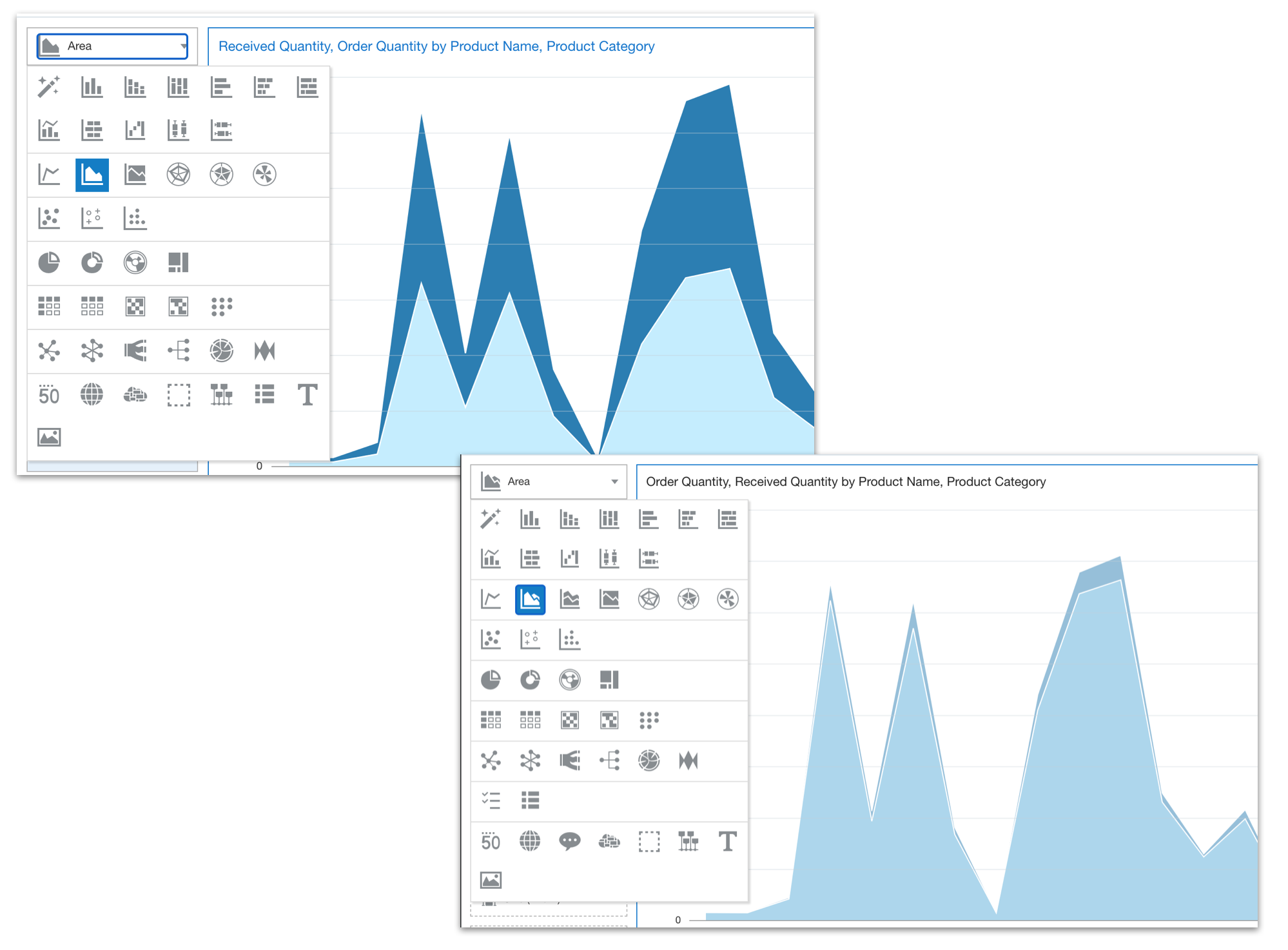
There's not too much to report in terms of new visualisations in 5.9, but we do see the addition of a new area chart option. Previously, we only had two options: Area (pictured below) and 100% Area. Now...the Area option was always confusing to me as it actually stacked measure values, making the Y axis a cumulative scale and not an absolute one. I always found this made it difficult to compare measure values and it was relatively easy to misinterpret the scale. This has been addressed through the addition of the new option (named Area). This allows us to plot our data on a single value scale (Y axis), showing the absolute values as opposed to the cumulative values stacked on top of each other. Conveniently, the areas are displayed with some transparency, as they are overlayed on top of each other and, as normal, these settings can be manipulated through the Properties menu. The old Area visualisation remains, but has been (appropriately) renamed as Stacked Area and the 100% Area option also remains unaffected.
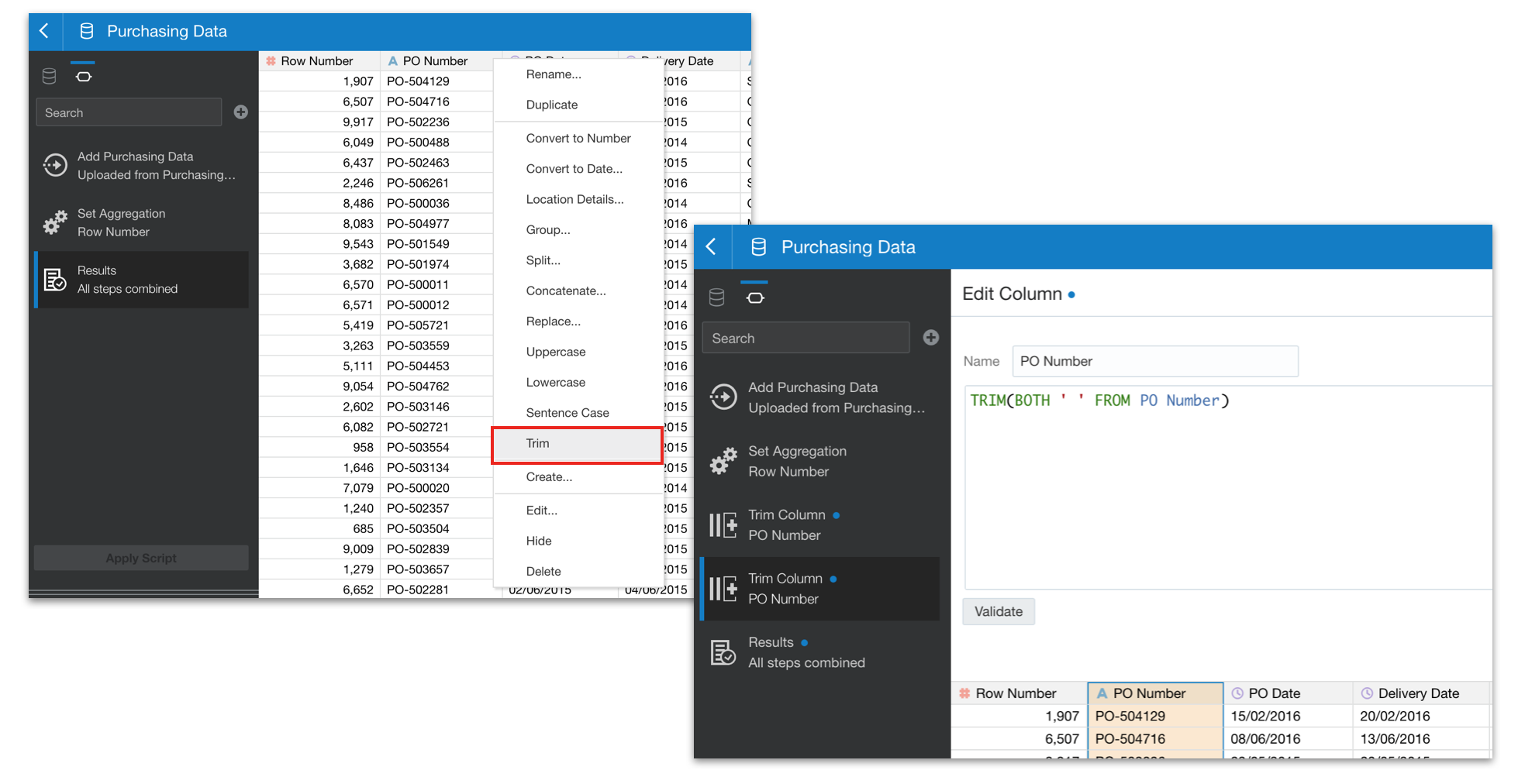
One of the major strengths within DV is the ease with which data can be acquired and loaded, with preparation actions being defined and applied to the data on its journey into the system. The ability to clean source data has been made a little simpler in 5.9 with the addition of a TRIM function which allows you to eliminate any leading or trailing spaces from source data elements. Interestingly, I hit exactly this issue on my current project and, whilst it was simple enough for me to create a custom transformation, I can see how achieving the same result with a single mouse click will be very useful to many self-service users.
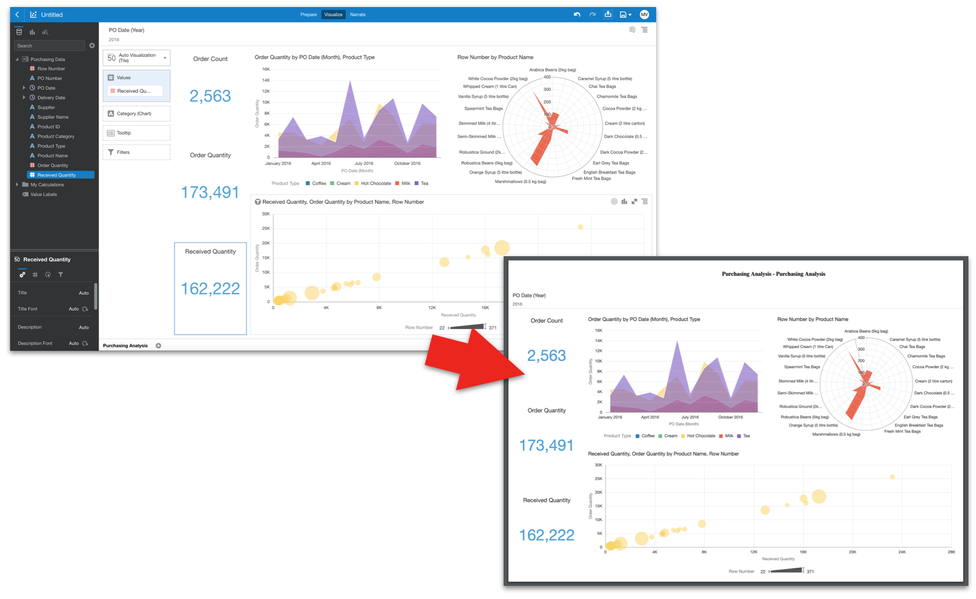
Now, as much as we rail against the thought of users moving data and insight outside of the platform, it is an inevitability that we've all come to accept. It's therefore interesting to see that the classic data download limits (i.e. Enterprise Analysis & Dashboards) has been increased (2m rows for 2-12 OCPU's or 4m rows for 16-52 OCPU's) for raw downloads and for formatted downloads (200k rows for 2-12 OCPU's or 4ook rows for 16-52 OCPU's). There are also some nice improvements to the share/export feature in 5.9, with the outputs to Powerpoint, PDF and Image now being much cleaner. Where previously, the formatting of the exported outputs was a little clunky and often required manual adjustment, in 5.9 the rendered output is much more closely aligned to what you see on your screen when working in DV. Aspect ratios are respected and the end result is all the better for it!
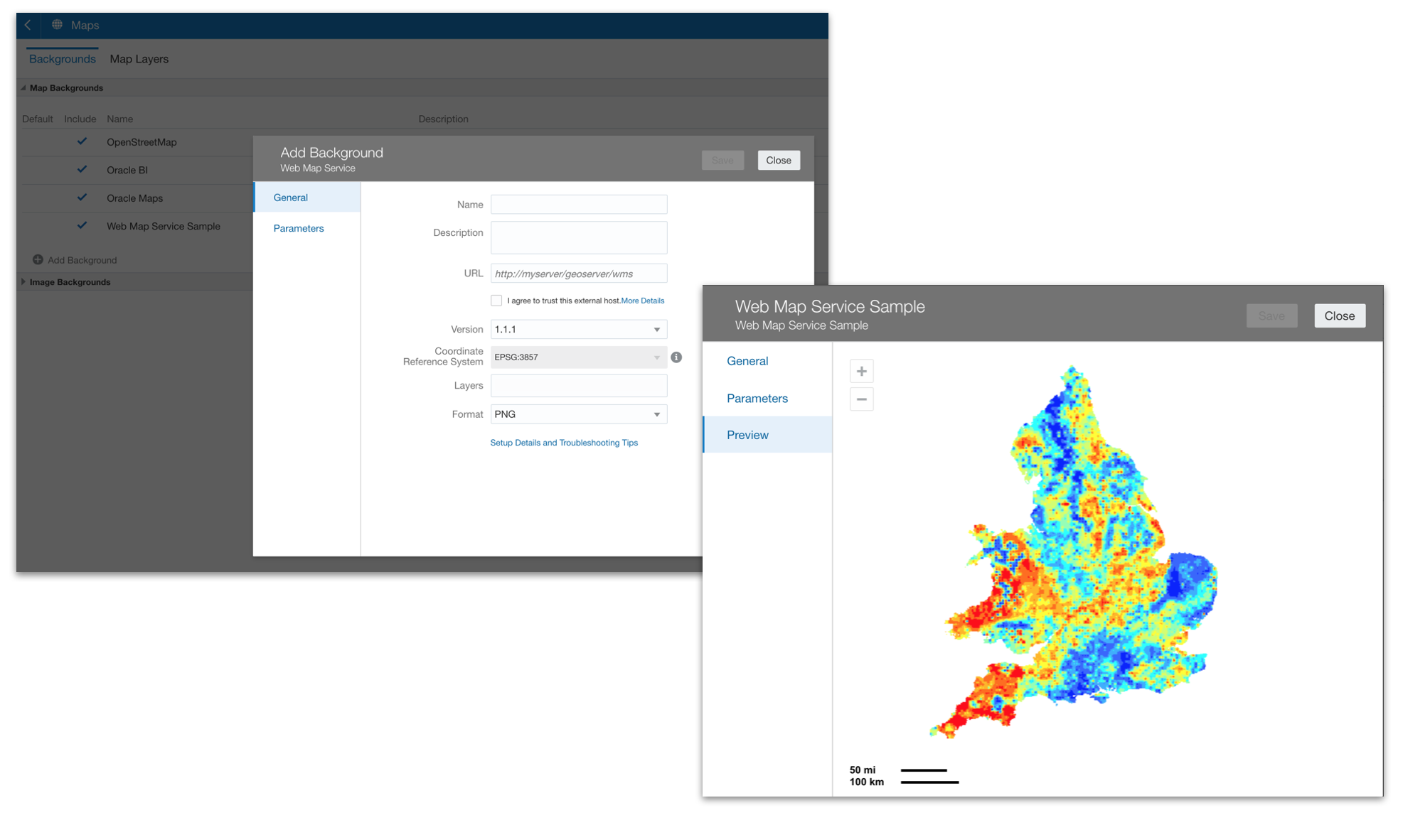
Finally (for now, at least), 5.9 brings us greatly increased flexibility over the ways we can present geographical insights with the inclusion of Web Map Services and XYZ Tiled Web Maps as sources for your Background Maps. This allows you to configure map backgrounds based on integrations with openly available services. Configuration is a relatively simple process and once created the new backgrounds are immediately available for your self-service user community to grab and create map layers over as soon as configured.
In summary, I can definitely see how the enhancements described above will make OAC 5.9 a cleaner, more intuitive platform allowing users to be that little bit more efficient in their work. When aggregated, I think the cumulative effect becomes quite measurable.
Next time, I'll look into these new background map integrations in more detail and also explore the other new features that arrive in 5.9, including some new data preparation actions, assistance in understanding machine learning models and more.
Contact us to understand how our team of OAC experts can help you.