Oracle APEX - Universal theme tip #1 - Grid Responsiveness


I finally had some time to play with the responsiveness in the Universal Theme of Oracle APEX. Given that our APEX instance has just been upgraded to 22.2, and I had to refresh the theme anyway, I decided to invest some time into checking a hidden feature that I recently got to know.
So, here I am, on a plane, without internet and no better way to invest my time other than to quickly blog about my findings and share them with the community!
The problem
For a long time, I have missed the “Bootstrap” way of defining the column span of elements for different screen sizes in the grid. The magic behind that is that you can, for instance, on smaller screens use all 12 columns, while on tablets just 6 or on big screens 4 or 3, depending on your needs.
By doing so, you can dramatically improve the responsiveness of your application, especially in mid size screens, as APEX usually takes care of small screens by itself 🙃
The declarative APEX way
Oracle APEX offers a declarative way of setting the column span and position in the grid. Those are standard attributes that can be found under the properties panel (Column/Column Span)
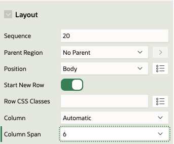
In this instance the above configuration will result in the following HTML structure being generated by APEX.
<div class="container">
<div class="row ">
<div class="col col-6 apex-col-auto col-start col-end">
...
</div>
<div class="col col-6 apex-col-auto col-start col-end">
...
</div>
</div>
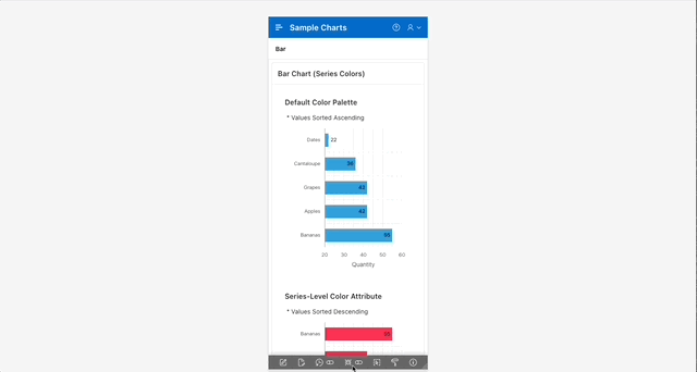
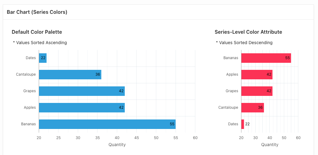
</div>As you can see in the following animation, while the charts are nicely displayed and readable on mobile devices and desktops, the rendering on some of the mid-range screens leads to a poor user experience.
In reality, this declarative way will cover most typical use cases (at least the ones that I have been working on 😛 ). A quick look at any analytics tool will show you that the majority of your consumers are either small-screen devices (smartphones) or big screens (desktops).
But… if you have:
- an atypical case
- you are a perfectionist
- you want to exploit every available native bit of APEX functionality
- or just curious
Keep reading!
The solution
Funnily enough, this feature has been documented and has been part of the Universal Theme from at least version 18.01. However, it was only a couple of weeks ago, whilst reacting to an APEX world Slack message from Mr Timothy Kimberl (Consulting Member Of Technical Staff at Oracle), that I finally got to know about the native APEX solution.
He had been interested in knowing which features we would like to see in future versions of the universal theme and I was reminded of the times, when to achieve the same responsive results discussed above, I was injecting javascript in my app to change those classes dynamically based on the size of the screen.
After being pointed to the Universal theme documentation, I discovered that APEX has a similar implementation to what I already knew from my "classic" web development training.
This simple method doesn’t involve javascript or complex logic, but is just applied via a set of CSS properties.
The only thing you need to do is to define the corresponding column span CSS class for each screen size in the Column CSS Classes layout attribute.
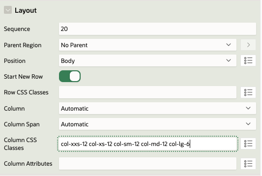
Setting the following classes in two regions in the same row, will result in both regions being displayed in the same row only in Large screens and above.
col-xxs-12 col-xs-12 col-sm-12 col-md-12 col-lg-6
As you can see below, you are in control of the breaking point of the grid now 😎
In this case, CSS classes are added by APEX to the HTML template as below.
<div class="container">
    <div class="row">
        <div class="col col-6 apex-col-auto col-xxs-12 col-xs-12 col-sm-12 col-md-12 col-lg-8 col-start">
        ...
    	</div>
    	<div class="col col-6 apex-col-auto col-xxs-12 col-xs-12 col-sm-12 col-md-12 col-lg-4 col-end">
        ...
    	</div>
    </div>
</div>You can play with any possible scenario you want or need, for instance this:
col-xxs-12 col-xs-12 col-sm-12 col-md-12 col-lg-6 col-xl-4 col-xxl-3
would display a full row chart in screens of up to 991px, two charts in a row in screens up to 1199px, three charts in screens up to 1399px and four charts in larger screens.
Furthermore, you can combine different spans within the same row. For example setting your left region to
col-xxs-12 col-xs-12 col-sm-12 col-md-12 col-lg-8
and your right one to
col-xxs-12 col-xs-12 col-sm-12 col-md-12 col-lg-4
will result in one region per row in smaller screens, while a split of 2/3 - 1/3 in larger screens.
You might want to learn more from the Grid Layout in Universal Theme here. There is a detailed description of the grid breaking points and more helper classes that might help you develop cleaner and future-proof applications.
Grid System Explained
The Grid System is a powerful layout system that is widely used in web development. It is a responsive grid system that allows developers to create flexible and responsive layouts for their web pages.
It usually uses a 12-column grid system, which means that a web page layout is divided into 12 equal columns. Developers can then use these columns to create rows and place content within them.
The Grid System is based on a mobile-first approach, meaning that the default styles are designed for smaller screens like smartphones and tablets. As the screen size increases, the layout adjusts to accommodate larger screens.
To use the Grid System, developers can use predefined classes to specify how their content should be arranged on the page.
For example, to create a row with two equal columns, a developer can use the following code:
<div class="row">
  <div class="col-md-6">Column 1</div>
  <div class="col-md-6">Column 2</div>
</div>
In this example, the "row" class specifies that we are creating a new row. The "col-md-6" class specifies that each column should take up six of the 12 available columns on medium-sized screens and above.
Developers can also use different classes to control how the layout behaves on smaller screens. For example, the "col-sm-6" class could be used to specify that each column should take up six columns on small screens and above.
Overall, the Grid System is a powerful tool for creating flexible and responsive layouts for web pages. By using a simple set of predefined classes, developers can create complex layouts without having to write custom CSS.
Find out more about our APEX services