Oracle Analytics Cloud March 2023 Update: What's New?

The March 2023 Update for Oracle Analytics Cloud came out few days ago and in this article I'm going to have a look at the features it includes. If you are also interested in a comprehensive list of the defects fixed by the update, please refer to Doc ID 2919336.1.
Parameters
How can we use presentation variables in Data Visualization just like in Analytics (Classic)? This is a recurring question in any Data Visualization training, and the answer used to be that the feature was not available (I never considered the questionable Presentation Variable Prompts extension as a proper solution).
The March 2023 update finally introduces parameters which allow users to define variables in workbooks and reference them in multiple places.
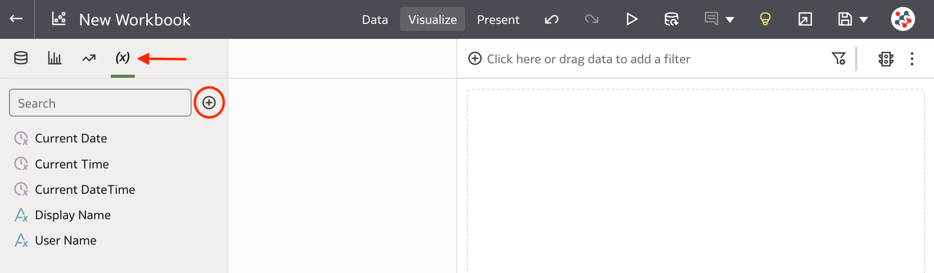
To create a parameter, select the Parameters tab in the Data Panel, and click Add (Figure 1).
In the Create Parameter dialog (Figure 2), enter a unique name and an optional description, select the data type, specify the list of possible values, select one or more initial values, and click OK.
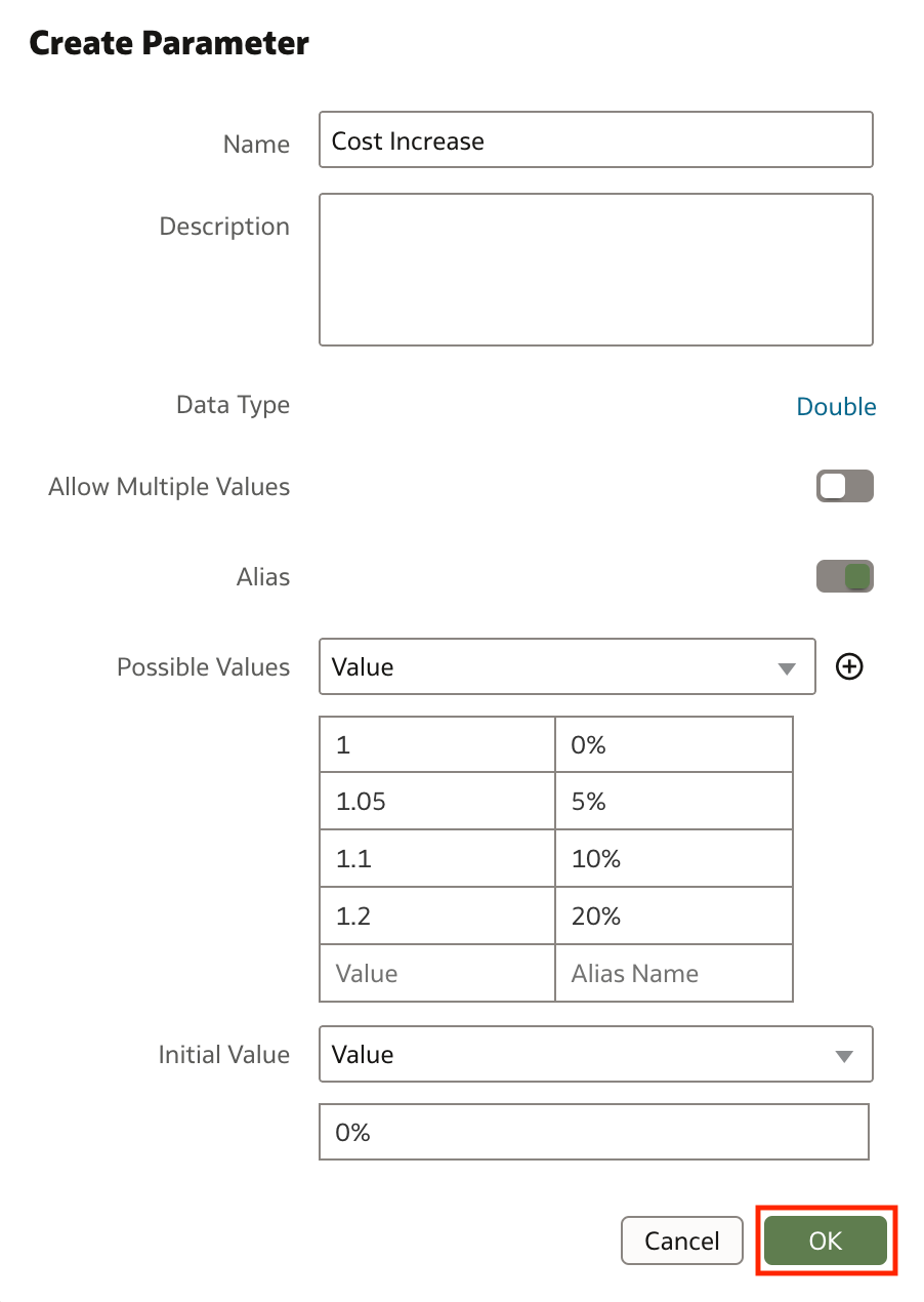
I particularly like that the interface allows us to define aliases to provide more familiar, user-friendly labels for each value in the list. For example, for a cost increase factor of 1.1, I provided an alias of 10%. Unfortunately, there isn't an easy way to initialize the possible values from a column: the user must type or paste a logical SQL expression which is not coherent with the immediate and easy-to-use design principles of Data Visualization! 🤦🏻♂️
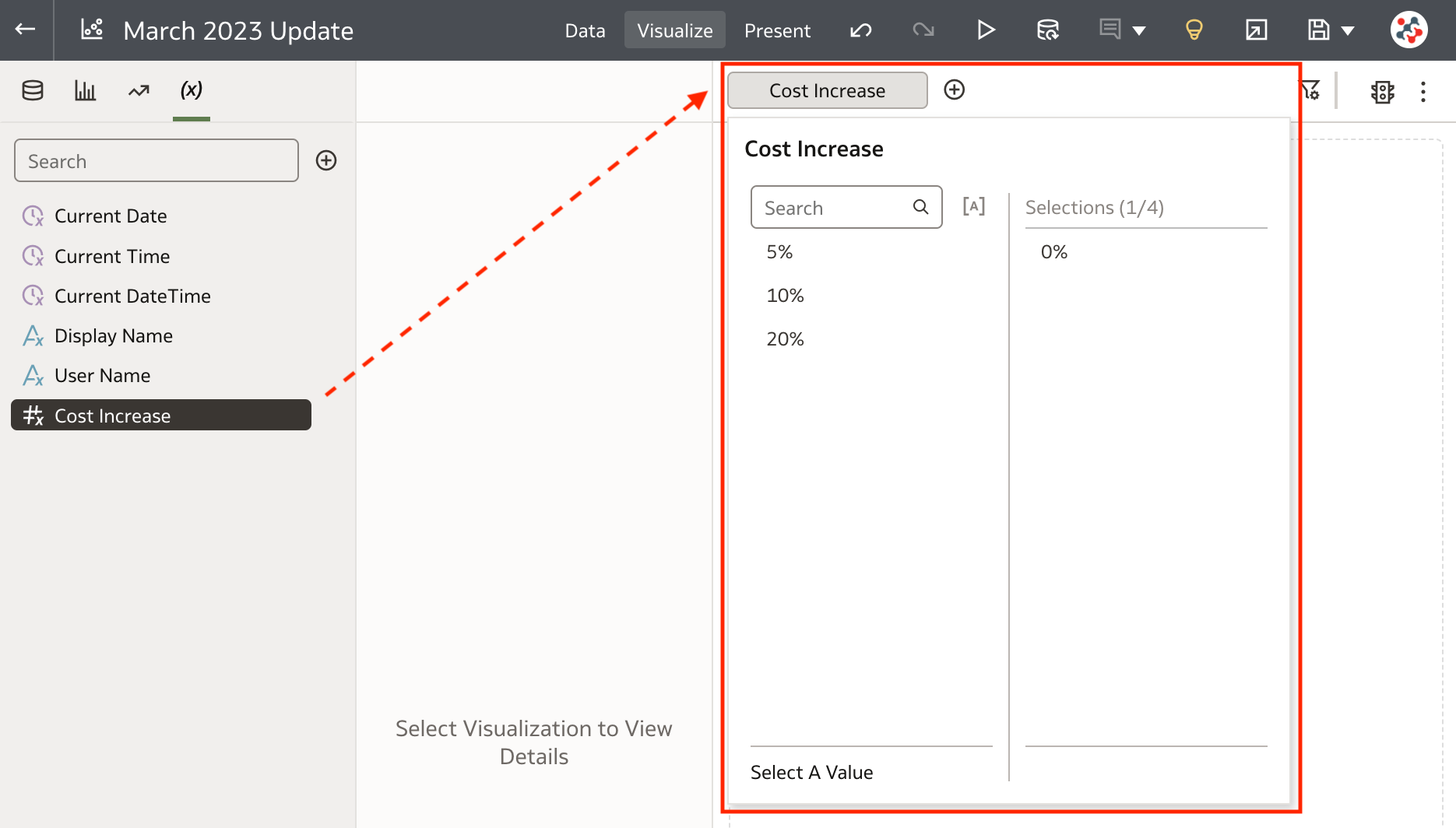
Parameters can be dragged and dropped to the Filter bar (Figure 3) or the Filter Controls drop target of Dashboard Filters visualization. Using a parameter in this way does not provide the same features as a standard filter (i.e. Top Bottom N, exclude, nulls and limit values functionalities are not available).
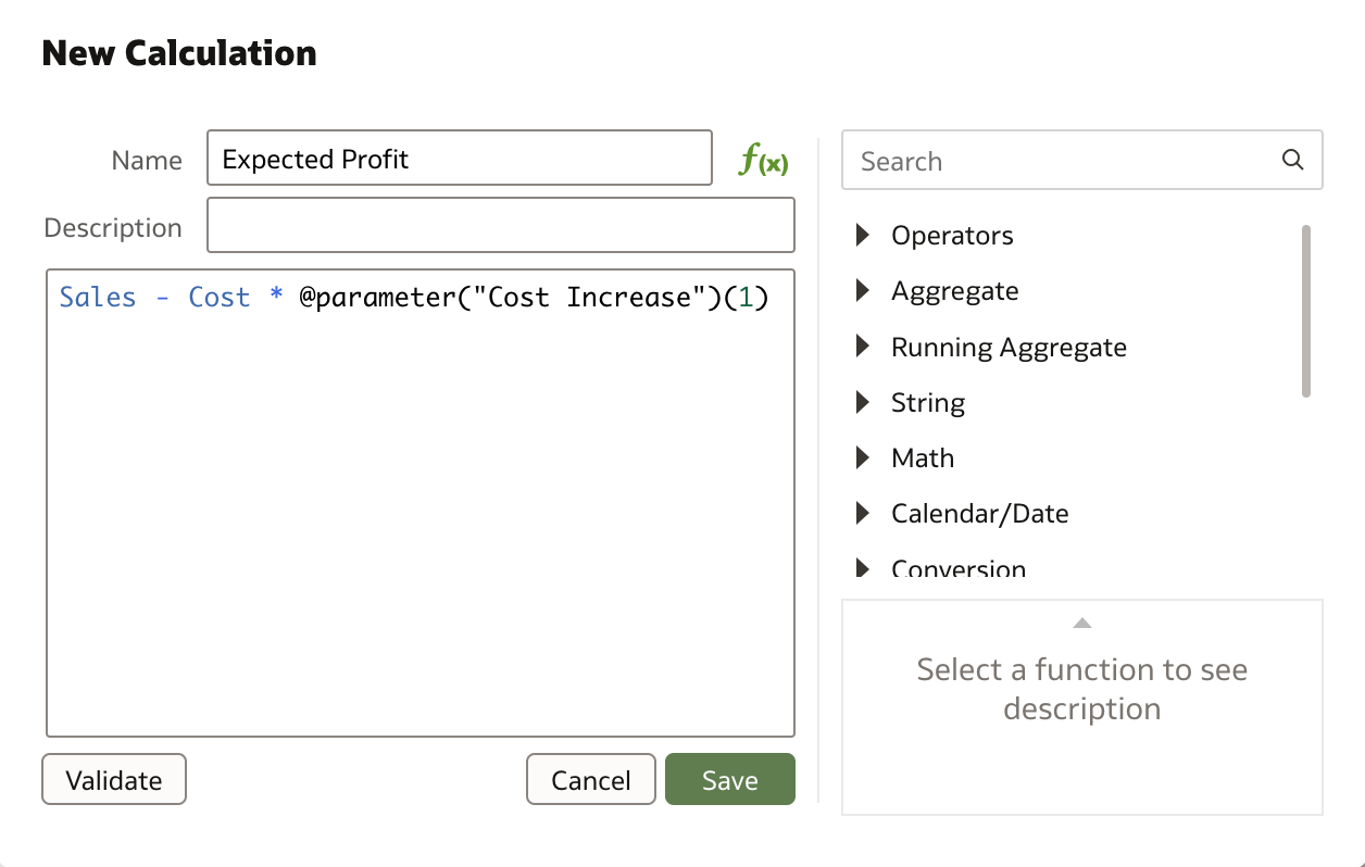
Parameters can be referenced in a visualization's title, in an expression filter, in a calculation (Figure 4), or in a URL Navigation Data Action using the following syntax:
@parameter("parameter_name")(default_value)
In addition to user-defined parameters, each workbook contains system parameters which are independent of the datasets or subject areas you are using, and are designed to cover the most common use cases such as Current Date, Current Time, Current Date Time, Display Name and User Name.
Leveraging AutoML in Data Flows
AutoML is part of the Oracle Machine Learning (OML) offering and provides a user-friendly, automated solution to building and deploying machine learning models, allowing organizations to benefit from the power of machine learning without requiring advanced data science skills (if you want to know more about AutoML my friend Borkur Steingrimsson wrote an excellent article on this topic).
When your datasets are based on a connection to Oracle Autonomous Data Warehouse (ADW), you can leverage AutoML in data flows to recommend and train a predictive model. AutoML will analyze your data, calculate the best algorithm to use, and register a prediction model in the Models area of the Machine Learning page in Oracle Analytics.
All you have to do is create a data flow, add the dataset containing the data to analyze, and configure the AutoML step. The AutoML step requires you to specify the target column to predict, the task type (Regression or Classification) and the model ranking metric to optimize (Figure 5).
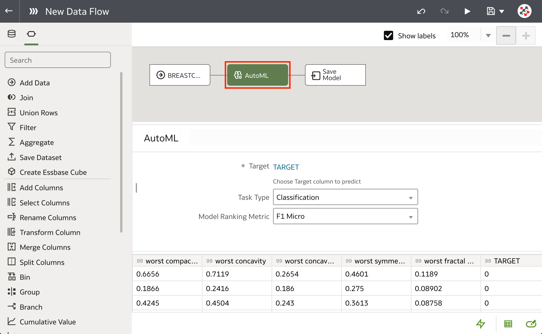
Models generated and registered with AutoML can be inspected, but all the metrics about how they actually perform (quality) are missing in this first release. Users that don't know what they are doing may give suboptimal data input to AutoML, get poor models as result, and believe they are great! 🤦🏻♂️
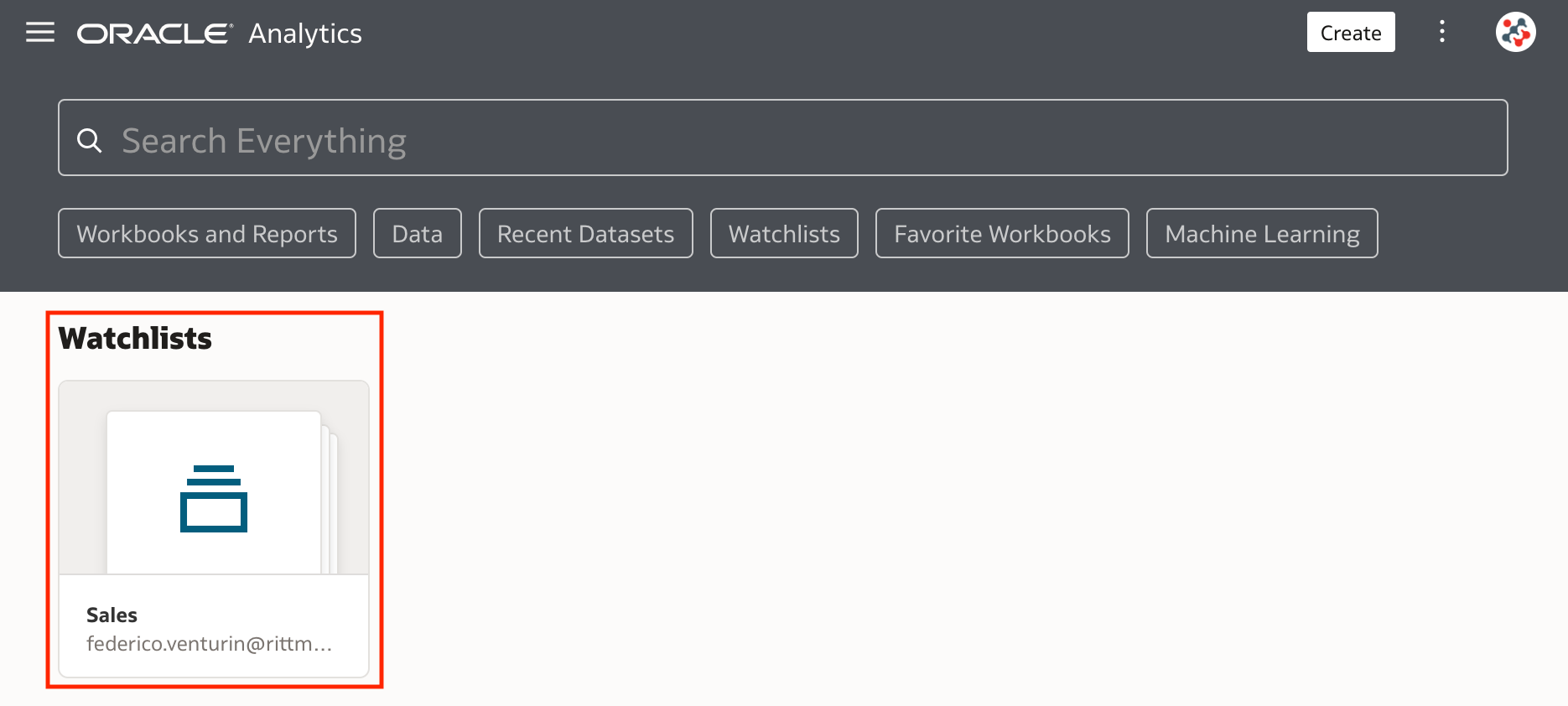
Watchlists
Watchlists allows users to group together visualizations from one or more workbooks, and display them as visualization cards in the Home page (Figure 6).
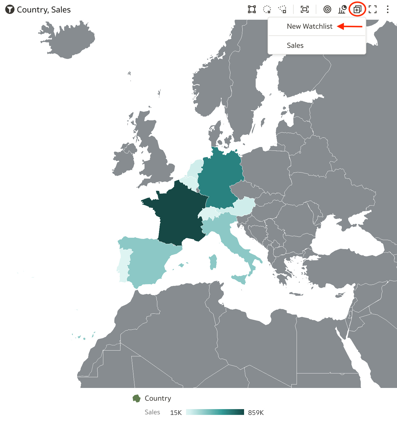
To create a new watchlist, hover over a visualization, click on the Add to Watchlist icon, and select the New Watchlist option (Figure 7). The same approach can be used to add visualizations to a previously created watchlist.
In the Add to New Watchlist dialog, enter a name for the watchlist, and click on the Add button (Figure 8).
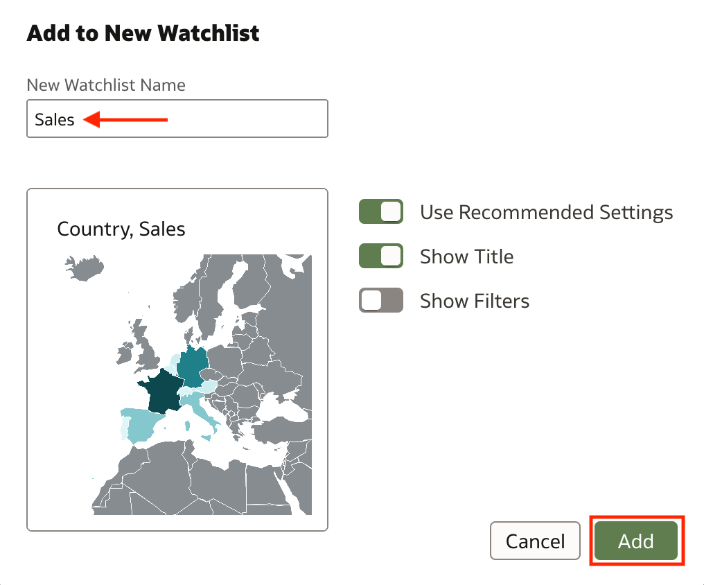
Watchlist objects are private and cannot be shared with other users. When you open a watchlist, you can rearrange visualization cards using drag and drop, navigate to the workbook that contains a specific visualization, or create a copy of the visualization in a new workbook.
Hiding the Filter Bar in Workbooks
When designing a presentation flow in a workbook you can now chose to hide the Filter bar to the end users. From the Present panel it's sufficient to select the Workbook tab and set the Show Filter Bar property to Off (Figure 9).
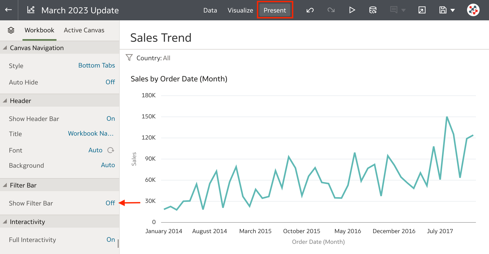
This feature is handy when you want to setup filters that apply to all your visualizations, but you don't want end users to be able to display or change them. If you are tempted to use it to implement row-level security, please remember that nothing prevents a user with DV Content Author role (and Read privileges on the data) to create a new workbook based on the same datasets and bypass all your hidden filters!
Blending Conditional Formatting Rules
It's now possible to define multiple conditional formatting rules for the same measure, and apply them all at the same time to a visualization or workbook. All you have to do is define your rules and tick the Enable rule blending checkbox in the Conditional Formatting dialog (Figure 10).
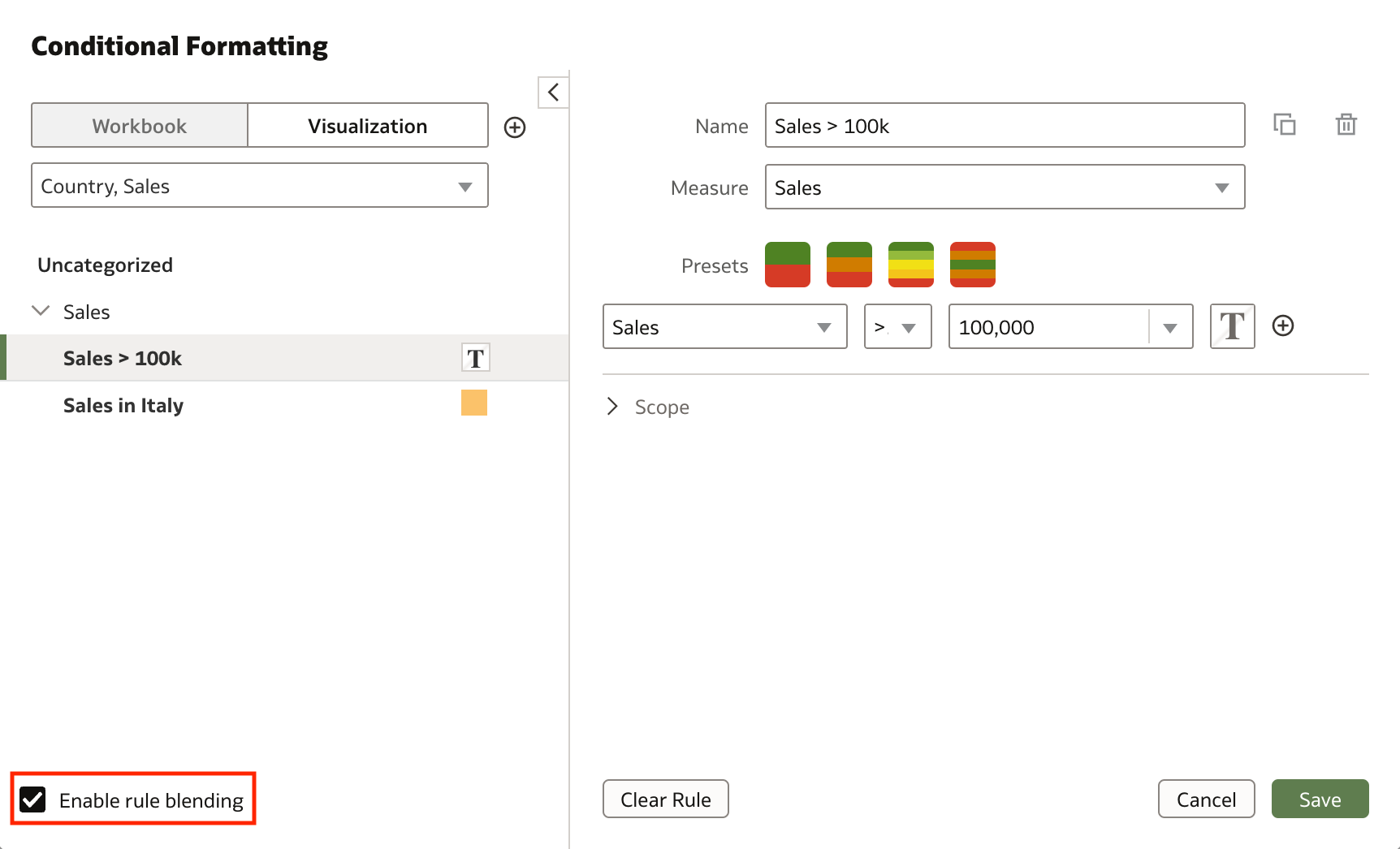
Remember that rules at the top activate first, but rules at the bottom will overwrite them when they specify a different value for the same format.
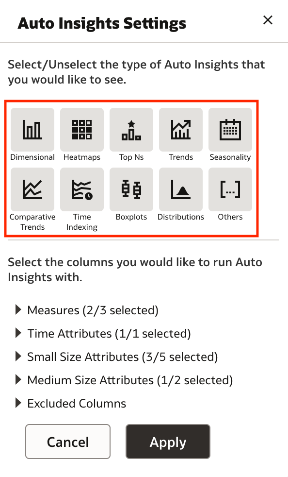
Auto Insight Type Selector
The Auto Insights feature has been further improved and allows users to focus on specific relationships in the data by specifying in the Auto Insights Settings dialog which visualization types to display (Figure 11).
Other Features
The March 2023 Update also allows users to:
- Register multiple digital signatures and choose a digital signature for a PDF Publisher report
- Use
Last DayandLast 7 Daysfilters to quickly see your most recent deliveries in the Monitor Deliveries page - Create analytics content based on MySQL Heatwave databases
- Create analytics content based on Vertica databases
Conclusion
The March 2023 Update includes several new features, enhancements and fixes for Oracle Analytics Cloud that significantly improve the suite.
If you are looking into Oracle Analytics Cloud and want to find out more, please do get in touch or DM us on Twitter @rittmanmead. Rittman Mead can help you with a product demo, training and assist within the migration process.