Oracle APEX - Customising Oracle JET charts


In this blog post, we will explore the process of customising Oracle JET components within an Oracle Application Express (APEX) environment and show how doing this enables us to unlock many more display options that are not presently available natively through standard APEX chart configuration screens.
Whether you're an experienced APEX developer, or simply interested in data visualisation, this guide aims to provide you with the knowledge and techniques necessary to fully utilise Oracle JET's capabilities.
Throughout this post, we will examine two essential resources
- the Oracle JET Cookbook Styles to explore colours, borders, legend settings, and more
- the Oracle JET documentation as our guide, offering detailed options to fine-tune and enhance your charts
These documents will be helpful guides as we explore how to change charts the way we want.
We will focus primarily on popular chart types such as Bar and Pie charts, discovering a wide range of options to modify and tailor them to meet your specific requirements. The principles that we apply to these two types of charts can, however, be extended to all the other JET types of charts.
About Oracle JET
Oracle JET (JavaScript Extension Toolkit) is a collection of open-source JavaScript libraries for developing modern web applications.
The integration of Oracle JET with APEX (Application Express) offers developers a wide range of possibilities for creating dynamic and visually appealing applications. Components such as charts and form items are already part of the APEX framework, providing developers with a solid foundation to work with.
While the initial integration of JET components into APEX may appear straightforward, unlocking the full potential and customising them further requires a deeper understanding. APEX allows for declarative configuration of a limited set of JET component attributes, offering some level of customisation out of the box.
If you're interested in exploring the extensive range of capabilities offered by Oracle JET, this blog post will introduce you to the ins and outs of digging into JavaScript code to discover all the possibilities that can be unlocked.
Official documentation about Oracle JET and its integration with Oracle APEX can be found here.
About Oracle JET components in Oracle APEX
As stated earlier, certain JET components are already integrated into APEX. Charts, for instance, made their debut in version 5.1, which was released in December 2016 and brought significant added value to the product.
In addition to the continuous introduction of numerous enhancements, it is worth noting that the range of declarative (configuration) options available for charts remains somewhat limited. This limitation could stem from either the maximum number of parameters a plugin can handle (capped at 25) or a deliberate business decision to focus on supporting the most commonly used attributes.
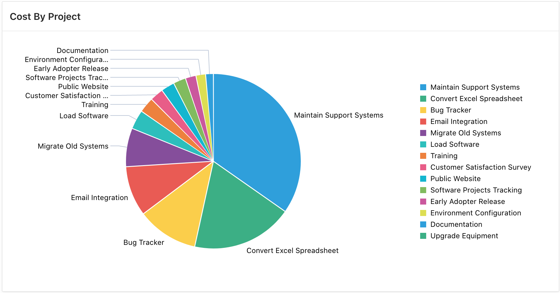
Let's take the Pie chart as an example. Personally, I find it visually appealing. Nonetheless, there might be instances where you wish to customise it to align with the overall aesthetic of your application. Perhaps your client requires a specific colour scheme that maintains consistency across the application, or you may want to indulge in your own creativity, exploring different colours and styles, as I often enjoy doing myself. :)
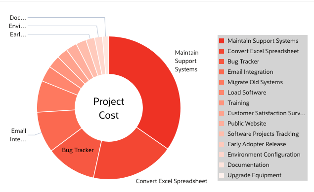
For example, if you desire a chart resembling the one below, you will have to employ JavaScript code to modify additional attributes that are not accessible through the declarative options in the APEX application builder itself.
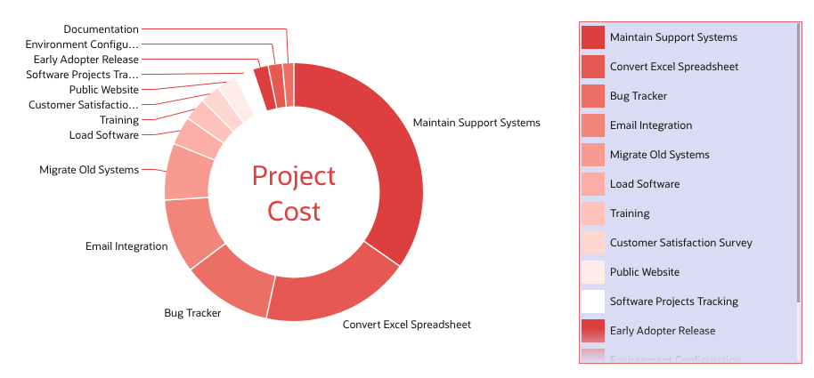
The modified example has undergone significant changes to achieve a more modern appearance compared to the default one. It includes custom colours, a background and border for the legend, feeler colour, label in the centre of the chart, and other enhancements. These alterations combine to create a visually appealing and contemporary look.
How to customise Oracle JET Components
Determining the connection between attributes and their respective outcomes solely by reading the documentation can be a challenging task. To help us with that Oracle provides a style editor in the Oracle JET Cookbook, which offers an interactive method for exploring a wider range of attributes for each component.
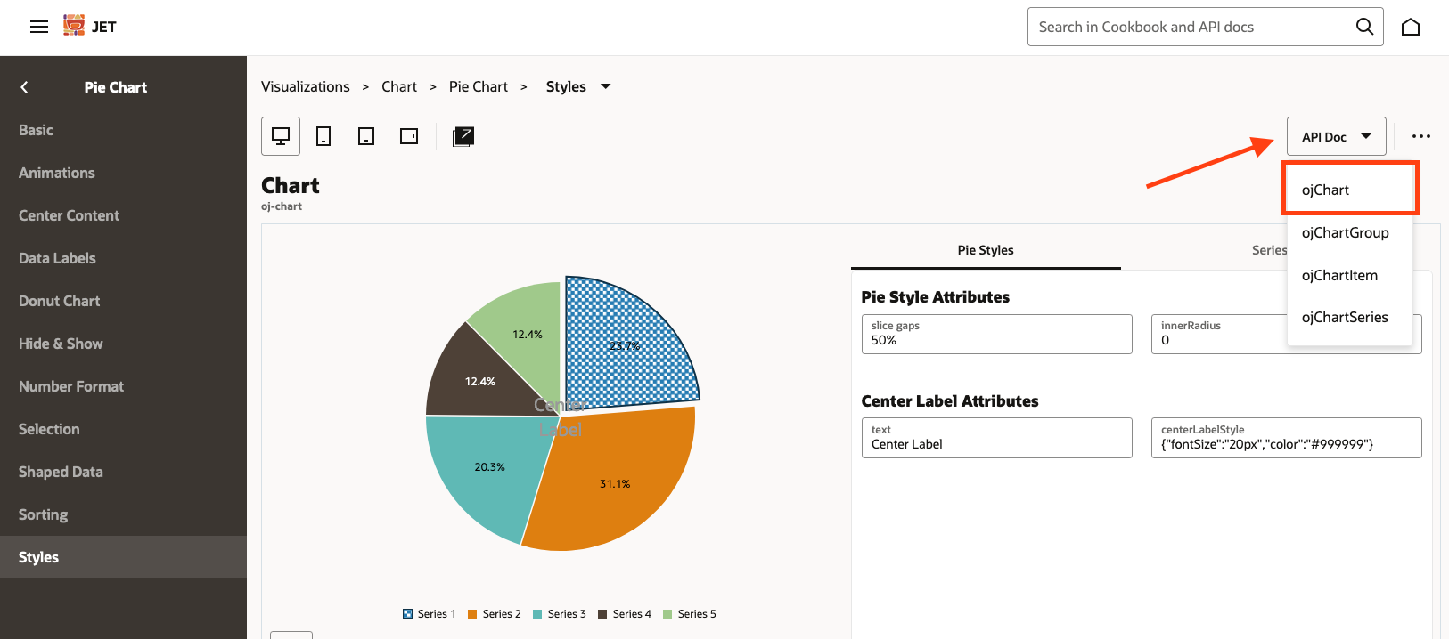
You can find the specific cookbook page we are referring to for the pie chart example here.
While this tool is helpful for understanding the level of customisation offered by Oracle JET, it doesn't provide an easy way to implement these changes into our Oracle APEX application. As a result, you'll have to dig into the API documentation which, I find, isn't as clear as it could be.
Apart from playing with styles, you can find a direct link to the relevant documentation section on the tool. Specifically, in our example case above, the essential class to work with is the ojChart class.
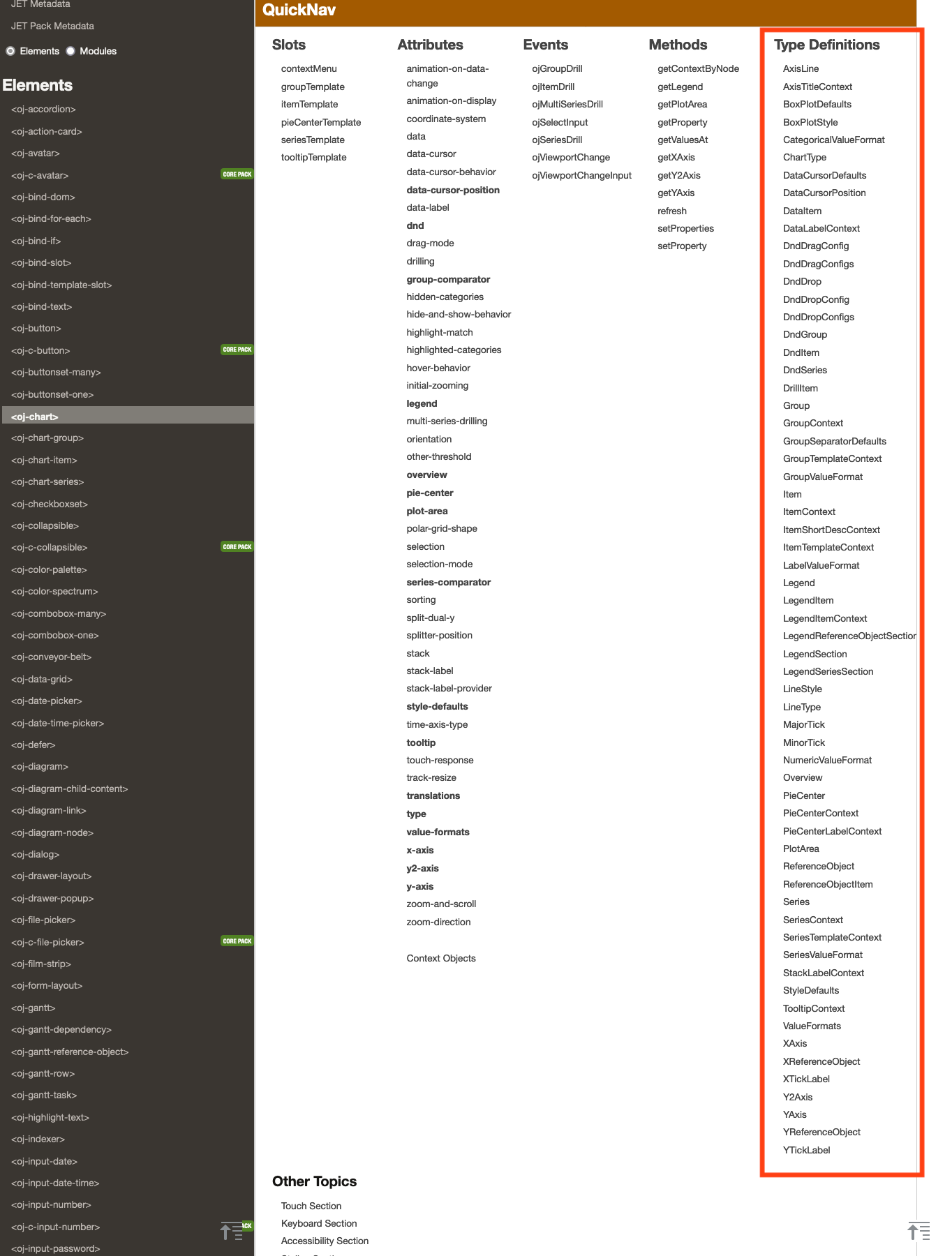
Type Definitions
Our example will focus only on the Object types that are documented within the Type Definition section.
The crucial aspect here is to generate an object that will be passed to the Initialisation script in Oracle APEX. Within this object, we will override the default parameter values for the particular chart type. This is similar to how the Application Builder translates your chart parameter settings into an object.
This bit of code is then set in the Application builder, under Chart region > attributes > Advanced > Initialisation JavaScript Function
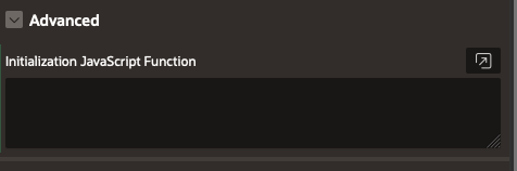
Here is a simple example code structure of the initialisation function:
function( options ){
	options.<type Definition> = {
    	<property 1>: "<value>",
        <property 2>: "<value>",
        <property 3>: "<value>"
    };
    return options;
 }
It is crucial to note that the camelCase convention is obligatory when defining objects. For example, the PieCenter definition type should be expressed as "pieCenter" in the initialisation code.
Here is a functional example that demonstrates how to position some text in the centre of a pie chart, similar to the example mentioned earlier.
function( options ){

    options.pieCenter =  {
        label: 'Project Cost',
        labelStyle: 'font-size:30px; color:black;',
    };

    return options;
}
Common type definitions
Let's explore some of the possibilities that Oracle JET offers that apply to the majority of JET charts.
This object type contains properties that affect the look and feel of the chart itself, for example, series colours, marker shapes, and other style attributes.
Please note that not all the properties apply to every chart type.
| Name | Description |
|---|---|
animationDownColor
|
The colour of the indicator shown for a decreasing data change animation. |
animationDuration
|
The duration of the animations in milliseconds. |
animationIndicators
|
Defines whether data change indicators are displayed during animation. |
animationUpColor
|
The colour of the indicator shown for an increasing data change animation. |
barGapRatio
|
Specifies the width of the bar group gap as a ratio of the group width. The valid value is a number from 0 to 1. |
borderColor
|
The default border colour for the data items. For funnel and pyramid charts, it is used for the slice border. |
borderWidth
|
The default border width for the data items. For funnel and pyramid charts, it is used for the slice border. |
boxPlot
|
An object containing the style properties of the box plot items. |
colors
|
The array defining the default colour ramp for the series. |
dataCursor
|
An object defining the data cursor style. |
dataItemGaps
|
Specifies the presence and size of the gaps between data items, such as bars, markers, and areas. Valid values are a percentage string from 0% to 100%, where 100% produces the maximum supported gaps. |
dataLabelCollision
|
Rule for adjusting data label layout. If set to fitInBounds, data label positions will be adjusted if they overlap with the chart's major axes or the legend, or go outside the bounds of the chart's plot area. |
dataLabelPosition
|
The position of the data label. For range series, if an array of two values is provided, the first and second value will apply to the low and high point respectively. The 'outsideSlice' value only applies to pie charts. The 'aboveMarker', 'belowMarker', 'beforeMarker', and 'afterMarker' values only apply to line, area, scatter, and bubble series. The 'insideBarEdge' and 'outsideBarEdge' values only apply to non-polar bar series. Stacked bars do not support 'outsideBarEdge'. The chart does not currently adjust layout to fit labels within the plot area or deal with any overlaps between labels. |
dataLabelStyle
|
The CSS style object defining the style of the data label text. For range series, if an array of two values are provided, the first and second value will apply to the low and high point respectively. The following style properties are supported: color, cursor, fontFamily, fontSize, fontStyle, fontWeight, textDecoration. |
funnelBackgroundColor
|
The default background colour of funnel slices that show actual/target values. |
groupSeparators
|
An object defining the style for hierarchical label separators. |
hoverBehaviorDelay
|
Specifies initial hover delay in milliseconds for highlighting items in chart. |
lineStyle
|
The line style of the data line. Only applies to line, lineWithArea, scatter, and bubble series. |
lineType
|
The line type of the data line or area. Only applies to line, area, scatter, and bubble series. centeredStepped and centeredSegmented are not supported for polar, scatter, and bubble charts. |
lineWidth
|
The width of the data line. Only applies to line, lineWithArea, scatter, and bubble series. |
markerColor
|
The colour of the data markers, if different from the series colour. |
markerDisplayed
|
Defines whether the data markers should be displayed. Only applies to line, area, scatter, and bubble series. If auto, the markers will be displayed whenever the data points are not connected by a line. |
markerShape
|
The shape of the data markers. In addition to the built-in shapes, it may also take SVG path commands to specify a custom shape. The chart will style the custom shapes the same way as built-in shapes, supporting properties like colour and borderColor and applying hover and selection effects. Only 'auto' is supported for range series. |
markerSize
|
The size of the data markers in pixels. |
marqueeBorderColor
|
The border colour of the marquee. Applies to marquee selection and marquee zoom. |
marqueeColor
|
The fill colour of the marquee. Applies to marquee selection and marquee zoom. |
maxBarWidth
|
Specifies the maximum width of each bar in pixels. |
otherColor
|
Specifies the colour of the "Other" slice. Only applies to pie chart. |
patterns
|
The array defining the default pattern ramp for the series. This is used only when seriesEffect is 'pattern'. |
pieFeelerColor
|
The colour of the line extending from the pie slice to the slice label. |
pieInnerRadius
|
Specifies the radius of the inner circle that can be used to create a donut chart. Valid values range from 0 (default) to 1. Not supported if 3D effect is on. |
selectionEffect
|
The selection effect that is applied to selected items. The values explode and highlightAndExplode only apply to pie charts. |
seriesEffect
|
Defines the fill effect for the data items. |
shapes
|
The array defining the default shape ramp for the series. Valid values are defined in the markerShape attribute. |
stackLabelStyle
|
The CSS style object defining the style of the stack label. Only applies to stacked bar charts. The following style properties are supported: color, cursor, fontFamily, fontSize, fontStyle, fontWeight, textDecoration. |
stockFallingColor
|
In stock charts, the colour of the candlestick when the 'open' value is greater than the 'close' value. |
stockRangeColor
|
In stock charts, the colour of the range bars for candlestick. |
stockRisingColor
|
In stock charts, the colour of the candlestick when the 'close' value is greater than the 'open' value. |
stockVolumeColor
|
In stock charts, the colour of the volume bars. If specified, overrides the default rising and falling colours used by the volume bars. |
threeDEffect
|
Defines whether the chart is displayed with a 3D effect. Only applies to pie, funnel and pyramid charts. |
tooltipLabelStyle
|
The CSS style object defining the style of the labels in the tooltip. The following style properties are supported: color, cursor, fontFamily, fontSize, fontStyle, fontWeight, textDecoration. |
tooltipValueStyle
|
The CSS style object defining the style of the values in the tooltip. The following style properties are supported: color, cursor, fontFamily, fontSize, fontStyle, fontWeight, textDecoration. |
The Object type that specifies the style, positioning, and behaviour of the legend. These are common to any legend regardless of the chart type.
| Name | Description |
|---|---|
backgroundColor
|
The colour of the legend background. |
borderColor
|
The border colour of the legend. |
maxSize
|
Defines the maximum size of the legend in pixels (e.g. '50px') or percent (e.g. '15%'). |
position
|
The position of the legend within the chart. By default, the legend will be placed on the side or bottom, based on the size of the chart and the legend contents. |
referenceObjectSection
|
An object with the following properties for the reference object section in the legend. |
rendered
|
Defines whether the legend is displayed. If set to auto, the legend will be hidden for charts with a large number of series. To ensure that the legend is always displayed, set this attribute to 'on'. To turn on legend for stock, funnel and pyramid charts, set the displayInLegend property for the series items to 'on'. |
sections
|
An array of objects with the following properties defining the additional legend sections, other than the default series and reference object sections. |
seriesSection
|
An object that specifies the properties for the series section in the legend. |
size
|
Defines the size of the legend in pixels (e.g. '50px') or percent (e.g. '15%'). |
symbolHeight
|
The height of the legend symbol (line or marker) in pixels. |
symbolWidth
|
The width of the legend symbol (line or marker) in pixels. |
textStyle
|
The CSS style object defining the style of the legend text. The following style properties are supported: color, cursor, fontFamily, fontSize, fontStyle, fontWeight, textDecoration. |
title
|
The legend title. |
titleHalign
|
The horizontal alignment of the title. |
titleStyle
|
The CSS style object defining the style of the title. The following style properties are supported: color, cursor, fontFamily, fontSize, fontStyle, fontWeight, textDecoration. |
Chart-specific type definitions
In this section, we will explore a specific type definition for the pie chart.
The Object type defines the centre content of a pie chart. Either a label can be displayed at the centre of the pie chart or custom HTML content.
| Name | Description |
|---|---|
converter |
The converter (an instance that duck types oj.Converter) used to format the label if it is numeric. When using a converter, scaling should be set to none, as the formatted result may not be compatible with the scaling suffixes. |
label |
Specifies the text for the label. When a innerRadius is specified, the label will automatically be scaled to fit within the inner circle. If the innerRadius is 0, the default font size will be used. |
labelStyle |
The CSS style object defining the style of the label. The following style properties are supported: color, cursor, fontFamily, fontSize, fontStyle, fontWeight, textDecoration. |
renderer |
A function that returns custom center content. The function takes a PieCenterContext argument,
provided by the chart, and returns an object with the following properties:
|
scaling |
The scaling behavior of the label if it is numeric. When using a converter, scaling should be set to none, as the formatted result may not be compatible with the scaling suffixes. |
You might want to explore the documentation for more specific type definitions.
Pie Chart Example
Let's take a pie chart customisation code example and dig down into each property to better understand how it works.
function(options) {
    options.styleDefaults = {
        colors: ["#ee3124", "#f34733",
        "#f75942", "#fb6950",
        "#fe785f", "#ff866e",
        "#ff947d", "#ffa28d",
        "#ffaf9c", "#ffbdac",
        "#ffcabc", "#ffd7cd",
        "#ffe5dd", "#fff2ee",
        "#ffffff"]
    }
    options.legend = {
    	backgroundColor:"#d3d3d3"
    }
    options.pieCenter = {
    	labelStyle:"font-size:20px; color:black;",
    	label:"Project Cost"
    }
    return options;
}As previously mentioned, APEX initialisation code expects an extension or overwrite of the default initialisation properties.
In the example above the first line is overwriting the styleDefaults object with a new colour property. As per documentation, this property is an array.
    options.styleDefaults = {
        colors: ["#ee3124", "#f34733",
        "#f75942", "#fb6950",
        "#fe785f", "#ff866e",
        "#ff947d", "#ffa28d",
        "#ffaf9c", "#ffbdac",
        "#ffcabc", "#ffd7cd",
        "#ffe5dd", "#fff2ee",
        "#ffffff"]
}The second bit of code refers to the background colour of the legend. In this case, a string is required and is defaulted to NULL.
    options.legend = {
    	backgroundColor:"#d3d3d3"
    }
The last bit is a pie chart specific type definition and controls the inner text of the chart itself.
    options.pieCenter = {
    	labelStyle:"font-size:20px; color:black;",
    	label:"Project Cost"
    }
Apart from the label itself, we can also manipulate the style of it. Please note that there are limited properties supported for the labelStyle.
Setting these options in the chart attributes will generate something similar to this:
Bar Chart Example
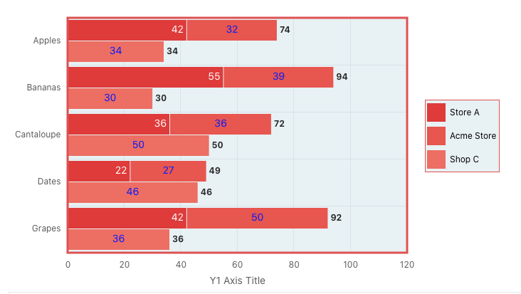
Here is another example of the JavaScript Initialisation Function code for a bar chart:
function(options) {

 var myColors = ["#de3b3b", "#e6564f",
                 "#ed6e63", "#f38378",
                 "#f8988d", "#fcada3",
                 "#ffc2b9", "#ffd6d0",
                 "#ffebe7", "#ffffff"];

    options.dataFilter = function( data ) {
        for ( i = 0; i < data.series.length; i++ ) {
            data.series[i].color = myColors [i];
        }
        return data;
    };

    options.styleDefaults = {
       barGapRatio:"0.1"
    }

    options.legend = {
       backgroundColor:"#e8f1f4",
       symbolWidth:"25",
       borderColor:"#dd5252",
       maxSize:"200",
       symbolHeight:"25"
    }

    options.plotArea = {
       backgroundColor:"#e8f1f4",
       borderWidth:"3",
       borderColor:"#dd5252"
    }

 return options;
}
When dealing with charts containing distinct series, assigning colours involves using various colours for separate series rather than differentiating colours within the same series. The syntax varies slightly, as demonstrated here:
	var myColors = ["#de3b3b", "#e6564f",
                 "#ed6e63", "#f38378",
                 "#f8988d", "#fcada3",
                 "#ffc2b9", "#ffd6d0",
                 "#ffebe7", "#ffffff"];

    options.dataFilter = function( data ) {
        for ( i = 0; i < data.series.length; i++ ) {
            data.series[i].color = myColors [i];
        }
        return data;
};As you can see, the rest of the properties follow the same logic as in the previous pie chart example. For example, here is the result of customisation for the bar chart:
In conclusion
Oracle JET serves as a valuable tool for APEX developers, allowing them to modernise their applications with ease. By leveraging Oracle JET, developers can enhance charts and transform the application interface into an engaging and pleasing experience for clients.
The best part? It should be remarkably straightforward if you have read this far!