Oracle APEX - Colouring JET Charts


In this article, we will explore the colour customisation possibilities that Oracle APEX offers for Oracle JET charts.
The no-colour-set approach
By default, APEX uses the colours defined in the Theme Roller colour palette. This is a great approach for simple applications and does, at least, ensure colour consistency across applications. However, there are some disadvantages to this approach:
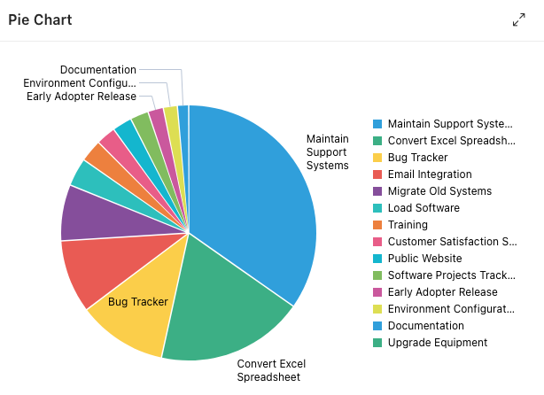
- Limited customisation options. The Theme Roller colour palette only offers 15 colours. If you have more values in your charts, the colours will be reused as in the example below.
- Difficult to maintain. If you need to make changes to the colours in your application, you will need to edit the Theme Roller settings.
- Conflicts with other areas of the system. The theme roller is used for colouring the entire application. This includes sidebars, navigation bars, region headings and more. You may want to reserve the palette for controlling the main application look and feel and have different colours specifically for charts.
- Accessibility issues. A colour-blind person might have issues while using your application.
To learn more about this or other features of the APEX Universal Theme, you can check out this application and webinar here.
The declarative approach
The declarative approach lets you set the colour of a series from the series' attributes panel. You can easily set a colour for your series by typing the hexadecimal colour code, selecting it from the suggested list, or using the colour picker.
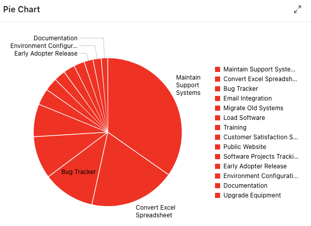
This approach, like the previous one, is ideal for simple systems and can be used for certain types of charts. For example, a one-colour bar chart may be visually appealing, but a pie chart with the same colour scheme would not be as effective.
The JavaScript approach
A more advanced approach can be implemented using a bit of JavaScript. This method involves defining an array of colours and then changing the initialisation options of your chart (found in the advanced section of the chart properties under the attributes tab).
The colour array can be defined in a variety of places, and you can allow your creativity to run wild, depending on your needs. For instance, you could allow an administrator or any user to choose their own colours, or you could use a third-party library to generate shades of a single base colour.
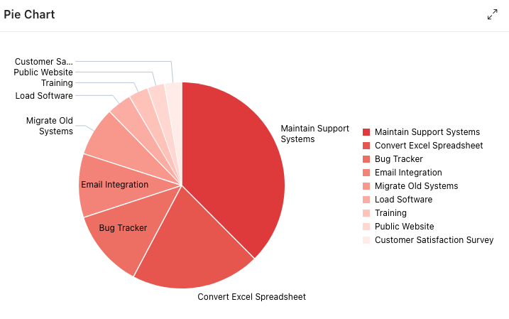
The most important thing is that your colour array will eventually look like this.
var myColors = ["#de3b3b","#e6564f",
		"#ed6e63","#f38378",
                "#f8988d", "#fcada3",
                "#ffc2b9", "#ffd6d0",
                "#ffebe7", "#ffffff"];
After your initialisation JavaScript code is applied, your chart may resemble the one below.
This method may work well in most cases, but it has its drawbacks. For example, the colours will be applied randomly, depending on the order of the array and values. This can be inconvenient if you want to apply a specific colour to a specific value type.
If you want to understand the customisation process for Oracle JET Charts, you can read a full description of the process in this blog post.
The SQL approach
The SQL approach is the most versatile method, as it allows you to colour the bars of a bar chart based on any criteria that you can define in a SQL query. This makes it ideal for situations where you need to apply specific colours to specific values.
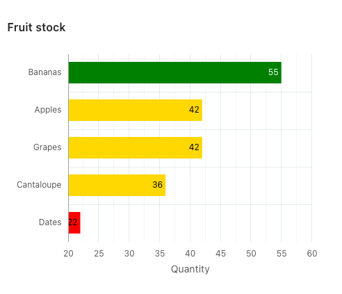
The following is an example of a query that creates a new column called BAR_COLOR in the result set based on a CASE statement for the QUANTITY column.
select
	a.product_name,
    b.quantity,
    b.customer,
    case
    	when b.quantity > 50 then 'green'
        when b.quantity <= 30 then 'red'
        when b.quantity between 30 and 50 then 'gold'
        else 'blue'
    end bar_color
from eba_demo_chart_products a,
	 eba_demo_chart_orders b
where
	a.product_id = b.product_id
	and customer = 'Store A'
order by b.quantity desc
Example query for a colour column in the result set
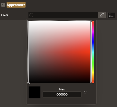
Now, we can use the BAR_COLOR column to set the colour of the bars in the chart. This can be done in the Color section under Appearance on the Chart Series level.
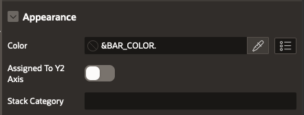
Please note that in this case, it would be straightforward to implement a solution that allows users or power users to set their own colours.
The colours of your chart should be dynamically generated by the query.
In conclusion
The methods we have explored allow us to handpick colours for different needs. Oracle APEX once again demonstrates its unique ability to span the application development spectrum, from no-code to low-code to high-control.
Find out more about our APEX services