Oracle APEX - Universal Theme Hack - Collapse Order


In the ever-evolving landscape of web design, crafting visually appealing and user-friendly web pages is a skill that continually demands new techniques and strategies. One technique that has gained prominence in recent years is the use of the CSS 'order' property to rearrange HTML elements on a page.
This powerful and often underutilised feature allows web designers and developers to manipulate the order in which elements appear in the document flow, giving them unprecedented control over the layout and user experience. This becomes particularly crucial when rearranging elements that must collapse in varying orders across different screen sizes.
In this blog post, we'll delve into the world of reordering HTML elements using CSS, utilizing the 'order' property alongside the default APEX Universal Theme media rules. It's important to emphasise that this functionality isn't native to APEX, so we'll need to deploy some custom CSS to accomplish our intended outcome.
The problem
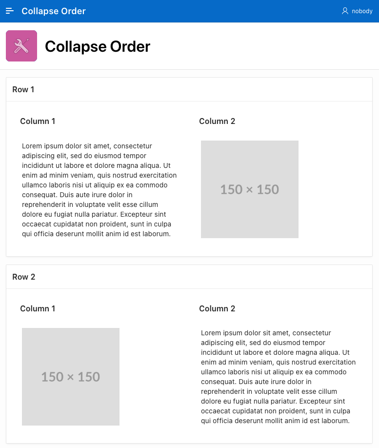
In the example picture below we show a layout deliberately designed for a larger screen. A block of text and an image on the 1st row is complemented with another text / image block on the second row but with the order reversed to create an aesthetically pleasing look and feel.
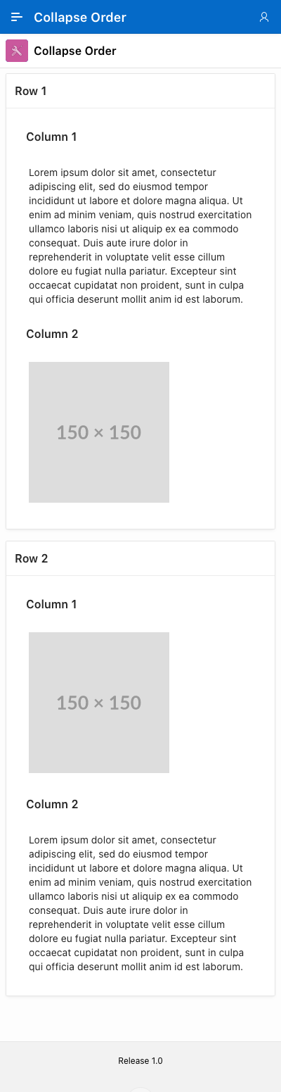
However, in the next image, you can see that when collapsing this screen, to mimic a typical mobile view, row 2 will be below the 1st column 2, leaving two images to render one above the other, which is not as elegant a look as alternating the text / images.
The Native Order rules
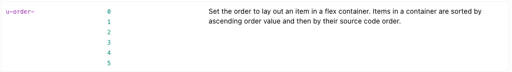
In the Universal theme, there are predefined order classes ranging from 0 to 5. However, it's important to note that these classes are not responsive to different screen sizes.
This means that while we can influence the order in which elements are rendered, the same order will be consistently applied across all screen sizes, lacking the adaptability we might need for various display scenarios, such as the one above.
The solution
Unfortunately, there is no native solution to this problem in APEX 23.1, a fact that has been confirmed by the Oracle APEX development team.
To address this issue, we can implement the 'order' property based on screen size, which is a well-known technique found in popular CSS frameworks like Bootstrap. In this instance, adhering to Universal theme naming conventions, we can create new classes that correspond to the media rules available in the Universal theme.
Here are the new CSS rules that we need to incorporate into our application:
@media (max-width:639px) {
    .u-order-xs-0 { order:0!important }
    .u-order-xs-1 { order:1!important }
    .u-order-xs-2 { order:2!important }
    .u-order-xs-3 { order:3!important }
    .u-order-xs-4 { order:4!important }
    .u-order-xs-5 { order:5!important }
}
@media (min-width:640px) and (max-width: 767px) {
    .u-order-sm-0 { order:0!important }
    .u-order-sm-1 { order:1!important }
    .u-order-sm-2 { order:2!important }
    .u-order-sm-3 { order:3!important }
    .u-order-sm-4 { order:4!important }
    .u-order-sm-5 { order:5!important }
}
@media (min-width:768px) and (max-width: 991px) {
    .u-order-md-0 { order:0!important }
    .u-order-md-1 { order:1!important }
    .u-order-md-2 { order:2!important }
    .u-order-md-3 { order:3!important }
    .u-order-md-4 { order:4!important }
    .u-order-md-5 { order:5!important }
}
@media (min-width:992px) and (max-width: 1199px) {
    .u-order-lg-0 { order:0!important }
    .u-order-lg-1 { order:1!important }
    .u-order-lg-2 { order:2!important }
    .u-order-lg-3 { order:3!important }
    .u-order-lg-4 { order:4!important }
    .u-order-lg-5 { order:5!important }
}
@media (min-width:1200px) and (max-width:1399px) {
    .u-order-xl-0 { order:0!important }
    .u-order-xl-1 { order:1!important }
    .u-order-xl-2 { order:2!important }
    .u-order-xl-3 { order:3!important }
    .u-order-xl-4 { order:4!important }
    .u-order-xl-5 { order:5!important }
}
@media (min-width: 1400px) {
    .u-order-xxl-0 { order:0!important }
    .u-order-xxl-1 { order:1!important }
    .u-order-xxl-2 { order:2!important }
    .u-order-xxl-3 { order:3!important }
    .u-order-xxl-4 { order:4!important }
    .u-order-xxl-5 { order:5!important }
}
These new classes enable us to manage the collapse order of each element on the page for different screen sizes. To address the problem we described in the original example, what we need to do is assign the order classes to the corresponding "Column CSS Classes" property in the application builder.
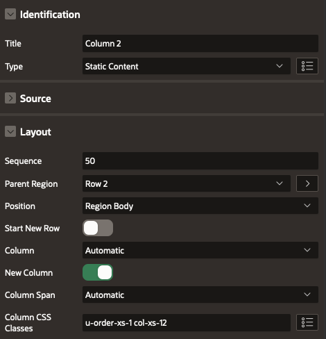
In our specific scenario, we want to rearrange the second row so that the second column (containing the image) collapses below the text. This would result in a layout where Text/Image is followed by another Text/Image section and not the Text/Image - Image/Text default scenario.
Here, we will configure "Column 1" to be ordered as second in extra-small screens.
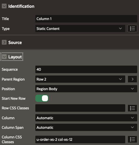
The custom class, u-order-xs-2, will specifically designate the element's position as second, but this arrangement applies solely to small screens. Additionally, the col-xs-12class is utilised to ensure that the region spans across all 12 columns within the same screen size.
For the other region in Column 2, we employ the inverse approach by assigning the u-order-xs-1 class to set it as the first element on small screens.
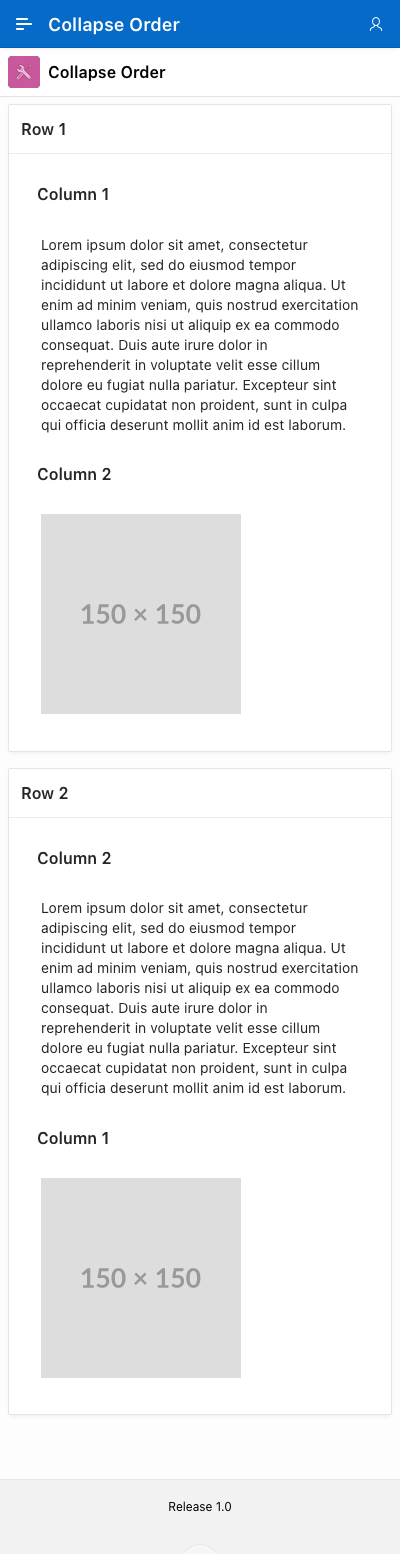
As you can observe below, the outcome now aligns with our desired layout on small screens, while larger screens retain their original arrangement.
Conclusion
Although APEX Universal Theme doesn't have this feature built-in, we've managed to achieve it with just a bit of CSS code. This helps us improve how our user interface looks on different screen sizes.
This was just one example, but you can apply and use these classes to rearrange any element in your application for any screen size. This is particularly valuable for public applications or e-commerce websites where, unlike internal applications, the user interface's appearance is crucial.
We're hopeful that the Oracle APEX team might include this feature in their future updates, making it even easier for everyone to use.
Find out more about our APEX services