Performance and OBIEE - part VI - Analysing results

This part of the OBIEE performance cycle is the one which arguably matters most. Having defined what we’re going to test, built a means by which to test it, and executed that test, we now need to sift through the tealeaves and work out what the data we collected is telling us. Except we’re not going to use hocus-pocus like tea leaf reading, gut feeling or best practice checklists, we’re going to use cold hard data and analysis.
Analysing the data breaks down into several stages, and is often an iterative process:
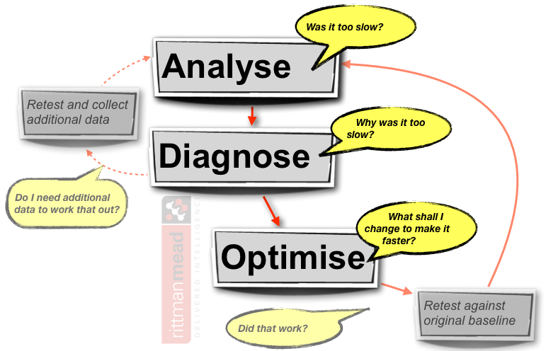
- Analyse the net response time. Is it as fast as it needs to be, at the required level of user concurrency?
- If the response time is too slow ("too slow" being defined by you or your users, in advance of the test), then diagnose to determine why. This is another phase of analysis, breaking down the net response time into its constituent parts, analysing system and OBI metrics for signs of a bottleneck. The output of this phase will be an hypothesis as to the cause of the performance problem
- Based on the diagnosis of the issue, apply one change to the system to improve it, that is, resolve the performance issue. Having made one change (and one change only), the original test should be repeated and the analysis cycle repeated to determine the impact of the tuning.
Analysis
How you analyse your data determines whether you will be accurately and fairly representing the results of the test in your diagnoses and conclusions.Avoid Averages
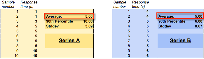
From your test execution you will have a series of response times. You need to summarise, that is, aggregate these into a single figure to give as a headline figure in your test report. If you take only one thing away from reading this, let it be the following point: don’t use average figures! I’ll say it again for emphasis : Averages are not a good way to represent your test data. What I am saying here is nothing that you won’t read in every other decent article written on performance testing and analysis.When you average out a series of data, you mask and muddy your data by inadvertently hiding extreme values in the series. A much better summary to use is the percentile.
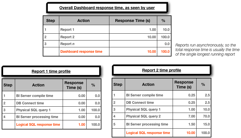
Consider a performance test of a single dashboard for a single user. It is run ten times, so as to get a representative set of data for the response time. Here are two series of data, both with an average response time of five seconds. If we look at the 90th Percentile for the same two series of data, we can see that series ‘A’ has a response time of ten seconds, whilst series ‘B’ has a response time of six seconds.
For more detail and clear statistical explanations, read “Averages Only” in Zed Shaw’s Programmers Need To Learn Statistics and “Percentile Specifications” in Cary Millsap’s Thinking Clearly about Performance.
Throw away your test data
Well, not literally. But, if you are testing user concurrency, make sure that when you calculate your percentile (eg 90th percentile) response time, do it for a given number of users. Otherwise you are distorting the figure. Typically a test will have a ‘ramp up’ period where the concurrent users are gradually introduced onto the system, until the target number is active, at which point the system is in ‘steady state’. It is from this point, the steady state, that you should be deriving your response time calculation. It is useful to look at how the response time might vary as the workload is increased, but for an accurate figure of a response time at a given number of users, you should be ignoring the data except where the full number of users was running.Analysis summary
The output of this phase of the analysis should be very simple:The 90th Percentile response time for dashboard <xx> is <yy> at a user concurrency of <zz>
And this should then satisfy a pass/fail criterion that was specified when you defined the test.
- If the test passes, great. Record all your test parameters and data, and move on to the next test.
- If the test doesn’t pass, then you need to work out why, and for that, see below.
Diagnosing poor OBIEE performance
Get to the root of the problem
So, the test results showed that the dashboard(s) run too slowly. Now what? Now, you need to work out why there is a performance problem. I am deliberately spelling this out, because too many people jump forward to attempting to fix a performance problem without actually understanding exactly what the problem is. They whip out their six-shooters loaded with silver bullets and start blasting, which is a bad idea for two reasons:- You may never know what the problem was - so you won’t be able to avoid doing it again! Everyone makes mistakes; the mark of a good programmer is one who learns from them. If I run a dashboard on a 2 CPU 4GB server and find it’s slow, one option could be to run it on a 8 CPU 32GB server. Tada! It’s faster. But, does that mean that every report now needs to be run on the big server? Well, yes it’d be nice - but how do we know that the original performance problem wasn’t down to machine capacity but perhaps a missing filter in the report? Or a wrong join in the RPD? It could be an expensive assumption to make that the problem’s root cause was lack of hardware capacity.
- In determining the root cause, you will learn more about OBIEE. This better understanding of OBIEE will mean you are less likely to make performance errors in the future. You will also become better at performance diagnostics, making solving live problems in Production as well as future performance tests easier and faster to resolve.
“I broke things, so now I will jiggle things randomly until they unbreak” is not acceptable – Linus Torvalds
There are always exceptions, but exceptions can be justified and supported with data. Just beware of the the silver bullet syndrome…The unfortunate part […] is that rarely anyone goes back and does the root cause analysis. It tends to fall into the bucket of “problem…solved”. – Greg Rahn
Performance vs Capacity
I always try to split it into #performance tuning (response time) and capacity tuning (throughput/scalability) – Alex GorbachevPerformance issues can be local to a report, or global to a system implementation and exacerbated by a particular report or set of reports - or both.
If an individual dashboard doesn’t perform with a single user running it, then it certainly isn’t going to with a 100, and there is clearly a performance problem in the design (of the dashboard, RPD, or physical data model design or implementation).
However, if an individual dashboard runs fine with a single user but performance gets worse and worse the more users that run it concurrently, this would indicate a capacity problem in the configuration or physical capacity of your system.
So which is which? An easy way to shortcut it is this: before you launch into your mega-multi-user-concurrency tests, test the dashboard with a single user. Is the response time acceptable? If not, then you have a performance problem. You’ve eliminated user concurrency from the equation entirely. If the response time is acceptable, then you can move onto your user concurrency tests.
If you have already run a big user concurrency test and are trying to identify whether the issue is performance or capacity, then look at what happens to your response time compared to the number of users running. If the response time is constant throughout then it indicates a performance problem; if it is increasing as more users are added it shows a capacity (which can include configuration) problem. Being able to identify this difference is why I’d never run a user concurrency test without a ramp-up period, since you don’t get to observe the behaviour of the system as users are added.
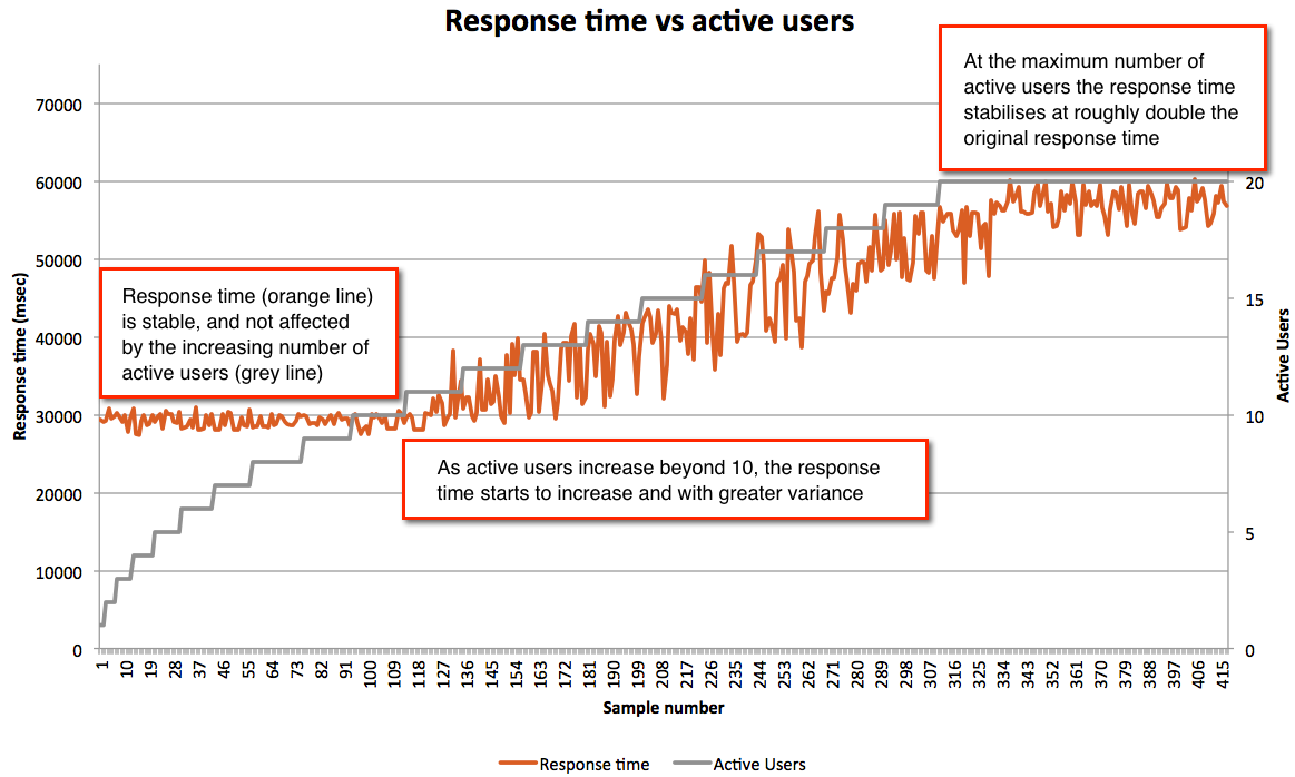
- Up to ten users the response time is consistent, around 30 seconds. If the response time needs to be faster than this then there is a performance problem
- If 30 seconds is the upper limit of an acceptable response time then we can say that the system has a capacity of 10 concurrent users, and if the user concurrency needs to be greater than this then there is a capacity problem
Errors
Don’t overlook analysing the errors that may come out during your testing. Particularly as you start to hit limits within the stock OBIEE configuration, you might start to see things like:Too many running queries. Server is too busy to process any more queries at this time.com.siebel.analytics.javahost.standalone.SAJobManagerImpl$JobQueueFullExceptionGraph server does not appear to be responding in a timely fashion. It may be under heavy load or unavailable.The queue for the thread pool ChartThreadPool is at it's maximum capacity of 512 jobs.
Response time profiling
A good way to get started with identifying the root cause(s) of a problem is to build a time profile of the overall response time. This is something that I learnt from reading about Method R, and is just as applicable to OBIEE as it is to the Oracle RDBMS about which it was originally written. This link gives a good explanation of what Method R is.You can improve a system without profiling, and maybe you can even optimize one without profiling. But you can’t know whether a system is optimal without knowing whether its tasks are efficient, and you can’t know whether a given task is efficient without profiling it. –Cary MillsapGiven the number of moving parts in any complex software stack there’s often more than one imperfection. The trick is to find the most significant that will yield the best response time improvement when resolved. It also lets you identify which will give the “biggest bang for your buck” - maybe there are several problems, but the top one requires a complete redesign whilst the second one is an easy resolution and will improve response times sufficiently.
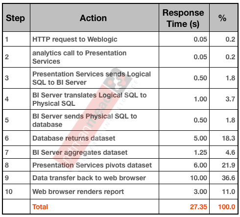
So in the context of OBIEE, what does a response time profile look like? If you hark back to the OBIEE stack that I described previously, a simple example profile could look something like this:
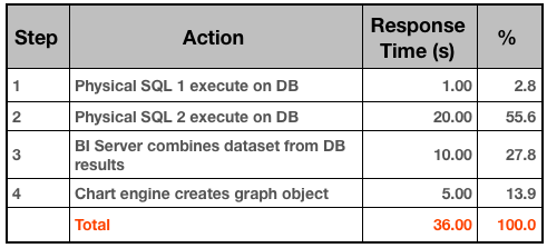
When building a time profile, start at the highest level, and break down the steps based on the data you have. For example, to determine the time it takes Presentation Services to send a query to BI Server is quite a complex process involving low-level log files. Yet, it probably isn’t a significant line entry on the profile, so by all means mark it down but spend the time on the bigger steps - which is usually the fetching and processing of the report data.
 If the response time profile shows that just as much of the total response time is happening on the BI Server then I would want to see what could be done to shift the weight of the work back to the database:

For more on this subject of where work should ideally be occurring, see the section below “Make sure that the database is sweating”.
Here are the sources you can look for response time profile data, starting at the user interface and going down to the database
- Rendering time - Web browser profiler such as Chrome Developer Tools, YSlow, Google Page Speed
- WebLogic - access.log will show the HTTP requests coming in
- Presentation Services - sawlog0.log, but may require custom log levels to get at low-level information
- BI Server
- nqquery.log
- Time to create physical SQL(s), i.e. compile time
- Time to connect to DB
- Time to execute on DB
- Time to process on BI server and return to PS
- Usage Tracking
S_NQ_ACCTS_NQ_DB_ACCT
- nqquery.log
- Database - whilst profiling can be extended down to the DB (for example, using an 10046 trace in Oracle), it makes more sense to do as a standalone analysis piece on an individual query where necessary. In extreme examples the profiling could actually go beyond the database down into the SAN, for example.
Diagnosing capacity problems
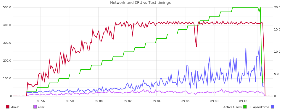
If a dashboard is performing acceptably under a single user load, but performance deteriorates unacceptably as the user currency increases, then you have a capacity issue. This capacity could be hardware, for example, you have exhausted your CPUs or saturated your I/O pipe. Capacity can also refer to the application and how it is configured. OBIEE is a powerful piece of software but to make it so flexible there are by definition a lot of ways in which is can be configured - including badly! Particularly as user concurrency (as in, concurrent executing reports) increases into three figures and above it may be the default configuration options are not sufficient. Note that this “three figures and above” should be taken with a large pinch of salt, since it could be lower for very ‘heavy’ dashboards, or much higher for ‘light’ dashboards. By ‘heavy’ and ‘light’ I am primarily referring to the amount of work they cause on the BI Server (e.g. federation of large datasets), Presentation Services (e.g. large pivot tables) and Javahost (e.g. lots of chart requests such as you’d see with trellis views).To diagnose a capacity problem, you need data. You need to analyse the response time over time against the measures of how the system was performing over time, and then investigate any apparent correlations in detail to ascertain if there is causation.
- OBI Metrics
- Analysis of the performance of the database against which queries are running
- End-to-end stack capacity, eg Network, SAN, etc.
Don’t forget to also include the OBI logs in your analysis, since they may also point to any issues you’re seeing in the errors or warnings that they record.
Additional diagnosis tips
Having profiled the response time you should hopefully have pinpointed an area for investigation for coming up with your diagnosis. The additional analysis that you may need to do to determine root cause is very dependent upon the area you have identified. Below are some pointers to help you.Make sure that the database is sweating
As mentioned above, a healthy OBI system will wherever possible generally push all of the ‘heavy lifting’ work such as filtering, calculations, and aggregations down to the database. You want to see as little difference between the data volume returned from the database to the BI Server, and that returned to the user.Use nqquery.log to look at the bytes and rows that OBIEE is pulling back from the database. For example, you don’t want to see entries such as this:
Rows 13894550, bytes 3260497648 retrieved from database query id: xxxx
(13.8 million rows / 3GB of data!)
If you return lots of of data from the database to the BI server, performance suffers because:
- You’re shifting lots of data across the network, each time the query runs
- As well as the database processing lots of data, the BI Server now has to process the same volume of data to pare it down to the results that the user wants
- If the data volumes are large the BI Server will start having to write .TMP files to disk, which can have its own overhead and implications in terms of available disk space
N.B. If you’re using cross-database federation then this processing of data by the BI Server can be unavoidable, and is of course a powerful feature of OBIEE to take advantage of when needed.
A related point to this is the general principle of Filter Early. If dashboards are pulling back data for all months and all product areas, but the user is only looking at last month and their own product area then change the dashboard to filter it so. And if you use dashboard prompts but have left them unset by default then every time the user initially navigates to the dashboard they’ll be pulling back all data, so set defaults or a filter in the constituent reports.
As a last point on this particular subject - what if there are 13 million rows pulled back from the database because the user wants 13 million rows in their report? Well, other than this:

I would say: use the right tool for the right job. Would the user’s workflow be better served by an exception-based report rather than a vast grid of data just ‘because we’ve always done it that way’? If they really need all the data, then it’s clear that the user is not going to analyse 13 million rows of data in OBIEE, they’re probably going to dump it into Excel, or some other tool - and if so, then write a data extract to do it more efficiently and leave OBIEE out of the equation. If you want to make use of the metadata model you’ve built in the RPD, you could always use an ODBC or JDBC connection directly into the BI Server to get the data out. Just don’t try and do it through Answers/Dashboards.
Instrumenting connection pools
For a detailed understanding of how the database behaves under load as the result of BI queries, consider using instrumentation in your connection pools as way of correlating [problematic] workload on the database with originating OBIEE queries and users.I have written previously about how to this, here
Why’s it doing what it’s doing
If a report ‘ought’ to be running well, but isn’t, there are two optimisers involved to investigate to see why it is running how it is. When the inbound Logical SQL is received by the BI Server from Presentation Services, it is parsed (‘compiled’) by the BI Server through the RPD to generate the Physical SQL statement(s) to run against the database.To see how OBIEE analyses the Logical SQL and decides how to run it, use a LOGLEVEL setting of 4 or greater. This writes the execution plan to nqquery.log, but be aware, it’s low-level stuff and typically for Oracle support use only. To read more about log levels, see here. The execution plan is based entirely upon the contents of the RPD, so if you want different Physical SQL generated, you need to influence it through the RPD.
The second optimiser is the database optimiser, which will take the Physical SQL OBIEE is generating and decide how best to execute it on the database. On Oracle this is the Cost-Based Optimiser (CBO), about which there is plenty written already and your local friendly DBA will be able to help with.
Footnote: Hypotheses
Finally, in analysing your data to come up with a diagnosis or hypothesis as to the root cause of the problem, bear this quotation in mind:If you take a skeptical attitude toward your analysis you’ll look just as hard for data that refutes your hypothesis as you will for data that confirms it. A skeptic attacks the same question from many different angles and dramatically increases their confidence in the results. John Rauser
What next?
If your testing has shown a performance problem then you should by now have a hypothesis or diagnosis of the root cause. Read all about optimisation here. If your testing has shown performance is just fine, you might want to read it anyway ...Other articles in this series
This article is part of a series on the subject of Performance and OBIEE:Comments?
I’d love your feedback. Do you agree with this method, or is it a waste of time? What have I overlooked or overemphasised? Am I flogging a dead horse?Because there are several articles in this series, and I’d like to retain the comments in one place, I’ve enabled comments on the summary and FAQ post here, and disabled comments on the others.