Analytics Publisher - Dynamic Graphs in Excel Templates

Analytics Publisher as a development tool has been around a few years now, in various guises, and there is a fair amount of help and information available for it out on the web. I've used it to develop quite a few reports for bespoke systems, E-Business Suite applications and as part of the Oracle Fusion Applications Analytics toolset.
I received a requirement recently to include a graph on an Excel template report. This sounds quite straightforward, but the graph must take account of a varying amount of data depending on what the report produces. I couldn't find much discussion about this in my web searches, so I set about working it out using what I know about Excel and the Analytics Publisher plug-in. This guide is the result of my research. For more information on creating a template in Excel, refer to the Oracle documentation.
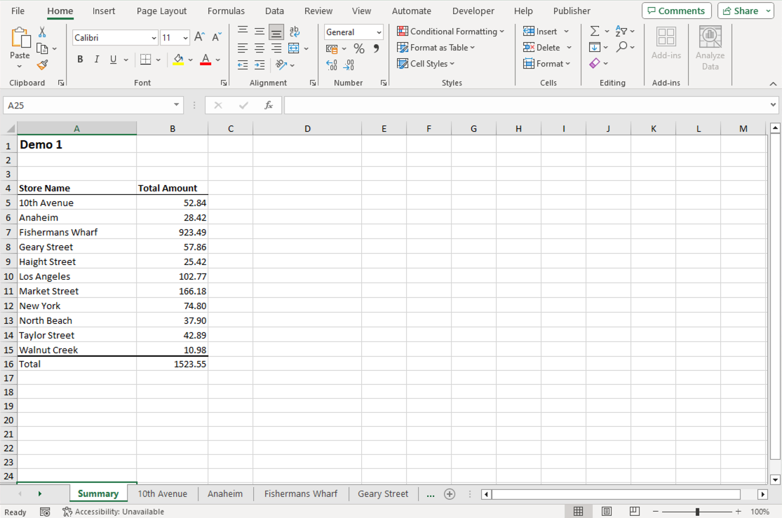
It is possible to create graphs and charts in Excel that take data from a Publisher data set using standard Excel functionality. We are going to prepare a simple graph for the purpose of this example, placing a bar graph on the summary page of a split-tab report.
Dynamic named ranges
Dynamic ranges can be used to define the source data in a graph. There are two methods we can use in the Excel template to create dynamic ranges that will populate our graph.
Method 1: Modify the XDO references created by Publisher
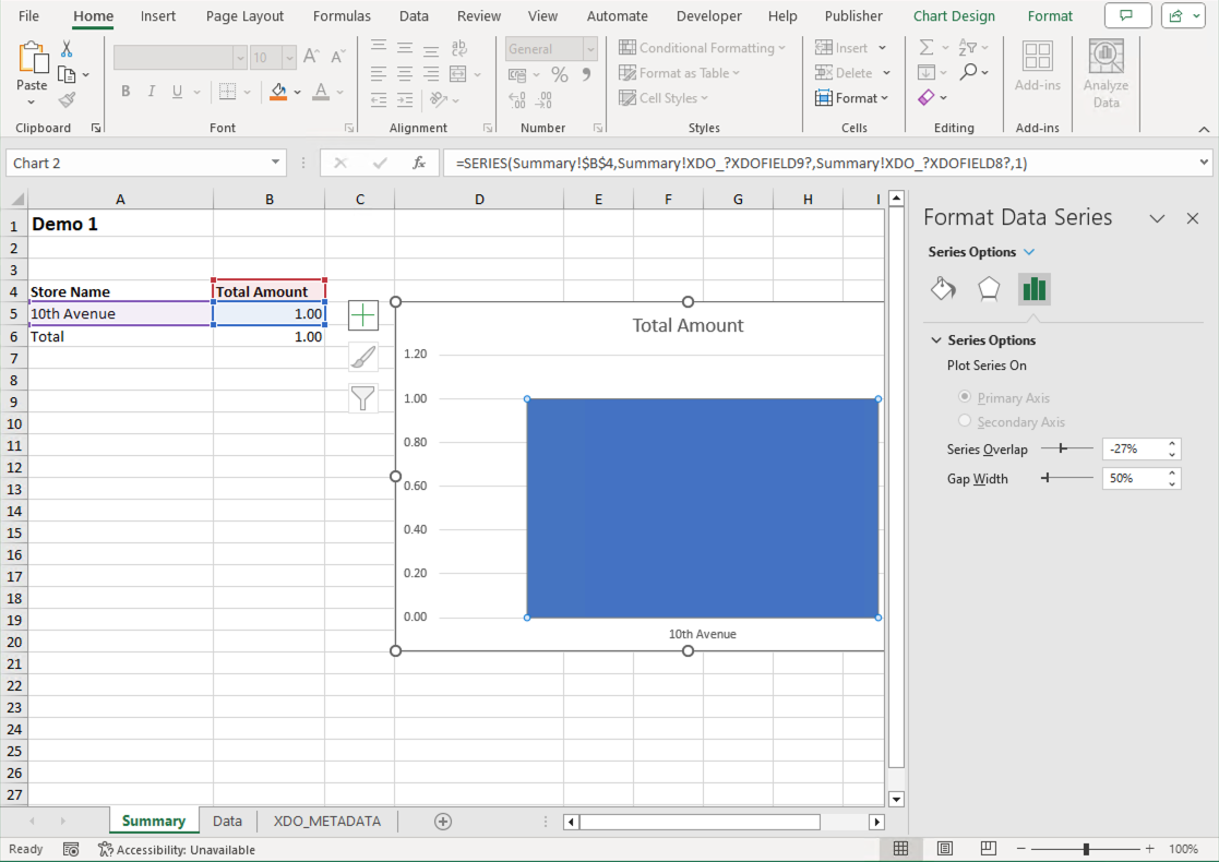
The XDO reference that Publisher creates when you define a field is a dynamic named range, of sorts. The name initially refers to a single cell where data will be placed when the report runs. e.g. On our Summary page we have a Total Amount field which we will be using as the data source for our Y axis in the graph. You can see the single cell definition in the name manager. XDO_?XDOFIELD8? refers to cell Summary!$B$5 on the Summary page:
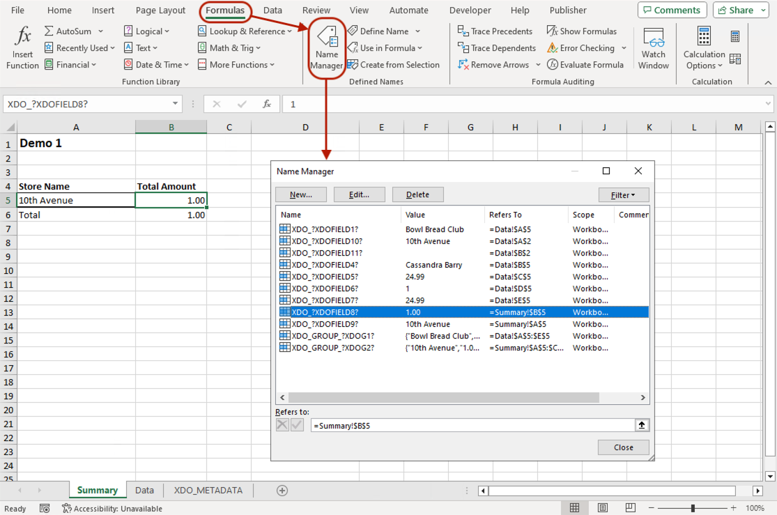
The cell is part of a group (XDO_GROUP_?XDOG2?), so this name is resolved into a multi-cell range when the report runs and populates the template. Publisher creates new rows for the data, and Excel automatically extends the range as the report runs. As a result, XDO_?XDOFIELD8? refers to Summary!$B$5:$B$15 on completion of the report. The range of XDOFIELD8 is determined by the number of rows returned by the source query.
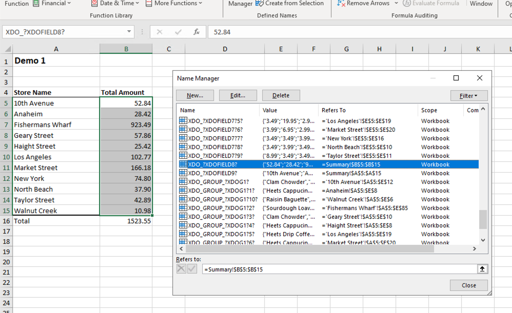
We can use this functionality to define the data sources for our graph. XDOFIELD8 will be used for the total values, with XDOFIELD9 for the X axis labels - XDOFIELD9 refers to Summary!$A$5.
Configuring the XDO References
For this, we will need to redefine the scope for XDOFIELD’s 8 and 9 to ensure the data source is from the Summary page only.
Unfortunately, Excel does not allow us to modify the scope directly, so we need to delete the names and then recreate them with the new scope. This video shows this procedure for both the XDOFIELD8 and XDOFIELD9 names:
- In the Name Manager, delete both
XDO_?XDOFIELD8?andXDO_?XDOFIELD9?names. - Recreate each with the scope set to Summary.
Video: Changing the Scope of XDOFIELD8 and XDOFIELD9
Create the graph
- Create the graph object and position it on your page - we have chosen a 2D clustered column.
- Right click on the graph object and select Select Data…
- Click Add.
- Series name is from
Summary!$B$4 - Series values are from
Summary!XDO_?XDOFIELD8? - Back in the Select Data Source dialog, click Edit.
- Add the X axis labels from
Summary!XDO_?XDOFIELD9? - Click OK on the two open dialog boxes to complete the configuration.
Video: Create the Graph
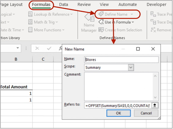
Method 2: Add custom dynamic ranges
For this method we need to create two new dynamic ranges that will be used to define the data ranges for the graph. This is slightly more complex than method 1 but it allows more flexibility for defining the data sources.
Click on Define Name in the Formulas menu and add two ranges. The formulae can be adjusted to suit your requirements.
|
|
Name |
Scope |
Refers To |
|
Range 1 |
Stores |
Summary |
=OFFSET(Summary!$A$5, 0, 0, COUNTA(Summary!$A:$A)-2, 1) |
|
Range 2 |
StoreTotals |
Summary |
=OFFSET(Summary!$B$5, 0, 0, COUNTA(Summary!$B:$B)-2, 1) |
What the formulae do
- The OFFSET function returns a reference to a range of cells that match the criteria given in the parameters. This reference is then used by the graph to identify which rows (range) the data will be taken from.
- The first parameter specifies the starting cell in the range. In this case, it’s the first row of data (row 5) for a given column.
- The two zeroes are the row and column offset. We do not need an offset for this purpose.
- The fourth parameter is the height of the range. i.e. The number of rows it will cover. For this we use COUNTA which returns a count of the non-blank cells in the column.
- The range we provide in the COUNTA parameter is the entirety of one column, either column A or B.
- We subtract 1 from this count as we are not including the title row and subtract 1 again as we do not include the total row.
- The last parameter is the width of the range. In this case it’s 1 column.
Create the graph
Repeat steps 1 to 8 from the graph creation section above, with the following amendments to steps 5 and 7:
- 5. Series values are from the StoreTotals range:
Summary!StoreTotals
-
7. Add the X axis labels from the Stores range:
Summary!StoresConfigure the Graph
Finally, you can apply formatting to the graph to suit your requirements. In our example we have set the bar gap width to 50%. Right click on the graph and select Format Data Series.
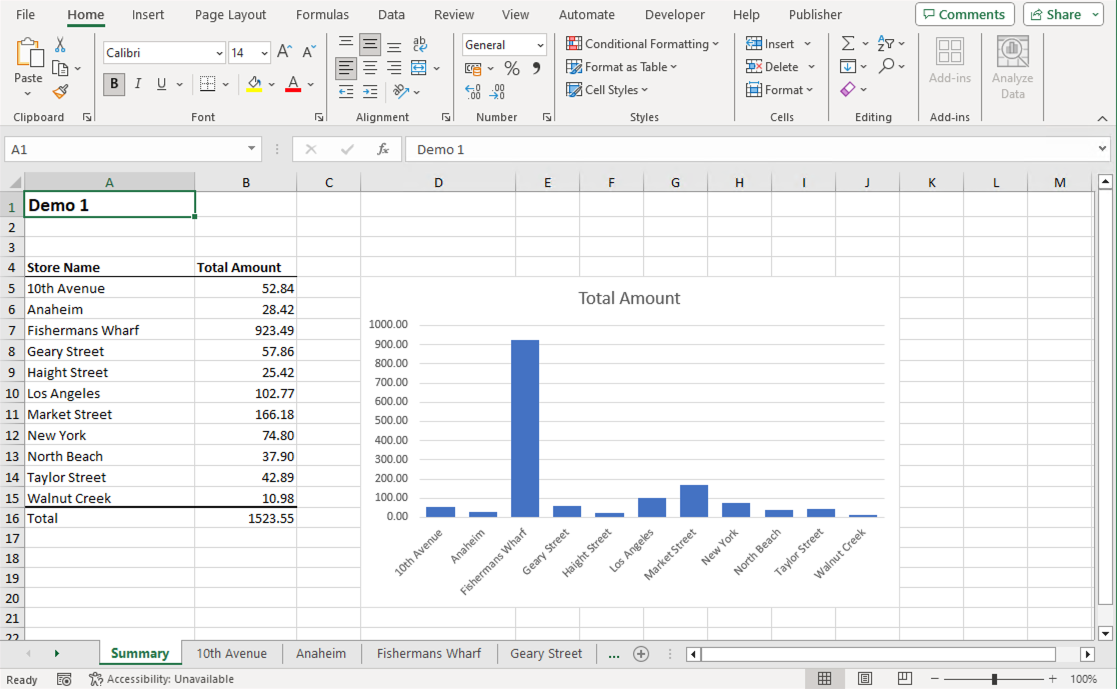
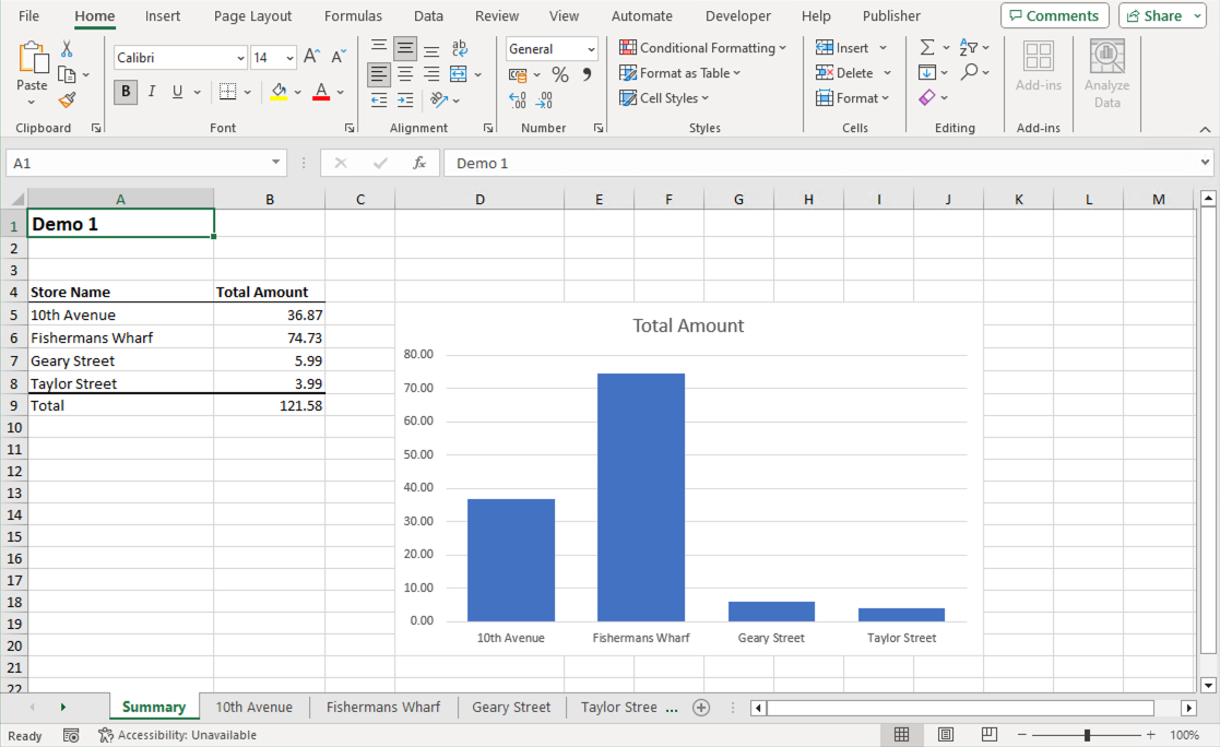
Example output
Here are two examples of the results from using either of the methods described above.
Conclusion
That concludes this introduction to creating graphs in Excel for Analytics Publisher, which I hope you find useful. If you are using APEX you can also check out our blog that describes how to integrate Analytics Publisher with APEX.
Further information
You can implement Oracle Analytics Server for your users, which includes Publisher, on Oracle Cloud. Please refer to Oracles guide 'How to deploy Oracle Analytics Server on Oracle Cloud Infrastructure' for more information.
Please share your feedback on this blog and contact us if you have any suggestions or there is something you would like to see for Analytics Publisher development.
For more information on how Rittman Mead can help your organisation, please see our Services web page.