Can Better Visual Design Impact User Engagement?

Background
For every dashboard succinctly displaying key business metrics, there’s another that is a set of unconnected graphs which don’t provide any insight to its viewers.
In order for your users to get value from your business intelligence and analytics systems they need to be engaging, they need to tell a story.
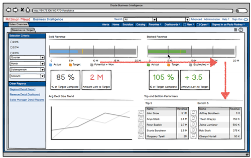
As part of its User Engagement initiative Rittman Mead has created a User Engagement Service. A key part of this is a Visual Redesign process. Through this process, we review an organisation’s existing dashboards and reports and transform them into something meaningful and engaging.
This service focuses on the user interface and user experience; here we will use our expertise in data visualisation to deliver high value OBIEE dashboards.
The process starts by prioritising your dashboards and then, taking one at a time, rebuilds them. There are 3 key concepts that lie behind this process.
Create a guided structure of information
The layout of information on a dashboard should tell the user a story. This makes it much easier for data to be consumed because users can identify related data and instantly see what is relevant to them. If a user can consume the data they need easily, they’re more likely to come back for more. ‘The founder of modern management’, Peter Drucker said “If you can’t measure it, you can’t manage it.” When users are in touch with their data, they will be more engaged with the business.
To achieve this, first we must consider the audience. We need to know who will be consuming the dashboards and how they will be used. Then we can begin to create a design that will satisfy the users’ needs. Secondly, we need to think about what we exclude as much as what we include on the dashboard. There is limited space, so it needs to be used effectively. Only information that adds value should be displayed on a dashboard and everything should be there for a reason. Finally, we need to consider what questions the users want to answer and what decisions will be based on this. This will enable us to guide the user to the information that will help them take action.
Choose the right visuals
One common design mistake is overcrowding of dashboards. Dashboards often develop over time to become a jumbled array of graphs and tables with no consideration of the visual design.
The choice of graphs will determine how readable the information being displayed on a dashboard is. We constantly ask ourselves “What is the best graph for the data?” Understanding how different types of graphs answer different questions, allows us to make the best visual choices. This is a vital tool for communicating messages to the users and providing them with the ability to identify patterns and relationships in the data more efficiently.
Thoughtful use of colour
The use of colour is an effective way to draw attention to something, connect related objects and evoke users’ emotions. Thoughtful use of colour can have a big impact on user engagement. To be sure we choose the best colours throughout dashboard design, the key question we need to ask ourselves is, “how will these colours make the user feel?”
Like the charts themselves, every different colour used on a dashboard should be there for a reason. Intentional use of colour could determine how a user will feel whilst consuming the information being displayed to them. Bright, unnatural colours will alarm users and attract their attention. Cool colours will give a restful, calming feel to the user and are most effective for displaying sustained trends. Through taking into consideration the most effective way to use colour, we can work towards creating an attractive visual design, which is engaging and enjoyable to use.
Applying these 3 concepts through Rittman Mead’s visual redesign process, has proven to result in engaging OBIEE dashboards. Users are equipped to make the most out of their data, allowing them to make informative business decisions.
Rittman Mead’s Visual Redesign process is a key part Rittman Mead’s User Engagement Service, for more info see http://www.rittmanmead.com/user-engagement-service/.
If you are interested in hearing more about User Engagement please sign up to our mailing list below.
