Time Series Visualisations: Kibana or Grafana?

Grafana has rapidly become one of the de-facto “DevOps” tools for real time monitoring dashboards of time series metrics. In addition to its powerful visualisations, Grafana is not tied to a particular stack or vendor, and supports multiple backend data sources including InfluxDB, Graphite, Elasticsearch and many others which can be added via plugins.
Another similar tool, Kibana is the data visualisation front end for the Elastic Stack, complementing the rest of the stack which includes Beats, Logstash (ingest) and Elasticsearch itself (storage). With the version 5.x release of the Elastic Stack, Kibana now includes Timelion for interactive time series charts.
Here at Rittman Mead we are big fans of both tools, and have written about them over the years (see 1, 2, 3). Our industry-leading Performance Analytics solution for OBIEE is built on top of these tools, and takes advantage of the time series features to provide interactive web-based dashboards presenting a “full stack" view of the important metrics relating to OBIEE's performance.
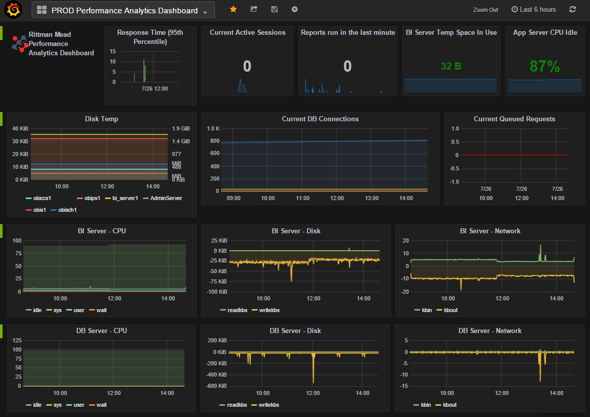
To give you an idea of what we’ve built, here is a sample dashboard from our Performance Analytics tool. We use both Grafana and Kibana, to present different views of data. The dense dashboards of time series metrics work brilliantly in Grafana:

To enable the user to view and analyse performance data across multiple dimensions we use Kibana, which does a stirling job:
With the recent release of Timelion - a time series visualisation plugin for Kibana - out of beta and into the big time, we wanted to ensure we were still using the right tool for the right job. Did we still need Grafana in our stack for visualisation of time series metrics, or could Timelion fill that gap now, and enable us to streamline our platform’s toolset?
In this article we’ll see how Timelion and Grafana stack up against each other. The intention is not to define which is “best” (a pointless exercise), nor create an unintelligible grid of down-in-the-weeds features that each may or may not support, but to see how the two tools compared in real-world usage, side by side. Which makes it easier to build charts? Which produces a nicer-looking dashboard at the end of it? Which has the best UI and UX for the end user reading and analysing the data? What limitations -if any- are there on data sources and functionality in analysing that data? And ultimately, can we unify our product’s front end on a single one of these tools?
Introduction to Timelion
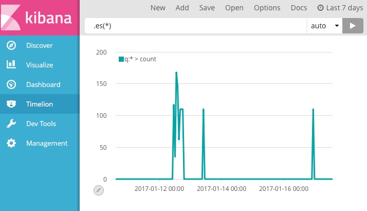
Since version 5 of Kibana, Timelion (pronounced "Timeline") has been included as part of the default installation. Charts are defined using a bespoke query language, which specifies both the source of the data, functions to apply to it, and how it is presented. The query is specified in a textbox in the Timelion interface. In this simple chart here we’re using the expression .es(*) to show the total number of documents in Elasticsearch, over time:
Every Timelion expression starts with a data source function and continues with a chain of functions that are connected with a dot. Over 20 functions are provided, across three groups:
-
Data sources - the default is Elasticsearch, and other APIs such as World Bank and Quandl are also available.
For example in the graph above, the default expression.es(*)(similar to.elasticsearch(*)) shows a count of all documents in Elasticsearch. You can specify details of the Elasticsearch index, mappings and metrics here too, as well as filters. -
Data manipulations ranging from simple arithmetic to moving averages, cumulative sums and derivatives
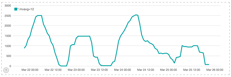
For example, adding a moving average to the data is as simple as including the function to the end of the expression:.es(*).movingaverage(12)
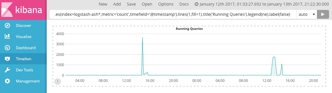
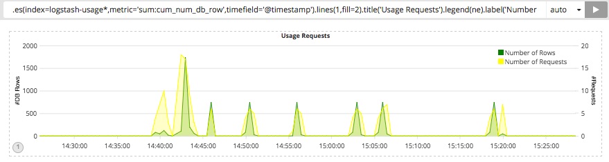
- Themes and styles of the visual elements including bar/point/lines, labels, title and legends. The graph below shows the number of running queries by time extracted from the active session history data in the Oracle database.
.es(index=ash*).lines(1,fill=1).title('Running Queries').legend(none).label(false)
With regards to the available documentation and guides for the developers, the main documentation for Timelion is somewhat sparse. For details of each function you can refer to the documentation on github. Compared to the rest of the excellent Elastic documentation, this is surprising and hopefully now that Timelion is part of the core product its documentation will be brought up to parity - full explanations of features and functions along with examples of usage.
On the positive side, the query builder text box supports auto-complete of functions and their arguments, and the Timelion interface provides online help too. A downside to this minimalist Timelion page is the size of the expression textbox. As you will read more in this post, it wouldn’t take long before you need to add more than one metric and a few styles to a visualisation which means having too many words in the textbox that can’t be seen, scrolled and edited easily:
If you are a beginner, to avoid the confusion over typos and errors, try building the expressions step by step and add functions gradually. The blog here nicely explains how to gradually create Timelion expressions.
Of special note in the data manipulation functions that Timelion provides are the statistical analysis ones:
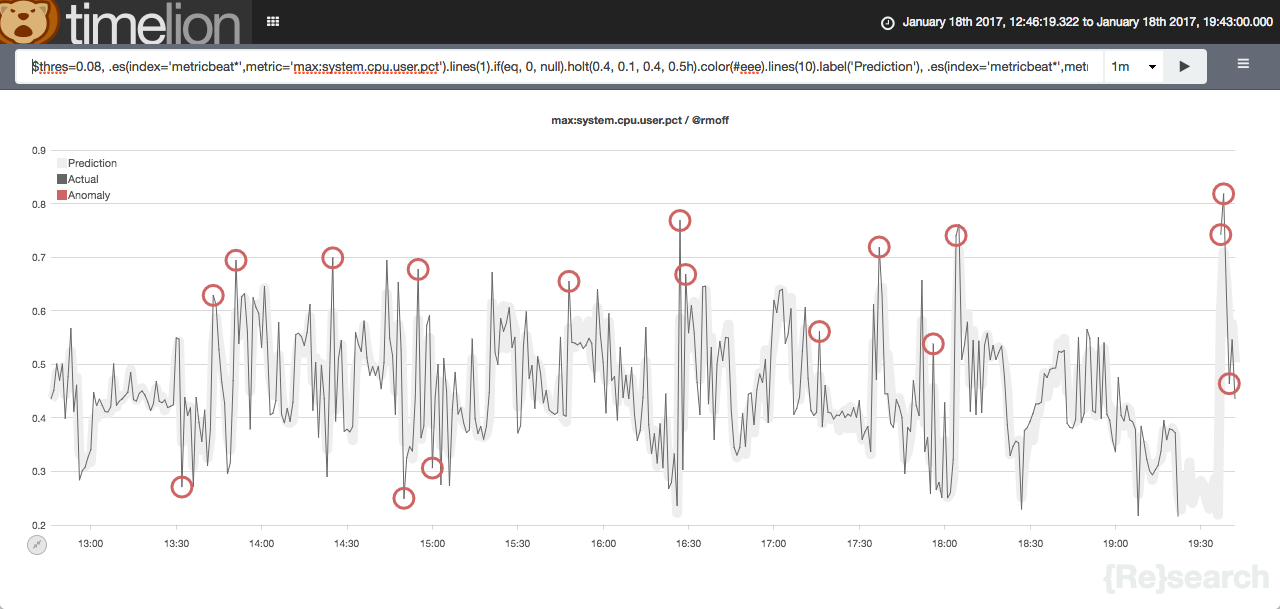
.trend(): add a trendline using a specified regression algorithm to your graph.holt(): an early version of this function, which samples the beginning of a series and use it to forecast what should happen via several optional parameters.
These are useful for our performance monitoring dashboards, enabling us to show things such as the point at which you would run out of memory/disk space if you continued to consume resources at your current rate.
Related to this concept is Prelert, which Elastic acquired next year and is expected to be part of a future X-Pack release. Whilst dashboard-based analysis is useful, once a clear pattern on which we want to alert is identified we can bring in Watcher to provide real time notifications to pager systems etc.
Introduction to Grafana
Grafana is an open source feature rich dashboard and graph editor that is rapidly becoming accepted as one of the best time-series metric visualisation tools available. Grafana has gained its popularity thanks to its simplicity, ease of use and snazzy look and feel that attracts many users. You can read more about Grafana in an earlier article that we wrote on the Rittman Mead blog here. Here is the kind of dashboard you can easily build with Grafana:
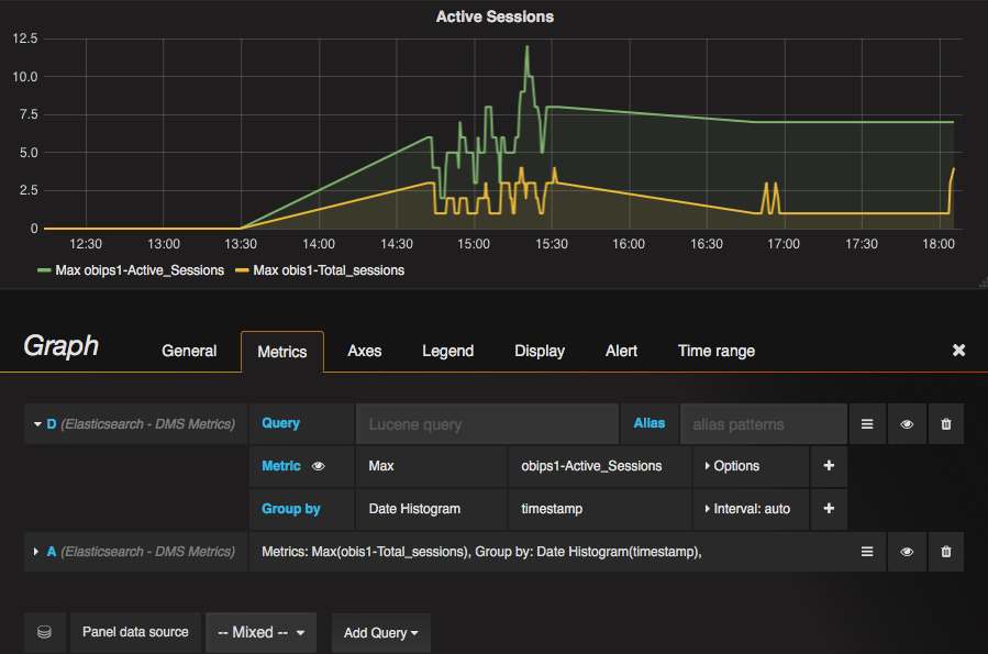
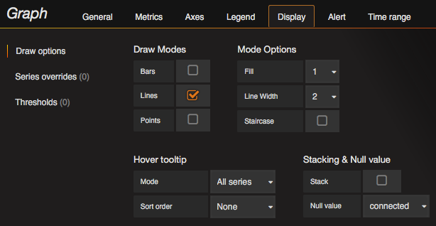
Most of the configurations in Grafana are done via a comprehensive graph editor interface:
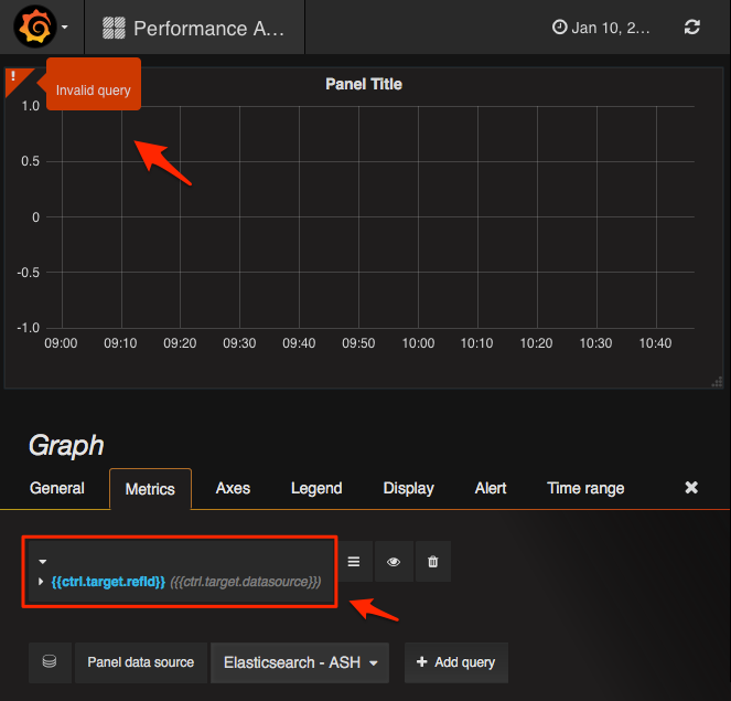
In the Grafana editor queries are generally built entirely through the GUI. Manually specified queries are used in cases such as accessing advanced functionality, and for specifying Lucene queries for in order to access data held in Elasticsearch. In terms of support for Elasticsearch, the latest version of Grafana at the time of writing this post (v4.1.1) supports both Elasticsearch v2 and v5. From my time spent working with Grafana 4.1.1 and Elasticsearch v5 I haven’t found it to be as stable as the long-standing data sources such as InfluxDB and Graphite (or even Elasticsearch v2). As an example, if a chart is configured incorrectly (for example settings for null values), Grafana is not as intuitive in returning no results or throw a descriptive error explaining the issue; instead the graph seems locked and the only possible solution for this behaviour seems to be deleting the chart and recreating it from scratch.
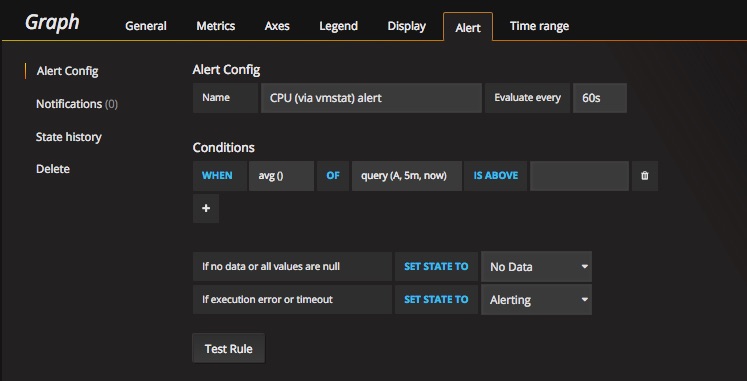
An interesting new addition to the Grafana family is the alerting engine which allows users to attach rules to the dashboard panels. Once dashboards are saved Grafana will extract the alert rules into a separate alert rule storage and schedule them for evaluation.
Side-by-Side : Presenting the Data
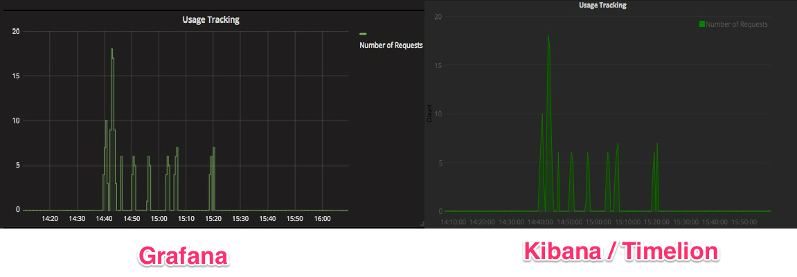
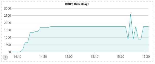
On the face of it, the output from Grafana and Timelion can be remarkably similar:
However, there are a few differences between the two tools that are worth digging into here. They are mainly on the display configuration part and simplicity of the user experience.
As mentioned, Grafana’s chart editor has a clear interface over the multitude of options available for refining the presentation of the data.
Timelion also supports chart formatting, but with fewer options than Grafana. It also depends on the user concatenating the correct functions onto the data query expression as we saw above. For example to add a graph that has a “Running Queries” title, a legend on the top right of the plot, not labeled axes and data shown with a 1px width line, you would need to hand-code the this expression: .lines(1,fill=1).title('Running Queries').legend(ne).label(false)
Grafana offers significantly greater flexibility in the formatting of the chart. One example is displaying metrics of different units such as time, currency and data. Grafana can automatically scale axes based on the units (bytes -> MB -> GB). The following Grafana graph shows disk usage from our monitored application stored in Elasticsearch. The disk usage metric on the Y axis is in Kilobytes, which Grafana has automagically scaled to the appropriate magnitude (MiB) in the labelling:
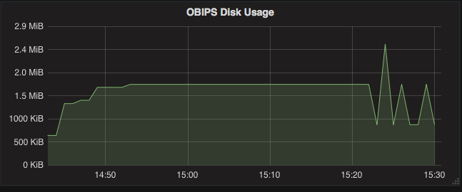
The same could be done manually in Timelion by specifying the appropriate conversion, but this is a hardcoded option compared to Grafana’s dynamic one, and even then wouldn’t have the varying labeling that Grafana does above (KiB initially, switching to MiB subsequently)
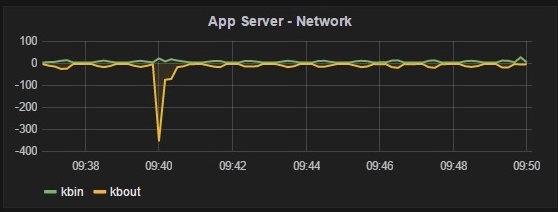
Grafana also supports the rendering of negative values on the Y axis, which is just not possible in Timelion. As well as genuinely negative data values (for example, temperature recordings below zero degrees), using transform feature of Grafana it is possible to invert particular series so as to aid the comprehension of the data as seen here:
Another nice feature that Grafana has - and unfortunately Timelion doesn’t - is the ability to show metric values in the legend itself. It’s a great way to see key values at a glance, without requiring a separate table or the user to hover over the data points.
Side-by-Side : Interacting with the Data
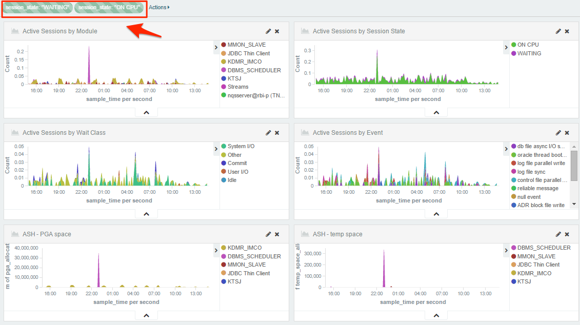
Grafana and Kibana are also different in terms of the level and ease with which it is possible to interact with the charted data. Both Kibana and Grafana support the drag-select of time periods on a chart to zoom into detail, with the rest of the charts on the same dashboard updating to show the same time period too. However, Kibana is much more feature-rich in this area. As a front end to Elasticsearch it supports ad-hoc text search of your data. It also allows users to automatically drill down into data, by clicking on a value in a chart to show details just for that. In the OBIEE monitoring dashboard below (built in Kibana), Active Session History data is filtered for the session_states in “Waiting” and “On CPU” - this filter was created by the user simply by clicking on the data points in one of the charts, and can be toggled dynamically from the same interface.
This interactivity is supported by Timelion too. The es() datasource function includes an argument called “kibana”. This argument defines whether the visualisation should follow the filters applied to the rest of the Kibana dashboard or not, for example:
.es(index=dms_*,metric='avg:obips1-Current_Disk_Usage',fit='nearest',kibana='true')
Whilst it is possible to specify Elasticsearch Lucene queries in Grafana and use term filters in the editor, these are local to the graph. With some use of variables it can be possible to enable a degree of global filtering on a single Grafana dashboard but this is a bespoke solution per-dashboard, rather than the out-of-the-box functionality that Kibana provides.
Grafana does enable you to toggle the display of data in a chart, by clicking on the measure label in the legend, seen above.
Conclusion
Comparing Kibana and Timelion to Grafana, it is true that they do a similar job displaying time series metrics - with pros and cons on each side.
Grafana’s graph editor offers an amazing interface with regards to the options available for refining the presentation of the data. Grafana is not only an straightforward development tool but also adds a huge amount of value to the resulting dashboards making them easier to read and analyse by the end users
On other hand, Timelion is just one of many visualisations that Kibana provides (including Tile Map and Tag Cloud), meaning that dashboards can be built which are less dense with numbers and time series but information is shown through variety of visualisations. Unfortunately Timelion and its expression editor at its current version seem slightly immature and relatively limited. A few more additional display options plus a nicer editor would put Timelion in a better position in comparison.
So, for now, we’ll be sticking with our dual approach of both Grafana and Kibana. Grafana provides our pure time-series metric dashboards, with the ease-of-building being one of the key factors, along with the rich formatting capabilities and its support for a data sources rather than Elasticsearch. Kibana does an unbeatable job of dashboards enabling rich exploration of metrics across dimensions, rendered in a greater number of possible visualisation forms. Timelion is a great first step, but ultimately just can’t compete with Grafana.
This is a fast-moving area of tool development, and you can bet that Grafana and Kibana are going to continue developing at a rate of knots - which as users and developers is great news!