OBIEE Monitoring and Diagnostics with InfluxDB and Grafana

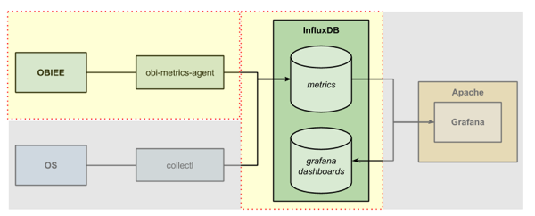
In this article I’m going to look at collecting time-series metrics into the InfluxDB database and visualising them in snazzy Grafana dashboards. The datasets I’m going to use are OS metrics (CPU, Disk, etc) and the DMS metrics from OBIEE, both of which are collected using the support for a Carbon/Graphite listener in InfluxDB.
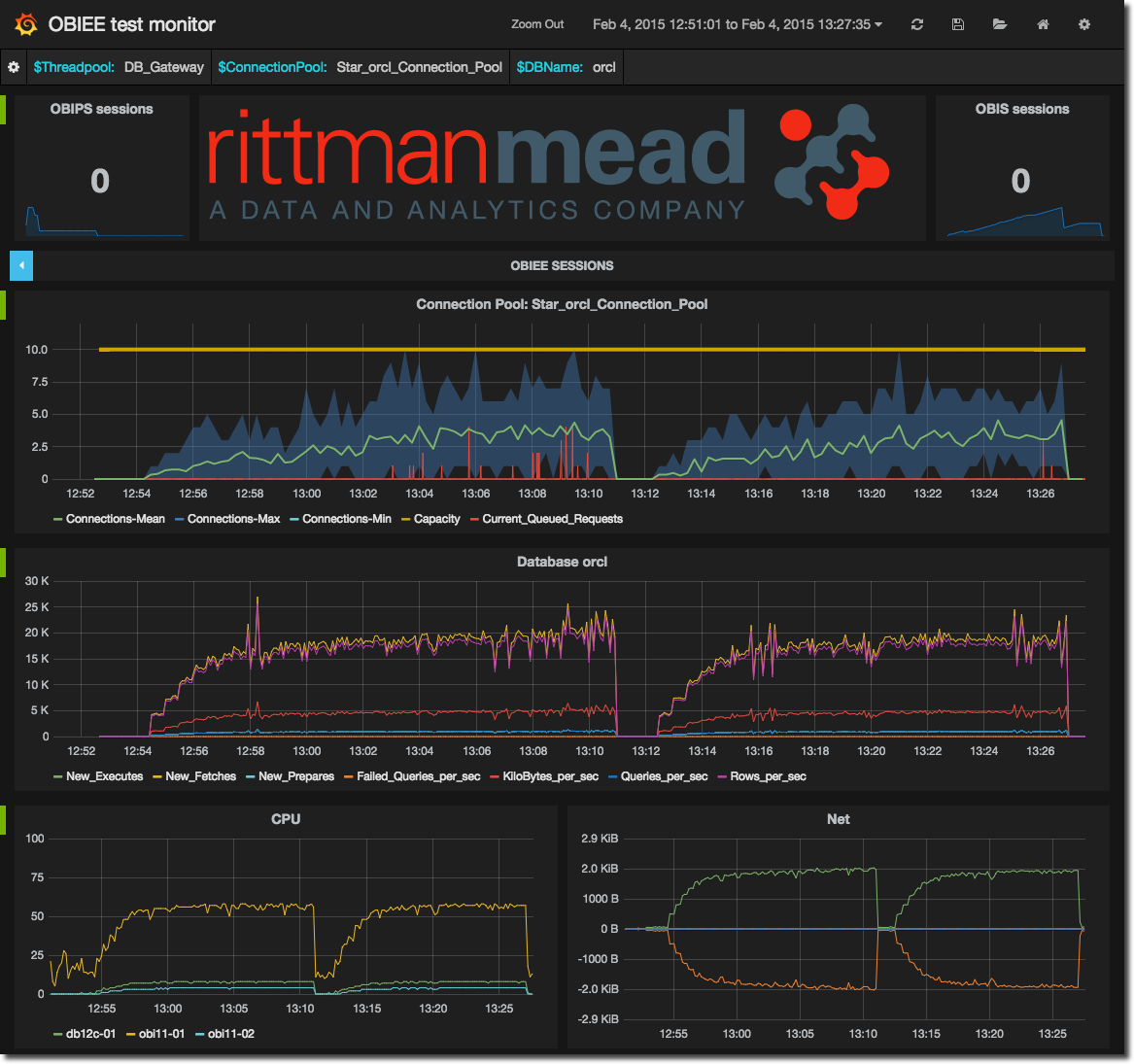
The Dynamic Monitoring System (DMS) in OBIEE is one of the best ways of being able to peer into the internals of the product and find out quite what’s going on. Whether performing diagnostics on a specific issue or just generally monitoring to make sure things are ticking over nicely, using the DMS metrics you can level-up your OBIEE sysadmin skills beyond what you’d get with Fusion Middleware Control out of the box. In fact, the DMS metrics are what you can get access to with Cloud Control 12c (EM12c) – but for that you need EM12c and the BI Management Pack. In this article we’re going to see how to easily set up our DMS dashboard.
N.B. if you’ve read my previous articles, what I write here (use InfluxDB/Grafana) supersedes what I wrote in those (use Graphite) as my recommended approach to working with arbitrary time-series metrics.
Overview
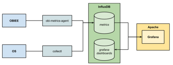
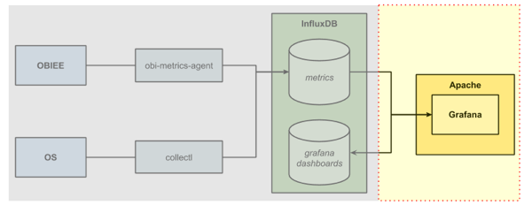
To get the DMS data out of OBIEE we're going to use the obi-metrics-agent tool that Rittman Mead open-sourced last year. This connects to OPMN and pulls the data out. We’ll store the data in InfluxDB, and then visualise it in Grafana. Whilst not mandatory for the DMS stats, we’ll also setup collectl so that we can show OS stats alongside the DMS ones.
InfluxDB
InfluxDB is a database, but unlike a RDBMS such as Oracle - good for generally everything - it is a what’s called a Time-Series Database (TSDB). This category of database focuses on storing data for a series, holding a given value for a point in time. Generally they’re optimised for handling large quantities of inbound metrics (think Internet of Things), rather than necessarily excelling at handling changes to the data (update/delete) - but that’s fine here since metric events in the past don’t generally change.
I’m using InfluxDB here for a few reasons:
- Grafana supports it as a source, with lots of active development for its specific features.
- It’s not Graphite. Whilst I have spent many a happy hour using Graphite I’ve spent many a frustrating day and night trying to install the damn thing – every time I want to use it on a new installation. It’s fundamentally long in the tooth, a whilst good for its time is now legacy in my mind. Graphite is also several things - a data store (whisper), a web application (graphite web), and a data collector (carbon). Since we’re using Grafana, the web front end that Graphite provides is redundant, and is where a lot of the installation problems come from.
- KISS! Yes I could store time series data in Oracle/mySQL/DB2/yadayada, but InfluxDB does one thing (storing time series metrics) and one thing only, very well and very easily with almost no setup.
For an eloquent discussion of Time-Series Databases read these couple of excellent articles by Baron Schwarz here and here.
Grafana
On the front-end we have Grafana which is a web application that is rapidly becoming accepted as one of the best time-series metric visualisation tools available. It is a fork of Kibana, and can work with data held in a variety of sources including Graphite and InfluxDB. To run Grafana you need to have a web server in place - I’m using Apache just because it’s familiar, but Grafana probably works with whatever your favourite is too.
OS
This article is based around the OBIEE SampleApp v406 VM, but should work without modification on any OL/CentOS/RHEL 6 environment.
InfluxDB and Grafana run on both RHEL and Debian based Linux distros, as well as Mac OS. The specific setup steps detailed here might need some changes according on the OS.
Getting Started with InfluxDB
InfluxDB Installation and Configuration as a Graphite/Carbon Endpoint
InfluxDB is a doddle to install. Simply download the rpm, unzip it, and run. BOOM. Compared to Graphite, this makes it a massive winner already.
wget http://s3.amazonaws.com/influxdb/influxdb-latest-1.x86_64.rpm
sudo rpm -ivh influxdb-latest-1.x86_64.rpm
This downloads and installs InfluxDB into /opt/influxdb and configures it as a service that will start at boot time.
Before we go ahead an start it, let’s configure it to work with existing applications that are sending data to Graphite using the Carbon protocol. InfluxDB can support this and enables you to literally switch Graphite out in favour of InfluxDB with no changes required on the source.
Edit the configuration file that you’ll find at /opt/influxdb/shared/config.toml and locate the line that reads:
[input_plugins.graphite]
In v0.8.8 this is at line 41. In the following stanza set the plugin to enabled, specify the listener port, and give the name of the database that you want to store data in, so that it looks like this.
# Configure the graphite api
[input_plugins.graphite]
enabled = true
# address = "0.0.0.0" # If not set, is actually set to bind-address.
port = 2003
database = "carbon"  # store graphite data in this database
# udp_enabled = true # enable udp interface on the same port as the tcp interface
Note that the file is owned by a user created at installation time, influxdb, so you’ll need to use sudo to edit the file.
Now start up InfluxDB:
sudo service influxdb start
You should see it start up successfully:
[oracle@demo influxdb]$ sudo service influxdb start
Setting ulimit -n 65536
Starting the process influxdb [ OK ]
influxdb process was started [ OK ]
You can see the InfluxDB log file and confirm that the Graphite/Carbon listener has started:
[oracle@demo shared]$ tail -f /opt/influxdb/shared/log.txt
[2015/02/02 20:24:04 GMT] [INFO] (github.com/influxdb/influxdb/cluster.func·005:1187) Recovered local server
[2015/02/02 20:24:04 GMT] [INFO] (github.com/influxdb/influxdb/server.(*Server).ListenAndServe:133) recovered
[2015/02/02 20:24:04 GMT] [INFO] (github.com/influxdb/influxdb/coordinator.(*Coordinator).ConnectToProtobufServers:898) Connecting to other nodes in the cluster
[2015/02/02 20:24:04 GMT] [INFO] (github.com/influxdb/influxdb/server.(*Server).ListenAndServe:139) Starting admin interface on port 8083
[2015/02/02 20:24:04 GMT] [INFO] (github.com/influxdb/influxdb/server.(*Server).ListenAndServe:152) Starting Graphite Listener on 0.0.0.0:2003
[2015/02/02 20:24:04 GMT] [INFO] (github.com/influxdb/influxdb/server.(*Server).ListenAndServe:178) Collectd input plugins is disabled
[2015/02/02 20:24:04 GMT] [INFO] (github.com/influxdb/influxdb/server.(*Server).ListenAndServe:187) UDP server is disabled
[2015/02/02 20:24:04 GMT] [INFO] (github.com/influxdb/influxdb/server.(*Server).ListenAndServe:187) UDP server is disabled
[2015/02/02 20:24:04 GMT] [INFO] (github.com/influxdb/influxdb/server.(*Server).ListenAndServe:216) Starting Http Api server on port 8086
[2015/02/02 20:24:04 GMT] [INFO] (github.com/influxdb/influxdb/server.(*Server).reportStats:254) Reporting stats: &client.Series{Name:"reports", Columns:[]string{"os", "arch", "id", "version"}, Points:[][]interface {}{[]interface {}{"linux", "amd64", "e7d3d5cf69a4faf2", "0.8.8"}}}
At this point if you’re using the stock SampleApp v406 image, or if indeed any machine with a firewall configured, you need to open up ports 8083 and 8086 for InfluxDB. Edit /etc/sysconfig/iptables (using sudo) and add:
-A INPUT -m state --state NEW -m tcp -p tcp --dport 8083 -j ACCEPT
-A INPUT -m state --state NEW -m tcp -p tcp --dport 8086 -j ACCEPT
immediately after the existing ACCEPT rules. Restart iptables to pick up the change:
sudo service iptables restart
If you now go to http://localhost:8083/ (replace localhost with the hostname of the server on which you’ve installed InfluxDB), you’ll get the InfluxDB web interface. It’s fairly rudimentary, but suffices just fine:
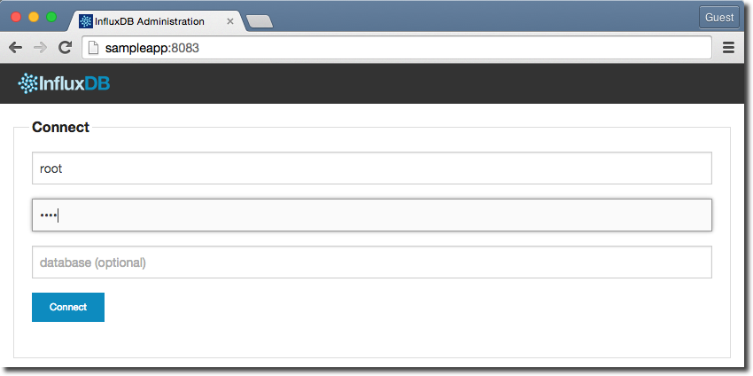
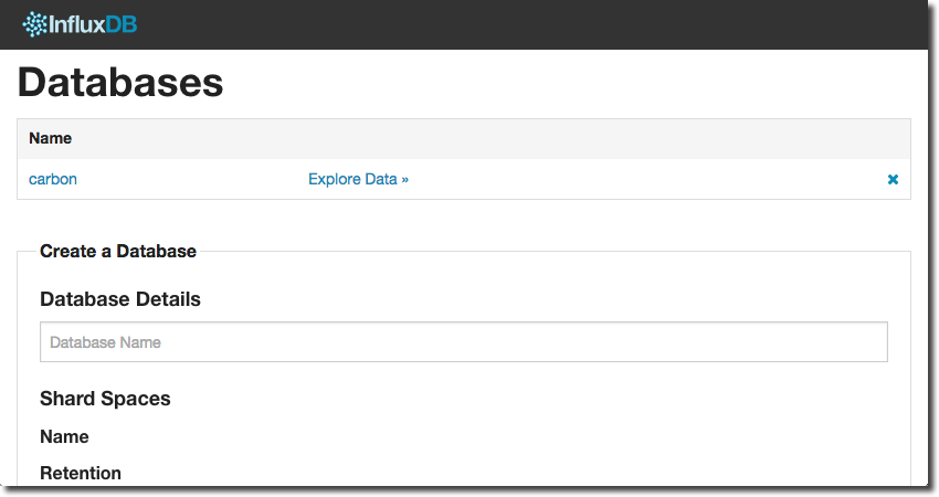
Login as root/root, and you’ll see a list of nothing much, since we’ve not got any databases yet. You can create a database from here, but for repeatability and a general preference for using the command line here is how to create a database called carbon with the HTTP API called from curl (assuming you’re running it locally; change localhost if not):
curl -X POST 'http://localhost:8086/db?u=root&p=root' -d '{"name": "carbon"}'
Simple huh? Now hit refresh on the web UI and after logging back in again you’ll see the new database:
You can call the database anything you want, just make sure what you create in InfluxDB matches what you put in the configuration file for the graphite/carbon listener.
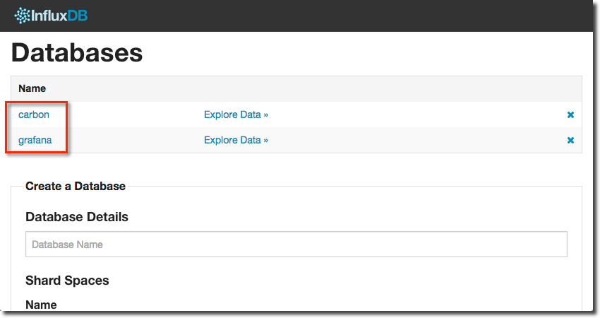
Now we’ll create a second database that we’ll need later on to hold the internal dashboard definitions from Grafana:
curl -X POST 'http://localhost:8086/db?u=root&p=root' -d '{"name": "grafana"}'
You should now have two InfluxDB databases, primed and ready for data:
Validating the InfluxDB Carbon Listener
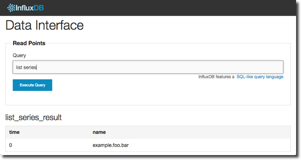
To make sure that InfluxDB is accepting data on the carbon listener use the NetCat (nc) utility to send some dummy data to it:
echo "example.foo.bar 3 `date +%s`"|nc localhost 2003
Now go to the InfluxDB web interface and click Explore Data ». In the query field enter
list series
To see the first five rows of data itself use the query
select * from /.*/ limit 5
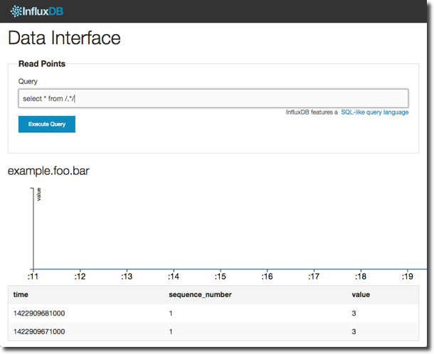
InfluxDB Queries
You’ll notice that what we’re doing here (“SELECT … FROM …”) looks pretty SQL-like. Indeed, InfluxDB support a SQL-like query language, which if you’re coming from an RDBMS background is nicely comforting ;-)
The syntax is documented, but what I would point out is the apparently odd /./ constructor for the “table” is in fact a regular expression (regex) to match the series for which to return values. We could have written select * from example.foo.bar but the . wildcard enclosed in the / / regex delimiters is a quick way to check all the series we’ve got.
Going off on a bit of a tangent (but hey, why not), let’s write a quick Python script to stick some randomised data into InfluxDB. Paste the following into a terminal window to create the script and make it executable:
cat >~/test_carbon.py<<EOF
#!/usr/bin/env python
import socket
import time
import random
import sys

CARBON_SERVER = sys.argv[1]
CARBON_PORT = int(sys.argv[2])

while True:
        message = 'test.data.foo.bar %d %d\n' % (random.randint(1,20),int(time.time()))
        print 'sending message:\n%s' % message
        sock = socket.socket()
        sock.connect((CARBON_SERVER, CARBON_PORT))
        sock.sendall(message)
        time.sleep(1)
        sock.close()
EOF
chmod u+x ~/test_carbon.py
And run it: (hit Ctrl-C when you’ve had enough)
$ ~/test_carbon.py localhost 2003
sending message:
test.data.foo.bar 3 1422910401

sending message:
test.data.foo.bar 5 1422910402
[...]
Now we’ve got two series in InfluxDB:
example.foo.bar– that we sent usingnctest.data.foo.bar– using the python script
Let’s go back to the InfluxDB web UI and have a look at the new data, using the literal series name in the query:
select * from test.data.foo.bar
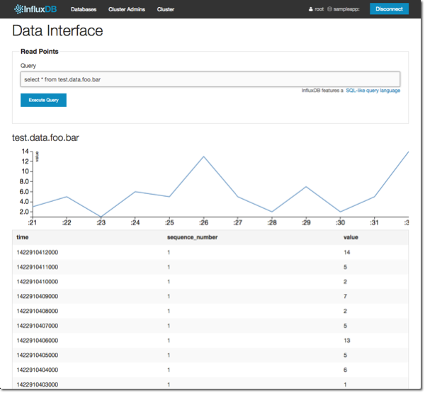
Well fancy that – InfluxDB has done us a nice little graph of the data. But more to the point, we can see all the values in the series.
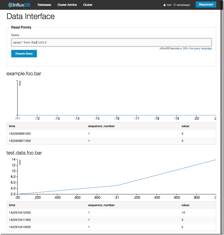
And a regex shows us both series, matching on the ‘foo’ part of the name:
select * from /foo/ limit 3
Let’s take it a step further. InfluxDB supports aggregate functions, such as max, min, and so on:
select count(value), max(value),mean(value),min(value) from test.data.foo.bar
Whilst we’re at it, let’s bring in another way to get data out – with the HTTP API, just like we used for creating the database above. Given a query, it returns the data in json format. There’s a nice little utility called jq which we can use to pretty-print the json, so let’s install that first:
sudo yum install -y jq
and then call the InfluxDB API, piping the return into jq:
curl --silent --get 'http://localhost:8086/db/carbon/series?u=root&p=root' --data-urlencode "q=select count(value), max(value),mean(value),min(value) from test.data.foo.bar"|jq '.'
The result should look something like this:
[
  {
    "name": "test.data.foo.bar",
    "columns": [
      "time",
      "count",
      "max",
      "mean",
      "min"
    ],
    "points": [
      [
        0,
        12,
        14,
        5.666666666666665,
        1
      ]
    ]
  }
]
We could have used the Web UI for this, but to be honest the inclusion of the graphs just confuses things because there’s nothing to graph and the table of data that we want gets hidden lower down the page.
Setting up obi-metrics-agent to Send OBIEE DMS metrics to InfluxDB
obi-metrics-agent is an open-source tool from Rittman Mead that polls your OBIEE system to pull out all the lovely juicy DMS metrics from it. It can write them to file, insert them to an RDBMS, or as we’re using it here, send them to a carbon-compatible endpoint (such as Graphite, or in our case, InfluxDB).
To install it simply clone the git repository (I’m doing it to /opt but you can put it where you want)
# Install pre-requisite
sudo yum install -y libxml2-devel python-devel libxslt-devel python-pip
sudo pip install lxml
# Clone the git repository
git clone https://github.com/RittmanMead/obi-metrics-agent.git ~/obi-metrics-agent
# Move it to /opt folder
sudo mv ~/obi-metrics-agent /opt
and then run it:
cd /opt/obi-metrics-agent

./obi-metrics-agent.py \
--opmnbin /app/oracle/biee/instances/instance1/bin/opmnctl \
--output carbon \
--carbon-server localhost
I’ve used line continuation character </code> here to make the statement clearer. Make sure you update opmnbin for the correct path of your OPMN binary as necessary, and localhost if your InfluxDB server is not local to where you are running obi-metrics-agent.
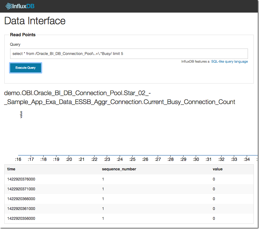
After running this you should be able to see the metrics in InfluxDB. For example:
select * from /Oracle_BI_DB_Connection_Pool\..+\.*Busy/ limit 5
Setting up collectl to Send OS metrics to InfluxDB
collectl is an excellent tool written by Mark Seger and reports on all sorts of OS-level metrics. It can run interactively, write metrics to file, and/or send them on to a carbon endpoint such as InfluxDB.

Installation is a piece of cake, using the EPEL yum repository:
# Install the EPEL yum repository
sudo rpm -Uvh http://dl.fedoraproject.org/pub/epel/6/`uname -p`/epel-release-6-8.noarch.rpm
# Install collectl
sudo yum install -y collectl
# Set it to start at boot
sudo chkconfig --level 35 collectl on
Configuration to enable logging to InfluxDB is a simple matter of modifying the /etc/collectl.conf configuration file either by hand or using this set of sed statements to do it automagically.
The localhost in the second sed command is the hostname of the server on which InfluxDB is running:
sudo sed -i.bak -e 's/^DaemonCommands/#DaemonCommands/g' /etc/collectl.conf
sudo sed -i -e '/^#DaemonCommands/a DaemonCommands = -f \/var\/log\/collectl -P -m -scdmnCDZ --export graphite,localhost:2003,p=.os,s=cdmnCDZ' /etc/collectl.conf
If you want to log more frequently than ten seconds, make this change (for 5 second intervals here):
sudo sed -i -e '/#Interval = 10/a Interval = 5' /etc/collectl.conf
Restart collectl for the changes to take effect:
sudo service collectl restart
As above, a quick check through the web UI should confirm we’re getting data through into InfluxDB:
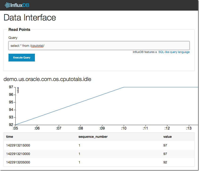
Note the very handy regex lets us be lazy with the series naming. We know there is a metric called in part ‘cputotal’, so using /cputotal/ can match anything with it in.
Installing and Configuring Grafana
Like InfluxDB, Grafana is also easy to install, although it does require a bit of setting up. It needs to be hooked into a web server, as well as configured to connect to a source for metrics and storing dashboard definitions.
First, download the binary (this is based on v1.9.1, but releases are frequent so check the downloads page for the latest):
cd ~
wget http://grafanarel.s3.amazonaws.com/grafana-1.9.1.zip
Unzip it and move it to /opt:
unzip grafana-1.9.1.zip
sudo mv grafana-1.9.1 /opt
Configuring Grafana to Connect to InfluxDB
We need to do a bit of configuration, so first create the configuration file based on the template given:
cd /opt/grafana-1.9.1
cp config.sample.js config.js
And now open the config.js file in your favourite text editor. Grafana supports various sources for metrics data, as well as various targets to which it can save the dashboard definitions. The configuration file helpfully comes with configuration elements for many of these, but all commented out. Uncomment the InfluxDB stanzas and amend them as follows:
datasources: {
    influxdb: {
        type: 'influxdb',
        url: "http://sampleapp:8086/db/carbon",
        username: 'root',
        password: 'root',
    },
    grafana: {
        type: 'influxdb',
        url: "http://sampleapp:8086/db/grafana",
        username: 'root',
        password: 'root',
        grafanaDB: true
    },
},
Points to note:
- The servername is the server host as you will be accessing it from your web browser. So whilst the configuration we did earlier was all based around ‘localhost’, since it was just communication within components on the same server, the Grafana configuration is what the web application from your web browser uses. So unless you are using a web browser on the same machine as where InfluxDB is running, you must put in the server address of your InfluxDB machine here.
- The default InfluxDB username/password is root/root, not admin/admin
- Edit the database names in the url, either as shown if you’ve followed the same names used earlier in the article or your own versions of them if not.
Setting Grafana up in Apache
Grafana runs within a web server, such as Apache or nginx. Here I’m using Apache, so first off install it:
sudo yum install -y httpd
And then set up an entry for Grafana in the configuration folder by pasting the following to the command line:
cat > /tmp/grafana.conf <<EOF
Alias /grafana /opt/grafana-1.9.1

<Location /grafana>
Order deny,allow
Allow from 127.0.0.1
Allow from ::1
Allow from all
</Location>
EOF

sudo mv /tmp/grafana.conf /etc/httpd/conf.d/grafana.conf
Now restart Apache:
sudo service httpd restart
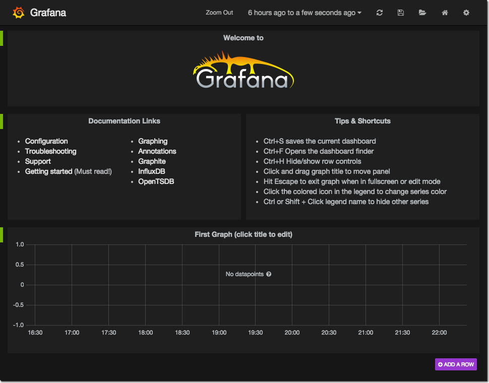
And if the gods of bits and bytes are smiling on you, when you go to http://yourserver/grafana you should see:
Note that as with InfluxDB, you may well need to open your firewall for Apache which is on port 80 by default. Follow the same iptables instructions as above to do this.
Building Grafana Dashboards on Metrics Held in InfluxDB
So now we’ve set up our metric collectors, sending data into InfluxDB.
Let’s see now how to produce some swanky dashboards in Grafana.
Grafana has a concept of Dashboards, which are made up of Rows and within those Panels. A Panel can have on it a metric Graphs (duh), but also static text or single figure metrics.
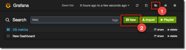
To create a new dashboard click the folder icon and select New:
You get a fairly minimal blank dashboards. On the left you’ll notice a little green tab: hover over that and it pops out to form a menu box, from where you can choose the option to add a graph panel:
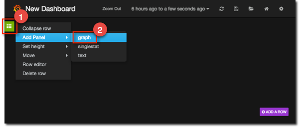
Grafana Graph Basics
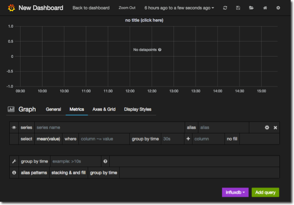
On the blank graph that’s created click on the title (with the accurate text “click here”) and select edit from the options that appear. This takes you to the graph editing page, which looks equally blank but from here we can now start adding metrics:
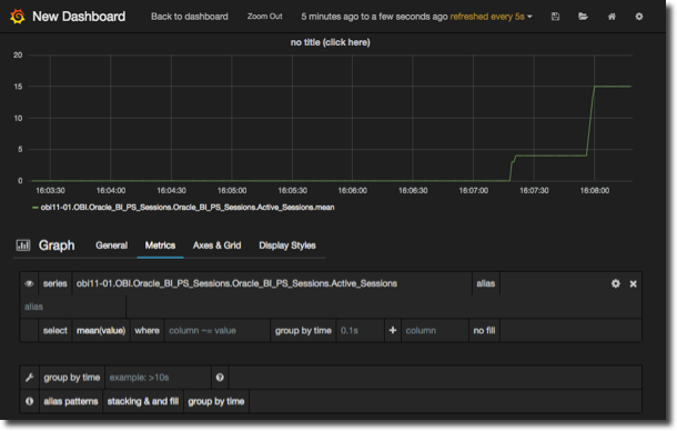
In the box labelled series start typing Active_Sessions and notice that Grafana will autocomplete it to any available metrics matching this:
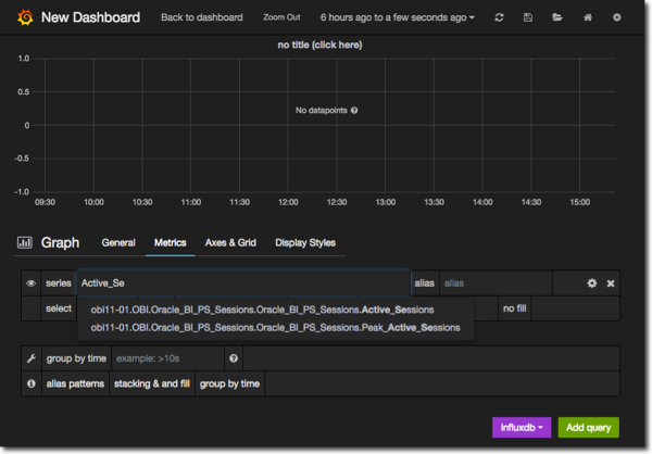
Select Oracle_BI_PS_Sessions.Active_Sessions and your graph should now display the metric.
To change the time period shown in the graph, use the time picker at the top of the screen.You can also click & drag (“brushing”) on any graph to select a particular slice of time.
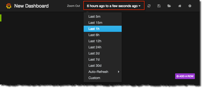
So, set the time filter to 15 minutes ago and from the Auto-refresh submenu set it to refresh every 5 seconds. Now login to your OBIEE instance, and you should see the Active Sessions value increase (one per session login):
To add another to the graph you can click on Add query at the bottom right of the page, or if it’s closely related to the one you’ve defined already click on the cog next to it and select duplicate:
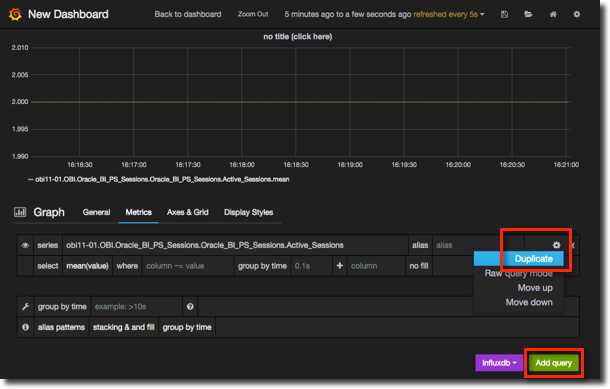
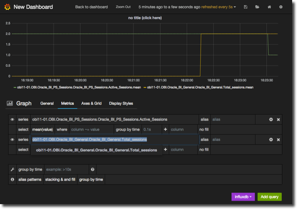
In the second query add Oracle_BI_General.Total_sessions (remember, you can just type part of the string and Grafana autocompletes based on the metric series stored in InfluxDB). Run a query in OBIEE to cause sessions to be created on the BI Server, and you should now see the Total sessions increase:
To save the graph, and the dashboard, click the Save icon. To return to the dashboard to see how your graph looks alongside others, or to add a new dashboards, click on Back to dashboard.
Grafana Graph Formatting
Let’s now take a look at the options we’ve got for modifying the styling of the graph. There are several tabs/sections to the graph editor - General, Metrics (the default), Axes & Grid, and Display Styles. The first obvious thing to change is the graph title, which can be changed on the General tab:
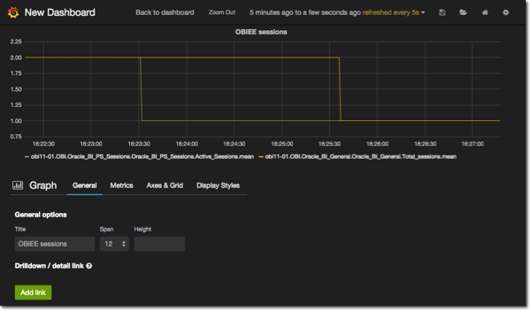
From here you can also change how the graph is sized on the dashboard using the Span and Height options. A new feature in recent versions of Grafana is the ability to link dashboards to help with analysis paths - guided navigation as we’d call it in OBIEE - and it’s from the General tab here that you can define this.
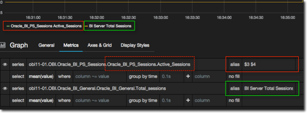
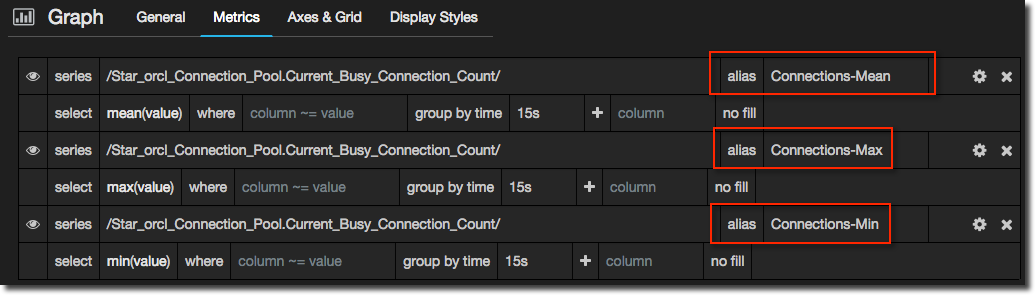
On the Metrics tab you can specify what text to use in the legend. By default you get the full series name, which is usually too big to be useful as well as containing a lot of redundant repeating text. You can either specify literal text in the alias field, or you can use segments of the series name identified by $x where x is the zero-based segment number. In the example I’ve hardcoded the literal value for the second metric query, and used a dynamic segment name for the first:
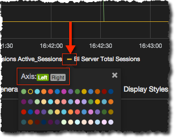
On the Axes & Grid tab you can specify the obvious stuff like min/max scales for the axes and the scale to use (bits, bytes, etc). To put metrics on the right axis (and to change the colour of the metric line too) click on the legend line, and from there select the axis/colour as required:
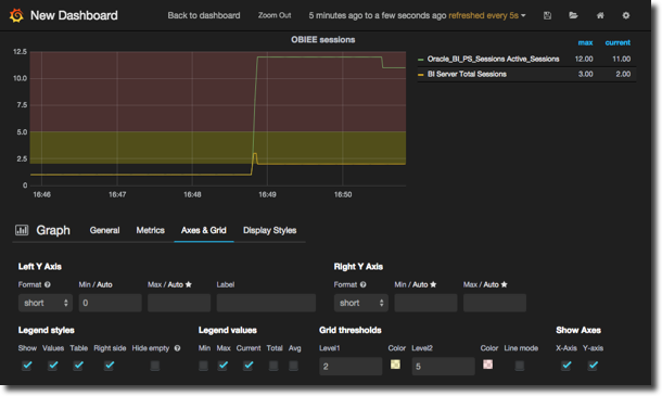
You can set thresholds to overlay on the graph (to highlight warning/critical values, for example), as well as customise the legend to show an aggregate value for each metric, show it in a table, or not at all:
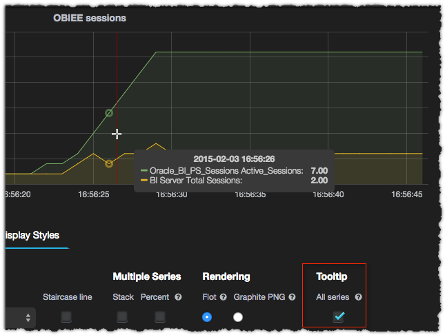
The last tab, Display Styles, has even more goodies. One of my favourite new additions to Grafana is the Tooltip. Enabling this gives you a tooltip when you hover over the graph, displaying the value of all the series at that point in time:
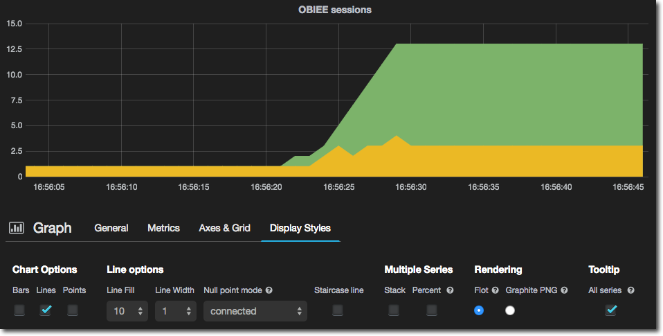
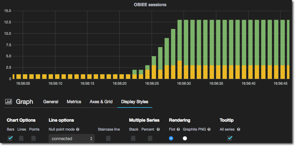
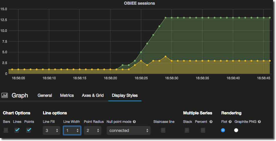
You can change the presentation of the graph, which by default is a line, adding bars and/or points, as well as changing the line width and fill.
- Solid Fill:
- Bars only
- Points and translucent fill:
Advanced InfluxDB Query Building in Grafana
Identifying Metric Series with RegEx
In the example above there were two fairly specific metrics that we wanted to report against. What you will find is much more common is wanting to graph out a set of metrics from the same ‘family’. For example, OBIEE DMS metrics include a great deal of information about each Connection Pool that’s defined. They’re all in a hierarchy that look like this:
obi11-01.OBI.Oracle_BI_DB_Connection_Pool.Star_01_-_Sample_App_Data_ORCL_Sample_Relational_Connection
Under which you’ve got
Capacity
Current Connection Count
Current Queued Requests
and so on.
So rather than creating an individual metric query for each of these (similar to how we did for the two session metrics previously) we’ll use InfluxDB’s rather smart regex method for identifying metric series in a query. And because Grafana is awesome, writing the regex isn’t as painful as it could be because the autocomplete validates your expression in realtime. Let’s get started.
First up, let’s work out the root of the metric series that we want. In this case, it’s the orcl connection pool. So in the series box, enter /orcl/. The / delimiters indicate that it is a regex query. As soon as you enter the second / you’ll get the autocomplete showing you the matching series:
/orcl/
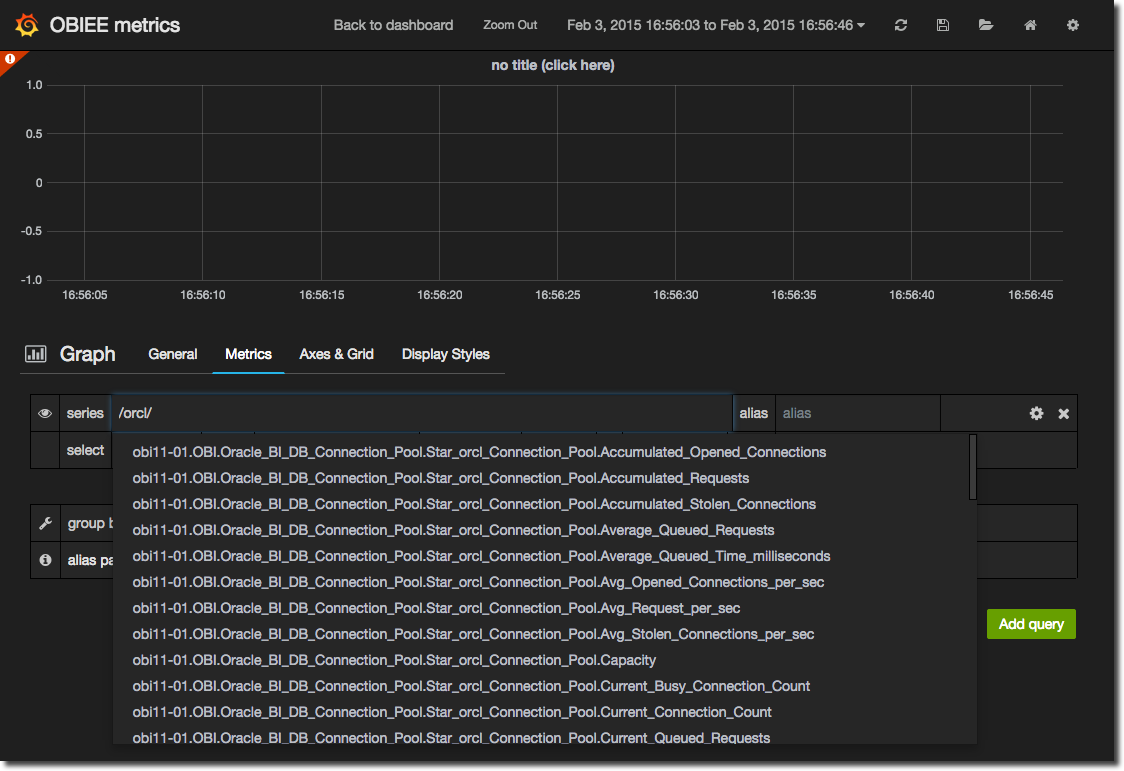
If you scroll down the list you’ll notice there’s other metrics in there beside Connection Pool ones, so let’s refine our query a bit
/orcl_Connection_Pool/
That’s better, but we’ve now got all the Connection Pool metrics, which whilst are fascinating to study (no, really) complicate our view of the data a bit, so let’s pick out just the ones we want. First up we’ll put in the dot that’s going to precede any of the final identifiers for the series (.Capacity, .Current Connection Count, etc). A dot is a special character in regex so we need to escape it .
/orcl_Connection_Pool\./
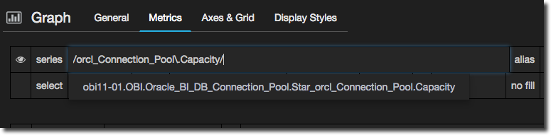
And now let’s check we’re on the right lines by specifying just Capacity to match:
/orcl_Connection_Pool\.Capacity/
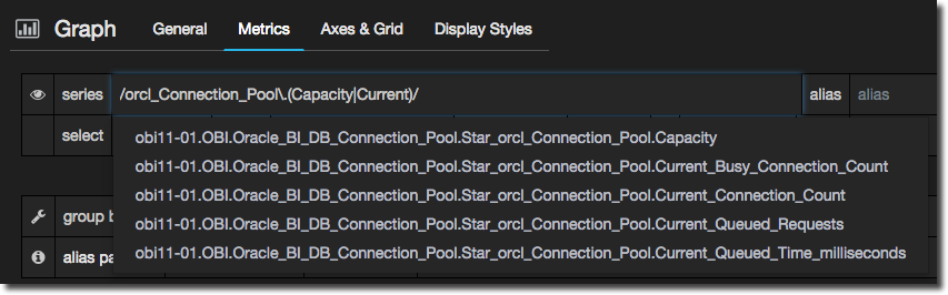
Excellent. So we can now add in more permutations, with a bracketed list of options separated with the pipe (regex OR) character:
/orcl_Connection_Pool\.(Capacity|Current)/
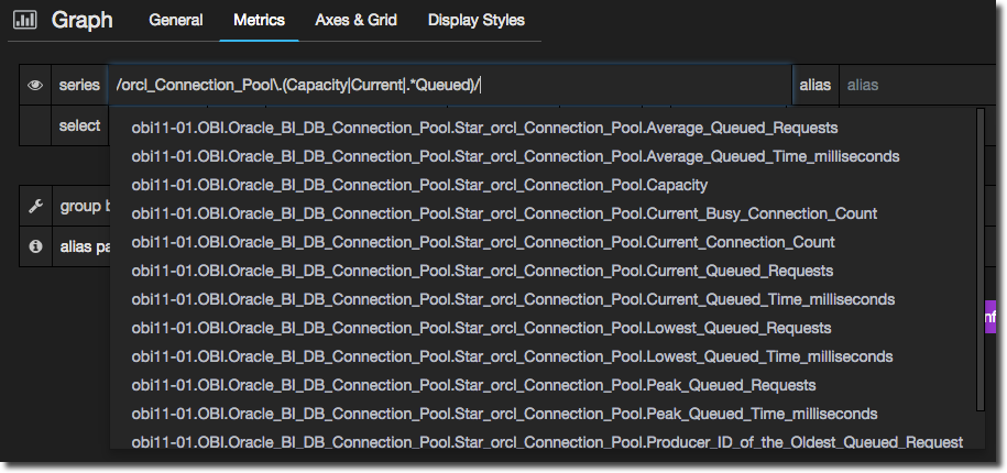
We can use a wildcard .* for expressions that are not directly after the dot that we specified in the match pattern. For example, let’s add any metric that includes Queued:
/orcl_Connection_Pool\.(Capacity|Current|.*Queued)/
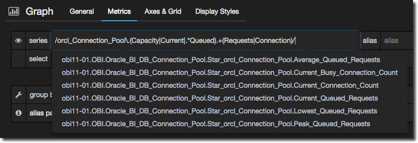
But now we’ve a rather long list of matches, so let’s refine the regex to narrow it down:
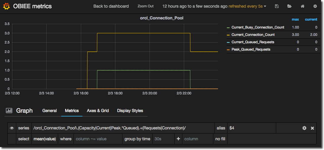
/orcl_Connection_Pool\.(Capacity|Current|Peak.*Queued).+(Requests|Connection)/
(Something else I tried before this was regex negative look-behind, but it looks like Go (which InfluxDB is written in) doesn’t support it).
Setting the Alias to $4, and the legend to include values in a table format gives us this:
Now to be honest here, in this specific example, I could have created four separate metric queries in a fraction of the time it took to construct that regex. That doesn’t detract from the usefulness and power of regex though, it simply illustrates the point of using the right tool for the right job, and where there’s a few easily identified and static metrics, a manual selection may be quicker.
Aggregates
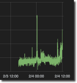
By default Grafana will request the mean of a series at the defined grain of time from InfluxDB. The grain of time is calculated automatically based on the time window you’ve got shown in your graph. If you’re collecting data every five seconds, and build a graph to show a week’s worth of data, showing all 120960 data points will end up in a very indistinct line:
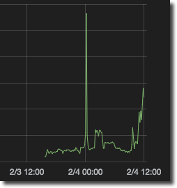
So instead Grafana generates an InfluxDB query that rolls the data up to more sensible intervals - in the case of a week’s worth of data, every 10 minutes:
You can see, and override, the time grouping in the metric panel. By default it’s dynamic and you can see the current value in use in lighter text, like this:
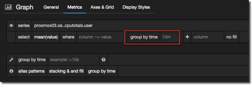
You can also set an optional minimal time grouping in the second of the “group by time” box (beneath the first). This is a time grouping under which Grafana will never go, so if you always want to roll up to, say, at least a minute (but higher if the duration of the graph requires it), you’d set that here.
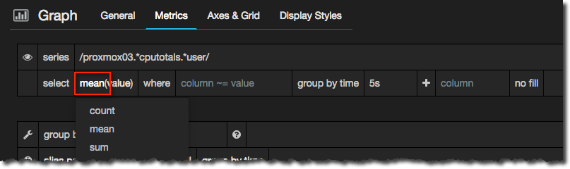
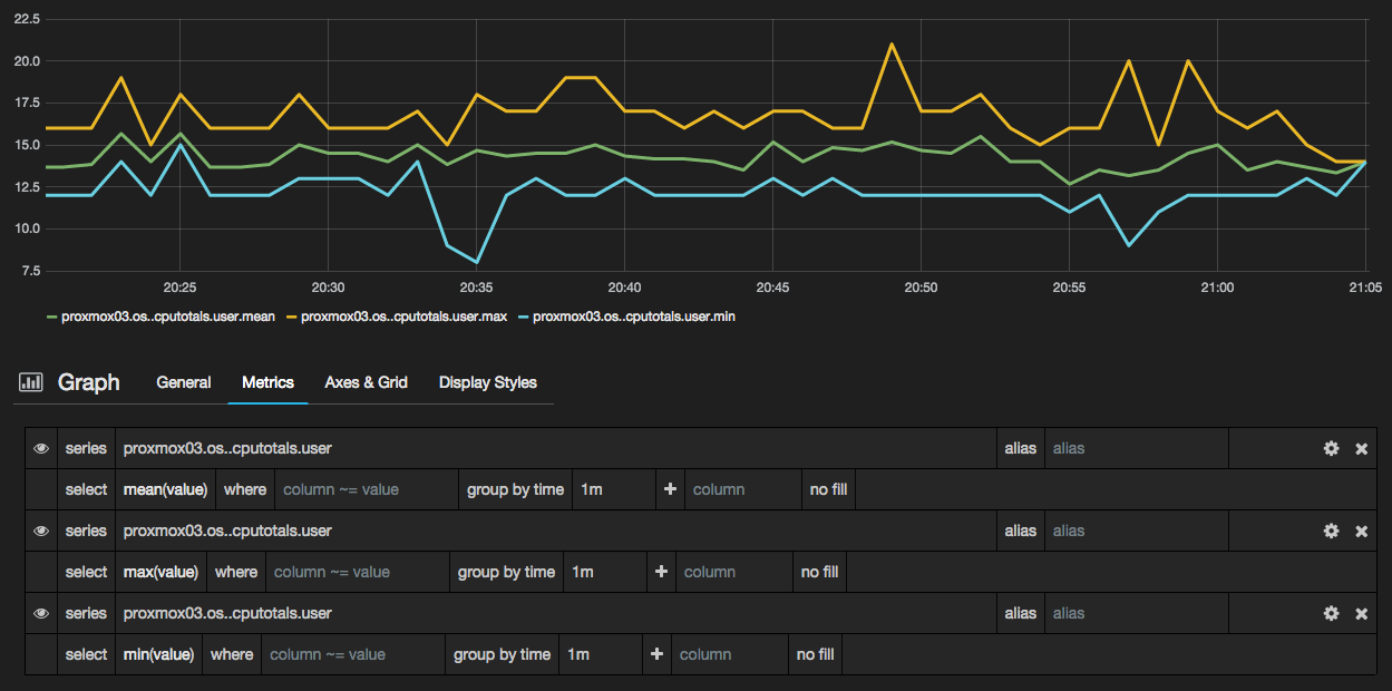
So I’ve said that InfluxDB can roll up the figures - but how does it roll up multiple values into one? By default, it takes the mean of all the values. Depending on what you’re looking at, this can be less that desirable, because you may miss important spikes and troughs in your data. So you can change the aggregate rule, to look at the maximum value, minimum, and so on. Do this by clicking on the aggregation in the metric panel:
This is the same series of data, but shown as 5 second samples rolled up to a minute, using the mean, max, and min aggregate rules:
For a look at how all three series can be better rendered together see the discussion of Series Specific Overrides later in this article.
You can also use aggregate functions with measures that may not be simple point in time values. For example, an incrementing/accumulating measure (such as a counter like “number of requests since launch”) you actually want to graph the rate of change, the delta between each point. To do this, use the derivative function. In this graph you can see the default aggregation (mean, in green) against derivative, in yellow. One is in effect the “actual” value of the measure, the other is the rate of change, which is much more useful to see in a time series.
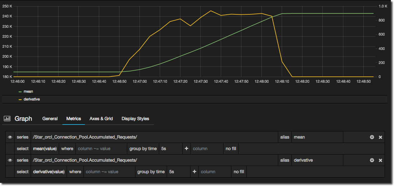
Note that if you are using derivative you may need to fix the group by time to the grain at which you are storing data. In my example I am storing data every 5 seconds, but if the default time grain on the graph is 1s then it won’t show the derivative data.
See more details about the aggregations available in InfluxDB in the docs here. If you want to use an aggregation (or any query) that isn’t supported in the Grafana interface simply click on the cog icon and select Raw query mode from where you can customise the query to your heart’s content.
Drawing inverse graphs
As mentioned just above, you can customise the query sent to InfluxDB, which means you can do this neat trick to render multiple related series that would otherwise overlap by inverting one of them. In this example I’ve got the network I/O drawn conventionally:
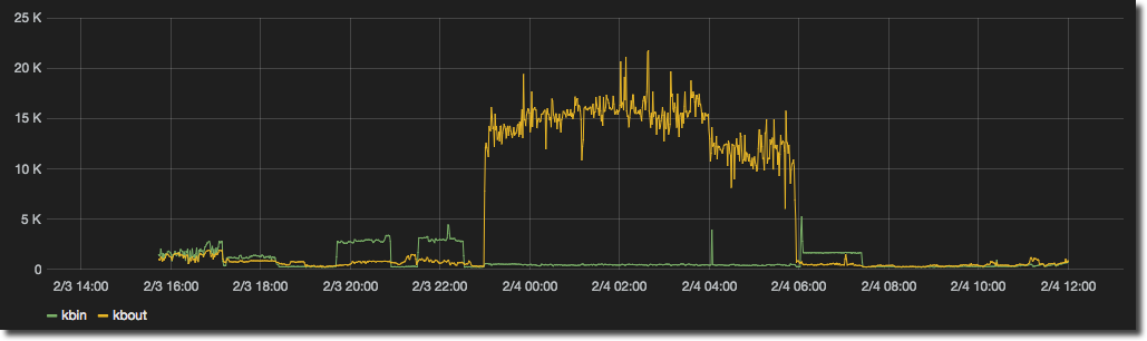
But since metrics like network I/O, disk I/O and so on have a concept of adding and taking, it feels much more natural to see the input as ‘positive’ and output as ‘negative’.
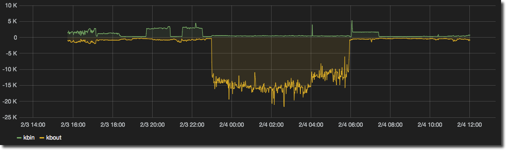
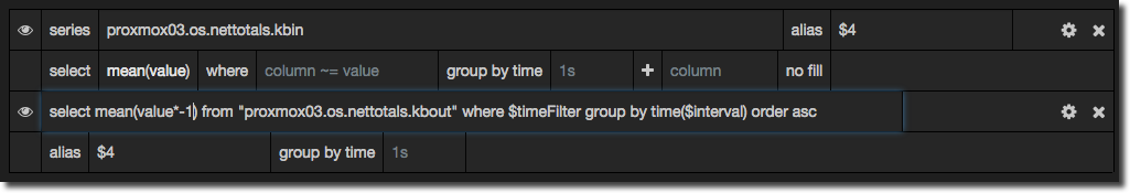
Which certainly for my money is easier to see at a glance whether we’ve got data coming or going, and at what volume. To implement this simply set up your series as usual, and then for the series you want to invert click on the cog icon and select Raw query mode. Then in place of
mean(value)
put
mean(value*-1)
Series Specific Overrides
The presentation options that you specify for a graph will by default apply to all series shown in the graph. As we saw previously you can change the colour, width, fill etc of a line, or render the graph as bars and/or points instead. This is all good stuff, but presumes that all measures are created equal - that every piece of data on the graph has the same meaning and importance. Often we’ll want to change how display a particular set of data, and we can use Series Specific Overrides in Grafana to do that.
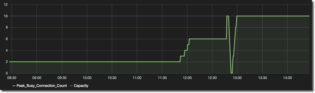
For example in this graph we can see the number of busy connections and the available capacity:
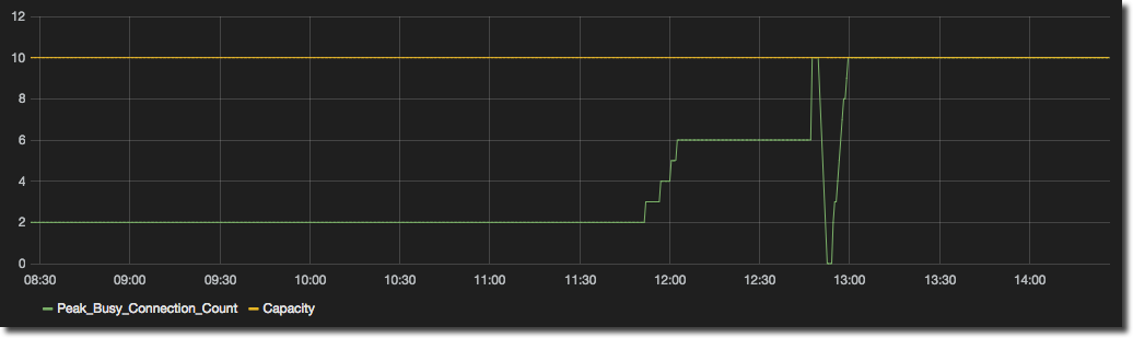
But the actual (Busy Connections) is the piece of data we want to see at a glance, against the context of the available Capacity. So by setting up a Series Specific Override we can change the formatting of each line individually - calling out the actual (thick green) and making the threshold more muted (purple):
To configure a Series Specific Override got to the Display Styles panel and click Add series override rule. Pick the specific series or use a regex to identify it, and then use the + button to add formatting options:
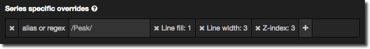
A very useful formatting option is Z-index, which enables you to define the layering on the graph so that a given series is rendered on top (or below) another. To bring something to the very front use a Z-index of 3; for the very back use -3. Series Specific Overrides are also a good way of dynamically assigning multiple Y axes.
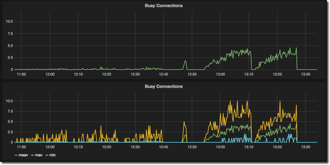
Another great use of Series Specific Overrides is to show the min/max range for data as a shaded area behind the main line, thus providing more context for aggregate data. I discussed above how Grafana can get InfluxDB to roll up (aggregate) values across time periods to make graphs more readable when shown for long time frames – and how this can mask data exceptions. If you only show the mean, you miss small spikes and troughs; if you only show the max or min then you over or under count the actual impact of the measure. But, we can have the best of all worlds! The next two graphs show the starting point – showing just the mean (missing the subtleties of a data series) and showing all three versions of a measure (ugly and unusable):
Instead of this, let’s bring out the mean, but still show it in context of the range of the values within the aggregate:
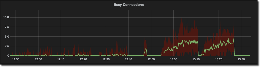
I hope you’d agree that this a much cleaner and clearer way of presenting the data. To do it we need two steps:
- Make sure that each metric has an alias. This is used in the label but importantly is also used in the next step to identify each data series. You can skip this bit if you really want and regex the series to match directly in the next step, but setting an alias is much easier
- On the Display Styles tab click Add series override rule at the bottom of the page. In the alias or regex box you should see your aliases listed. Select the one which is the maximum series. Then choose the formatting option Fill below to and select the minimum series
You’ll notice that Grafana automagically adds in a second rule to disable lines for the minimum series, as well as on the existing maximum series rule.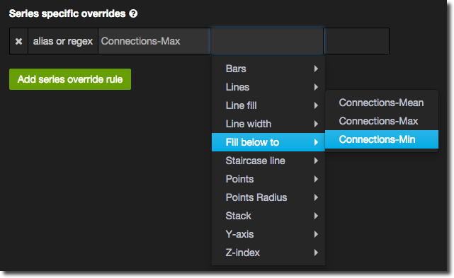
Optionally, add another rule for your mean series, setting the Z-index to 3 to bring it right to the front.
All pretty simple really, and a nice result: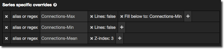
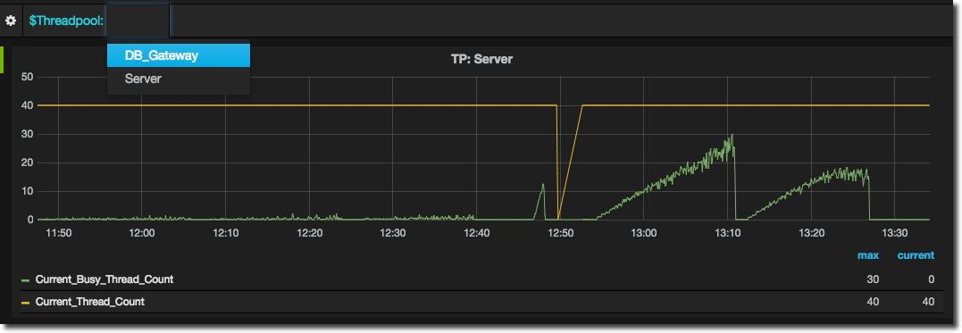
Variables in Grafana (a.k.a. Templating)
In lots of metric series there is often going to be groups of measures that are associated with reoccurring instances of a parent. For example, CPU details for multiple servers, or in the OBIEE world connection pool details for multiple connection pools.
centos-base.os.cputotals.user db12c-01.os.cputotals.user gitserver.os.cputotals.user media02.os.cputotals.user monitoring-01.os.cputotals.user etc
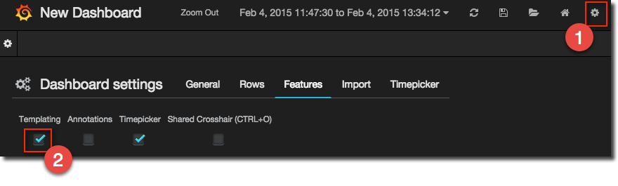
Instead of creating a graph for each permutation, or modifying the graph each time you want to see a different instance, you can instead use Templating, which is basically creating a variable that can be incorporated into query definitions.
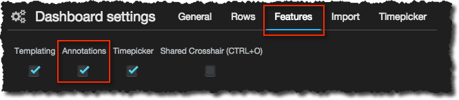
To create a template you first need to enable it per dashboard, using the cog icon in the top-right of the dashboard:
Then open the Templating option from the menu opened by clicking on the cog on the left side of the screen
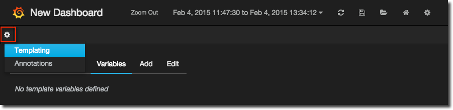
Now set up the name of the variable, and specify a full (not partial, as you would in the graph panel) InfluxDB query that will return all the values for the variable - or rather, the list of all series from which you’re going to take the variable name.
Let’s have a look at an example. Within the OBIEE DMS metrics you have details about the thread pools within the BI Server, and there are different thread pool types, and it is that type that I want to store. Here’s a snippet of the series:
[...]
obi11-01.OBI.Oracle_BI_Thread_Pool.DB_Gateway.Peak_Queued_Requests
obi11-01.OBI.Oracle_BI_Thread_Pool.DB_Gateway.Peak_Queued_Time_milliseconds
obi11-01.OBI.Oracle_BI_Thread_Pool.DB_Gateway.Peak_Thread_Count
obi11-01.OBI.Oracle_BI_Thread_Pool.Server.Accumulated_Requests
obi11-01.OBI.Oracle_BI_Thread_Pool.Server.Average_Execution_Time_milliseconds
obi11-01.OBI.Oracle_BI_Thread_Pool.Server.Average_Queued_Requests
obi11-01.OBI.Oracle_BI_Thread_Pool.Server.Average_Queued_Time_milliseconds
obi11-01.OBI.Oracle_BI_Thread_Pool.Server.Avg_Request_per_sec
[...]
Looking down the list, it’s the DB_Gateway and Server values that I want to extract. First up is some regex to return the series with the thread pool name in:
/.*Oracle_BI_Thread_Pool.*/
and now build it as part of an InfluxDB query:
list series /.*Oracle_BI_Thread_Pool.*/
You can validate this against InfluxDB directly using the web UI for InfluxDB or curl as described much earlier in this article. Put the query into the Grafana Template definition and hit the green play button. You’ll get a list back of all series returned by the query:
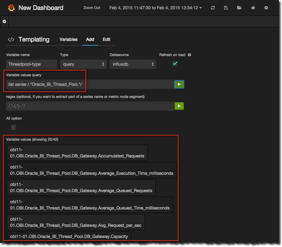
Now we want to extract out the threadpool names and we do this using the regex capture group ( ):
/.*Oracle_BI_Thread_Pool\.(.*)\./
Hit play again and the results from the first query are parsed through the regex and you should have just the values you need:
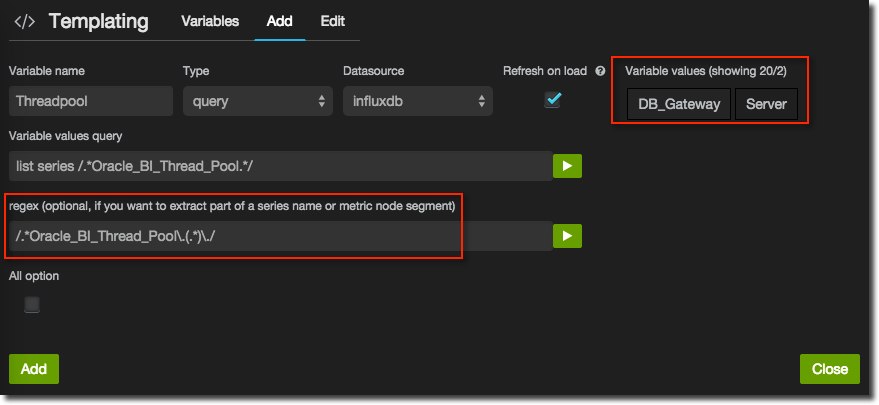
If the values are likely to change (for example, Connection Pool names will change in OBIEE depending on the RPD) then make sure you select Refresh on load. Click Add and you’re done.
You can also define variables with fixed values, which is good if they’re never going to change, or they are but you’ve not got your head around RegEx. Simply change the Type to Custom and enter comma-separated values.
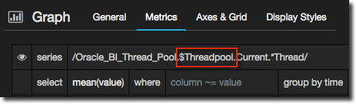
To use the variable simply reference it prefix with a dollar sign, in the metric definition:
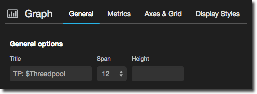
or in the title:
To change the value selected just use the dropdown from the top of the screen:
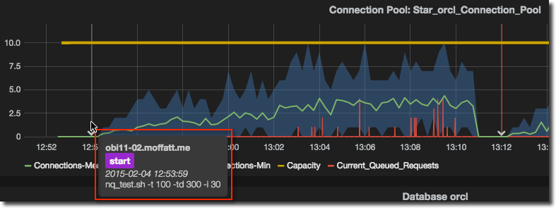
Annotations
Another very nice feature of Grafana is Annotations. These are overlays on each graph at a given point in time to provide additional context to the data. How I use it is when analysing test data to be able to see what script I ran when:
There’s two elements to Annotations - setting them up in Grafana, and getting the data into the backend (InfluxDB in this case, but they work with other data sources such as Graphite too).
Storing an Annotation
An annotation is nothing more than some time series data, but typically a string at a given point in time rather than a continually changing value (measure) over time.
To store it just just chuck the data at InfluxDB and it creates the necessary series. In this example I’m using one called events but it could be called foobar for all it matters. You can read more about putting data into InfluxDB here and choose one most suitable to the event that it is you want to record to display as an annotation. I’m running some bash-based testing, so curl fits well here, but if you were using a python program you could use the python InfluxDB client, and so on.
Sending data with curl is easy, and looks like this:
curl -X POST -d '[{"name":"events","columns":["id","action"],"points":[["big load test","start"]]}]' 'http://monitoring-server.foo.com:8086/db/carbon/series?u=root&p=root'
The main bit of interest, other than the obvious server name and credentials, is the JSON payload that we’re sending. Pulling it out and formatting it a bit more nicely:
{
   "name":"events",
   "columns":[
      "test-id",
      "action"
   ],
   "points":[
      [
         "big load test",
         "start"
      ]
   ]
}
So the series (“table”) we’re loading is called events, and we’re going to store an entry for this point in time with two columns, test-id and action storing values big load test and start respectively. Interestingly (and something that’s very powerful) is that InfluxDB’s schema can evolve in a way that no traditional RDBMS could. Never mind that we’re not had to define events before loading it, we could even load it at subsequent time points with more columns if we want to simply by sending them in the data payload.
Coming back to real-world usage, we want to make the load as dynamic as possible, so with a few variables and a bit of bash magic we have something like this that will automatically load to InfluxDB the start and end time of every load test that gets run, along with the name of the script that ran it and the host on which it ran:
INFLUXDB_HOST=monitoring-server.foo.com
INFLUXDB_PORT=8086
INFLUXDB_USER=root
INFLUXDB_PW=root
HOSTNAME=$(hostname)
SCRIPT=`basename $0`
curl -X POST -d '[{"name":"events","columns":["host","id","action"],"points":[["'"$HOSTNAME"'","'"$SCRIPT"'","start"]]}]' "http://$INFLUXDB_HOST:$INFLUXDB_PORT/db/carbon/series?u=$INFLUXDB_USER&p=$INFLUXDB_PW"

echo 'Load testing bash code goes here. For now let us just go to sleep'
sleep 60

curl -X POST -d '[{"name":"events","columns":["host","id","action"],"points":[["'"$HOSTNAME"'","'"$SCRIPT"'","end"]]}]' "http://$INFLUXDB_HOST:$INFLUXDB_PORT/db/carbon/series?u=$INFLUXDB_USER&p=$INFLUXDB_PW"
Displaying annotations in Grafana
Once we’ve got a series (“table”) in InfluxDB with our events in, pulling them through into Grafana is pretty simple. Let’s first check the data we’ve got, by going to the InfluxDB web UI (http://influxdb:8083) and from the Explore Data » page running a query against the series we’ve loaded:
select * from events
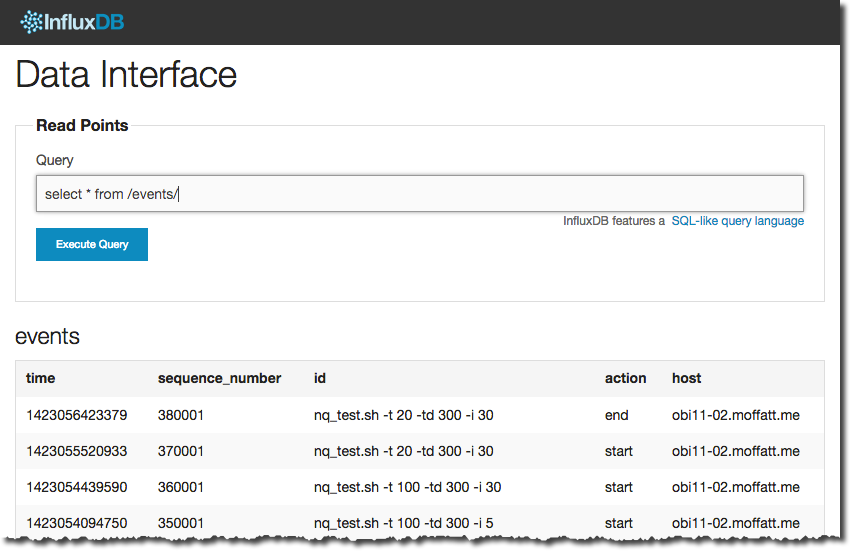
The time value is in epoch milliseconds, and the remaining values are whatever you sent to it.
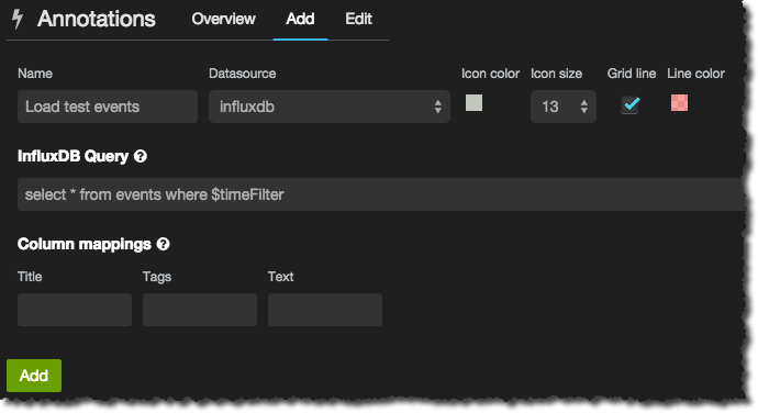
Now in Grafana enable Annotations for the dashboard (via the cog in the top-right corner)
Once enabled use the cog in the top-left corner to open the menu from which you select the Annotations dialog. Click on the Add tab. Give the event group a name, and then the InfluxDB query that pulls back the relevant data. All you need to do is take the above query that you used to test out the data and append the necessary time predicate where $timeFilter so that only events for the time window currently being shown are returned:
select * from events where $timeFilter
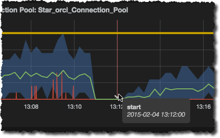
Click Add and then set your time window to include a period when an event was recorded. You should see a nice clear vertical line and a marker on the x-axis that when you hover over it gives you some more information:
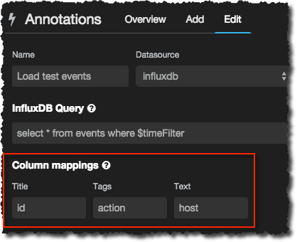
You can use the Column Mapping options in the Annotations window to bring in additional information into the tooltip. For example, in my event series I have the id of the test, action (start/end), and the hostname. I can get this overlaid onto the tooltip by mapping the columns thus:
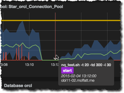
Which then looks like this on the graph tooltips:
N.B. currently (Grafana v1.9.1) when making changes to an Annotation definition you need to refresh the graph views after clicking Update on the annotation definition, otherwise you won’t see the change reflected in the annotations on the graphs.
Sparklines
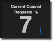
Everything I’ve written about Grafana so far has revolved around the graphs that it creates, and unsurprisingly because this is the core feature of the tool, the bread and butter. But there are other visualisation options available - “Singlestat”, and “Text”. The latter is pretty obvious and I’m not going to discuss it here, but Singlestat, a.k.a. Sparkline and/or Performance Tiles, is awesome and well worth a look. First, an illustration of what I’m blathering about:
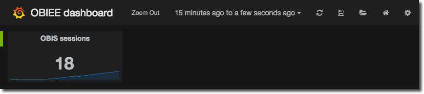
A nice headline figure of the current number of active sessions, along with a sparkline to show the trend of the metric.
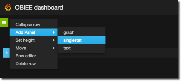
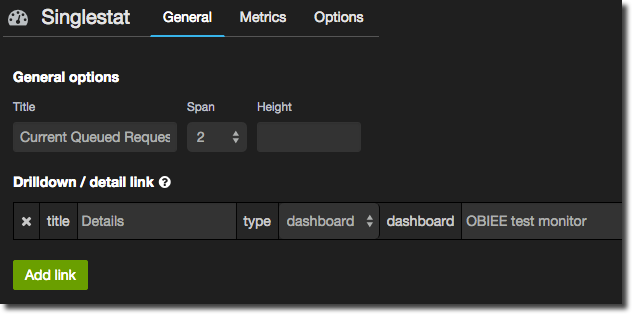
To add one of these to your dashboard go to the green row menu icon on the left (it’s mostly hidden and will pop out when you hover over it) and select Add Panel -> singlestat.
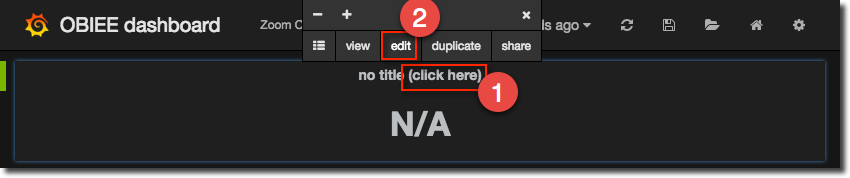
On the panel that appears go to the edit screen as shown :
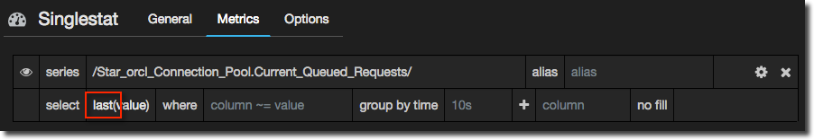
In the Metrics panel specify the series as you would with a graph, but remember you need to pull back just a single series - no point writing a regex to match multiple ones. Here I’m going to show the number of queued requests on a connection pool. Note that because I want to show the latest value I change the aggregation to last:
In the General tab set a title for the panel, as well as the width of it – unlike graphs you typically want these panels to be fairly narrow since the point is to show a figure not lots of detail. You’ll notice that I’ve also defined a Drilldown / detail link so that a user can click on the summary figure and go to another dashboard to see more detail.
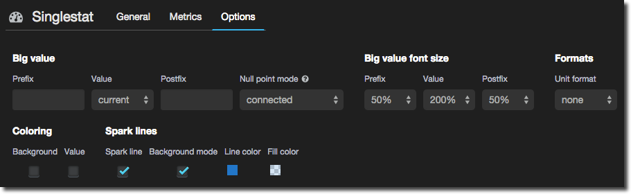
The Options tab gives you the option to set font size, prefixes/suffixes, and is also where you set up sparkline and conditional formatting.
Tick the Spark line box to draw a sparkline within the panel - if you’re not seen them before sparklines are great visualisations for showing the trend of a metric without fussing with axes and specific values. Tick the Background mode to use the entire height of the panel for the graph and overlay the summary figure on top.
Now for the bit I think is particularly nice - conditional formatting of the singlestat panel. It’s dead easy and not a new concept but is really great way to let a user see at a real glance if there’s something that needs their attention. In the case of this example here, queueing connections, any queueing is dodgy and more than a few is bad (m’kay). So let’s colour code it:
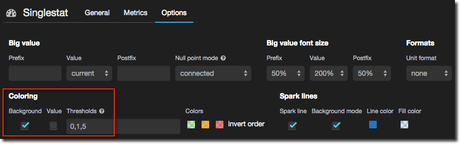
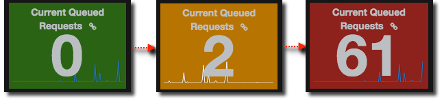
You can even substitute values for words – maybe the difference between 61 queued sessions and 65 is fairly irrelevant, it’s the fact that there are that magnitude of queued sessions that is more the problem:
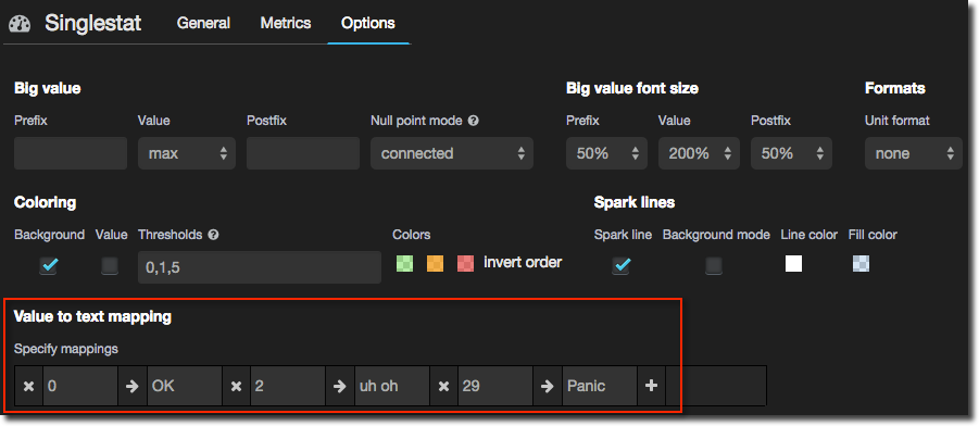
Note that the values are absolutes, not ranges. There is an open issue for this so hopefully that will change. The effect is nice though:


Conclusion
Hopefully this article has given you a good idea of what is possible with data stored in InfluxDB and visualised in Grafana, and how to go about doing it.
If you’re interested in OBIEE monitoring you might also be interested in the ELK suite of tools that complements what I have described here well, giving an overall setup like this:

You can read more about its use with OBIEE here, or indeed get in touch with us if you’d like to learn more or have us come and help with your OBIEE monitoring and diagnostics.